Experience the power of Luzmo. Talk to our product experts for a guided demo or get your hands dirty with a free 10-day trial.


August 10, 2023
Mile Zivkovic
Building a good analytics dashboard means more than just picking your metrics and KPIs. Here is how to create a great dashboard, with examples.
Analytics dashboards are like sheets and tables on steroids. They let you make massive amounts of data, metrics, and KPIs insightful, and all of that with stunning visualizations in real-time. But as any good data professional knows, having all of these options and choices can be overwhelming.
Which metrics do you choose? Which types of visualizations work the best for which type of audience? Which data analytics tool to choose?
We’ll answer all of those questions for you and a few more you didn’t know you even had.
An analytics dashboard is a document that shows key metrics and data points in real-time. Unlike a report, a dashboard is interactive and lets the viewer adjust it to their needs. This means that they can use buttons, sliders, and more to change date ranges, views, and similar options.
There are different types of analytics dashboards, depending on the use case and the intended audience reading it:
Depending on the use case, each type of analytics dashboard has a unique twist on it. However, there are some general principles that all dashboards should follow. Let’s walk through them, step by step.
What you include in a dashboard depends primarily on one thing: who will end up reading it.
The audience for an analytics dashboard could be anyone, from your SaaS product users, your CMO, the company management, the sales team or someone really specific like an enterprise customer who uses your product.
Think about your audience and determine:
Once you determine the audience and their needs, choosing the direction of your analytics dashboard is going to be much simpler.
For example, a CEO will need a much simpler, more refined and actionable dashboard compared to a marketing manager. A CEO is concerned with revenue, churn, lifetime value and the overall health of a business, and perhaps some marketing metric like a conversion rate.
On the other hand, a digital marketing manager will need more detailed insights. They might need to analyze the bounce rate and the performance of a landing page for lead generation which involves information about keyword density, Google Analytics insights, and other key information.
If you know who the end user is for the dashboard, choosing the right tool for the job becomes much easier. There are many tools in the market, some more general and some more specialized, such as Luzmo.

When choosing analytics dashboard software, here are the criteria you should have in mind:
Once you do your research, you’ll find your top competitors. For example, if you want to create marketing dashboards, a tool such as Looker Studio might be the ideal fit for you.
However, if you want to create embedded business intelligence and analytics dashboards for SaaS, Luzmo is the ideal choice. Whether you have a team of programmers on board or just one tech-savvy person who knows code, creating a dashboard and embedding it is super simple.
Once you know who’s reading the dashboard and what kind of tool you’re using to create said dashboard, everything else falls into place. Metrics and key performance indicators are the building blocks of every good dashboard. They give the reader crucial info they need to make data-driven decisions and they’re a key part of great dashboard design.
How do you choose them? They are unique to every business, but you can take a cue from good dashboard software, as it will have templates for different uses.
For example, a marketing dashboard will include different KPIs regarding your marketing strategy:
A product manager will be interested in a different set of important metrics, such as:
And others.
There is no rule of thumb here, but most dashboard experts agree that you should not go for more than 8-10 KPIs per dashboard.
In order for the KPIs to show up in the dashboard, that dashboard needs to pull data from somewhere. Every good analytics dashboard software has this functionality - you connect a data source to the dashboard once and the data updates in real-time.
For a marketing dashboard, you’ll connect it to sources such as:
Once the data source is connected, you’re all set. Every time you load the dashboard, the data fetches from the source and it is accurate and up to date. The person reading can see your marketing efforts without ever contacting anyone from your marketing team.

Some dashboard analytics tools offer data sources in the form of integrations. For example, Looker Studio integrates with Google Analytics. Other tools such as Luzmo connect directly to a SaaS app via APIs, or you can hook it up to the most popular databases and data warehouses. While this may sound more complex, it’s actually easier and in the long haul, cheaper to get real-time data this way.
Data in the form of numbers is great, but in order to tell a story, you should visualize it. Some examples of different visualizations include:
As we’ve written when discussing dashboard design, choosing the right type of visualization makes all the difference.
For example, pie charts are a popular type of visualization, but in reality, they are not all that useful. They can be difficult to read and with many different types of slices, it gets confusing really fast.
Bar charts and line charts are the best choices if you want clarity and ease of interpretation. Note that tools such as Luzmo have a large selection of visualizations and you’ll find the best type for your use case in our template library.
Drill down into the data and explain what each metric, KPI, drop and rise in metrics mean. You can do this within the widgets in the dashboard. If you want to make the dashboard self-service, go the extra mile and show your team members or managers what the changes mean.
In Luzmo, you can do that with tooltips - which are small elements in the widgets that allow readers to click on them and get more info.
If you want to give even more detailed information about the dashboard contents, add a section at the very bottom and present a summary of the information.
This is the fun part because the work is done and ready for display. You can share your dashboard in the form of a link - where the user can click on it and access it. Links can be shared in emails, on your website, in text messages and in other places.
If you want a more secure way of sharing confidential data, you can choose to embed your dashboard in your SaaS product. You should do your research and see if your tool of choice supports this option. Some tools such as Looker allow you to embed analytics dashboards in websites, but it’s cumbersome and expensive.
Then there is Luzmo where embedding a dashboard takes as little as a few hours. Embed once and it’s forever in your product, with live data going straight to your users.
To get you inspired and moving in the right direction, here are a few great examples you can copy and learn from.
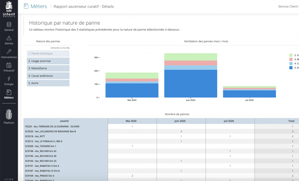
A property management SaaS dashboard by Intent Technologies:
An energy management dashboard by Enersee:
Creating an analytics dashboard really is as simple as that. Start from the intended audience and the path to a fully custom dashboard will reveal itself.
And if you’re looking for an easy way to translate datasets into beautiful visualizations for your SaaS users, look no further than Luzmo. Sign up today and add an interactive, embedded dashboard to your product!
Experience the power of Luzmo. Talk to our product experts for a guided demo or get your hands dirty with a free 10-day trial.


