Experience the power of Luzmo. Talk to our product experts for a guided demo or get your hands dirty with a free 10-day trial.

.webp)
April 8, 2024
Mile Zivkovic
Want to use Tableau for data visualization but not sure if it’s the right choice? Let our guide show you the ins and outs of this tool.
If you’re in a restaurant and ask the waiter for a soda, many waiters will ask you to choose between Coke or Pepsi as default. Looking for a phone? It’s Apple or Samsung. In the world of traditional business intelligence, it’s a toss-up between Tableau and Power BI.
Today we talk about one of the main reasons why Tableau is so popular: data visualization. This tool can turn datasets into actionable dashboards. But are the visualizations really that good and how does Tableau compare against the competition?
We’re here to find out.
Tableau is a data analytics tool founded in 2003 by a couple of Stanford students with an idea to improve data analysis and make insights from data available to everyone. 21 years later, the company has $1.6 billion in revenue and more than 4,000 employees. Being purchased by Salesforce in 2019 likely helped with the growth.
Tableau is a popular option for data analytics, in companies of all sizes - for many different reasons. There are a variety of products in their offering, including Tableau Desktop, Tableau Server, Tableau Public, and others. The tool uses a proprietary language called Viz QL, which is their alternative to the omnipresent SQL.
The user experience is great: even beginners can quickly connect the data sources and create dashboards, using a drag-and-drop builder. Speaking of data sources, it connects with many of them, from data warehouses to cloud services, spreadsheets like Excel, as well as web data connectors.
The dashboards are interactive and allow business users to drill down into data, without the need to read extensive tutorials. You can do real-time data analysis and scale your team up and down by adding extra seats. You get advanced analytics and predictive modeling, as well as collaboration and sharing features for your team (internal dashboards) and your customers (embedded dashboards).
But let’s get to the reason why you’re really reading this article.
With about 20 years on the market, there are plenty of reviews out there on Tableau and how it works. While there are some complaints here and there, most users agree on one thing: the visualizations are amazing.
This is one of the most versatile data visualization tools out there, allowing even beginners to engage in data storytelling and present data in an actionable shape and form.
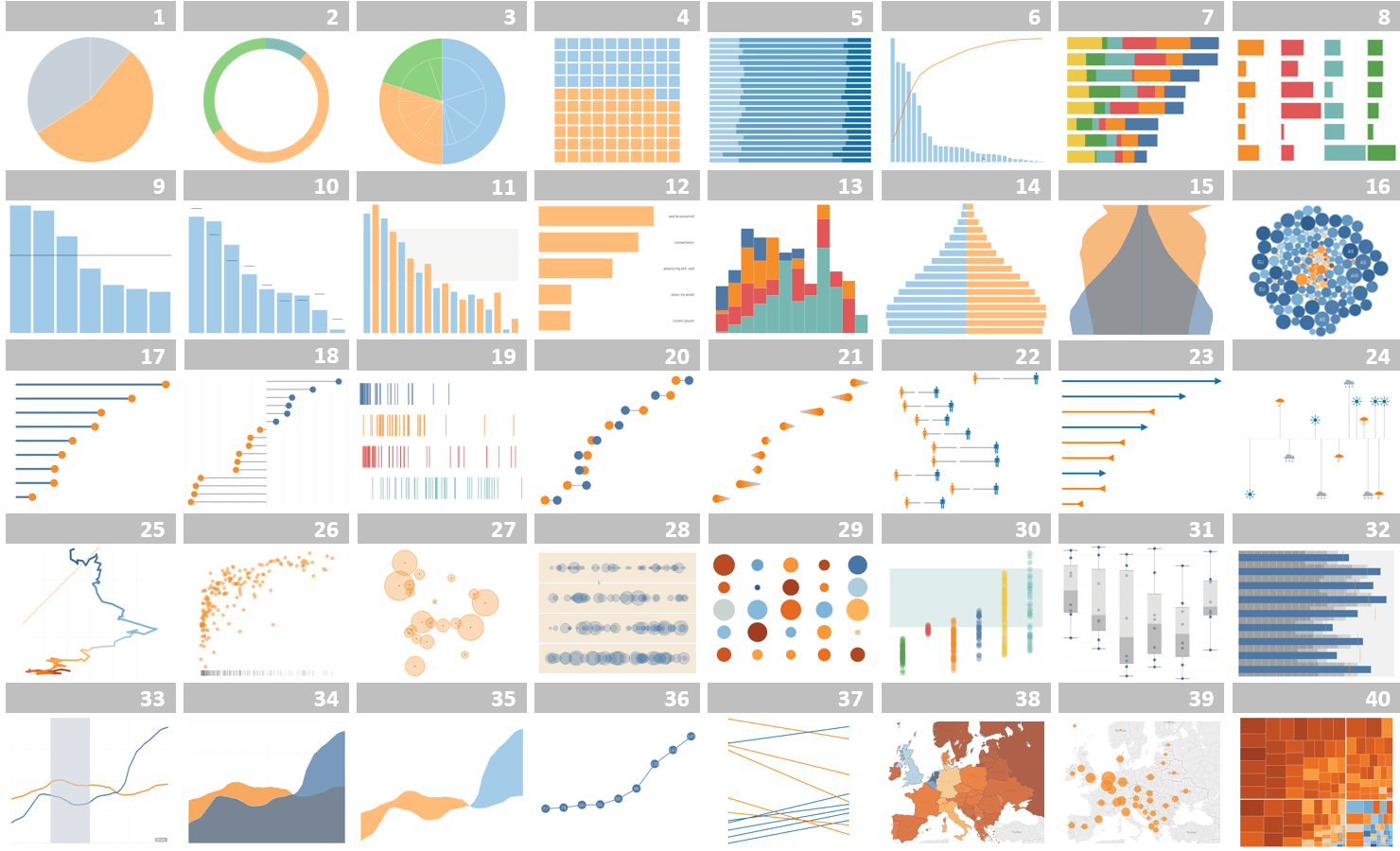
Tableau is a dream come true for every data scientist or data analyst out there who wants to visualize any type of data in a clear, engaging way. These are some of the many types of visualizations you can use, including various types of charts:
With each software update, Tableau adds new types of visualizations to their selection. And if you have the right data skills, you can customize all of these visualization types to show the data points you want in the context you need.
There is even a fictional model of something called Superstore to help you explore the different ways collected data from a store is visualized.
Not everyone has a degree in data science or knows the difference between a histogram and a bar chart. Tableau counted on that.
In the Tableau Help Center, there are countless articles helping you determine which type of visualization to use based on what data you have and what you’re trying to show. Just like the tool is easy to use, the articles are easy to read and follow.
For each of the chart types, you can access articles on how to create it in Tableau and make changes to it to get the desired effect.
Similar to Microsoft’s Power BI, the visual analytics suite works amazingly well for internal dashboard reporting. Send a workbook to your coworker, have them play with the data and explore it - and it works flawlessly. The problem starts with Tableau online, when you want to embed dashboards in your website or app.
Basic embedding in Tableau is pretty straightforward - you copy and paste a few lines of code in HTML, Python or Javascript. But if you want to embed a dashboard seamlessly in your own app, you’ll need some serious Tableau training or an expert developer to help you out.
Showing a single dashboard to all of your users is simple enough, but showing different versions of dashboards to different users takes more than a right click and a drop-down menu.
For example, if you want to show dashboards in different languages, time zones, orcurrencies - that’s going to require heavy development work. Multi-tenancy and authentication are still not at the level of more modern alternatives.
Besides embedding, the performance of dashboards is also questionable because they tend to crash, especially under heavy loads and large datasets.
Last but not least, the customization options are limited, and you can’t make the dashboard seamlessly integrate with the app's design and user interface.
Absolutely yes.
If you need an internal reporting tool that turns text files and data into amazing visuals, not many tools offer the capabilities of Tableau. There is massive help documentation available, a huge Tableau community and a bunch of guidelines to help you choose the right visualization for your needs.
But if you need a tool for embedded analytics dashboards, Tableau is not the best choice. While you do get stunning visualizations with drill-down capabilities, the tool is simply not built embedded-first. The dashboards will not look like a part of your app and they may crash while loading big data sets.
Instead, grab a free demo so we can show you how Luzmo works. With our API-first approach, connect a wide range of data sources to your dashboard, and embed it within just a few hours - not days or weeks. We also have great visualizations (and a large variety), but ours will look great in your app too.
Talk to our team today to find out how your SaaS team can use Luzmo!
Experience the power of Luzmo. Talk to our product experts for a guided demo or get your hands dirty with a free 10-day trial.


