Histogram vs. Bar Chart - Which One to Use and When?

What would you say is the better tool to cut down a tree - a kitchen knife or a chainsaw? Sure, both can do the job eventually, but one will do it quickly and efficiently. The other, not so much. In data visualization, choosing the right visualization type makes all the difference. For example, in the battle of histogram vs bar chart, you want to make sure you’re not chopping down trees with a knife.
Today, we’re going to look into these common visualization types and explain where you should use them for the best results.
What is a bar graph/bar chart?
A bar chart or a bar graph is a type of data visualization used to compare discrete data categories or data groups. They are best for those cases when you need data in separate, non-adjacent horizontal bars (=bar chart) or vertical columns (=column chart).
The reason is that data visualized in separate columns is easy to compare. This is why bar charts are commonly used for nominal and categorial data, eg. product categories, cities, months, countries, and similar discrete values.
To make sure the bar graph is easy to view and understand, make sure the bars have equal width.
What is a histogram?
A histogram is a data visualization type designed to show the distribution of interval or continuous data. In histograms, data is shown in the form of contiguous bars, where each bar corresponds to a data range or a bin.
You would use a histogram when you want to visualize the frequency or count of data points within each of those data ranges and understand how the data is distributed.
There are two axes on a histogram.
The horizontal axis (x-axis) shows the range of values or bins into which the data is divided. Each horizontal bar represents a range of bins or data values.
The vertical axis (y-axis) is the frequency or count of data points that belong to each data range or bin on the x-axis.
Histogram vs bar graph - key differences
There are five main differences between histograms and bar charts for data visualization.
The purpose
Bar charts are mainly used when you want to compare or contrast discrete data categories or groups.Bar charts are commonly used in nominal or categorical data, e.g. different categories of data in products, cities, or months.
Bar charts usually represent categorical variables, discrete variables or continuous variables in class interval groups.
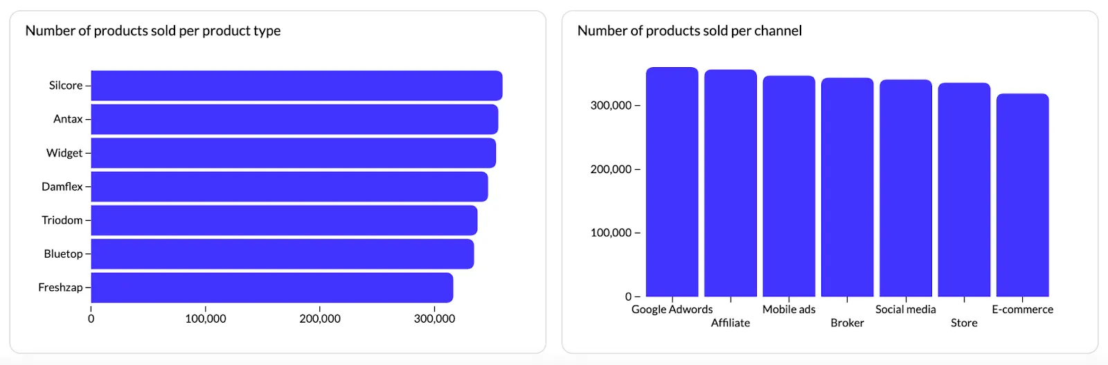
For example, you run a retail store and you want to create a data visualization to see the most sold categories in your store over a period of one year. The x-axis will show the months, while the y-axis will show the product categories in separate bars. This will help you see which product category sold the best over the year.
Histograms are used for showing the distribution of continuous or interval data.You want to use histograms to visualize the frequency of occurrences or count of data points within each range. They also help understand data distribution patterns.
For example, you run a healthcare organization and you want to see the most common age of your patients. A histogram can show the age groups of bins on the x-axis and the y-axis shows the frequency or count of patients that fall into each age group.
In modern analytics workflows, choosing the right visualization can also be assisted by intelligent analytics tools. With Luzmo Studio, teams can quickly build dashboards and experiment with different chart types such as histograms and bar charts directly inside their applications. Luzmo IQ helps surface patterns and anomalies in the data automatically, while Luzmo AI allows users to ask questions about their data in natural language and instantly generate the most relevant visualizations.
Data type
A bar chart will work well with discrete or categorical data. With these data types, every category or group is distinct and separate. The X-axis categories won’t necessarily be ordered in a continuous way.
Histograms are great for interval or continuous data, where values are placed on a numerical scale with a natural order. The X-axis is always ordered continuously, but the bin width can vary.
For example, let’s say you’re doing age distribution on a histogram. Since you’re dealing with continuous data, bins will be ordered from youngest to oldest, and typically, you’ll spread the groups evenly across bins (e.g. 0-9 years, 10-19 years, 20-29 years, etc.). However, if you want to focus on specific age groups more precisely, you don’t have to create bins of equal width. Something like 0-9 years, 10-14 years, 15-19 years, 20-24 years,... would also work.
X-Axis Labels
In a bar chart, the X-axis is used to show category labels. These are categorical or nominal, with values such as January, February, March, etc.
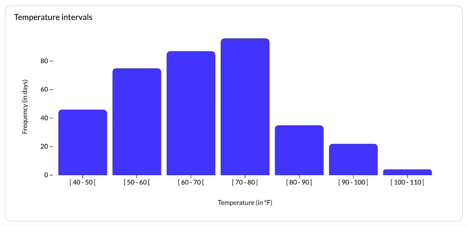
For histograms, the X-axis is a continuous range of values where the labels correspond to intervals and bins. Let’s say you have a temperature histogram - the X-axis will have labels such as "50°F-60°F," "60°F-70°F," etc.
Use in statistics
In statistical analysis, you won’t find bar charts too much because they are better for categorical data comparisons. When it comes to showing data distribution characteristics, they are not the typical #1 choice.
On the other hand, histograms are common in statistics in situations when you want to analyze data distribution and see what shape it is in (e.g. skewed or normal). It’s also suitable for finding patterns in data, such as outliers or bimodality.
When to use histograms vs bar graphs?
To keep the answer simple: bar graphs are the ideal type of graph to compare data between different categories. Histograms are best for looking at the frequency of data values within a single dataset.
Sounds too complex? Let’s explain it with some examples from real life.
3 examples where histograms are better than bar charts
We’re not saying histograms are better, but for graphical representation of continuous data within dashboards, this is the better choice of the two. Let’s look at a few common use cases.
Data Distribution Analysis
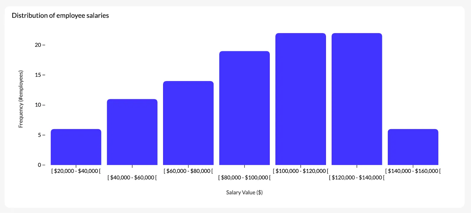
Let’s say you want to analyze your employees’ salaries.
You want to analyze the overall distribution of salaries in your company, with the distribution of numerical data ranging from $30,000 to $150,000.
You want to divide this big range into intervals (such as $30-40k, 40-50k, etc.). With a histogram, you can take this type of data and visualize how many employees fall into each category and part of the range.
This type of chart will show you the distribution, clusters, outliers, and percentages with ease. Any time you need to account for the number of observations, a histogram should be your default choice of visualization.
Quantitative Data Visualization
You’re tired of staring at Excel and you want to get some great data insights. In this situation, you have temperature readings for a certain location across months that you have collected for an entire year.
With a histogram, you create temperature intervals (e.g., 50°F-60°F, 60.1°F-70°F, etc.) to plot the frequency of days with temperatures between different intervals. The end result is a histogram that will give you a clear overview of how temperature is distributed throughout the year. You’ll also be able to highlight seasonal trends and variations. Try out the interactive histogram below, and use the filter to view temperature intervals in different months.
Frequency Analysis
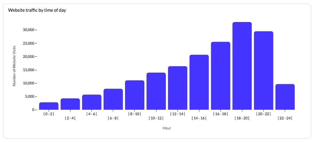
For the final example, we’re taking a look at a website and analyzing its visits.
In our case, we’ll say it’s an e-commerce website where you want to learn the frequency distribution of visits during different hours during the day. You want to use this information for marketing and sales, and histograms are the best tool for the job.
With a histogram, break down the 24 hours into hourly intervals (e.g., 12 AM-1 AM, 1 AM-2 AM, etc.) and plot the visitor numbers within each hour interval.
The end result is a histogram that shows patterns such as peak hours with the most traffic, periods with the lowest traffic, and activity as well as opportunities for targeted promotions.
Creating meaningful visualizations with Luzmo
Choosing between a histogram or a bar chart be tough, especially if you don’t know much about data visualization. Then there are other charts, such as pie chart, scatter plots and others.
But spending time to find the right type makes all the effort worth it, because the data then becomes insightful and tells a story, so the reader can make the right business decisions.
With Luzmo, the stress is gone - we help you build charts and graphs you can embed into your SaaS tools. And if you don’t know what to choose, just grab a template, check out our chart types guide, or ask our team to give a helping hand.
Grab your free trial and get started!
FAQ
All your questions answered.
What is the main difference between a histogram and a bar chart?
The main difference lies in the type of data they represent. Bar charts are used to compare discrete categories, while histograms show the distribution of continuous numerical data across ranges or intervals. In a histogram, bars touch each other because the values are part of a continuous scale.
When should you use a histogram instead of a bar chart?
Histograms are ideal when you want to analyze how data is distributed across a range of values. For example, they are commonly used for analyzing age distributions, temperature readings, salary ranges, or website traffic frequencies across time intervals.
Why is choosing the right chart type important in data visualization?
Choosing the right chart type ensures that data patterns and comparisons are clear and easy to interpret. Using the wrong visualization can make trends harder to understand or lead to misleading conclusions, which is why selecting the appropriate chart for your data type is essential for effective data storytelling.
Written by

Ship the future of your data
Let us show you what Luzmo can do for your product.

Leave your e-mail and one of our analytics experts will reach out to you