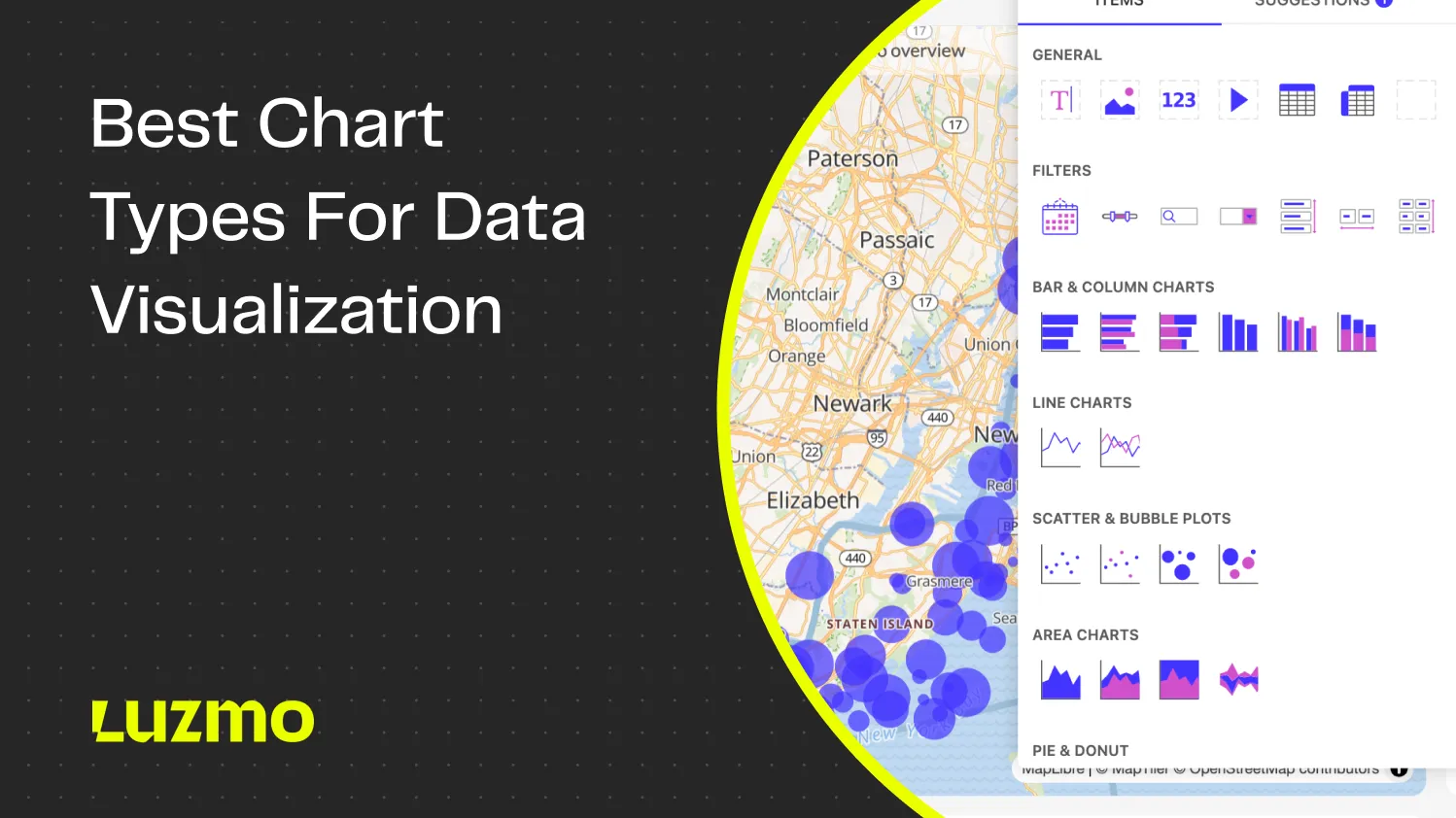
34 Top Chart Types for Data Visualization
Ever looked at a dashboard and thought: “What am I even looking at?”
You’re not alone. A chart can either tell a crystal-clear story—or completely confuse your audience. And too often, it’s the latter. Because 40% of software users rate their dashboard experience 3 out of 5 or lower.
Even great data becomes useless when visualized the wrong way. A pie chart where it should have been a bar chart. A sunburst chart that hides more than it reveals.
In this guide, we’ll walk you through the most essential chart types for turning raw numbers into meaningful insights. You don’t need a PhD in data science to take action on your data. Just clear visualizations and some best practices on how to create them.
Whether you're building reports, dashboards, or in-app analytics, this is your go-to cheat sheet for choosing the right chart at the right time. With tools like Luzmo Studio for dashboard creation, Luzmo IQ for AI-powered insights, and Luzmo AI for natural-language analytics, you can quickly turn these chart types into interactive, production-ready analytics.
Now, let’s make your data actually say something!
Most common chart types and when to use them
Line chart
When you want to track and trace the evolution of a specific quantitative value, this chart type is a good choice. It is often used to show trends and analyze data changes over time. The line graph can also be used for comparing data from multiple values by using multiple curved or straight lines.
In a line chart, the y-axis represents the quantitive value, while the x-axis shows the timescale or a sequence of intervals. The direction of the line on the chart tells you a story about where the data is going - an upward or a downward slope shows you the general direction of the values in the visualization.
Best for: trend analysis, time series data, comparing multiple data series.
Bar chart
One of the most commonly used chart types is the bar chart, and for a good reason. If you’re looking for an answer to the question of “how many” for several categories and a specific period of time, this is the chart to use.
The classic bar graph setup uses horizontal bars for comparing numeric values across different categories. The longer the bar, the bigger the value displayed on the horizontal axis. For example, you could compare the sales performance of different products this year to see which product sells best.
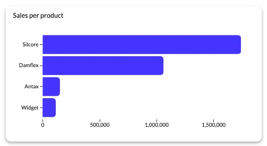
Best for: comparing categories, ranking items, frequency distribution.
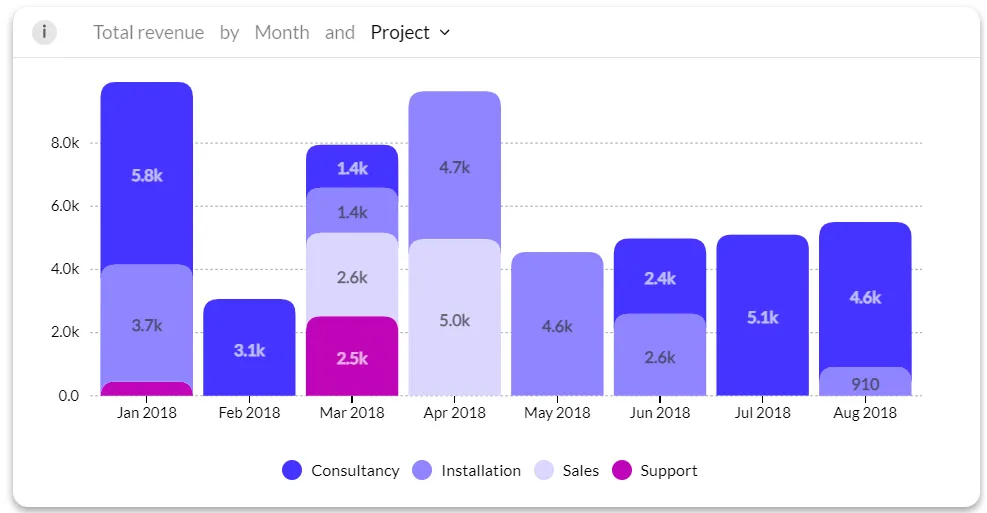
Stacked bar chart
Simple bar charts are great to compare values of a specific category. But sometimes, you may want to compare numerical values across multiple categories. You can do exactly that with a stacked bar chart, which is a more advanced version of the bar chart.
With a stacked bar chart, you can group data from one bar into multiple subdivisions to show even more data in one visualization. For example, we could break down our sales performance bar chart to see how much sales each product drove quarter over quarter.
That way, we can see the overall best-performing products, but we can also compare shifts in preferences over time.
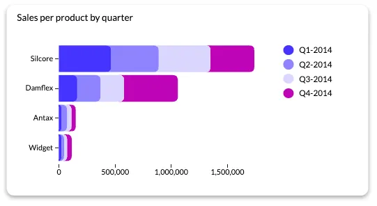
Best for: comparing categories, ranking items, and frequency distribution - grouped by multiple subdivisions.
Column chart
This is one of the most common chart types that can be used for various sets of data. It’s great for answering the question of “how many” for a specific time period and across different categories. Time indication can be used as a category too so you can track a metric over time.
It uses vertical bars to compare numeric values across different categories or time frames. The longer the bar, the higher the value, which you can see on the vertical axis in the chart.
Best for: comparing categories, ranking items, frequency distribution.
Pie chart
It does not get more classic than a pie chart, which was invented in the 18th century. This chart type is ideal for showing different parts of a whole and getting a proportional distribution of your data. The circle (pie) is divided into pieces to show how much space a certain value takes up in proportion to the whole.
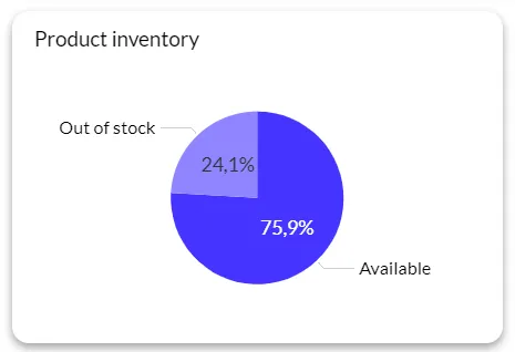
The problem with pie charts is that as humans, we are naturally not very good at interpreting the sizes of the different slices. To combat this issue, make sure you always follow common data visualization best practices. That means no more than five different slices in a pie, ideally only two.
Best for: showing relative proportions, highlighting the relationship of a part to a whole, simple data sets.
Donut chart
Pies vs. donuts debate in terms of taste is a tricky one. However, when it comes to chart types, donut charts are a better option than pie charts. There is just one difference: the doughnut chart has a hole in the middle of the slices, hence, making it a donut.
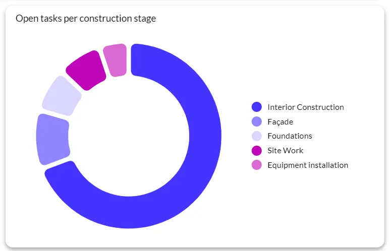
Example of a donut chart in the construction industry: open tasks/tickets per construction stage (for better project management of a construction project)
The downside is the same: our brain can't interpret the sizes easily, so keep it under five slices for this chart type as well. However, since there is no center (that we focus on by default), we judge the pieces by their length. This makes them easier to read than pies. If you do have more than five data points, use a bar chart as a good alternative.
Best for: showing relative proportions, highlighting the relationship of a part to a whole, simple data sets.
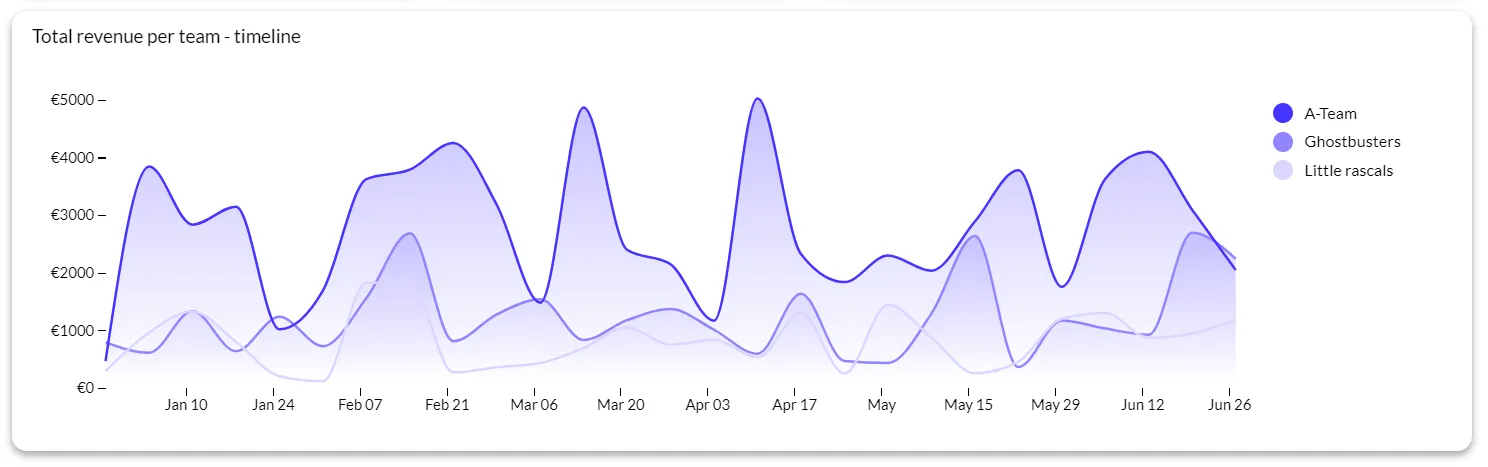
Area chart
Similar to the line chart, an area chart lets you track changes over time for one or more categories. You can just as easily compare data from multiple categories with multiple areas.
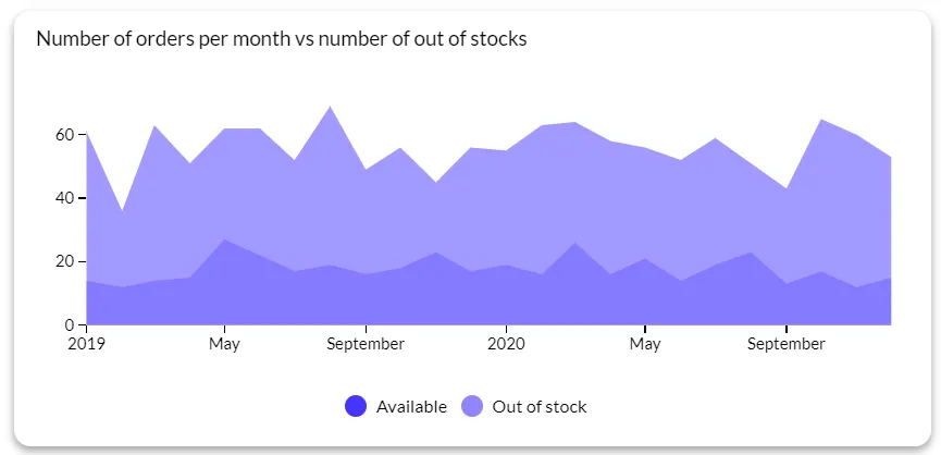
You can use it to show trends over time for related categories. The main difference between an area chart and a line chart is that the area below the line is filled with color to show volume.
If the differences between the values in the data are big enough for a clear representation, an area chart may be a better choice than a line chart.
Best for: showing trends over time, parts-to-whole relationships, stacked data comparison
Stacked area chart
A stacked area chart shows you how a measure changes over time, as seen through multiple category values. Opposed to the regular area chart, it stacks all of the lines on top of each other. In other words, these charts visualize the cumulated sum with numbers or percentages over a certain time period, so you can show the contribution of each category.
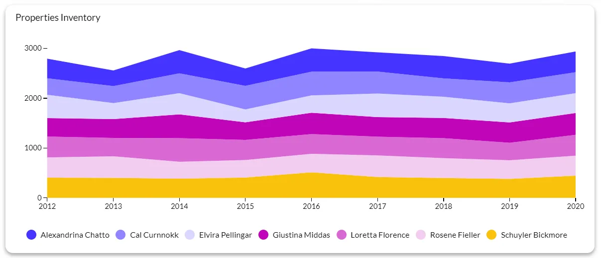
Similarly, the stacked column chart measures contributions from different individual values with their total value.
While they have their pros, they are also not ideal for some use cases. For example, when you want to give an accurate representation of fluctuations per category.
Best for: part-to-whole contribution, changes to contribution over time, trend analysis.
Histogram
A histogram shows you the frequency of numerical data by using rectangles. The vertical axis represents the frequency of a variable. The horizontal axis shows the variable value, e.g. months, weeks, days.
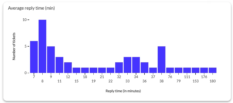
Example of average reply time per tickets in a customer support context. Horizontal access has reply time as variable value; vertical has the amount of tickets (frequency)
A histogram is the ideal chart type for comparing the distribution of numerical data in different time intervals or ranges. Histograms should not be mistaken for bar charts, even though they look similar.
Best for: data distribution analysis, identifying outliers, data preprocessing.
How to choose the right chart type: a decision framework
Knowing what each chart does is only half the job. The harder question — the one most guides skip — is which chart to reach for when you're staring at a dataset and need to make a call.
Start with what you want to communicate. If the point is how something changes over time, line charts and area charts are usually your first stop. If you're comparing values across distinct categories, bar charts and column charts are the default. If you want to show how parts make up a whole, reach for a pie or donut chart — but only if you have five categories or fewer. If the goal is to reveal a relationship between two variables, a scatter plot handles that better than anything else.
From there, ask how much data you have. Scatter plots and box plots handle large datasets well. Pie charts and bubble charts become unreadable past a handful of data points. Finally, consider your audience. A heatmap or a dual-axis chart requires the reader to do more interpretive work — that's fine for analysts, but it's friction for an executive glancing at a dashboard.
A useful shortcut: if you can't describe what the chart is telling you in one sentence, it's probably the wrong chart. Luzmo AI can suggest the right chart type automatically based on your data structure and the question you're trying to answer, which removes the guesswork for teams building dashboards at scale.
Common mistakes when choosing a chart type
The most common chart mistakes aren't random — they tend to follow predictable patterns. Recognizing them makes it easier to catch them before they reach a dashboard.
Using a pie chart with too many segments is one of the most frequent. Human perception struggles to compare slice sizes once you get past four or five categories. If you have more, a bar chart will communicate the same information more clearly.
Choosing a line chart for categorical data is another recurring error. Line charts imply continuity — they suggest the values flow from one point to the next. If your x-axis categories are independent (products, regions, teams), a bar chart is the right call, not a line.
Truncating the y-axis to exaggerate differences is a subtler problem. Starting a bar chart at a value other than zero makes small differences look dramatic. It's not always intentional, but it misleads the reader about the actual magnitude of the change.
A dual-axis chart used carelessly can also distort the relationship between two metrics — making a correlation appear strong when the scales have simply been adjusted to make the lines intersect. When in doubt, use two separate charts. Luzmo AI flags these kinds of layout issues automatically when building dashboards, which helps teams avoid publishing misleading visualizations.
When bar charts aren’t enough: 18 advanced chart types to use
Scatter plot
If you have two or more variables and want to discover the relationship between them, a scatter plot can be a solid choice. When you have two different variables, they are located on the X and Y axis. The data point is horizontally and vertically located for each variable on the scatter chart.
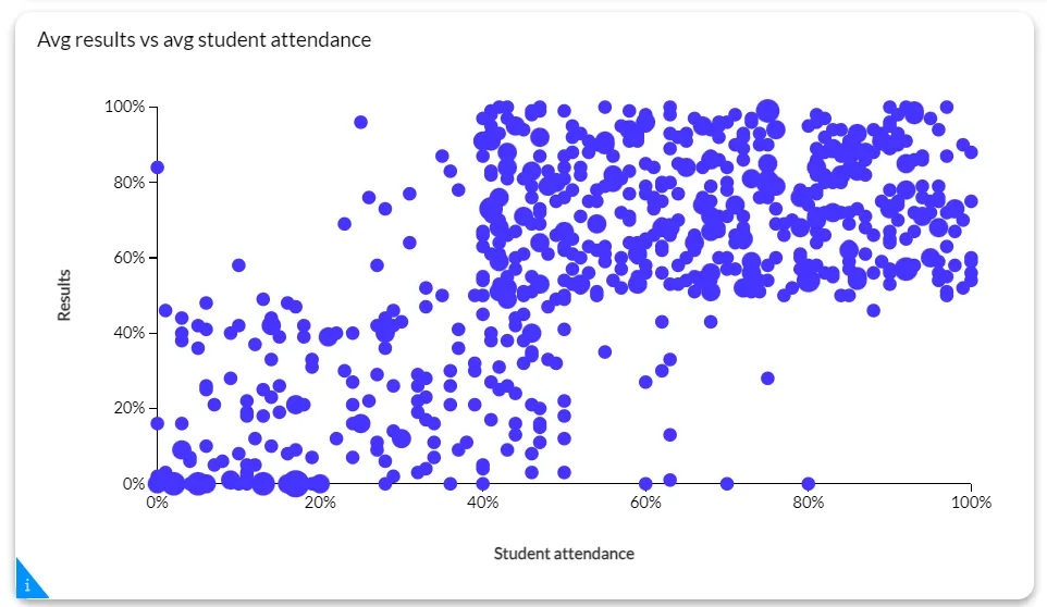
This graph is an example for education, showing the relation between the exam results of a student, and how often they attended their classes.
The closer the data points are together, the more related they are. Moreover, if they form a line or a curve, it signifies a strong relationship. The more spaced out the data points are, the weaker the relationship.
Best for: identifying relationships, correlation analysis, and detecting outliers.
Box plot
If you’re doing explanatory data analysis, a boxplot chart (or box and whisker plot) is an excellent choice. You can use it to summarize data measured on an interval scale. With a box plot chart, you show the distribution of data points, their central value and their variability.
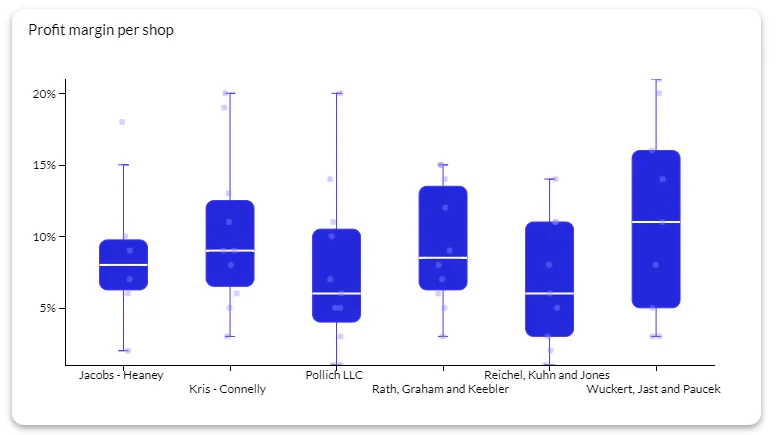
This example compares profit margins per shop, also showing the outliers of certain sales transactions that had a higher or lower profit margin, making it easier to compare across stores
One major advantage of a box plot over other types of charts is that you can see a variable’s spread and outliers in one place. To do so, box plots use the concept of quartiles, which divides your datasets into equal fourths.
Also, this graph type does not take up much space in your dashboard. Perfect if you want to pack a lot of information, but you’re limited in space.
Best for: comparing distributions, identifying central tendency, understanding data spread.
Dual axis chart
Dual axis chart (also called a multiple axis chart) lets you you compare metrics or different units of measure or scales on a single chart. This way, you can visualize trends that may not be obvious when viewing data points in isolation from each other.
For example, you can have a dual axis chart with products sold on one axis and revenue over time on another axis. This way, you can show the relationship between the two.
Best for: comparing different data types, showing relationships, highlighting trends
Bubble chart
A bubble chart is a fun way to show how many values you have per category. The higher the value, the bigger the bubble, which gives you a super easy overview of your top categories. To get even more value from this chart type, you can group similar categories by using the same or similar colors.
You can adjust and customize bubble charts to show the type of data you need. For example, you can limit the number of bubbles or choose to display the absolute value of percentages. Note that the data labels are small on bubble charts, so they might not be the best choice for comparing categories with long, descriptive names.
Best for: showing multivariate data, comparing more than two variables, visualizing trends and patterns
Funnel chart
Funnel charts are ideal for showing the stages of a process in parts stacked on top of each other and visually enhancing them with colors. The more items you have in a certain stage, the wider that part of the chart is.
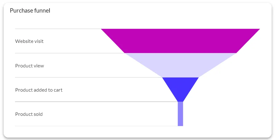
This makes funnel charts ideal for taking a look at processes and identifying bottlenecks. In Luzmo, there are three different layout types for this chart: dynamic width, dynamic height, and equal and linar.
Best for: lead generation and conversion charts, website conversion analysis, sales and marketing funnel visualization.
Heatmap
A heatmap or a heat map is a type of chart that shows values for a main variable across two axis variables as a grid with squares in different colors. The variables are split into ranges similar to a histogram or a bar chart.
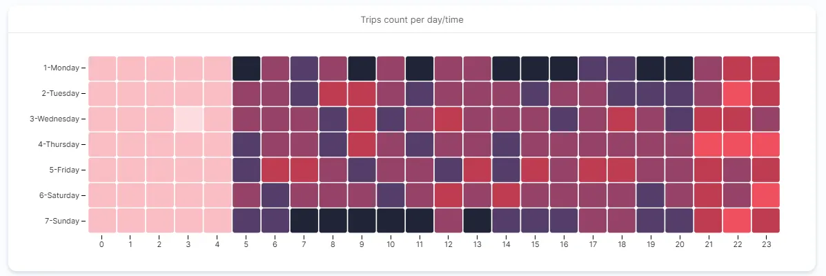
The typical heatmap chart has darker colors corresponding to the larger values in variables. This makes it easy to see patterns and make conclusions with a quick glance at a heatmap.
PS. another name for a heatmap is a density map, which is coincidentally, something entirely different from a chart.
Best for: data exploration and pattern recognition, correlation analysis, risk assessment and portfolio analysis.
Gantt chart
A Gantt chart is a subtype of a bar chart that shows different categories over a time period. You can use it to visualize the start and finish of a project in time period blocks. Besides data visualization, Gantt charts are also commonly used for project management to ensure that projects stay on track and within deadlines.
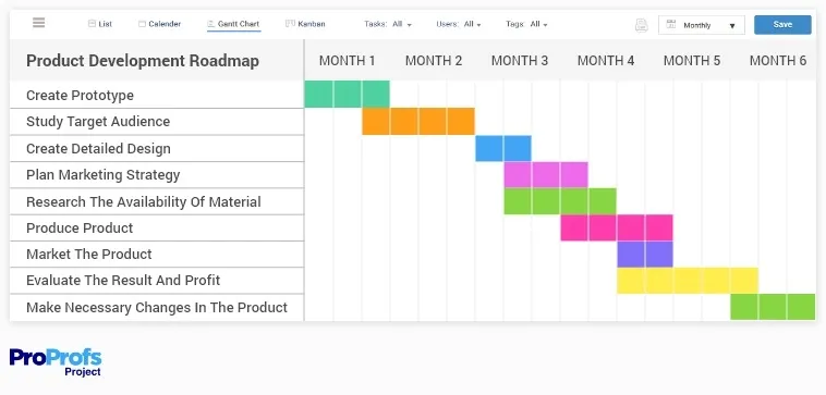
Best for: project planning, dependency management, task scheduling.
Radar chart
When you want to compare two or more categories based on different variables, a radar chart is the ideal choice for multivariable comparison. If you have a lot of data and a high number of variables and want to show them in one chart without it looking like a mess, you want to use a radar chart.
To make the radar chart more suitable for your needs, you can change the opacity of the color to make it more or less intense. A radar chart is often used for mapping out skillsets, e.g. for HR or training purposes.
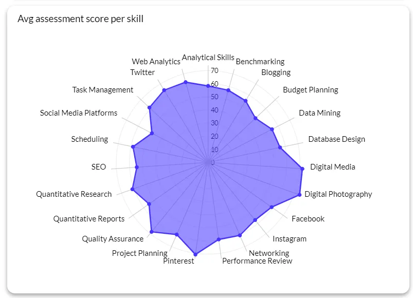
Best for: multi-dimensional data comparison, performance evaluation, feature comparison
Waterfall chart
You can use a waterfall chart to show a running total where the values are added or subtracted. This is a good type of chart to show how an initial value gets impacted over time with positive and negative values.
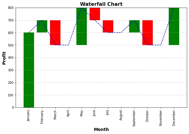
The values can be based on the time or category. Other names for this chart are a flying bricks chart or a Mario chart.
Best for: financial statement analysis, project budget analysis, sales and revenue analysis.
Treemap chart
If you want to show a hierarchical structure in a fun way, this type of graph is a great choice. Alternatively, if you want to show proportions between different values within a single category, you can use a treemap.
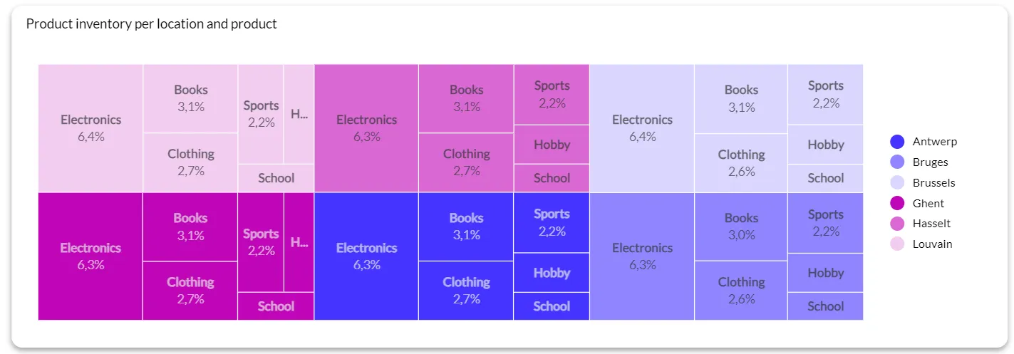
Even though it’s called a treemap, this visualization type uses squares for visualizing categories. Every category has a colored rectangle area and subcategories are within these rectangles. The bigger the rectangles, the bigger bigger the part-to-whole ratio.
Best for: hierarchical data visualization, nested categories, quantitative data display.
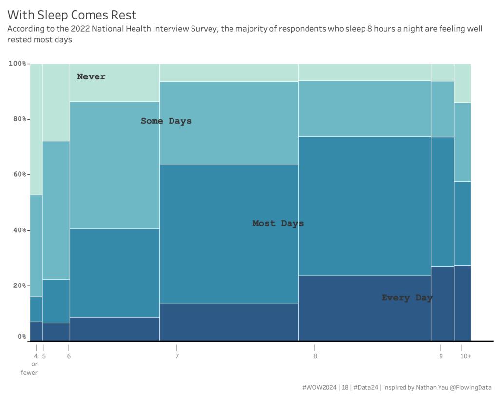
Marimekko chart
Although it looks very similar to a treemap, marimekko charts use stacked column charts of different widths, to help you detect relationships between categories and subcategories.
Marimekko charts are great for displaying survey results, because you can easily compare how different groups respond to certain questions. It is, however, a more complex visualization, which is why we prefer the treemap as a more intuitive visualization. But by no means is it a bad data visualization.
Bullet chart
When you need to visualize data in terms of performance, bullet charts are one of the most logical choices. They allow you to show the progress of multiple categories in one place.
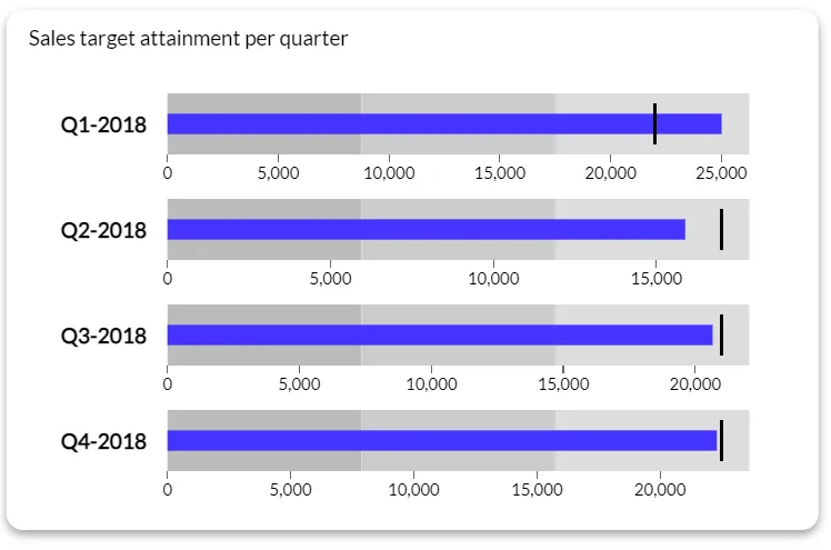
These chart types are most commonly used to compare a performance forecast with the actual numbers. If you want to track if your business or a certain department is meeting certain goals, this is a great chart type to use.
Best for: goal and target tracking, performance assessment, tracking efficiency and productivity.
Candlestick chart
Also known as the Japanese candlestick chart or a K-line, this is the ideal choice for visualizing and tracking financial data. It consists of two parts:
- The body (the open and close price)
- The wick (high and low price)
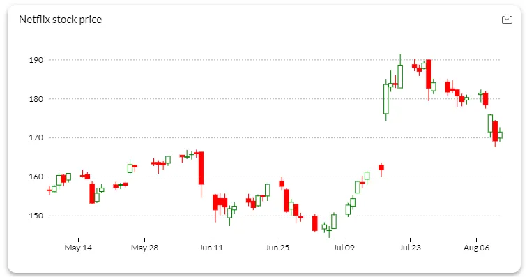
When creating this type of chart, the body is filled by default when the open price is higher than the close price. This means you’re in a bear market. If the body is empty, this is a bull market.
Because it's specific to the financial sector, you may not find this chart in every data visualization tool's assortment.
Best for: financial use cases - market sentiment, price reversals, support and resistance levels.
Sankey diagram
Dating back to the 19th century, the Sankey diagram is one of the oldest ways to show data values in visual form. This type of diagram is ideal for showing flows and amounts of traffic. The higher the quantity of the flow, the wider the streams in the diagram.
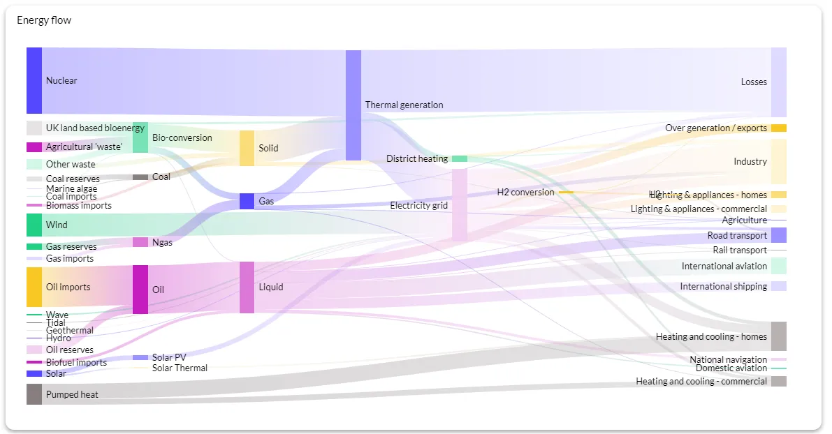
Example of how energy flows from different sources to different destinations
The flow can break out into multiple branches or subcategories, indicating the size connection between them.
Best for: energy flow analysis, material flow analysis, environmental data.
Pyramid chart
This chart type is ideal when comparing the distribution of two categories against each other on a few levels such as age groups, years and others. It’s commonly used for showing demographic data represented by two categories (male and female), grouped into different categories such as age groups.
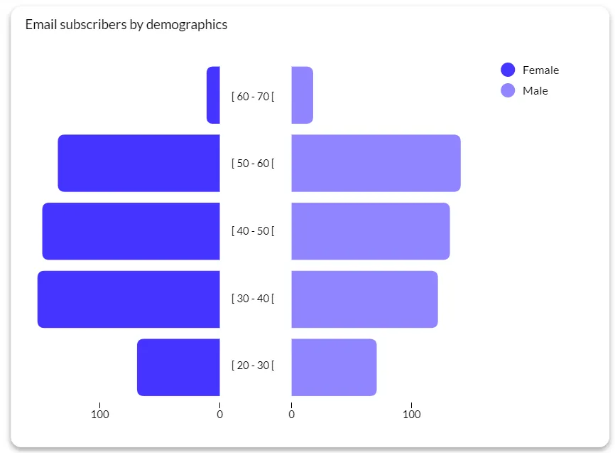
Best for: population demographics, market segmentation, economic data
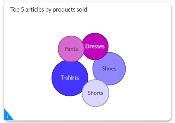
Circle pack diagram
If you want to visualize hierarchies without using traditional chart types, this is an interesting choice. Instead of using bars, circles can be used to show hierarchy. The larger the circle, the larger the category, packing up smaller categories within it.
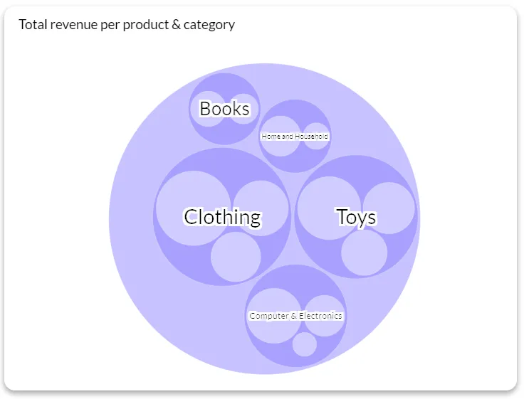
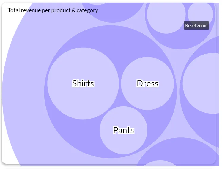
Best for: hierarchical data, proportional data, data exploration
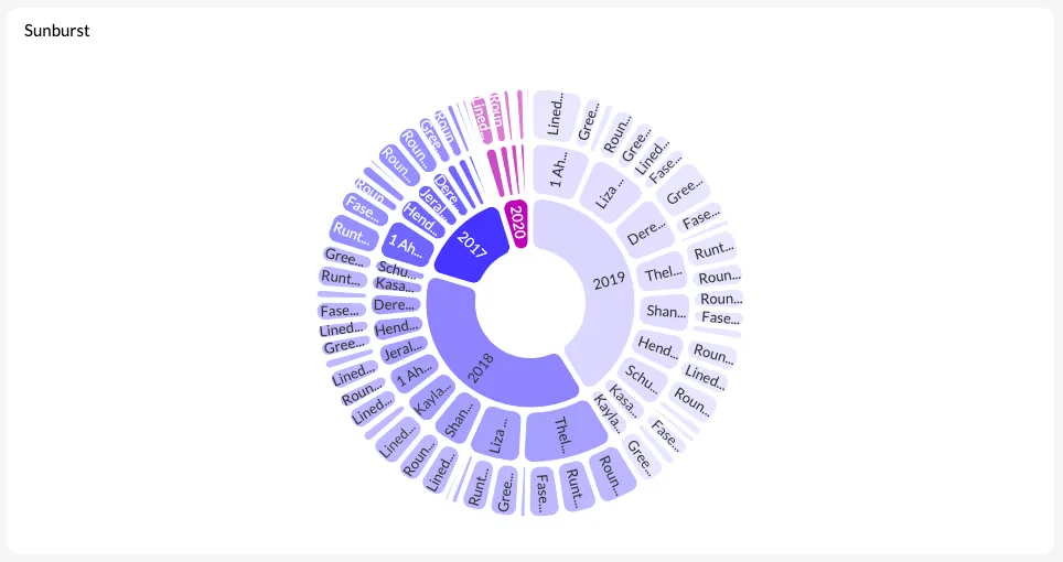
Sunburst diagram
Closely akin to the circle pack diagram, the sunburst chart shows hierarchical data, and is great for advanced data exploration. Instead of using embedded circles, it uses concentric circles. For each category you add, you’ll add another ring or circle to the visualization. The innermost circle is at the root, while the outer circles represent deeper levels of the hierarchy.
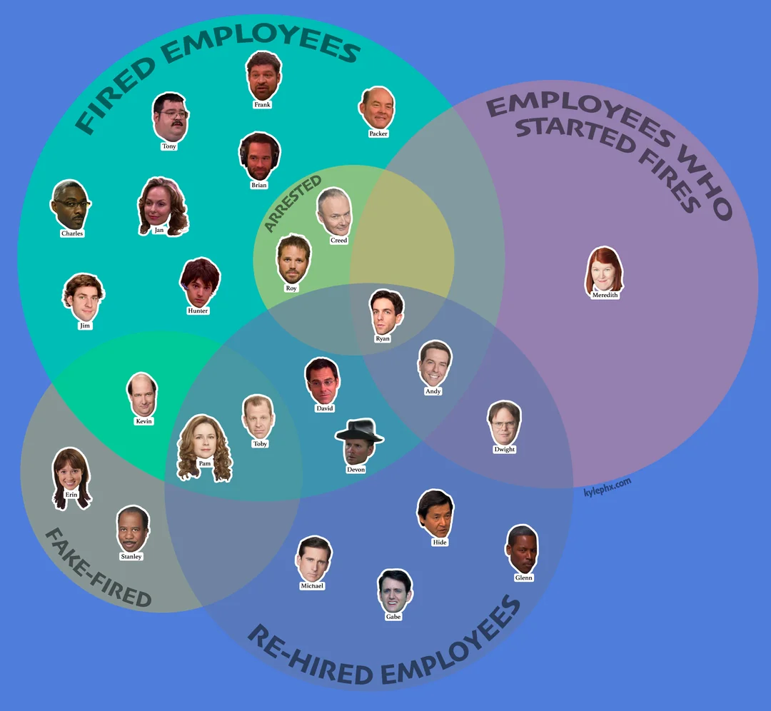
Venn diagram
The Venn diagram is a simple visualization that uses overlapping circles to show relationships between your data. Each circle represents one category; the overlap between the circles indicates which characteristics they have in common.
Because data visualizations don’t always have to be serious, enjoy this example Venn diagram showing all the firing, hiring, and re-hiring happening in The Office.
Map charts for geographic visualizations
Choropleth map
This is a statistical thematic map that uses colors that match a number range. It’s most commonly used to summarize a geographic characteristic in a geographic area. You’ll see these maps when viewing information such as income per capita or population density.
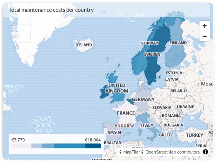
Best for: geographic insights, data distribution, special patterns
Symbol map
A symbol map overlays quantitative values over geographical locations through the use of symbols. These maps are easy to read and they have been around for centuries. When preparing presentations of data studies or something happening to a geographical area, go with this chart type.
Best for: geospatial data, location analysis, spatial trends
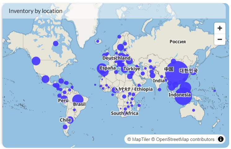
Chart types for embedded analytics and software dashboards
Choosing chart types for an internal report is one thing. Choosing them for an analytics experience embedded in your product — where end users have different levels of data literacy, different goals, and limited context — is a different problem.
The first constraint is simplicity. Embedded dashboards are usually part of a larger product workflow. Users aren't there to analyze data; they're there to make a quick decision and move on. That means complex chart types like treemaps, sunburst charts, or multi-axis visualizations tend to create friction rather than insight unless the user base is specifically data-savvy.
The second constraint is interactivity. Static charts in embedded analytics miss a key opportunity. Bar charts with drill-down, line charts with date range controls, and scatter plots with filtering are significantly more valuable to end users than their static equivalents — they let users answer follow-up questions without having to contact your support team.
The third consideration is the data update frequency. If your embedded dashboard is near real-time, gauge charts and single-metric displays communicate current status effectively. If it's reporting on historical trends, area charts and stacked bars work better for showing change over time.
Luzmo's embedded analytics platform supports all the chart types covered in this guide, with built-in interactivity, white-label styling, and AI-powered querying via Luzmo AI. If you're building analytics into a software product, you can start with a free trial and have a working embedded dashboard within days, not weeks.
Custom chart types to inspire your own
Sometimes, the perfect chart just… doesn’t exist. Maybe you just need a small customization to a common chart, like a custom funnel with dynamic width, or a very specific type of map visualization. But other times, you may need an entirely unique visualization tailored to your product’s logic.
When your BI tool only gives you a fixed library of basic charts, you’re stuck making compromises. Or worse, you need to build everything (bar charts included) manually with code.
That’s where Luzmo’s custom charts come in.
With Luzmo, you’re no longer limited to a standard set of visualizations. Using custom charts, you can build any chart you like using HTML, CSS, and JavaScript, and then plug it directly into your Luzmo dashboard interface. You get the best of both worlds: mix and match between typical charts and bespoke visualizations.
The cool thing? Once you’ve built your visualization, your dashboard designers can start using it just like any other common chart! Below are a few examples of what those highly custom charts might look like.
If standard bar charts aren’t cutting it, here are 7 powerful custom chart types you can build with Luzmo to take your dashboards to the next level:
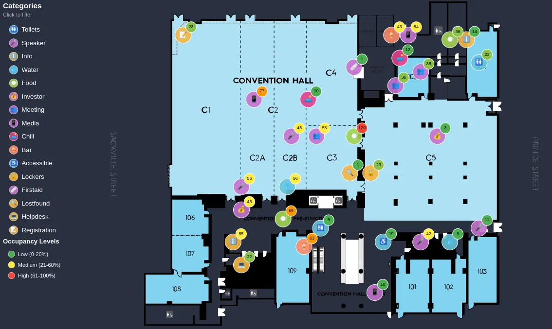
Floor Plans with Live Data Overlays
Ideal for events, real estate, or smart buildings, this chart type lets you embed real-world layouts into your dashboard and layer them with live data. You can track room occupancy, attendee flow, or equipment status using color codes, markers, or filters. It’s the perfect way to blend spatial awareness with actionable insights—no 3D map integrations needed.
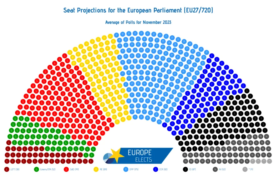
Parliament or Seat Distribution Visuals
When accuracy and clarity both matter—especially in political or voting contexts—parliament-style visuals show representation in a format people instantly recognize. Use this layout to illustrate vote shares, seat changes, or internal decision-making dynamics, with clickable elements that reveal deeper details or simulate coalitions.
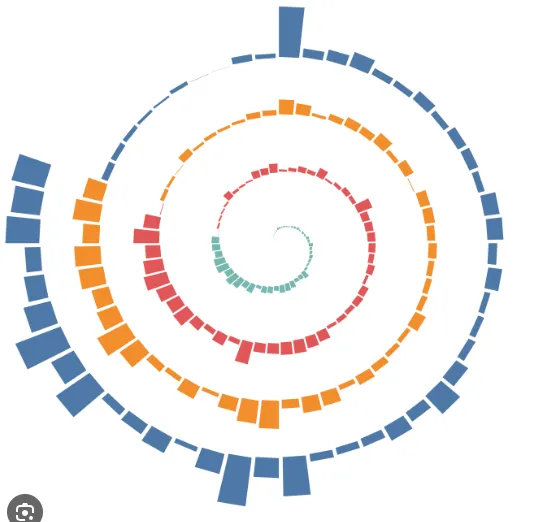
Spiral and Radial Charts for Cyclical Data
Linear charts flatten data, but behaviors often repeat. Spiral or radial charts are perfect for visualizing seasonality, weekly usage cycles, or campaign engagement patterns. They make recurring trends pop, helping teams quickly spot rhythms and anomalies without digging through date filters or long tables.
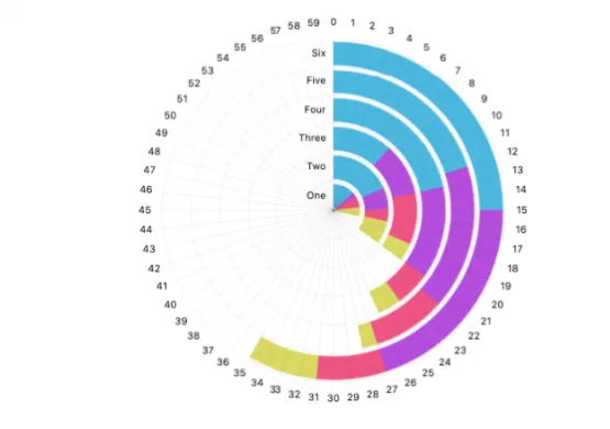
Radial Bar Charts with Layered Metrics
Need to gamify performance? Radial bar charts work brilliantly for tracking progress in leaderboards, wellness apps, or sales dashboards. You can layer multiple KPIs around a single data point, comparing personal growth, rankings, or targets—all in a compact, mobile-friendly design that adds visual flair and keeps users engaged.
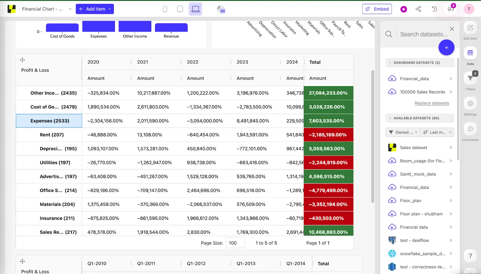
Visual-First P&L Tables and Financial Scorecards
Finance dashboards don’t have to be boring. With custom table visuals, you can retain the familiarity of rows and columns while enhancing clarity with embedded sparklines, color-coded thresholds, and micro-charts. It’s a smart hybrid that helps both finance and non-finance teams grasp key metrics fast—without sacrificing detail.
When to use which chart type?
As you can see, the amount of chart types to choose from has no limits. The right chart for your application will be the one that shows the most relevant data in a way that is clear and easy to understand. However, finding that chart can be challenging.
This flow chart is a handy tool to start figuring out which chart type to use for which data. If you’re looking for inspiration in real dashboards, our dashboard templates will show you how to go from your data points to a useful visualization.
Make your data speak
At Luzmo, we believe your data deserves more than default charts and clunky dashboards. With our flexible chart library and custom visualizations, you can design engaging client-facing analytics that don’t just show data, but drive decisions.
Whether you're just getting started or scaling your SaaS product, Luzmo offers pricing that grows with you. Plans start at $495/month for Starter, $1995/month for Premium, and custom pricing for Enterprise deployments, so you can choose the level of flexibility, customization, and scalability your product needs.
Ready to bring your data to life?
Get in touch with our experts or try it for free and start building interactive, insight-driven dashboards with Luzmo in just hours—not weeks.
FAQ
All your questions answered.
How do I choose the best chart for my data?
Match your business question to the visual goal: Use bar and column charts for category comparisons. Line charts for trends over time. Scatter plots to show relationships between variables. Heatmaps or box plots to visualize distributions and variances. The best chart highlights the answer you’re trying to communicate, not just “looks nice.” Automation in modern dashboards can even recommend chart types based on data patterns.
Can different chart types be combined in one dashboard?
Yes, mixed charts and coordinated views let analysts present multiple perspectives simultaneously. For instance, a trend line next to a distribution histogram offers both macro and micro views of the data. Just avoid clutter: too many visuals can overwhelm your audience.
What mistakes should I avoid when choosing charts?
Common pitfalls include using pie charts with many slices (hard to read), 3D effects that distort perception, and mismatched axis scales that make trends appear misleading. Good practice is to test charts with real users to ensure they convey the intended message.
Are certain charts better for mobile or embedded experiences?
Interactive and responsive charts (like line, bar, and small multiples) often work best on mobile. Avoid very detailed or dense visuals on small screens; simplify views or prioritize key insights for compact displays.
How to make custom scatter charts?
You don’t need to wrestle with code or clunky tools to create custom scatter charts. With Luzmo’s chart creator, you simply select data, set your axis labels, and tweak the design with just a few clicks. Choose from professionally designed templates or start from scratch to get the exact look you want. Add error bars, adjust your color scheme to fit your brand kit, and you’re ready for high quality images that impress. Luzmo’s interactive charts make every scatter plot clear, actionable, and ready to use—no design degree needed.
How to make custom doughnut charts?
Building a standout doughnut chart is quick and painless with Luzmo’s free chart maker. Start creating by picking a template from the chart templates gallery, then pull data from Excel or your connected sources. Drop in your chart title, choose fonts and icons, and tweak the background for that perfect touch. Save your favorite settings, so you never lose a look you love. Luzmo lets you make data charts that pop, whether you need a single doughnut or a full suite of interactive dashboards.
What makes beautiful data visualizations?
Beautiful data visualizations aren’t just about color—they’re about clarity and engagement. Luzmo’s chart design tools give you the best chart for every situation by offering a user friendly experience that balances aesthetics and function. Customization options for every template, intuitive chart maker features, and the ability to fine-tune details like axis labels, fonts, and icons mean your visualizations don’t just look good. They work hard, too. Want to keep it on-brand? Luzmo lets you apply your brand kit so every chart fits seamlessly into your product or report.
Can non-designers create custom charts?
Absolutely. Luzmo was built so anyone can create charts—designer or not. Thanks to a library of professionally designed templates and a drag-and-drop interface, you can start creating without feeling lost. Adjust your color scheme, add icons, or drop in your own fonts with just a few clicks. The platform’s chart creator is user friendly and offers quick data visualization, so your data charts look sharp even if you’ve never touched design software before. Plus, you can always upgrade to the standard plan for even more flexibility.
What are available chart types for customization?
Luzmo covers all the chart types you need for serious analytics—from bar charts and scatter plots to interactive charts like doughnut, radar, and funnel charts. Use the bar chart maker to visualize trends, or pick a template for quick data visualization. Each chart can be customized: change backgrounds, add chart titles, and save your favorite setups. With Luzmo’s chart maker, you’re not locked into default options—just select data and go. Want more? Explore unique chart types and tailor every element to fit your vision.
Written by

Ship the future of your data
Let us show you what Luzmo can do for your product.

Leave your e-mail and one of our analytics experts will reach out to you