What is Data Exploration? The Definitive Guide for 2026

If you’ve ever read a dictionary, you know how powerful they are: they contain all the words in a single language. And that’s all fine and dandy when you need a definition for a single word. But as a whole, a dictionary does not have the meaning and the artistic value of a work of fiction.
The same goes for business data. Just having all the rows and columns with numbers in one place is good, but on its own, it has no meaning. This is where data exploration comes in, connecting your pieces of data and helping you tell a story with the information you have at hand.
Today, we’re going to show you what data exploration is, how to do it, and which tools to use.
What is data exploration?
Data exploration is the first step in data analysis, where businesses use data visualization to interpret the data that they have and derive conclusions from it. There are two ways of doing data exploration: manually (by going through your data, row by row) or by using data exploration and analysis tools.
It is also known as Exploratory Data Analysis or EDA.
But perhaps this all sounds vague to you, so let’s take a look at an example.
Imagine you’re a marketing agency providing paid advertising services to over 100 clients around the world. You have the data about each of your clients, including:
- How much they are spending
- What kind of results you’re bringing to them
- Which clients spend the most money
- Which clients stay the longest (and have the highest lifetime value)
- Which members of your team perform the best
All of this data in one place is meaningless without data analytics and data exploration. After data exploration, your data is visualized and put into context. This allows you to answer questions such as:
- Which industries are bringing in the most revenue?
- Which employees are performing the best?
- Which clients spend the most and how could I get more of those clients?
In short, data exploration allows you to get practical insights from your existing data. You then use these insights to make conclusions and better business decisions.
Data exploration vs data mining
The two terms are often used interchangeably, but they are entirely different.
Data mining is the step that comes before data exploration. It entails gathering data from large datasets to have a starting point. Once you have that relevant data in one place, you can begin with data exploration and further analysis.
Why is data exploration important?
Data exploration is necessary to better understand your current business needs, your customers, and their use of your products and services. By tapping into this data, you can learn about your customers’ behaviors and pain points as well as how you solve them. Moreover, you’ll know how to optimize your existing resources.
Another major reason why data exploration is important is that it entails data visualization as the next step after data analysis. Even the best data scientists can agree that humans interpret visual information much better than large strings of numbers.
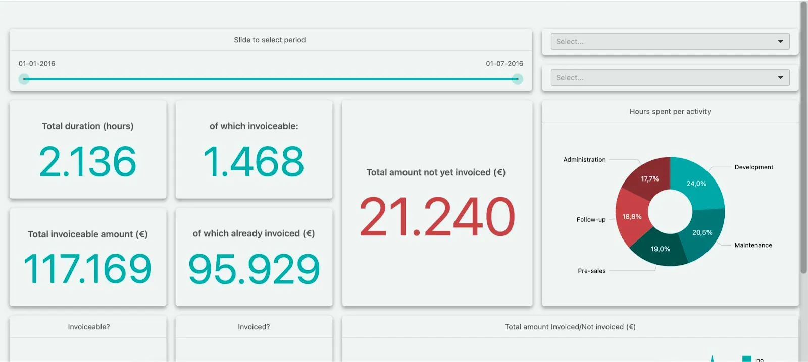
With data exploration, you can have complex information displayed in a visually engaging way, using elements such as graphs, charts, tables, pie charts, Gannt charts, and many others. If you’re creating a dashboard for your customers, simplicity is key because they don’t need to be data analysts to interpret any data.
Platforms like Luzmo Studio make it easy to build and embed interactive dashboards directly into your product, while Luzmo IQ and Luzmo AI help users explore datasets, uncover patterns, and generate insights using AI-powered and natural language interactions. This makes data exploration faster and more accessible for both technical and non-technical users.
Data exploration techniques
There are three main types of data exploration you can employ.
Descriptive analytics
As the name suggests, descriptive analytics aims to describe your data through measures of centrality and measures of dispersion.
Measures of centrality include values such as the average or median, while measures of dispersion include deviations, variances, and ranges.
Descriptive analytics lets you make conclusions such as:
- The average order size among all of your customers
- The total number of customers who ordered a specific product within a timeframe
- The location and the size of companies that bring in the largest percentage of revenue
In short, it describes what the data is telling you.
Visualizations
Just having numbers is great, but it’s even better if you can visualize it using histograms, Gannt charts, bar charts, pie charts, tables, and various types of widgets.
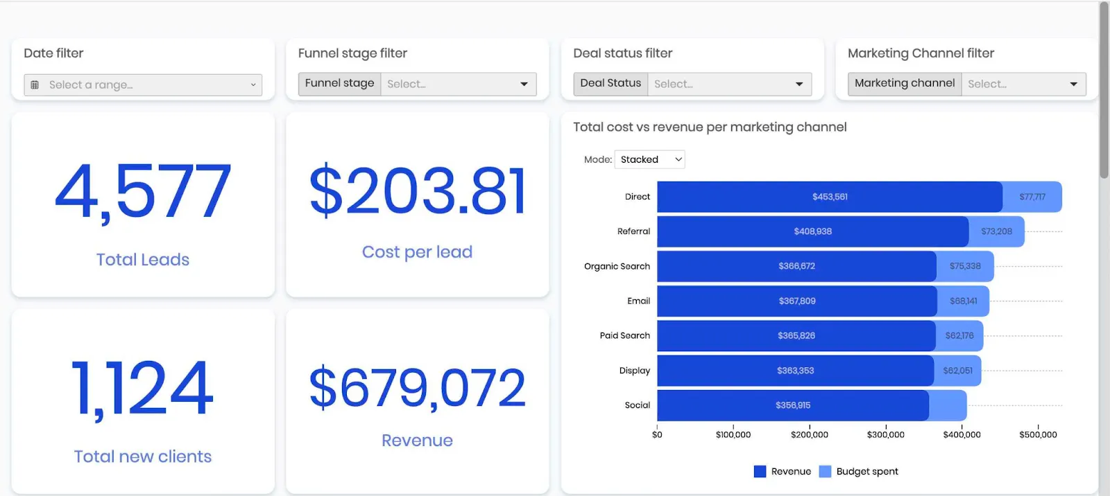
Visualizations put the different values and metrics in a context that is easy to understand. It can be hard to comprehend a drop in the average order value when shown in the form of a spreadsheet. However, that same data in the form of a histogram is easy to interpret even for non-data-driven users.
Statistical analysis
Last but not least, statistical analysis entails taking a deeper look at your data and quantifying it. For example, statistical analysis can show you outliers. If you have 100 orders and 95 of them are in the value range of $10-20 and 5 of them are in the value range of $1,500-2,000, this is an outlier and does not depict your data accurately.
In statistical analysis, you can also spot missing values, anomalies, standard deviations, correlations between datasets and more.
Benefits of data exploration
There are a few key benefits of using data exploration, no matter what your use case is.
- It’s an easy way to visualize large amounts of data at once. This allows you to get a high-level overview of all your data in a way that you can easily understand and learn from.
- You can spot anomalies and outliers. When analyzing all of your data points on a high level, you can easily identify outliers in datasets - the bits of data that skew your overall results.
- You can identify variables more easily. Especially if you’re not crazy about data science, data exploration, and visualization can show you the categorical variables in your data.
- It shows you patterns and relationships. You can see the connections between two different types of data more easily when it is displayed with visualization tools in the form of scatter plots, bar charts, box plots, and others. For example, you can see more clearly if there is a link between customers from a certain industry and their lifetime value and churn.
Tips and tools to speed up data exploration
Doing data exploration manually means weeding through tons of data and trying to find meaning from it. Needless to say, this method of exploratory data analysis is very time-consuming and won’t work for many businesses. This is why you should consider data exploration tools that allow regression and visualization.
As a side note: being familiar with programming languages such as Python or R is of huge help if you want to do open-source data exploration on your own, without employing paid tools.
Luzmo
If you have a SaaS product and you want to do data exploration and follow it up with an interactive dashboard, we have the tool for the job.
Luzmo lets SaaS teams connect a large number of data sources to a dashboard, either using the built-in connectors or our flexible API. You can then use our drag-and-drop editor to create stunning visualizations for your customers.
And besides building visualizations for your customers, customers can even data explorations on their own in Luzmo - since you can embed the full dashboard editor into your app - not just a complete dashboard itself.
To top it all off, embedding your dashboards into your product is a quick process and requires a few lines of code. The end result: a white-labeled dashboard that fits seamlessly into your website and product.
Microsoft Excel/Google Sheets
Even though you may not consider these tools for data exploration, they can do the job really well for most use cases. In spreadsheets, they can display raw data, filter through it and create basic visualizations that most people can interpret easily.
A huge perk of Excel is that most people have some experience with it, so you can get started fairly quickly.
Matplotlib
If you’re not afraid to get your hands dirty with data, Matplotlib is a way to analyze large sets of data quickly. It’s far less intuitive than most modern BI tools but anyone with the basic knowledge of Python can draw powerful conclusions from this tool.
The tool is completely free and it has extensive documentation and an open-source library provided for developers and non-developers alike. The downside is that the visualizations are not as stunning as with some of the other tools.
Pandas
Pandas is one of the most popular data exploration tools used in the financial industry. It is actually a Python library (much like Matplotlib) and it’s also open source and free. It’s similar to SQL in the types of commands you can use and you can create basic plots for data visualization.
Tableau
If you’re willing to risk a steeper learning curve to end up with amazing visualizations, Tableau is the tool for you. Built for in-house reporting and data visualization, it also helps with data exploration. It’s fast, supports many data models and data sources and the visualizations are highly customizable and interactive. However, you may need a tutorial or two and the tools is quite pricey.
Power BI
Like Excel but want to go one step further? Power BI is Microsoft’s answer to Tableau and it’s a powerful business intelligence, data visualization and exploration tool. It has a wide range of sources such as JSON and MySQL, it supports many different types of visualizations and it comes with data preparation and cleaning. However, the learning curve and pricing are similar to Tableau.
Wrapping up
At this point, you’ve hopefully realized that having a wealth of data means nothing if that data does not tell a story you can learn from. And thanks to a large variety of data exploration apps, getting started does not require a degree in machine learning or data science. Start properly exploring your data today so you can make better business decisions tomorrow.
And if you run a SaaS product that could benefit from data exploration and visualization, grab your free trial of Luzmo today! We’ll show you how doing data exploration can be quick and easy as you launch your first dashboard within hours - not weeks or months. Plans start at $495/month for Starter, $1,995/month for Premium, with custom Enterprise pricing available as your data needs grow.
FAQ
All your questions answered.
What is the goal of data exploration?
The goal of data exploration is to understand your data, identify patterns, detect anomalies, and extract meaningful insights. By visualizing data using dashboards and charts, businesses can make better decisions based on real evidence. Tools like Luzmo Studio help teams build dashboards for data exploration, while Luzmo IQ and Luzmo AI allow users to analyze data and generate insights automatically.
What tools are commonly used for data exploration?
Common data exploration tools include spreadsheets like Excel, programming libraries such as Pandas and Matplotlib, and business intelligence platforms like Tableau and Power BI. Modern embedded analytics platforms like Luzmo Studio also allow teams to embed dashboards directly into their applications, while Luzmo IQ and Luzmo AI help users explore and interpret data using AI-powered analytics.
Why is data visualization important in data exploration?
Data visualization helps users understand complex datasets more easily by presenting information in charts, graphs, and dashboards. Visual formats make it easier to identify trends, relationships, and outliers. With tools like Luzmo Studio, organizations can create interactive dashboards, while Luzmo IQ and Luzmo AI enhance data exploration by automatically identifying insights and helping users interact with data using natural language.
Written by

Luzmo
Ship the future of your data
Let us show you what Luzmo can do for your product.

Leave your e-mail and one of our analytics experts will reach out to you