What is a Data Visualization Dashboard? + 7 Amazing Examples

A picture is worth a thousand words, as the famous adage says. But what about numbers and data?
When someone needs to make an important decision based on data, they need to quickly figure out what is important and why. And when numbers alone don’t cut it, visualizations can help.
Businesses across different industries use data visualization dashboards to understand their data more easily. But how do you even create one and is your business a good fit for dashboards in the first place?
Let us show you some amazing data visualization dashboard examples to show you that you too can use dashboards in your business. But first…
What is a data visualization dashboard?
A data visualization dashboard is a document that takes data from various sources and displays it in an interactive form so that it is easy to interpret, understand and learn from. In other words, KPIs and metrics are turned into visualizations (such as bar charts, line charts, histograms, graphs, heat maps, tables and more) so that the person reading can immediately understand the data.
Unlike complex spreadsheets or tables, anyone with basic literacy should be able to understand a data analytics dashboard.
Businesses use data visualization dashboards for various purposes:
- To understand how customers are using their product
- To reveal their marketing performance across channels
- To present data and analyze their sales performance across channels, agents, product types and more
In short, if you have a lot of data points, a visualization dashboard helps you turn numbers into interactive visualizations you can learn from.
The main types of data visualization dashboards
There are four main types of dashboards. Depending on what data you have and who your intended audience is, you’ll choose one of the four types below.
Strategic dashboard: broader, more general dashboards that give an overview of your entire business operations. The intended audience for this one are CEOs and other types of executives.
Operational dashboard: similar to a strategic dashboard as it gives a high-level overview of your entire business. The difference is that the dashboard focuses on a specific field of operations.
Tactical dashboard: provides an in-depth analysis of specific metrics in a specific field of work. For example, a marketing ROAS dashboard. The audience for this one are direct managers in a field of work. In this example, it would be a marketing manager or a paid media manager.
Analytical dashboard: more detailed dashboards that take into account past performance. The end goal is to show insights behind historical data and determine what went wrong and what could be done better.
7 Data Visualization Dashboard Examples
Launching your own visualization dashboard from scratch can feel overwhelming. You don’t have to rack your brains about the best visualizations and metrics to use. Here are seven great examples of dashboards to get you inspired.
Email marketing dashboard
Email marketers deal with many data points every day. Staying on top of KPIs such as open rates and click-through rates is crucial as they need to have a clear idea of what is working. That way, they can adjust their campaigns in real-time and refine them for better results. This dashboard design helps you stay on top of that data:
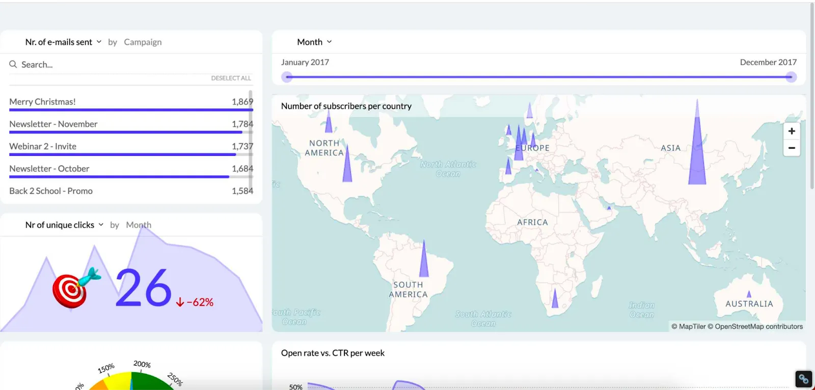
Besides historical data, you can see real-time information to help your decision-making. There is a campaign overview to show the best-performing emails, as well as a map to filter out top countries by subscribers.
The best part is that this dashboard is fully customizable in Luzmo and you can grab it and use it as a template.
Behind these dashboards, several components power the analytics experience. Luzmo Studio allows teams to design and manage dashboards using a visual editor and connect them to their data sources. Luzmo IQ helps automatically surface patterns and trends in datasets, while Luzmo AI enables users to ask questions about their data in natural language and instantly generate charts or insights.
E-commerce dashboard
Data visualization tools let you show a huge variety of datasets in one place, coming from different data sources. This ecommerce sales dashboard is a perfect example of that.
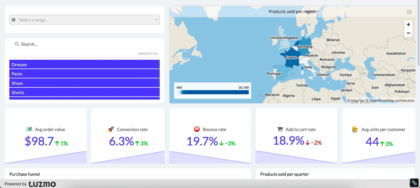
Similarly to the previous dashboard, this e-commerce tool shows data analysis for real-time, as well as historical performance.
You can see the most important metrics needed to make smart business decisions in e-commerce: average order value, conversion rate, bounce rate, add to cart rate and many others. On top of that, there is a breakdown of products sold per region. You can also choose different product categories and see all these data points across a specific category.
You don’t need to be a data scientist to interpret anything in this business dashboard. And if you choose Luzmo as your business intelligence tool, you don’t need to be a genius to create this dashboard either.
Google Analytics dashboard
If you have a website designed by professionals, using Google Analytics is a must. Not only is it completely free, but it also has a wealth of digital marketing data points you can use to improve your website.
However, the most recent version of the tool (Google Analytics 4) is not exactly intuitive. And GA just gives you data in the form of numbers and some graphs. To get more insights, you need interactive dashboards such as this one:
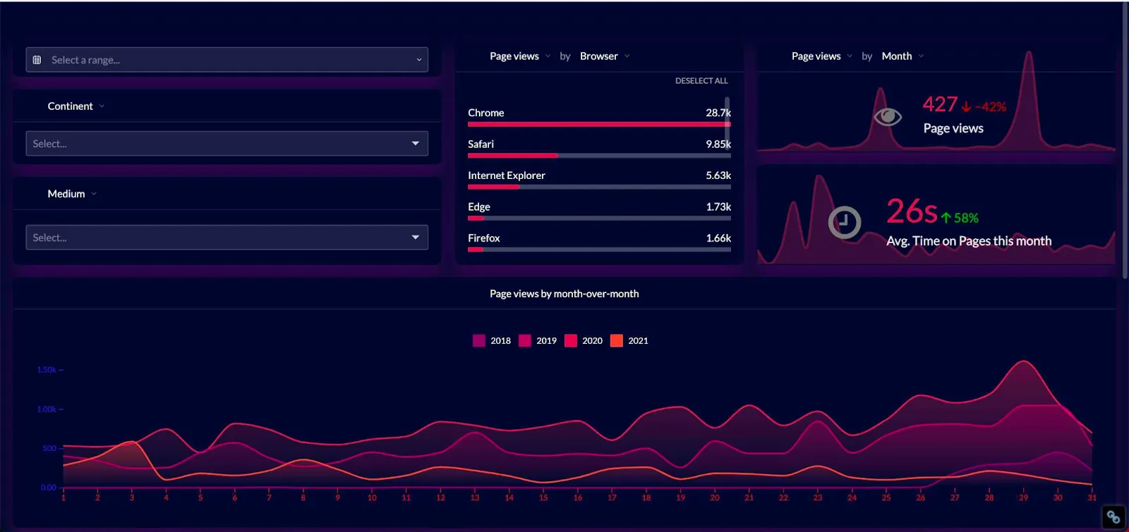
This KPI dashboard shows the most important key performance indicators from Google Analytics so that you can figure out what is happening on your website. And just like all the other dashboards, this one is fully customizable.
The great thing about this dashboard, unlike using Google Analytics, is that the experience is self-service. Instead of going through data for hours, you can showcase it with visual elements in a way that your team and customers understand it.
Recruitment dashboard
There are a lot of moving parts in recruitment and losing track of your data can cost you dearly. If you don’t keep track of data analytics, you could make the wrong hire or lose amazing candidates from your talent pool. This recruitment dashboard helps you avoid that.
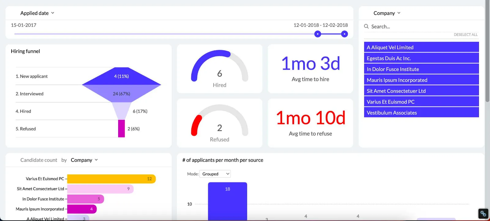
It gives you an overview of your most important hiring metrics, such as time to hire and time to refuse. At the same time, you get a glance at your entire funnel, so you can make data-driven decisions about which stages need improvements.
You no longer have to stare at raw data and wonder where you’re losing great candidates. You can also see outliers and correlations and determine what initiatives and driving the best applicants.
This dashboard in Luzmo can help you unearth valuable data within hours of signing up.
Property management dashboard
Property managers can also use dashboard tools to show important data points in real time. This is a booming industry with plenty of need for data visualization.
However, most property managers had to rely on enterprise tools like Tableau to visualize their data. Thanks to Luzmo’s property management dashboard - you can create one in minutes.
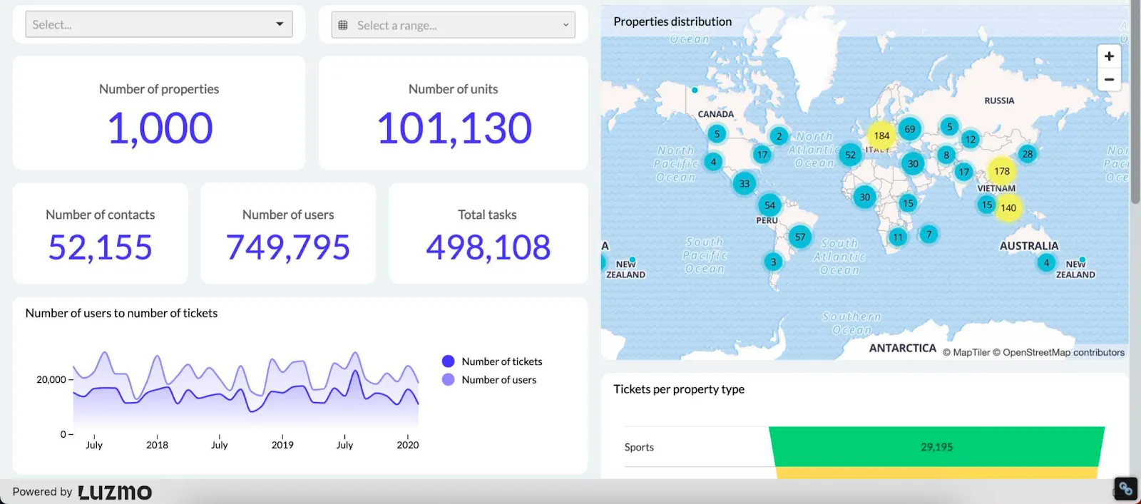
You get a quick overview of your total properties, users and units, all spread out across a map. On top of that, you can also have tasks come in from your users and view them directly in the dashboard. No matter how many properties you manage, you can drill down into data in one place.
Google Ads dashboard
Every dollar and click counts with Google Ads, and having all of that data available in real-time is crucial. Just a small tweak in copy or CTA can result in major changes in click-through rates. And there is no better way to find out what is going than a dedicated Google Ads dashboard.
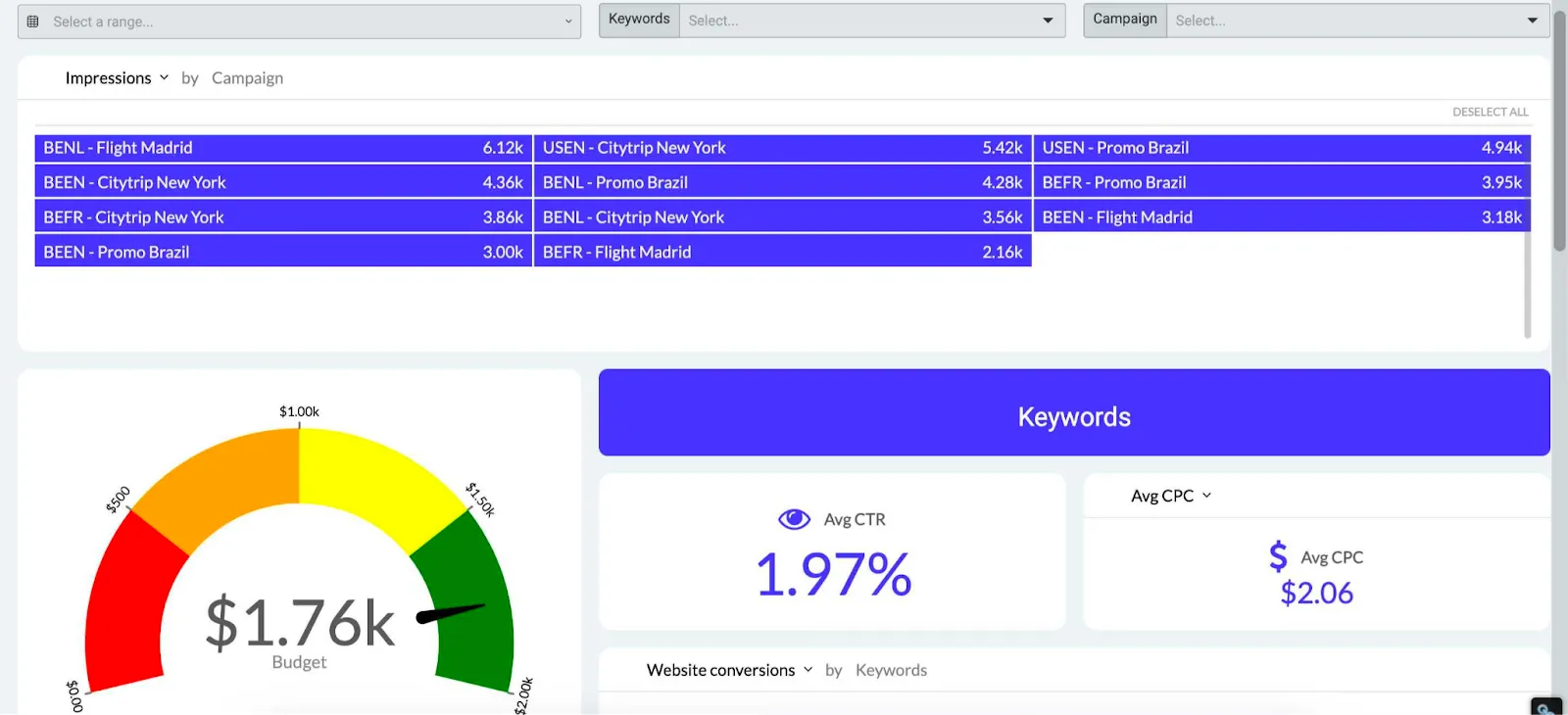
You get an overview of all of your campaigns in one place, as well as your overall clickthrough rate and cost per click.
And thanks to the visualization on the left, you can see how your spend is stacking up against your total budget for a given time period.
You can choose a different type of visualization, such as a scatter plot, bar chart, histogram or something else.
Sales pipeline dashboard
Sales professionals handle different types of data and having an overview of their entire pipeline can greatly help with formulating new sales strategies. Not only that, but sales leaders can see the performance of their entire team at a glance. You can view all of this in a sales pipeline dashboard.
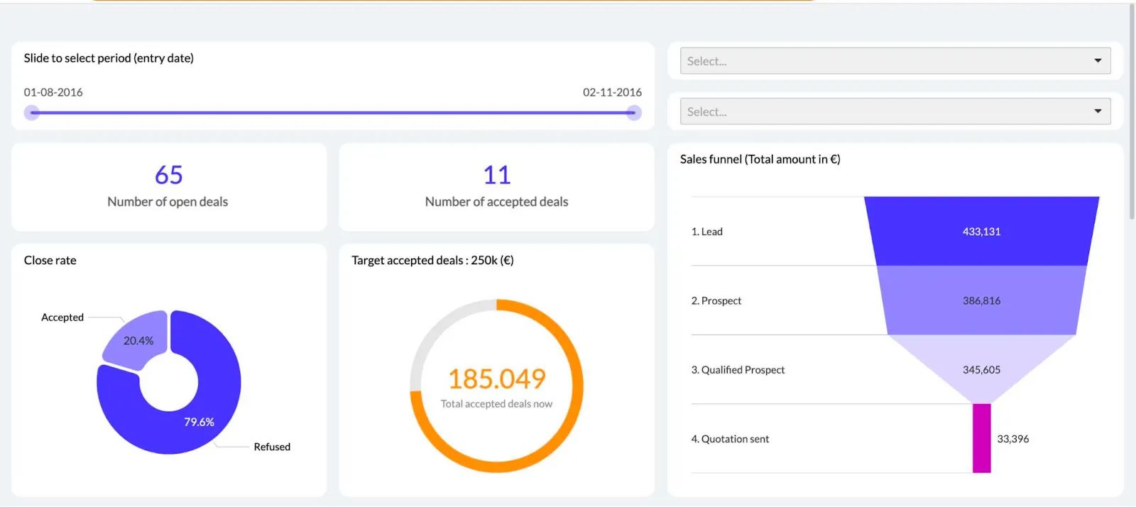
You can filter and sort through mountains of data and go into great detail to find out which deals were accepted and why - as well as why certain sales fell through.
Wrapping up
Data visualization dashboards can help distill complex data into beautiful visualizations that key stakeholders can use to make better decisions. Instead of wrangling with Excel and outdated pie charts, embrace the future and visualize data so that anyone can understand it and make informed decisions.
By the way, did you like the dashboard examples above? They are all available as templates in the Luzmo app. You can use them and change different aspects, such as types of visualizations, key metrics and more.
Did we also tell you that a 10-day trial is completely free? Sign up for free and create your first dashboard today!
FAQ
All your questions answered.
What is the purpose of a data visualization dashboard?
A data visualization dashboard turns raw data into visual formats such as charts, graphs, and tables so that people can quickly understand trends and patterns. Instead of manually analyzing spreadsheets, dashboards provide a centralized view of key metrics and insights.
What are the different types of dashboards?
The most common types of dashboards are strategic dashboards for high-level business monitoring, operational dashboards for tracking day-to-day performance, tactical dashboards for department-level metrics, and analytical dashboards that help explore historical data and uncover insights.
Who typically uses data visualization dashboards?
Dashboards are used by a wide range of professionals including executives, product managers, marketers, analysts, and sales teams. They help stakeholders understand business performance and make informed decisions based on real-time or historical data.
Written by

Ship the future of your data
Let us show you what Luzmo can do for your product.

Leave your e-mail and one of our analytics experts will reach out to you