How Commspace Wows SaaS Customers with Great Analytics UX

Your SaaS users cringe at poor UX. On G2, 71% of SaaS platforms get complaints about clunky interfaces and suboptimal experience. This shortcoming creates a massive opportunity for smart product managers. Go all-in on a premium user experience, and you’ll gain a competitive edge.
But what does a premium analytics UX look like? On a recorded webinar, we discussed the topic with Graham Anderson, Head of Business Intelligence at Commspace. He shares his hands-on advice for a good dashboard UX.
Company Profile: Commspace
Commspace is a SaaS platform in the FinTech space. Its commission management platform lets financial advisers manage, track, split and analyze revenue from commissions and fees. To let their product users effectively analyze their revenue, they needed an easy-to-use analytics dashboard where customers get revenue insights in one glance. They use Luzmo's embedded analytics tool to power these reporting features in Commspace.
HQ
Cape Town, South-Africa
Industry
Software as a Service, FinTech
Employees
11-50 employees
Customer-facing reporting challenges
❌ Long, complex dashboards make it difficult to find information quickly
❌ High support load to answer customer's reporting requests
❌ Keeping scarce engineering resources focused on the core product
Solution with embedded analytics
✔ Reduce the amount of dashboards with 50% for better usability
✔ Less frustrated product users and more constructive customer feedback
✔ Higher product engagement with impactful, easy-to-use analytics
How Commspace improved user experience on their dashboards
With Luzmo's embedded analytics, Commspace's Head of Business Intelligence, Graham Anderson, was able to build out a powerful analytics offering. In this recorded webinar, he shares his 5 main tips for a good user experience:
- Researching which metrics are relevant to customers
- Putting the most important metrics at the top
- Grouping charts and dashboards in a meaningful way
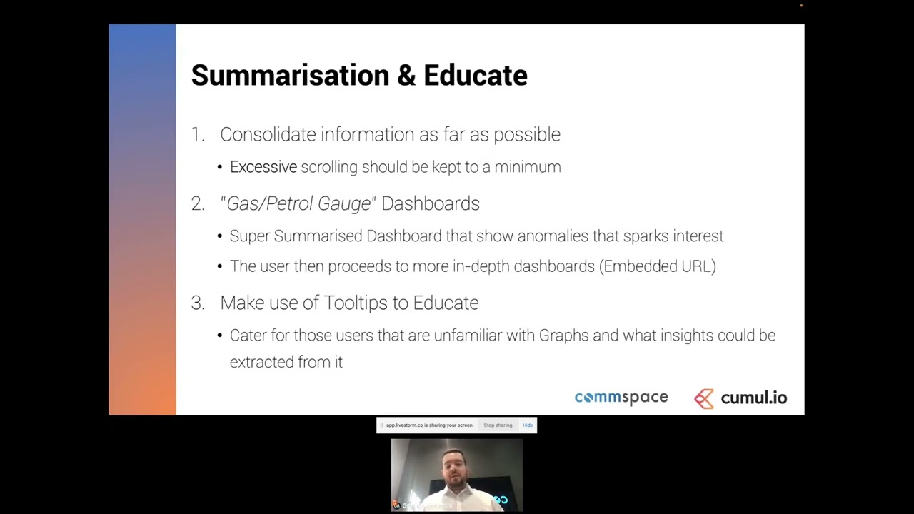
- Keep it simple - limited scrolling and essential information only
- Using smart visualization types and tooltips to help users make sense of data
Watch the full webinar recording below, or use the quick links to navigate to your section of choice.
[1.09] The state of analytics in SaaS today
[2.36] What is a premium analytics UX?
[5.12] 5 elements to help improve your dashboard UX
[9.38] Live demo of dashboard UX best practices
[17.50] How good dashboard UX lowers support load
[19.20] Q&A
Do you want to up your customer-facing analytics with an intuitive user experience? Get in touch with our embedded analytics experts for a free demo.
Good decisions start with actionable insights.
Build your first embedded data product now. Talk to our product experts for a guided demo or get your hands dirty with a free 10-day trial.

Leave your e-mail and one of our analytics experts will reach out to you