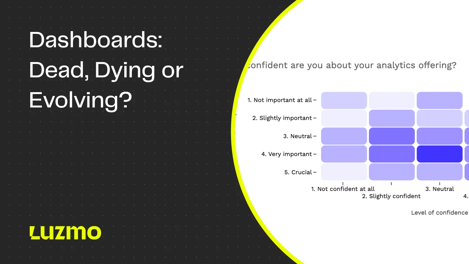
Dashboards: Dead, Dying, or Evolving? What 200+ SaaS Leaders Told Us
Dashboards aren’t delivering the value they promise.
In April 2025, we surveyed 200+ product leaders, data teams, and C-level executives to understand how analytics are performing in today’s software products. And it uncovered some ugly truths about present-day dashboards in apps.
👉 Explore the interactive report: "Dashboards: Dead, Dying or Evolving?"
The feedback was consistent: dashboards are falling short of user expectations.
78% of companies offer dashboards within their products. Despite this:
- Users rate these experiences at just 3.6 out of 5.
- Half of those users interact with dashboards daily, but 40% say the data doesn’t support decision-making sufficiently.
- Nearly half of the companies we surveyed spend over four months building these dashboards—only to have them underperform.
The demand for better analytics is clear. 58% percent of users report they would pay more for insights that help them make informed decisions. 75% believe AI-powered analytics could help uncover value currently buried in their data.
In this blogpost, we're diving deep into the survey results. Get to the bottom of all the underlying issues with traditional dashboards, read opinions and insights from real users, and see for yourself what needs to change for analytics to become a true asset in 2025.
Use the quick links to jump between sections:
- Why dashboards are failing users
- Why building dashboards drains SaaS teams
- What users really want from dashboards
- What the future holds for in-app dashboards
- Action plan for building better analytics
The decision-making gap
Dashboards are a core part of many products, expected to provide users with timely insights that support decision-making. But across industries, they often fail to fulfill that role.
- 37% of users report that the data presented isn’t clear or actionable.
- 34% spend too much time navigating dashboards, searching for insights that should be easy to find.
- 40% doesn't believe their dashboards consistently help them make better decisions (and rates them 3 out of 5 or lower).
Such disconnect between availability and usability has real consequences. Decision-making slows down when users hesitate or second-guess the data in front of them. Instead of finding answers, they’re left piecing together fragments, relying on experience or gut feeling to fill the gaps.
Dashboards aren’t meant to be passive displays, they should frame the data in ways that allow users to act quickly and confidently. When this doesn’t happen, even teams with strong data cultures risk losing momentum at critical moments.
"If I could create my ideal dashboard, I would make a dashboard of actions the customer needs to put in place. If needed, they should be able to understand why a certain action is recommended."
The Excel workaround
When dashboards fall short, users find workarounds. For many, that means returning to spreadsheets: manual, familiar, and flexible enough to compensate for missing functionality.
- 29% of users export data to spreadsheets daily.
- 43% regularly bypass dashboards to conduct deeper analysis elsewhere.
- “Easier data export” ranks among the top 3 most requested features (32%).
These numbers tell a larger story about trust and control. Users default to spreadsheets when dashboards don’t allow them to manipulate or explore data on their own terms. Exports become a necessary step, not because spreadsheets are ideal, but because they offer flexibility the dashboard lacks.
This workaround carries hidden costs. Fragmented data copies, version mismatches, and inconsistent interpretations become more likely as teams rely on manual exports. Over time, these gaps erode confidence in the data itself, making alignment across teams harder to maintain.
Rather than seeing exports as a feature request, they should be treated as a symptom. When users frequently leave dashboards to analyze data elsewhere, the system is signaling that it isn’t meeting expectations.
"Are dashboards outdated? That's like asking if spreadsheets are outdated :-) ! Some love them, some endure them, but either way they are here to stay. They just need a little facelift. Users want more than just graphics and boring metrics. Power users are craving context, storytelling, predictive intelligence and suggested next actions which can be plugged into Saas automations if needed - not just a screenshot of your data for the week!"
The limits of static dashboards
Data exploration is rarely a linear process. Users often start with one question and uncover new ones as they dig deeper. Dashboards that don’t support this flexibility leave users constrained, unable to follow emerging patterns or shifts in focus.
- 51% of users say they can’t meaningfully interact with the data provided.
- 34% find dashboards hard to navigate, with no options to customize or adjust when new questions arise.
- 34% express frustration over dashboards that feel too cluttered.
Static dashboards may provide a surface-level view, but they fail to keep pace with how users actually engage with data. Without features like filtering, drill-down capabilities, or real-time adjustments, dashboards limit opportunities for discovery. The result is missed insights – and that happens not because the data isn’t there, but because the tools aren’t flexible enough to surface it when needed.
As user expectations evolve, especially with growing exposure to interactive and AI-powered tools, static dashboards feel increasingly outdated. For analytics to remain valuable, they need to adapt as questions change, offering paths for exploration rather than predefined routes.
"No more fixed dashboard layouts. I want to move from one dashboard to another by clicking on elements, switching chart types on the fly, and keep consistent behaviors like tooltips across charts."
The time-to-value challenge
Analytics tools should deliver value quickly. Yet, for many companies, building and deploying dashboards remains a drawn-out process.
- 41% of companies spend more than four months implementing dashboards.
- 19% describe their dashboard projects as “never-ending stories.”
- Only 49% are satisfied with their implementation timeline.
Extended development cycles have a tangible impact. Business questions evolve, data priorities shift, and by the time a dashboard is ready, the original needs it was meant to address may no longer be relevant. This delay doesn’t just waste time, but it disconnects analytics from the fast pace of decision-making.
Lengthy implementations also risk losing stakeholder engagement. When analytics projects drag on, enthusiasm fades, and the final product often struggles to meet expectations.
"We aren't offering analytics in our product because (1) no time, (2) too many external systems are required, and (3) the customer does not allow us to access company data."
The customer demand treadmill
Even after dashboards launch, the work doesn’t stop. User needs continue to grow and shift, and many teams struggle to keep up.
- 36% of teams say meeting evolving user demands is their top analytics challenge.
- 41% get more than ten requests for analytics updates every month.
- 13% receive over thirty requests monthly, putting constant strain on resources.
Each request reflects a gap between what the dashboard offers and what users need to get from their data. These aren’t optional enhancements but signs that the system isn’t keeping pace with users’ workflows.
For teams managing these dashboards, the result is a cycle of constant updates and adjustments. Falling behind risks frustrating users. Keeping up means diverting resources from other priorities. This treadmill creates friction that slows product teams and prevents them from focusing on larger improvements.
"What makes good analytics "great" is again very specific from one client to another. Building analytics is an ongoing, always-on project."
Technical and resource constraints
Behind the scenes, technical limitations make delivering effective dashboards even more challenging.
- 31% of teams struggle with data accuracy and performance.
- 31% have trouble balancing functionality with visual design.
- 28% cite a lack of technical expertise or resources as a significant barrier.
- 25% face difficulties integrating analytics into their existing platforms.
These issues go beyond technical troubleshooting. When dashboards load slowly, contain questionable data, or feel clunky to use, trust in the system erodes. Users become less likely to rely on the dashboards provided, and the return on analytics investments diminishes.
"Most dashboards were designed to look impressive, not to drive real decisions. They dump data without helping you understand or act.”
The combination of technical constraints and rising user demands places teams in a difficult position. They’re expected to deliver flexible, high-quality insights without compromising performance but often lack the resources to meet these expectations consistently. As a result, software builders are left feeling insecure about their client-facing dashboards.
The basics done right
While advanced analytics features often get the spotlight, most users are still asking for the fundamentals to be delivered consistently.
- 42% want basic interactivity – simple tools to filter, sort, and explore their data.
- 38% need dashboards they can customize to fit their specific workflows.
- Real-time insights (32%) remain among the most requested features.
These aren’t optional enhancements. They represent core expectations for any analytics experience. Yet many dashboards continue to fall short, focusing on static displays or offering limited ways to engage with the data.
The absence of these essentials leads to frustration and workarounds. Users export data, abandon dashboards, or delay decisions because the tools don’t provide the functionality they need.
When dashboards handle these basics well, users engage more frequently, explore data more deeply, and rely on the system as part of their decision-making process.
“A lot of dashboard developers spend more time on how the dashboard look than how the users will interact with it. The dashboards that were built on top of simple requirements and do not have a lot displayed are the dashboards that bring the biggest joys and business value to users.”
The next generation of demands
Beyond the essentials, a growing segment of users is looking ahead. They expect analytics tools to not just present data but to assist in interpreting it – highlighting patterns, surfacing potential issues, and even suggesting actions.
- 32% of users want predictive analytics that can anticipate future trends.
- 28% request summaries that distill complex data into key takeaways.
- 26% look for automated alerts that notify them of significant changes without constant monitoring.
These demands reflect a shift in expectations. Users are no longer satisfied with dashboards that simply report what has happened. They want systems that help prioritize where to focus next.
For many teams, this shift feels like a significant leap. But these features align with the way people work: identifying trends early, focusing on what matters, and reducing the manual effort required to stay informed.
Delivering on these next-level demands requires a balance between advanced technology and thoughtful design. Predictive models and automation need to be integrated in ways that feel seamless – not overwhelming or intrusive.
“If I use dashboards inside software apps, it should show me: here's the outcome of our platform, this is impacting your business and this what you should do to fix it!"
AI as the competitive differentiator
AI has shifted from a potential add-on to a core expectation in analytics. Users increasingly view AI not as an enhancement but as a necessary tool for making sense of complex data.
- 76% of users believe AI can uncover insights they would otherwise miss.
- 70% say AI will be a key factor in distinguishing analytics products from their competitors.
This movement goes beyond augmenting human analysis – surfacing patterns too subtle for manual review, flagging anomalies before they escalate, and identifying trends across vast datasets. As data volumes continue to grow, users recognize that traditional methods can’t keep pace. AI’s role in analytics is becoming essential.
Companies that integrate AI into their analytics position themselves ahead of this curve. Those that delay risk falling behind as user expectations shift toward tools that offer more proactive, intelligent insights.
“Traditional dashboards are like relics from a bygone era. Static, boring, and utterly unresponsive. We're moving towards dynamic, AI-driven insights that tell you what you need to know, often before you even ask. Interactivity isn't a luxury anymore but the baseline expectation for any serious data work.”
Moving from description to prescription
Analytics has evolved along a clear path: from reporting on what happened to guiding what should happen next.
- Descriptive analytics shows past performance.
- Diagnostic analytics explains why it happened.
- Predictive analytics forecasts what’s likely to occur.
- Prescriptive analytics suggests actions to take.
More users are looking for systems that move beyond reporting and help shape decisions. They don’t just want to see data trends. They want to know what those trends mean for their next move.
This shift aligns with the broader role analytics plays in organizations. Tools must connect data to decisions, helping users navigate uncertainty and act with confidence.
For teams building analytics products, this means rethinking how insights are delivered. Instead of static reports, users expect real-time guidance – contextualized, actionable, and tailored to the specific decisions they face.
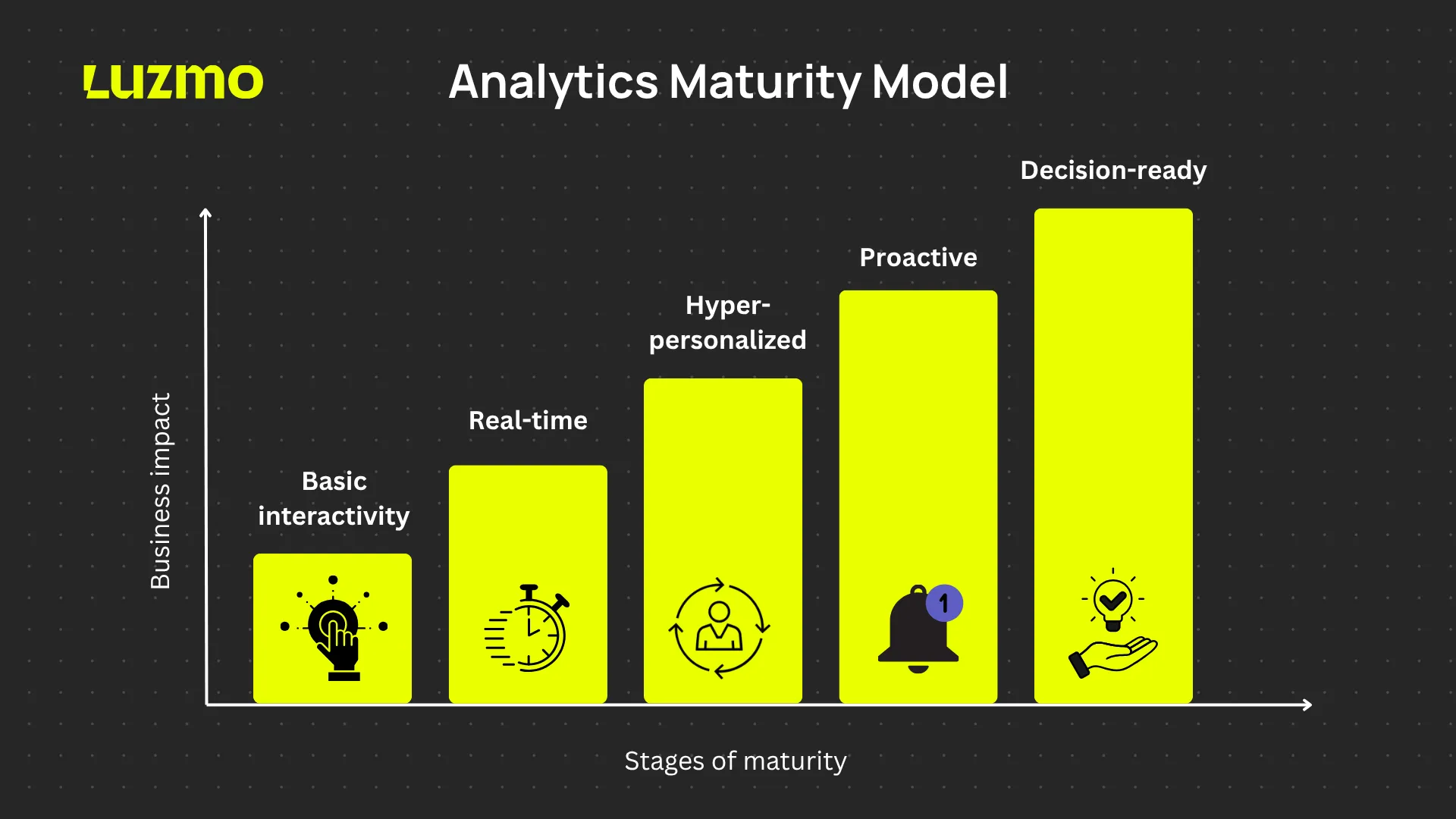
What a modern analytics experience looks like
The future of analytics is far away from adding more features – it should concentrate on creating experiences that fit naturally into how people work.
- Natural language interfaces: Users ask questions in plain language, without needing technical skills.
Proactive insights: Key findings and anomalies are surfaced automatically, without users having to search for them. - Transparent reasoning: Systems explain how conclusions were reached, building trust in the recommendations.
- Continuous learning: Analytics adapts over time, refining its outputs based on user interactions and feedback.
These capabilities reflect a shift from tools that present data to systems that help users focus on what matters. They reduce the time and effort needed to move from information to insight, creating space for more strategic thinking.
As AI continues to mature, the most successful analytics experiences will balance power with simplicity—offering sophisticated analysis through interfaces that feel approachable and intuitive.
“I’d build an experience, not a dashboard. It would:
- Speak your language (literally): you ask questions in plain language, and it answers clearly.
- Highlight what matters now, not just what changed.
- Simulate the impact of your decisions before you make them, like seeing the future of your KPIs.
- Work on your phone, on the go, because life isn’t lived behind a desk.
- Learn from you over time.
And most importantly: feel empowering, not overwhelming.”
The findings in this report highlight clear gaps between what dashboards deliver and what users need. With users rating dashboards just 3.6 out of 5 and 72% turning to spreadsheets for deeper analysis, it’s evident that analytics requires a new approach.
Here’s how product teams and users can respond directly to these challenges.
5 actions for product teams
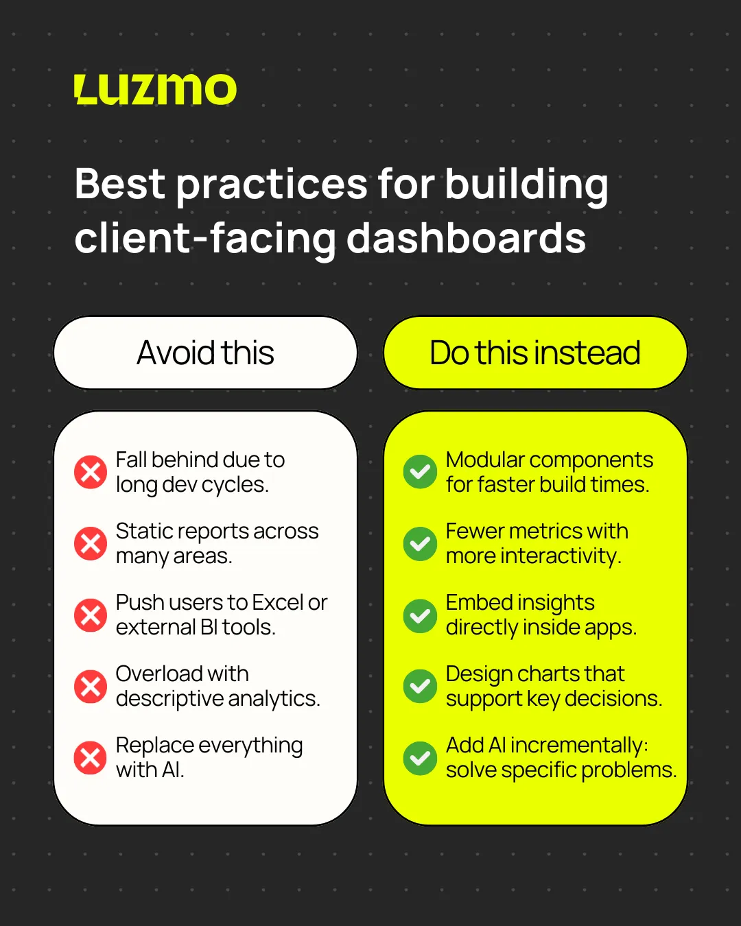
1. Accelerate time-to-value
With 41% of companies spending more than four months building dashboards—and 19% stuck in ongoing projects—speed matters. Long development cycles risk producing outdated or irrelevant tools. Adopt modular, configurable components to reduce build time and align faster with shifting business needs.
2. Prioritize interactivity over comprehensiveness
The survey revealed that 51% of users can’t interact meaningfully with their data. Focus on building fewer, more interactive metrics rather than offering static reports across too many areas. Flexibility to explore drives engagement more than volume.
3. Embed analytics within workflows
Given that 72% of users regularly abandon dashboards for spreadsheets, analytics should meet them where decisions happen. Embedding insights directly into operational systems reduces the need for manual workarounds and keeps data connected to actions.
4. Design around decision-making moments
Since a whopping 40% of users feel dashboards don’t help them make better decisions, start with the questions users need to answer, not just the data you have available. Align your analytics with key decision points to ensure relevance.
5. Implement AI incrementally
With 76% of users believing AI can uncover missed insights, start with practical AI features like anomaly detection or automated summaries. Avoid large-scale implementations upfront; instead, grow AI capabilities based on proven user value.
5 actions for analytics users
If you're buying new software and you want it to drive real decisions, here's what to look out for when assessing their analytics capabilities.
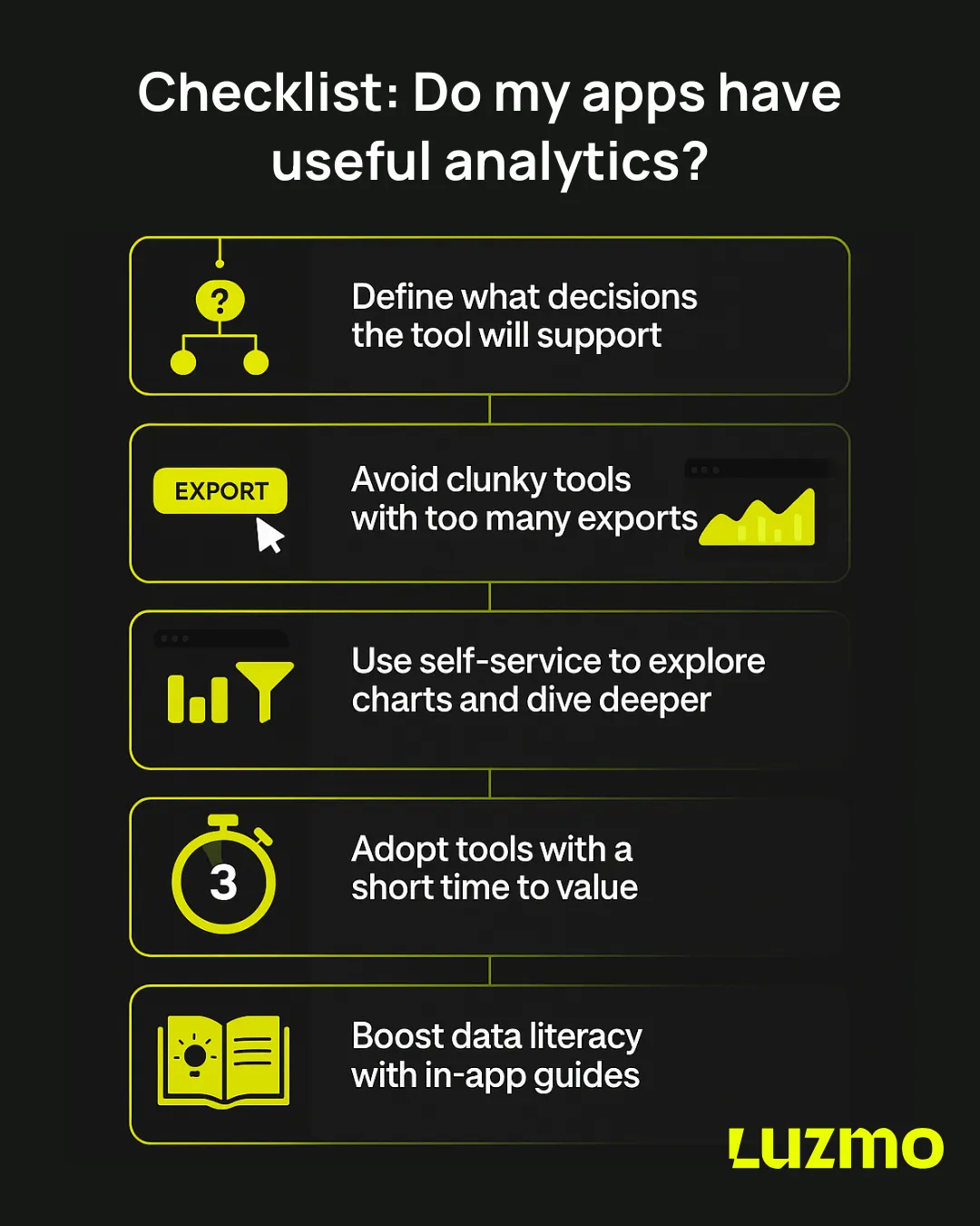
1. Start from real decision-making needs
With 40% of users reporting data isn’t actionable, outline the exact decisions your team makes regularly and map out the information needed to support them. This ensures any software you choose will offer insights that align with real workflows.
2. Watch out with forming bad exporting habits
Frequent exports are a red flag. Given 29% of users export data daily and 43% leave dashboards regularly for deeper analysis, it signals that dashboards aren’t flexible or useful enough. Prioritize tools that reduce the need for workarounds by letting you explore data in place.
3. Prioritize tools with flexibility
Since 38% of users are frustrated by dashboards they can’t adjust, choose solutions that allow for filtering, customization, and exploration—without technical barriers. If you can't tailor your dashboards to your needs, you'll stop using them.
4. Choose vendors that build solutions, not features
If you're not getting the valuable insights you need, and it takes ages to push improvements, adoption will tank. With only 49% of software builders being satisfied with their dashboard timelines, work with the ones who can show fast results, even in early rollouts. A quick win builds momentum and internal buy-in.
5. Invest in analytical literacy
The survey highlights that complex dashboards don’t automatically lead to better decisions. No matter how powerful the dashboard, your team needs the skills to use it. Choose vendors who offer training, contextual help or simple interfaces that make insigths accessible to everyone.
Conclusion: dashboards aren’t dead—but expectations have evolved
The data in this report speaks clearly: users aren’t abandoning dashboards. They’re abandoning dashboards that don’t deliver. The issue isn’t with the concept of dashboards. It’s with how they’re executed.
- Users crave interactivity and customization. → They want tools that let them explore data freely, adjust views on the fly, and answer the questions that matter most to their role.
- They need guidance, not just raw data. → Static charts and tables aren’t enough. Users want insights, context, and next steps without having to hunt for them.
- They expect analytics to move faster. → Long build times, rigid structures, and disconnected workflows drive users back to spreadsheets or out of the tool altogether.
In short: dashboards aren’t dead. They’re just falling short. And users are ready to pay for solutions that work better.
How Luzmo helps teams deliver analytics that users love
The findings from this research highlight a simple truth:
The features we often consider basic—like flexibility, customization, and interactivity—are exactly what users miss most in today’s dashboards.
At Luzmo, these aren’t extras. They’re the foundation.
Here’s how Luzmo helps you build analytics experiences that live up to modern expectations:
- Flexibility and interactivity out of the box → Customize dashboards, drill down, pivot, and filter without code, without barriers. Users stay in control of their data exploration.
- Seamless embedding into products and workflows → Analytics shouldn’t sit on the sidelines. Luzmo integrates directly into your product, so insights meet users where they work.
- Fast time-to-value → Skip the long development cycles. With low-code charts, prebuilt components and powerful APIs, teams can build and iterate quickly.
- AI-enhanced insights that guide, not overwhelm → From conversational analytics to automated insights, Luzmo helps surface the right information at the right time—so users can focus on decisions, not data gathering.
Dashboards don’t need to be replaced—they need to be done right.
Luzmo provides the toolkit to build analytics that feel like a natural extension of your product: flexible, intuitive, and built for today’s users.
Stop making your users suffer in silence
Let’s build dashboards they’ll actually thank you for.
💡 Talk to our experts today and see how Luzmo helps you turn data dread into data delight – because no one should be crying over a dashboard. Not your users, and definitely not your engineers.
Written by

Ship the future of your data
Let us show you what Luzmo can do for your product.

Leave your e-mail and one of our analytics experts will reach out to you