9 Stunning Embedded Analytics Examples You Can Learn From

Embedded analytics can be a game-changer for SaaS companies that want to provide more value to their users. It enables the end-user to understand how they are using the app and how it solves their pain points. And with modern BI solutions, using embedded analytics is neither complicated nor expensive.
But what if you have no idea where to get started? In this case, we’ve prepared a handful of amazing embedded analytics examples. Here are some great interactive dashboards that can inspire you to get started with embedded analytics.
Proptech embedded analytics dashboard by Zapfloor
Zapfloor is a proptech company that helps businesses manage shared office spaces. Their platform allows you to easily manage your shared office space. Simply set up a workspace and a digital lobby and you can see how much of your space is rented out, by whom, and when.
They wanted to create visualizations for their customers, but there were challenges. They did not have a development team and more and more customers asked for detailed dashboards. They checked out a variety of analytics tools and ended up choosing Luzmo to build this dashboard:
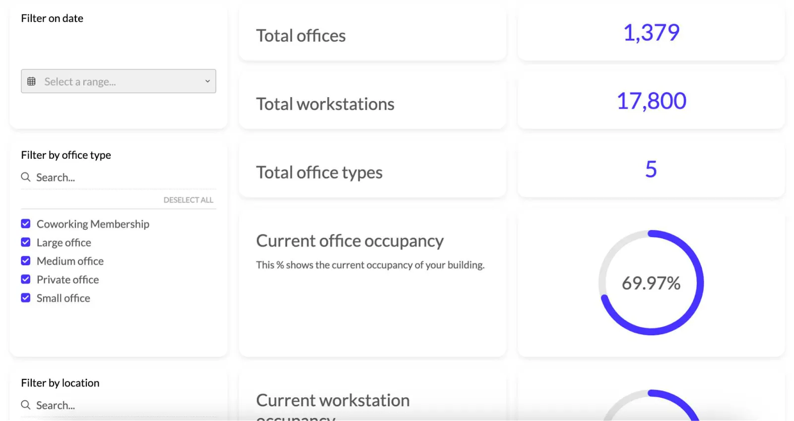
What sets it apart is that you have all the relevant information in one place, in real-time. Zapfloor customers can see which office spaces they have, how many are occupied and when, and what the trend is for the past several months.
Thanks to the drill-down functionality, users can filter which offices are free and what their size and capacity are. This resulted in higher customer satisfaction and ultimately, profitability.
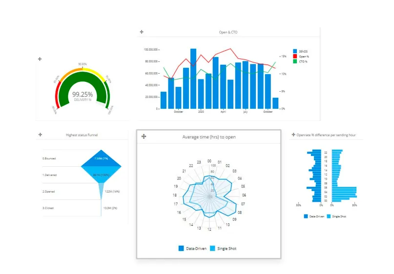
Marketing dashboard by Selligent
Selligent Marketing Cloud is a European marketing automation company that has over 750 customers around the world. The core part of their offering is tracking advertising and email metrics. And to provide more value to their users, they created an embedded analytics dashboard.
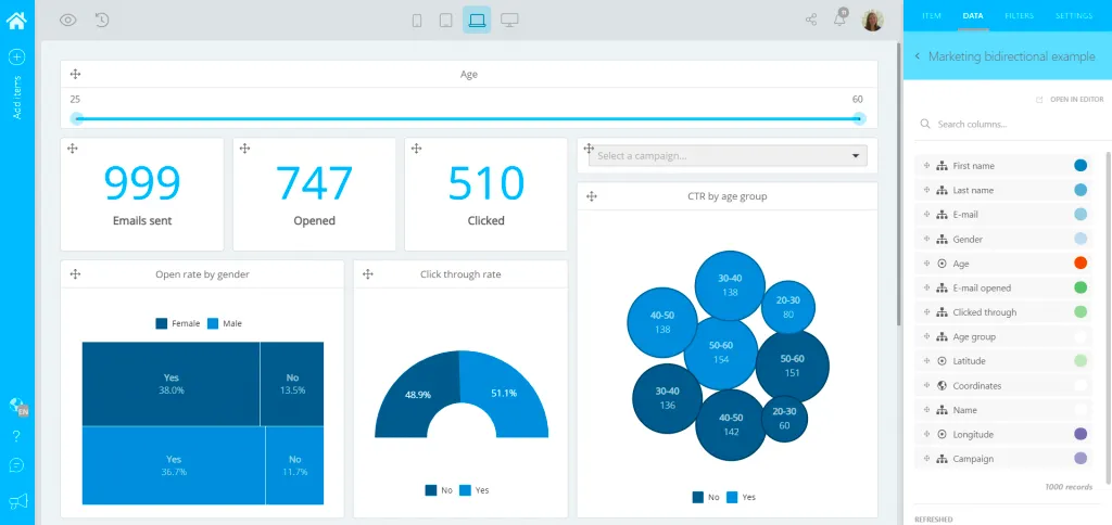
This shows customers key metrics within the product, such as open rate, click-through rate, email deliverability, overall ROI and many others. For their top-tier customers, Selligent also enabled a white-label dashboard builder. This way, they provide true end-user analytics for their customers.
Construction industry dashboard by Apogea
The construction industry is notorious for being very slow with digitalization. Apogea is a consulting company that wanted to stand out and be different. With the help of Luzmo, they built a 3D-enabled dashboard that allows businesses to make data-driven decisions around their construction projects.
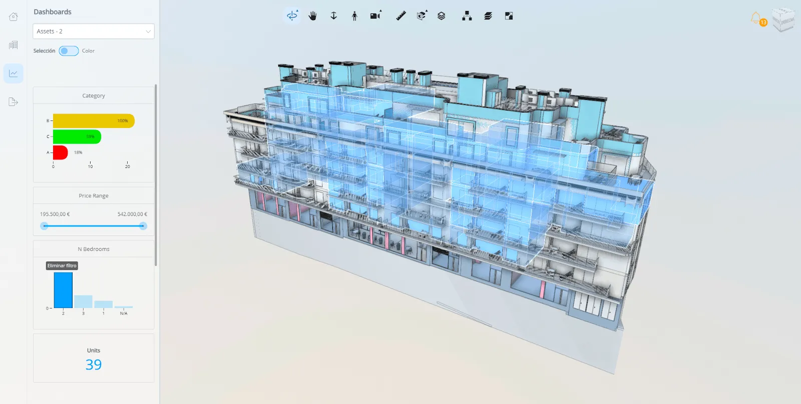
Within Luzmo, Apogea’s customers can build their own dashboards. Our embedded analytics solution allows them explore their data interactively in different charts and graphs, and highlight interesting insights on a 3D plan of their construction projects. They can then use data analytics to filter apartments according to size, materials, location, and many other criteria. And all of this in real-time.
Project management dashboard by Timewax
Timewax is a SaaS company in the project and resource management space. Their customers often have to wrangle many projects at once, all with their own intricacies and deadlines. Their clients are agencies, engineers and ICT teams and for all of them, dashboards were the number one feature request.
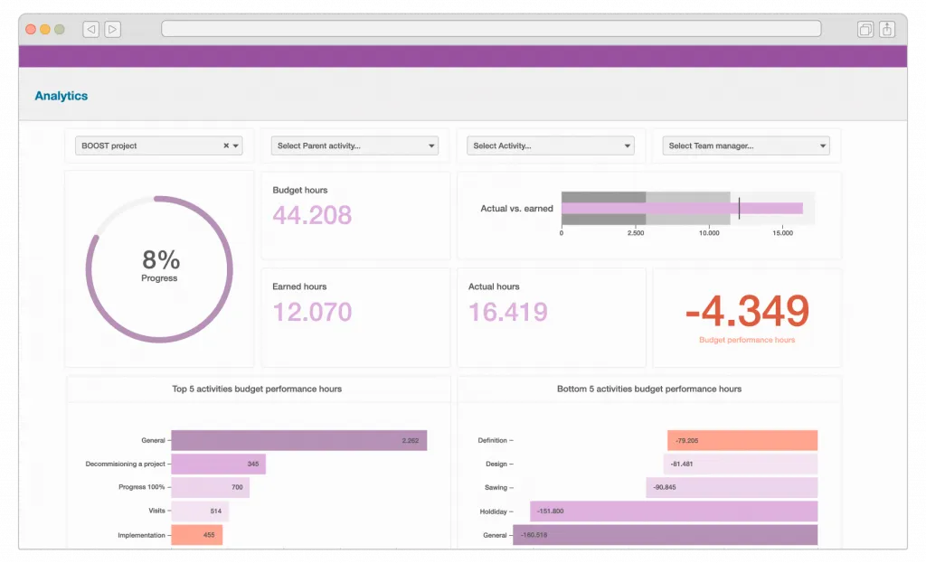
This dashboard allows Timewax’s customers to see which projects take the most time and resources, which projects were (not) profitable, how the budget is being used, and much more.
Fintech dashboard by Commspace
Commspace is a commission management platform for financial advisors. Within the platform, anyone can set up a way to split up revenue from financial advisor services.
Within their product, they have embedded dashboards that show a wide variety of KPIs. These include: commission allocation reports, revenue stream risks, client portfolio insights and more.
Meeting efficiency dashboard by 24Sessions
24Sessions (now acquired by Messagebird) is a video meeting platform. Large businesses often communicate through phone calls and in-person meetings and 24Sessions aims to save the time and effort wasted on those meeting types. The ultimate goal was to improve the customer experience and suggest their tool as a valid alternative to costly meetings.
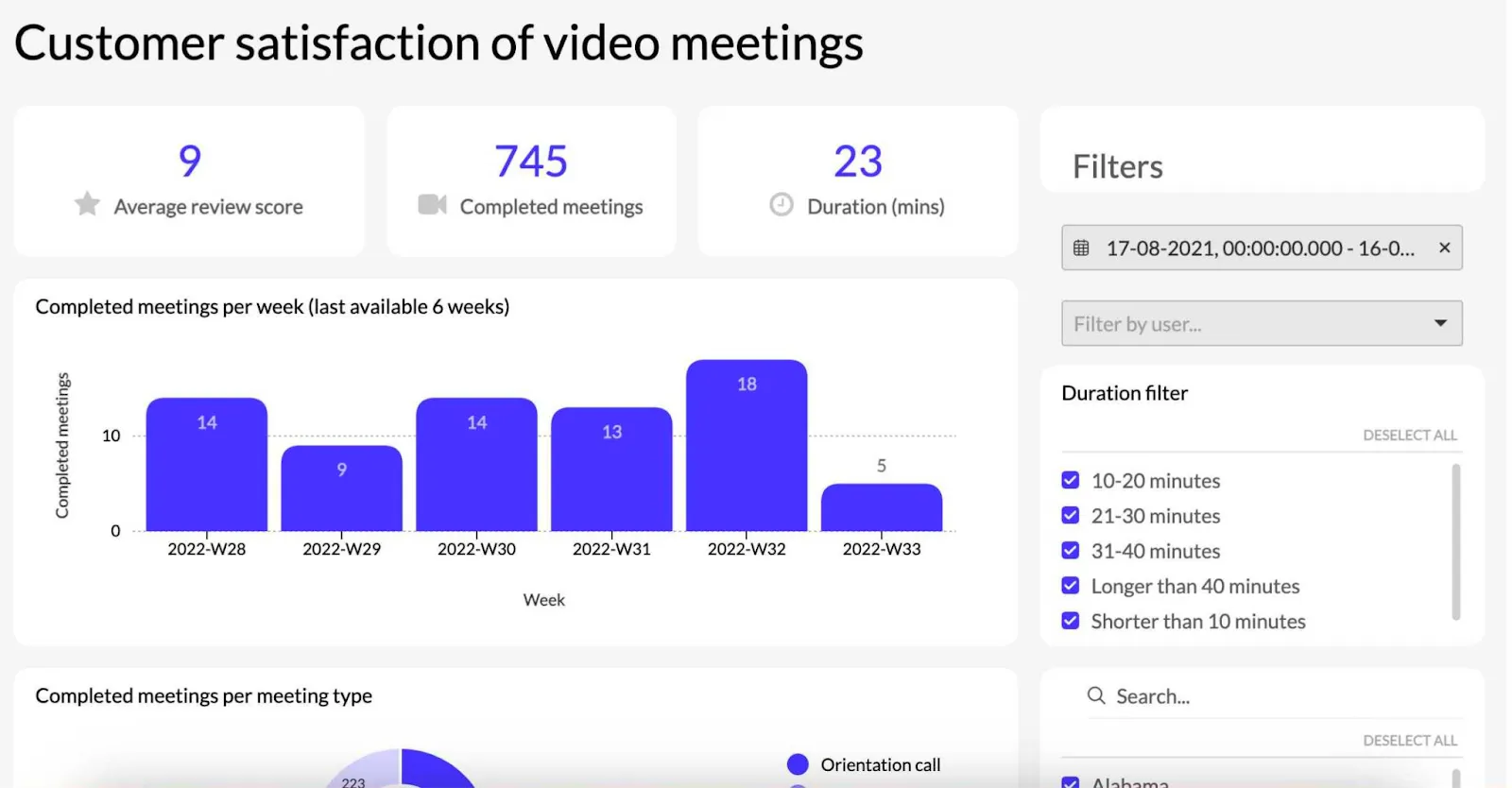
To help their customers realize the value that 24Sessions provides, they built data visualizations to help with business intelligence data. Their dashboards showed things like:
- How long video meetings are (on average, compared to in-person meetings or phone calls)
- How satisfied the participants are with those video calls (e.g., suitability of conference camera equipment)
- How many meetings are booked per day and week
- And many other data points
24Sessions used their own data sources to support their customers with better decision-making around meetings. And perhaps most importantly, they proved that their app is an intuitive, more functional alternative to traditional meetings. Their users could make better business decisions when equipped with the right data.
Municipality tool dashboard by Statbel
Government institutions are not famous for being on the brink of digitalization but one country decided to step up. The Belgian Bureau of Statistics, Statbel, decided to use all of the information they have and put it in an embedded analytics platform of their choice. And that choice was Luzmo.
They used the analytics capabilities of the dashboard software to provide self-service features to anyone who wants information from the public domain. More specifically, they allow literally anyone to see data from all the municipalities in Belgium. The number of inhabitants and buildings, the breakdown of age, gender, income, and much more.
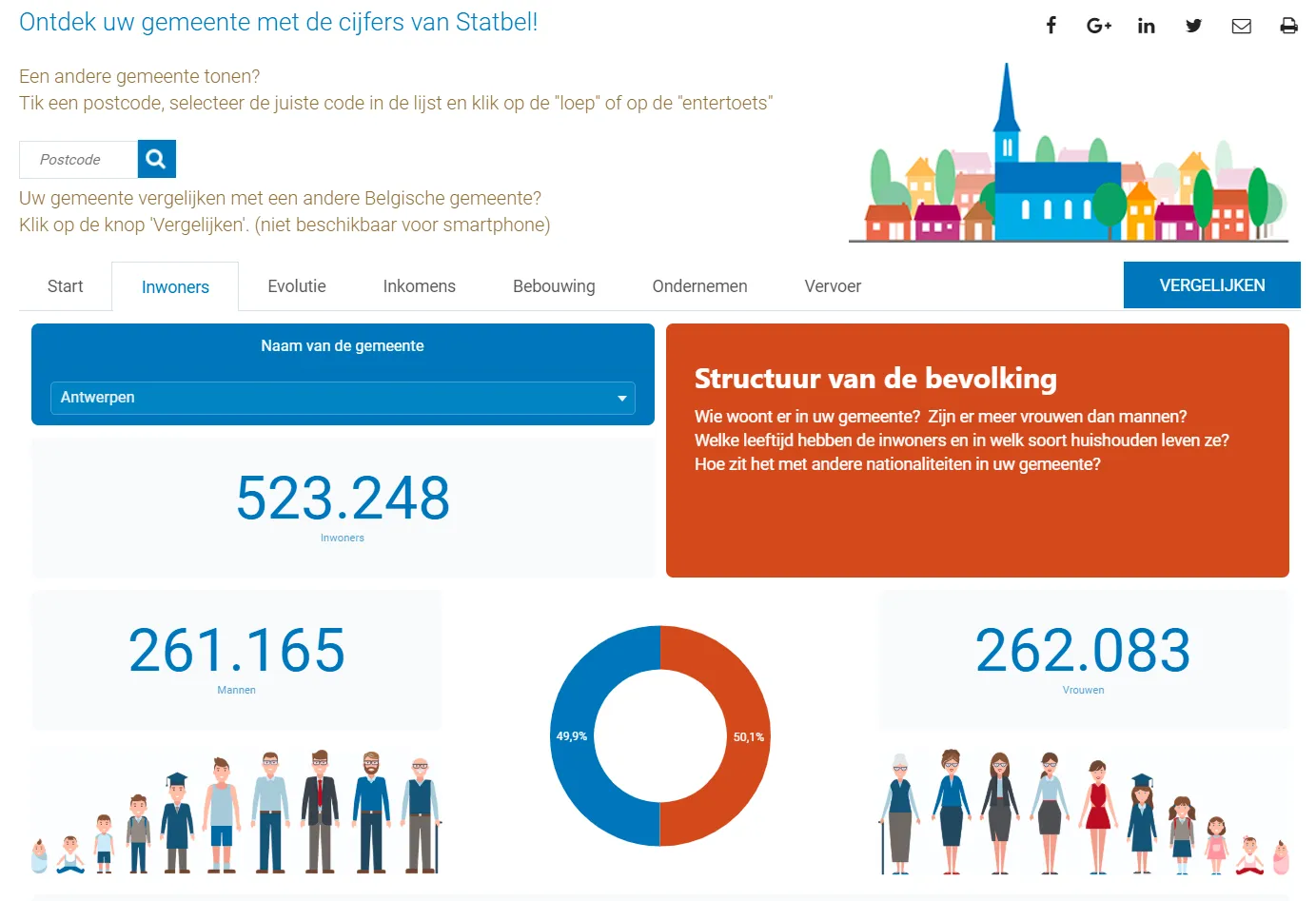
This allows any journalist, researcher, or just curious person to explore the cities in Belgium through self-service analytics - there are many use cases for this data. No more complicated spreadsheets or data sets to dig through. Just one click and you can explore all the data about Belgian people.
To this day, this data is publicly available on the Statbel website, thanks to our embedded solution.
A gardening dashboard by CurieuzeNeuzen
Advanced analytics don’t have to be used for business applications only. CurieuzeNeuzen is a Belgian company that wanted to create unique research amongst the citizens of Flanders. They gave more than 5,000 households in this area soil sensors to place in their gardens.
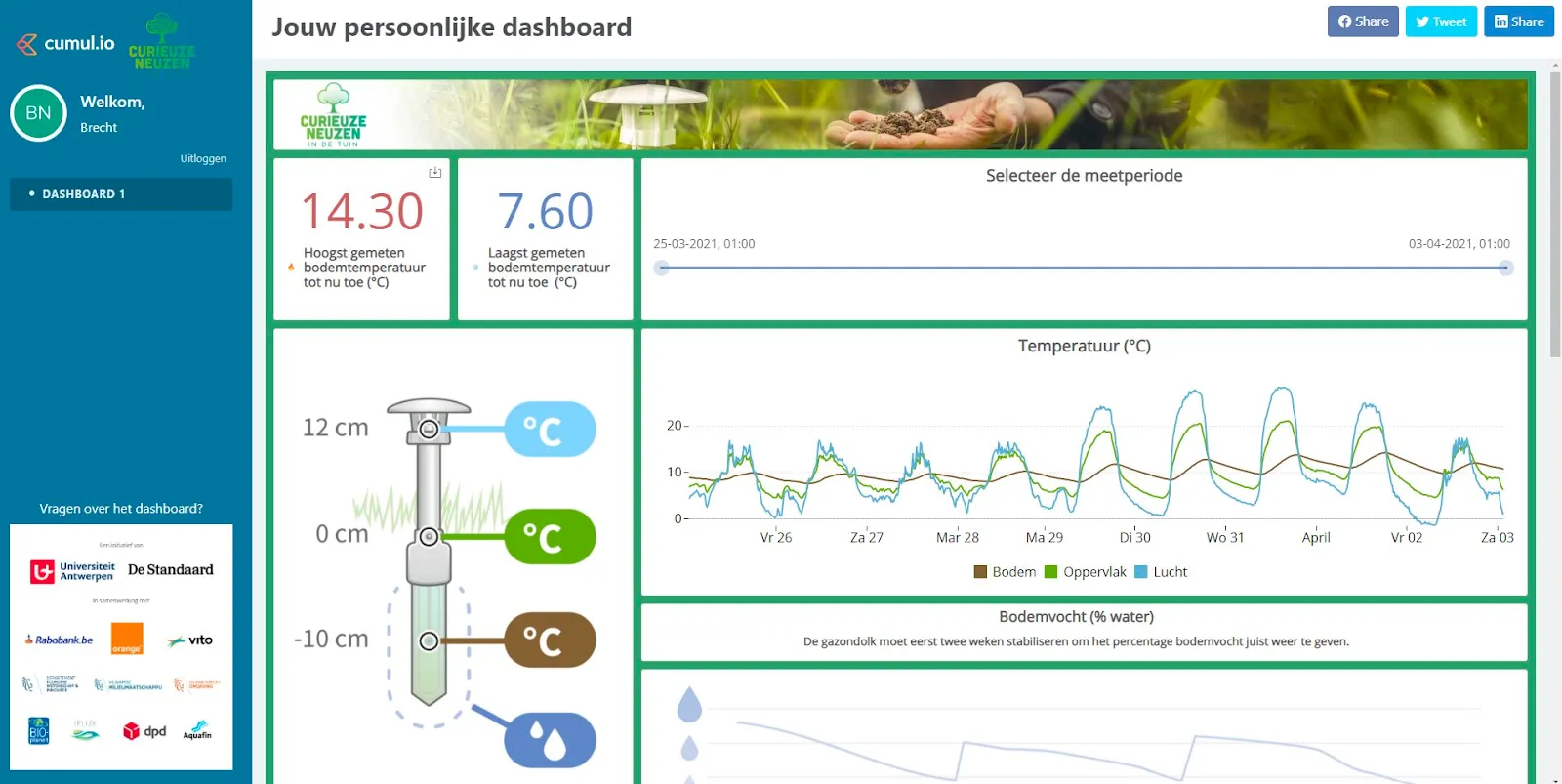
The end goal was to study the effects of heat waves and climate changes on gardens and households in Belgium. And they did not just collect the information for themselves. They also allowed individuals who had these soil sensors to track metrics such as temperature using their own phones and apps.
The challenge here was to make the user interface easy to understand for the regular user. And thanks to clever use of visulizations such as graphs, anyone could dig into the data about their garden.
Office bookings dashboard by Workero
Workero is a SaaS platform that brings two groups of people together. Those who want to rent a shared office space or a desk and those who have extra, unused office space. Both audiences can start using the app and either find a new tenant or an office/desk to rent. This saves both parties from buying expensive office equipment, especially when considering hidden costs like couch warranties, TV/computer warranties and more.
Through data analysis, Workero shows both groups the information they need. For example:
- How many offices are nearby
- What kind of space is free to sublease
- How much these spaces cost
- How much companies are earning from the spaces they are subleasing on average, i.e. showing their revenue streams
- How many bookings come from each source
All of the data was in the app dashboard, allowing for a superb user experience. And thanks to the API connection directly to Workero, the data was always up to date and shown in real time. At Luzmo, we just took care that the dashboards fit into the product in terms of design and user experience.
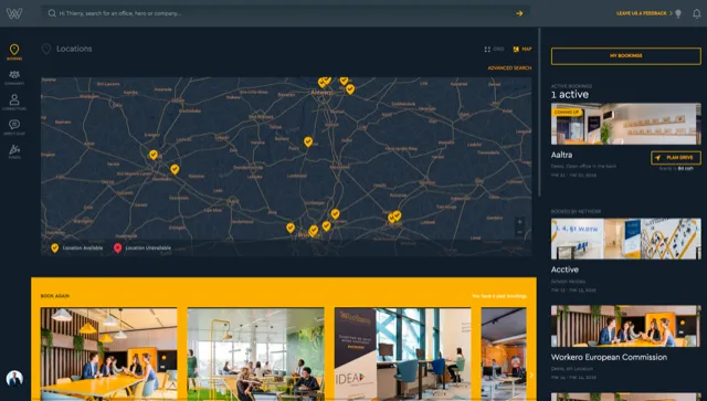
The reason why they chose Luzmo over traditional BI tools such as Tableau or PowerBI? The ability to connect their data to the dashboard by using API as a source.
Create your own embedded analytics dashboard
As you can see from these examples, embedded analytics can do many things for business users. It empowers your users to make more informed decisions and gives them data insights about your product. And for you as the business owner, it provides a competitive advantage and a superb user experience in your app.
The great news is - you can create dashboards just like the ones you’ve seen above, completely free. Sign up for Luzmo today and you can create your first embedded analytics dashboard in hours - no developer team required!
Written by

Ship the future of your data
Let us show you what Luzmo can do for your product.

Leave your e-mail and one of our analytics experts will reach out to you