4 Examples Of Using Open Data In Government

Today, governments stand before a challenge. They stand before a wave of open data, but how can they bring the right information to their citizens? Just like the modern consumer expects an open dialogue with businesses, today’s citizens want transparent & personal communication with their government.
Government institutions are leveraging business intelligence to better inform their citizens, and make their open data insightful. But how can they transform that raw data into useful information that citizens can easily access & understand?
In that process, 2 questions are truly important.
- Which data is useful for our citizens?
- How to present that data in an easy & interactive way to citizens?
Governments have proven that visual dashboards are a great way to bring their message across. Dashboards engage citizens & raise awareness about important topics in society.
In this article, we’ll highlight 4 examples of how governments can use their open data to bring information to their citizens.
1. Making cities safer with open data
Police departments keep records of each crime incident that has happened over time. When citizens get more insights into this, it helps them to make safer choices. Governments can really make a difference here by mapping those crimes & sharing that information with their citizens.
To show you an example, below we’ve used data from the FBI to map crime in the state of California.
This type of dashboard is a great tool for citizens. They will know which areas in the city or state are the most dangerous. In that way, they can easily pick the safest way home at night, or be warned to take extra safety precautions if they live in an area with increases burglary incidents.
2. Raising awareness about health & environment
Today, climate change & global warming are the topic of discussion across the globe. Not only environmental topics, but also health implications that come with it are widely researched.
When presented in the right way, these study results can have a great impact. A visual presentation of the effects of global warming are a real eye-opener for the public. In that way, data visualization helps to raise awareness for global issues like climate change at a large scale.
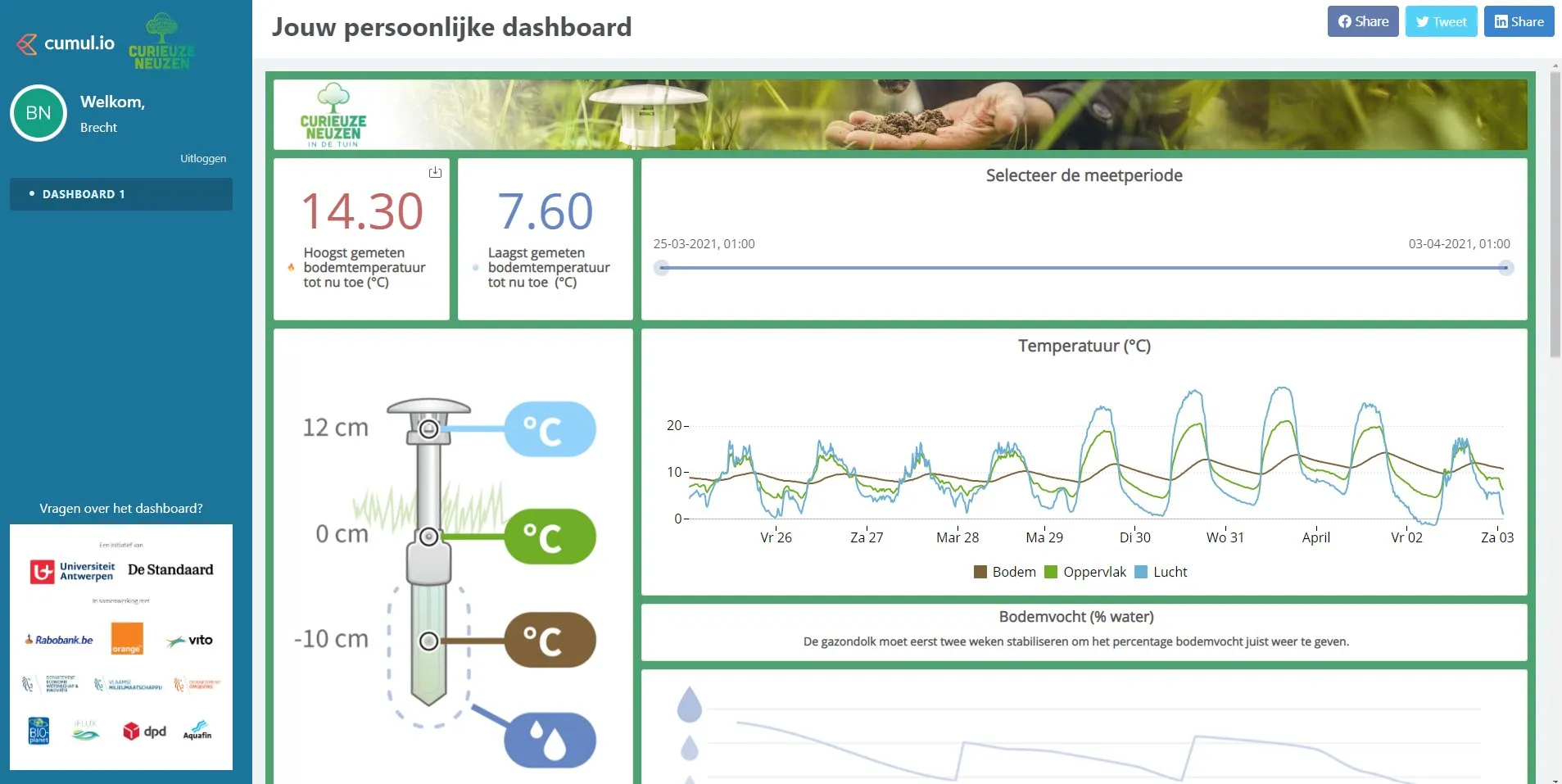
A nice example of this is CurieuzeNeuzen, a citizen participation project in Belgium. Citizens could apply to participate in a large-scale research of air quality in Flanders.
The result is an interactive map, showing the results of each individual air quality meter. It maps the amount of NO2 on a color scale from blue-green (least polluted) to red-black (most polluted).
Citizens felt really involved with this project because of 2 reasons.
- They could contribute to the research themselves
- It shows them almost at street level how good or bad the air quality is in their surroundings
As a result, the personal impact so much bigger than for example just reading an article or a press release about an air pollution study. Another nice example is CurieuzeNeuzen's research project that measures climate change in people's backyards.
3. Using open data to foster economic growth
Government institutions can make use of their open data to identify economical trends.
As an example, lets look into some statistics on employment in Belgium below. It shows how wages have evolved over time & how they differ between age groups, gender, regions and professions.
By sharing this information with the public, employers understand better how their business compares to industry averages. It will incentivize them to meet the industry standards. And what’s more, by pointing out employment issues such as wage gaps, companies are stimulated to make their contribution to equal pay.
Also employees will better understand how their situation compares to national averages. It creates transparency, and at the same time it’s a valuable instrument to have open discussions about salary at work.
Similar insights can be shared around unemployment or other economical topics. These dashboards are a great way to spot trending problems or issues. As a result, government, citizens & businesses can put that data to action & work together towards a solution, ultimately stimulating the economy.
4. Creating ‘smart cities’ with open data
So far, we’ve mainly highlighted examples of countries or regions. To finish off, we wanted to zoom in on the use of data in smart cities. Because we shouldn’t underestimate the power that data can bring to local communities.
The term ‘smart city‘ is applied to cities using technology to improve the lives of citizens. They use IoT sensors & technology to ‘connect’ components across a city. In that way, they generate data about mobility, energy, and common services such as waste management.
All of this data is used to make life easier for citizens. Just to give a few examples of how smart cities are using data:
- Monitor most & least used trash cans to optimize waste collection
- Adjust streetlights based on weather data, e.g. turn on the lights in stormy weather to improve visibility & reduce accidents
- Visualize open parking spots throughout a city to optimize mobility
Now, all that raw data needs to be visualized in the right way. Only then, citizens can easily make sense of it. Let’s look at public transport for example.
Many of the larger cities have a bike-sharing system in place. Now what’s the use if you first have to walk 10 blocks before finding an available bike? You’ll want to know the closest place to pick it up or drop it off. This is where data visualization comes in.
Live interactive dashboards can help citizens check how many bikes or drop-off points are still available in their area on the map. Or they can filter on the nearest station to see its occupancy. This will save citizens a lot of time running from one pick-up point to another.
What lies beneath your public data?
It’s quite clear that there’s no lack of data in the government & public sector. Nor is there a lack of use cases to create value for citizens with this data.
The challenge that governments need to tackle is to bring that information to citizens in an easy, clear and interactive way. So that ultimately, citizens feel involved, stimulating engagement and participation.
Are you active in the public sector? How are you using open data for better public information? If you’re curious to learn more, reach out for a product demo. We’re happy to help you ahead with your specific project or use case.
Written by

Luzmo
Ship the future of your data
Let us show you what Luzmo can do for your product.

Leave your e-mail and one of our analytics experts will reach out to you