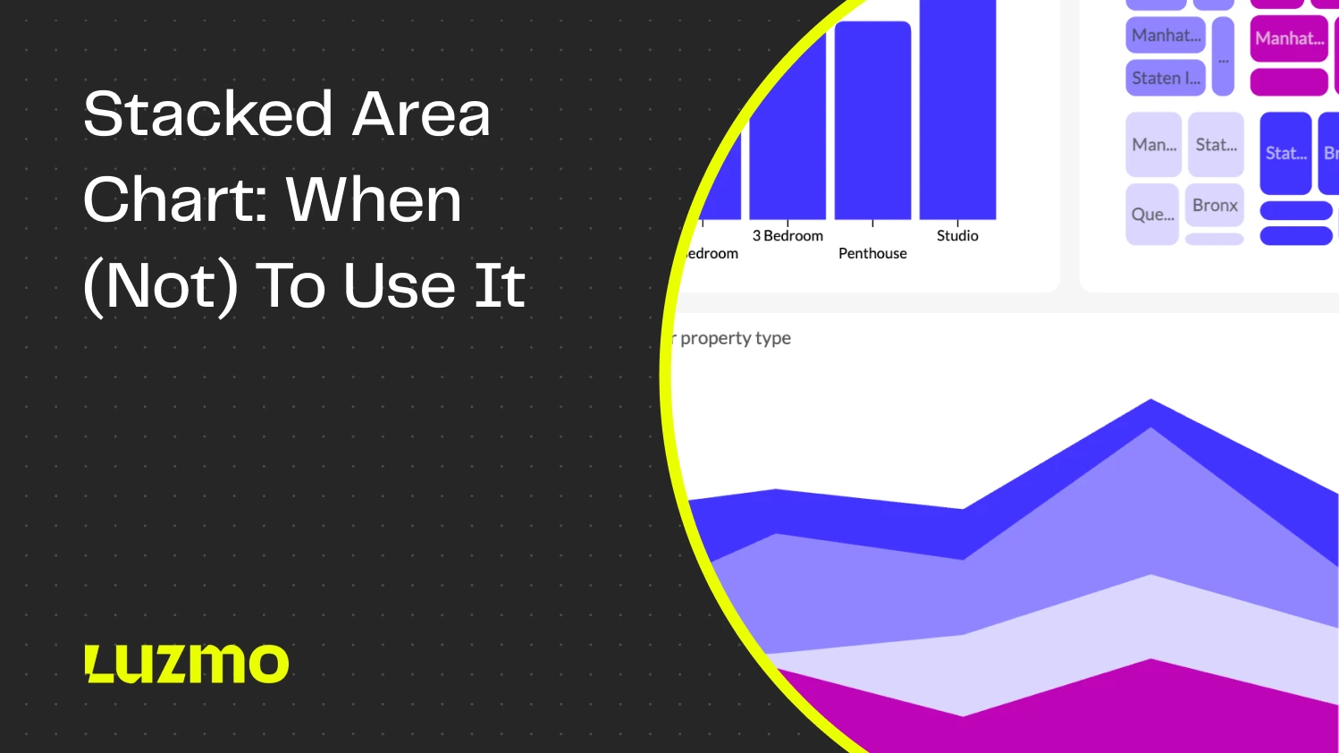
Stacked Area Chart: When (Not) to Use It
A stacked area chart is one of the most popular ways to show how a measure in multiple categories changes over time. You’ve probably seen them in dashboards and reports many times, everywhere from Excel to tools such as Power BI and Tableau.
Today, we’ll show you what a stacked area chart is and what its best use cases are, as well as some things you should avoid when using this chart type.
What is a stacked area chart/stacked bar chart?
A stacked area chart or stacked area graph is a data visualization type that shows the cumulative contribution of different categories or series to a total over time or another continuous variable.
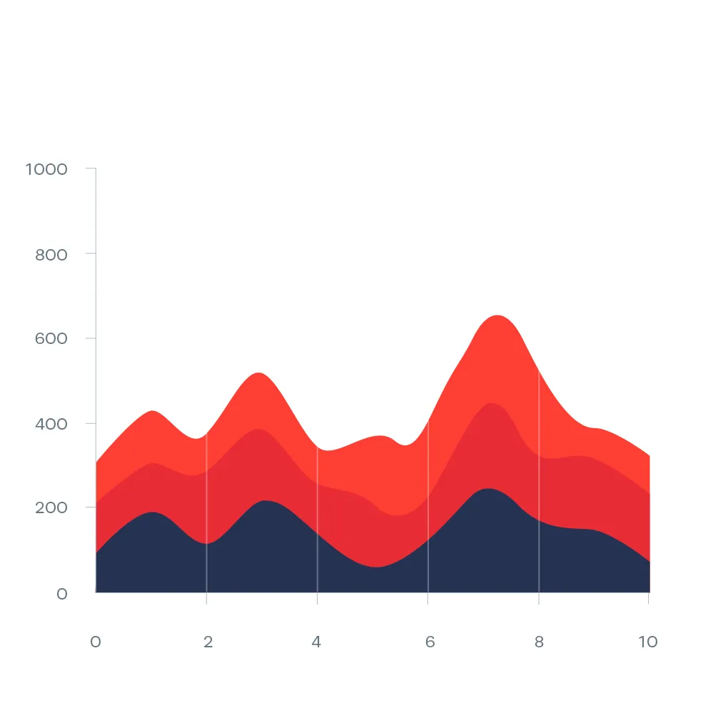
It’s a variant of the basic area chart, where the different values are “stacked” on top of each other to show how individual components contribute to the overall trend.
Stacked area chart: best use cases for data visualization
Here are some of the best use cases for stacked area charts in dashboards or reports.
Tracking changes in composition over time
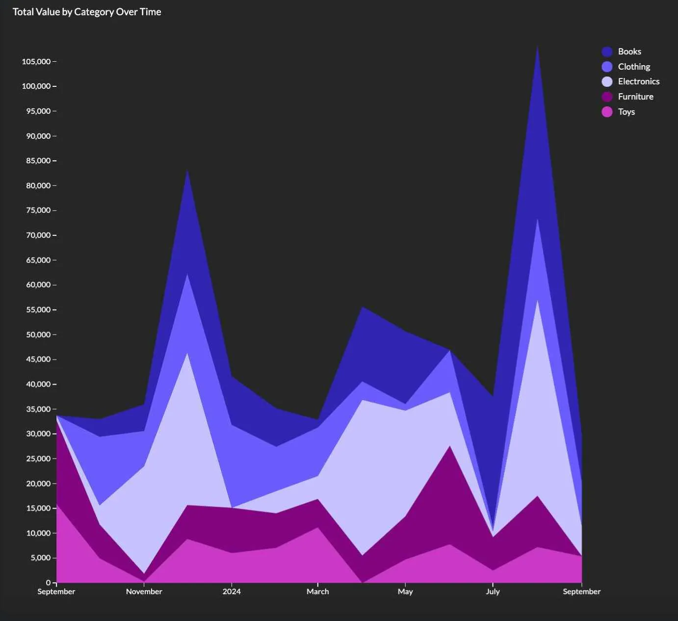
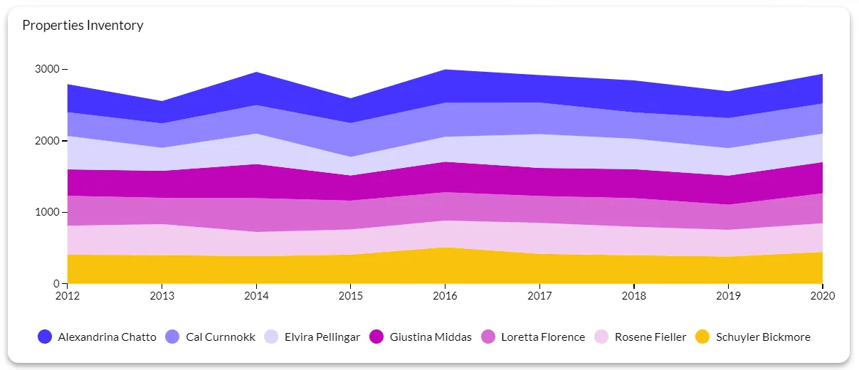
A stacked area chart is ideal for showing how different segments contribute to the total value over a certain period.
For example, stacked area charts can be used to break down revenue by product line throughout a couple of years, or to highlight market share by a competitor in the same period.
Platforms like Luzmo Studio make it easy to build dashboards with stacked area charts and embed them directly into software applications, while Luzmo IQ and Luzmo AI help users explore trends, analyze category performance, and generate insights automatically using AI-powered and natural language interactions.
Comparing proportions in a dataset
With a stacked area chart, you can compare the proportions of relative categories against the total value instead of focusing on the growth of an individual group.
In this chart example, these charts are useful when doing customer segmentation, to show the relative contribution of segments to the whole user base growth.
Showing the impact of categories on the total value
When you want to emphasize how individual categories add up to form a larger total value, a stacked area chart is one of the best choices.
For example, if you’re showing total sales numbers, you can break down the value into sales by region.
Visualizing the contribution of multiple variables
When you want to compare how several variables contribute to the total value while still showing the overall trend, a stacked area chart fits right in.
For instance, you’ve launched a new product, and a stacked area chart shows the cost breakdown of the launch, divided into each relevant numeric variable, such as research and development, marketing, operational expenses, etc.
Highlighting overall trends and individual components
Besides tracking the total trend, a stacked area chart allows you to track the individual evolution of different subcategories, independent of the main goal.
For example, it can show you different traffic sources that are contributing to the total value of website traffic.
Monitoring resource allocation
When you need to monitor how different resources are used up over time (such as budget or time) across different tasks or projects.
For example, how the budget is allocated over different departments in a fiscal year.
Stacked area chart examples: revenue, user growth, and traffic sources in software
Stacked area charts appear frequently in software product dashboards because the questions they answer — how is the total growing, and which segments are driving it — are exactly what product and revenue teams need to track.
Revenue by plan or segment
A software business with multiple pricing tiers can use a stacked area chart to show how total monthly recurring revenue is composed across Starter, Pro, and Enterprise plans over time. The total height shows ARR trajectory. The individual bands show which tier is growing, which is stable, and which is shrinking — useful context for pricing strategy decisions that a single revenue line chart would not provide.
User growth by cohort or acquisition channel
Tracking total active users as a stacked area chart segmented by acquisition channel — organic search, paid, referral, direct — shows which channels are responsible for growth at each point in time. If paid acquisition drops off and organic holds steady, the chart makes that visible immediately. A single active users line chart would show that growth continued, but not why, or at whose expense.
Traffic sources over time
For a content or marketing team, a stacked area chart showing sessions by source — organic, social, email, direct, paid — over a rolling twelve months reveals shifts in channel mix that individual line charts would make harder to see at a glance. If social traffic doubles but organic halves, the total might stay flat while the underlying composition has changed significantly.
In embedded analytics, stacked area charts work well for end users who own a portfolio of something — multiple products, multiple customer segments, multiple campaigns — and need to understand both total performance and composition at once. Luzmo AI can generate stacked area charts in response to natural language questions like "show me my revenue by plan over the last year," selecting the chart type automatically based on the data structure and question.
When not to use stacked area charts
This chart type is powerful, but it has certain limitations. Here is when you should avoid it.
When comparing individual category trends is important
It’s difficult to compare the performance and trends of individual categories in a stacked area chart because only the bottom category has a consistent baseline. In this use case, a line graph would be a better choice.
When you have too many categories
With a large number of categories, the stacked area chart becomes cluttered and tough to read. E.g., if you have more than 10 product categories in a stacked area chart, it would be hard to draw conclusions from it.
When your data is highly volatile
If there are large fluctuations in data over time, it’s challenging to extract meaningful insights. For example, comparing daily stock prices with a stacked area chart would be a challenge.
When proportional relationships are not important
If the proportion of individual categories is irrelevant to the main target, using a stacked area chart is often unnecessary. In this case, a line chart would be a better choice.
When you need to highlight exact values
Only the bottom layer (x-axis) has clear values, while the layers stacked on top of it are harder to interpret. Use bar charts or line charts if you want to highlight an exact value.
When data is negative or involves subtractions
Datasets that contain negative values or have substractions and complex additions will not display well in stacked area charts. Instead, use a waterfall chart or a bar chart.
For short time periods or small data sets
If the time frame is too small or the dataset is too small, the stacked area chart won’t show any meaningful values. Instead, use a pie chart or a bar chart.
Top tips for using this chart type
- Limit the number of categories: the number of stacked layers should ideally be between 3 and 5. Anything more than that will be cluttered and difficult to interpret.
- Order categories logically: the categories should be listed in order of importance or size. For example, the largest category would be placed at the bottom.
- Use consistent time intervals: the x-axis should have consistent intervals (e.g. months or years). Irregular intervals will distort the data.
- Use color wisely: choose distinct but complementary colors for different categories and avoid colors that are too similar to each other. Use a gradient for related categories and contrasting colors for unrelated ones.
- Provide context with clear labels: label the y-axis and x-axis clearly.
- Focus on proportions, not exact numbers: don’t try to show precise values. The proportions between values are more important for the reader.
- Highlight key trends: use annotations, tooltips, or callouts to label the most important trends in the data clearly.
- Use transparent or light shading: this ensures all the data remains distinguishable and does not overwhelm the reader.
- Ensure that data adds up to 100%: all the categories should add up to the total value on the x-axis.
- Use with time series data: this chart type works best with continuous time data series, so do not use them for categorical data.
Stacked area chart vs. line chart vs. area chart: when to use each
These three chart types are closely related, and the differences between them are easy to overlook — which leads to the wrong chart being used more often than it should be.
A line chart tracks one or more values over time without implying anything about the relationship between them. Each line is independent, and the space between lines carries no meaning. Use a line chart when you want to compare how separate metrics move over time — for example, revenue in three different regions displayed as three independent trend lines.
An area chart works like a line chart with the area beneath the line filled in. The fill adds emphasis to the volume below the trend, which makes it useful when the total magnitude of a metric matters as much as its direction. Where a line chart says "here is the trend," an area chart says "here is the trend and here is how much of it there is." Avoid stacking area charts on top of each other unless you switch to a stacked area chart specifically.
A stacked area chart adds a third element: the relationship between parts and a whole. Each category's area is stacked on top of the previous one, so the top edge of the chart represents the total across all categories. This is the right choice when you want to show both the overall trend and how different segments contribute to it simultaneously. The tradeoff is that only the bottom category has a stable baseline — all others are floating, which makes comparing their individual values harder than it looks.
If precise comparison of individual category values over time is the goal, a grouped line chart or small multiples will often serve the reader better than a stacked area chart.
Visualize your data with Luzmo
Did you know that you can use stacked area charts, as well as many other chart types, in your software? Simply embed a dashboard in your software or tool with Luzmo. Connect to your data sources with our API and visualize data for your end-users right in your app.
Grab a free demo with our team to learn more about data visualization in your software! Plans start at $495/month for Starter, $1,995/month for Premium, with custom Enterprise pricing available as your analytics needs scale.
FAQ
All your questions answered.
When should you use a stacked area chart instead of other chart types?
Stacked area charts are best used when you want to show how multiple categories contribute to a total over time. They are especially useful for tracking composition changes, such as revenue by product line or traffic sources over time. Tools like Luzmo Studio make it easy to include stacked area charts in dashboards, while Luzmo IQ and Luzmo AI help users explore trends and generate insights automatically.
Are stacked area charts suitable for dashboards and embedded analytics?
Yes, stacked area charts are commonly used in dashboards to help users understand how different variables contribute to overall trends. Embedded analytics platforms like Luzmo Studio allow developers to integrate these charts directly into their applications, while Luzmo IQ and Luzmo AI help users interact with their data and generate visualizations without requiring advanced technical skills.
What are the limitations of stacked area charts?
Stacked area charts can become difficult to read when there are too many categories or when precise values are important. They are better suited for showing proportions and trends rather than exact numbers. Using modern analytics tools like Luzmo Studio, along with AI-powered features from Luzmo IQ and Luzmo AI, can help users explore data more effectively and choose the right visualization for their needs.
Written by

Ship the future of your data
Let us show you what Luzmo can do for your product.

Leave your e-mail and one of our analytics experts will reach out to you