Why Embedded Analytics Fails (According to Product Leaders)

The embedded analytics market is projected to nearly triple by 2033, growing from around $70 billion to over $180 billion. And yet, Gartner has estimated that up to 85% of big data projects fail: not because the technology doesn't work, but because organizations misunderstand what users actually need from data.
That disconnect shows up clearly in embedded analytics. Teams invest months building dashboards and reporting features into their products, only to watch users ignore them. Luzmo's 2025 State of Dashboards research (survey of 200+ SaaS leaders) quantifies just how widespread the problem is: 40% of users don't believe their dashboards help them make better decisions. Only 3.6 out of 5 is the average satisfaction rating. And 43% of users regularly bypass dashboards entirely to do their own analysis in spreadsheets.
These aren't edge cases. They're the norm. So what's going wrong?
Too many charts, not enough clarity
The most common failure pattern is also the most intuitive one: giving users too much.
Product teams tend to treat the analytics layer like a feature buffet — more charts, more filters, more configuration options must mean more value, right? But for the non-technical end users who make up the vast majority of SaaS customers, a packed dashboard doesn't feel empowering. It feels paralyzing.
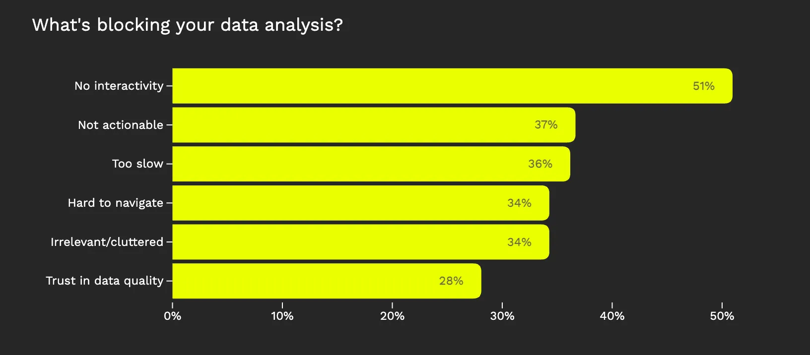
Luzmo's research confirms this at scale: 34% of users say dashboards are too cluttered with irrelevant information, and another 34% spend too much time navigating just to find basic insights. That's a third of your user base struggling with information overload before they ever get to a decision.
The instinct to build comprehensive dashboards usually comes from a good place; nobody wants to ship "not enough." But in embedded analytics, restraint is the harder and more valuable design skill. As analytics UX consultant Brian O'Neill has argued, if users are ignoring your analytics, you're effectively churning out outputs with no economic value. The question isn't "what can we show?". It's "what do users need to know right now?"
The best implementations don't try to anticipate every possible question. They answer the two or three that matter most, clearly and immediately.
Beautiful visualizations that don't drive action
Here's a trap that catches teams who've technically done everything right: the analytics work, the data is accurate, the visualizations look polished — but nothing changes.
This happens when dashboards are designed to display data rather than support decisions. There's a meaningful difference between showing a user their campaign performance and telling them which campaign to pause. Between presenting revenue trends and flagging that a specific segment is churning faster than expected.
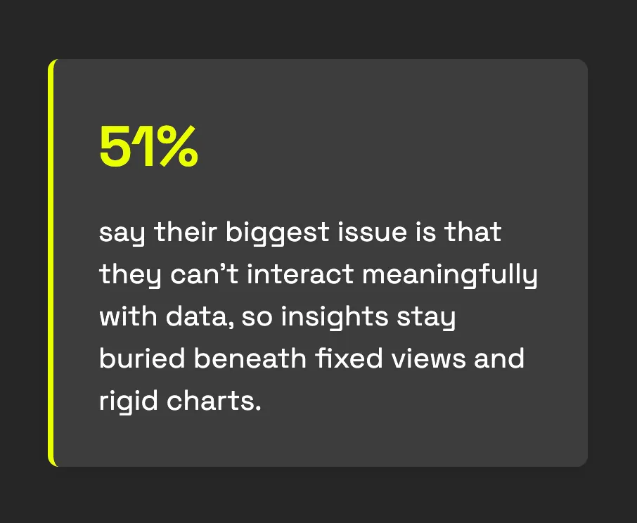
Luzmo's survey found that 37% of users say the data presented in their dashboards isn't clear or actionable enough. And 51% say dashboards lack meaningful ways to interact with data — they can look, but they can't dig in, filter, or drill down to answer follow-up questions.
This creates a frustrating experience. Users see numbers but don't know what to do with them. They lack the context, benchmarks, or guided pathways that would turn a data point into a decision. One respondent in Luzmo's research summed it up well: they wanted a dashboard that showed actions to take, with the ability to understand why those actions were recommended.
Most product users aren't analysts. They're marketers, operators, account managers, or small business owners who opened your product to do their job — not to interpret charts. When analytics answers their questions directly, adoption soars. When it just presents data and leaves interpretation as an exercise for the reader, users quietly disengage.
Data users can't trust
Even when the right data is surfaced in the right way, one thing kills adoption faster than anything else: doubt.
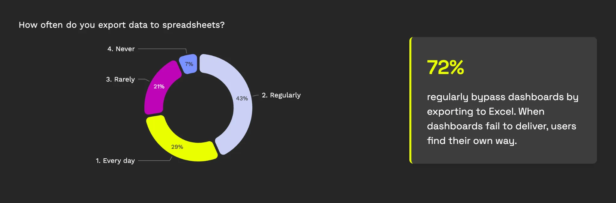
Trust in analytics is effectively binary. Once a user encounters data that conflicts with what they know to be true — even once — they stop relying on the dashboard. They go back to spreadsheets, ping someone on Slack, or just stop looking. Luzmo's research quantifies this: 28% of users don't trust the quality of data in their dashboards. And when trust breaks, 72% default to exporting to Excel.
The trust problem shows up in several predictable ways. Delayed data without freshness indicators leads users to misread pending states as actual outcomes — someone sees a dip in revenue that's really just an unsettled transaction. Metrics from different sources that don't reconcile cause users to question everything. And inconsistent definitions — where the same term means different things across different views — erode confidence quickly.
Gartner's own research on data quality underscores the scale: organizations lose an estimated $9.7 to $15 million annually from operational inefficiencies caused by poor data quality. In the context of embedded analytics, poor data quality doesn't just cost money directly — it costs you user trust, which is much harder to rebuild.
The fix isn't always about making data real-time (though that helps). It's about transparency: freshness indicators, clear status labels, explicit definitions of what each metric includes and excludes. Users can work with imperfect data as long as they understand the imperfections. They can't work with data they don't believe.
The spreadsheet escape hatch
Perhaps the most telling signal of embedded analytics failure is what users do when dashboards don't work for them: they leave.
Luzmo's research found that 43% of users regularly skip dashboards to do their own analysis in Excel or Google Sheets. Even more striking, 29% export data to spreadsheets every single day. These aren't occasional workarounds — they're systematic defections from the analytics experience you built.
Users default to spreadsheets when they can't manipulate, explore, or trust the data inside your product. They need to compare numbers from different sources, apply their own logic, or simply rearrange information in a way the dashboard doesn't support. Every export is a user telling you, silently, that your analytics didn't answer their question.
This is particularly damaging because it breaks the core promise of embedded analytics: insights in context, inside the workflow. Once users export to a spreadsheet, they've left your product. The decision happens somewhere else. The value accrues somewhere else. And your analytics feature becomes just another export button.
The assumption that leads teams astray
Across nearly every analytics failure pattern, one root assumption keeps surfacing: the belief that users want to explore data.
Product teams consistently overestimate their users' appetite for exploration and underestimate their desire for direction. They build configurable dashboards assuming users will customize them. They add drill-down layers assuming users will dig in. They ship open-ended analytics tools assuming users will ask their own questions.
But the data tells a different story. Luzmo's research found that 51% of users say dashboards lack interactivity — and yet, when asked what they want, respondents consistently favor guided insights over open-ended exploration. They want to know what changed, why it matters, and what to do about it. They don't want a data playground.
This mirrors what Gartner predicted: that through 2022, only 20% of analytic insights would deliver business outcomes. The insight gap isn't about technology — it's about the distance between showing users data and helping them act on it.
The pattern makes sense when you consider who embedded analytics actually serves. Your users aren't logging into your product to analyze data. They're logging in to do their jobs — manage campaigns, track shipments, close deals, serve customers. Analytics should make those jobs easier, not give them a second job as a data analyst.
What successful teams do differently
Our research doesn't just catalogue failures — it also reveals what separates the analytics experiences users value from the ones they ignore. And the playbook is strikingly consistent.
- Start with decisions, not data. Before designing a single chart, identify the 2-3 key decisions your users need to make. "Where should I move my budget?" or "Which accounts need attention this week?" beats "Here's your data" every time. The best analytics experiences are opinionated — they have a point of view on what matters.
- Replace open-ended dashboards with guided insights. Instead of exploration tools, surface focused answers to specific questions. Think insight cards, automated summaries, and contextual alerts rather than a wall of charts. One respondent in Luzmo's survey captured this perfectly: they'd rather see a dashboard of recommended actions than a collection of metrics.
- Add benchmarks and context. A number on its own means nothing. Is 3.2% conversion good or bad? Compared to what? Benchmarks, trends, and contextual labels transform raw metrics into signals users can act on.
- Be transparent about data freshness and definitions. Label everything. If data is 2 hours old, say so. If a metric includes pending transactions, make that visible. If "revenue" means something different in two views, clarify both. Users will forgive delays — they won't forgive feeling misled.
- Bring insights to users instead of waiting for them to come looking. Email alerts, in-app notifications, and automated anomaly detection keep analytics relevant without requiring users to form a daily dashboard-checking habit. The best analytics finds the user at the moment a decision needs to be made.
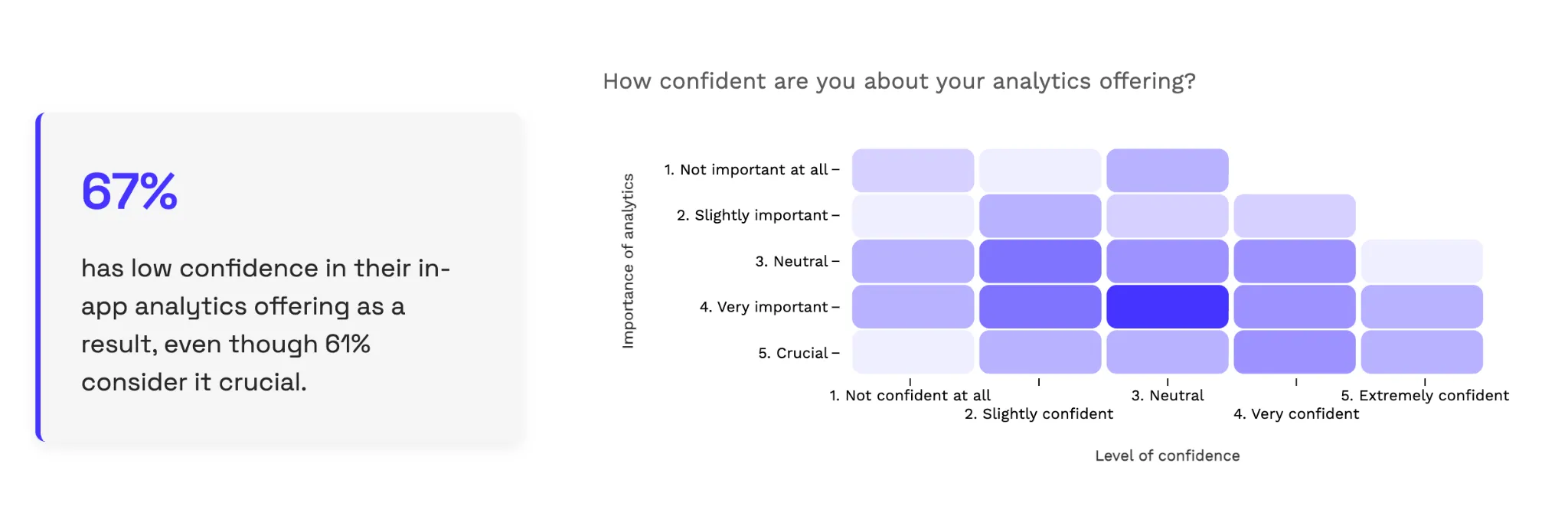
Keep ownership inside the product team. Luzmo's research found that 67% of SaaS teams have low confidence in the value of their in-app analytics, and 41% spend over four months building dashboards. When analytics is owned by a separate BI team or outsourced entirely, iteration slows to a crawl and user feedback gets lost. The teams that ship analytics users actually love are the ones where product managers can make changes without filing a ticket.
The real opportunity
Embedded analytics isn't failing because the technology is broken. The market is growing at double-digit rates for a reason — when analytics works, it genuinely transforms how users engage with your product. Companies with effective embedded analytics see higher retention, stronger differentiation, and real revenue impact.
The failures happen when teams approach analytics as a feature to be built rather than a user problem to be solved. When they start with data and work outward, instead of starting with decisions and working backward. When they optimize for visual polish rather than trust and clarity. When they give users exploration tools when users wanted answers.
At Luzmo, we've seen this pattern play out across hundreds of SaaS companies embedding analytics into their products. It's why we built an embedded analytics platform designed around the end user — typically someone non-technical who needs focused, contextual insights without a learning curve.
From API-first architecture that lets product teams ship in weeks instead of months, to real-time data connectivity that keeps trust intact, to Luzmo IQ which lets users ask questions in plain language instead of navigating complex dashboards — every design choice stems from the same principle these failure patterns point to: analytics should serve decisions, not demand exploration.
The demand is real. The market is there. But so are the failure modes. The product leaders and research telling us what goes wrong are also telling us what to do about it: start simpler than you think you should, obsess over clarity and trust, and never forget that your users opened your product to do their job — not to become data analysts.
Luzmo is an embedded analytics platform purpose-built for SaaS. Build customer-facing dashboards in days, not months, with an API-first approach, real-time data, and AI-powered insights that feel native to your product.
Written by

Ship the future of your data
Let us show you what Luzmo can do for your product.

Leave your e-mail and one of our analytics experts will reach out to you