Bad Data Visualization: 9 Examples to Learn From

Imagine you had a big block of marble. In the hands of Michelangelo, that block would turn into a beautiful sculpture with stunning attention to detail. In the hands of the person writing this article, that block would turn into millions of pieces of broken marble.
The same applies to data points. Starting off with the same data, you could have two different results: a dashboard with insightful graphics or something not even Bill Gates could decipher.
In other words, a bad data visualization. Today, we’ll show you what that is and how to avoid it, as well as provide some examples you can learn from.
What is a bad data visualization?
A bad data visualization is the visual analytics of data that misinforms the reader and leads them to the wrong conclusions. Instead of making data-driven decisions from relevant data, the reader is left confused.
Even with proper underlying data analysis and clean datasets, using the wrong data visualization techniques can lead to charts and graphs that simply make no sense. This problem is bigger than you might think. Research shows 72% of users regularly bypass dashboards by exporting to Excel. When the built-in tools don’t deliver, people take the data elsewhere, breaking the flow of insights.
This is why modern analytics tools like Luzmo Studio focus on building intuitive, interactive dashboards, while AI assistants like Luzmo IQ and Luzmo AI help users explore datasets conversationally and uncover insights without relying on static reports.
When we talk about misleading data visualizations, it usually has at least one of the following properties:
- Trying to cram in too much data in one graph
- Using the wrong type of chart for your intentions
- Using colors in the wrong way
- Lack of context
- Incorrect data handling before the visualization
- Using the wrong data visualization tools (e.g. Excel for product analytics)
- Lack of storytelling
- Not understanding the target audience
And it’s not only about individual charts going wrong. According to Luzmo’s Dashboards: Dead, Dying, or Evolving? report, 40% of users rate their dashboards 3/5 or lower - a clear sign that visualizations are falling short. Users don’t just want charts that look nice, they want analytics that actually help them make better decisions.
These are just some of the most common mistakes that can happen to your data presentation. But let’s take a look at some bad examples and see what you can learn from them.
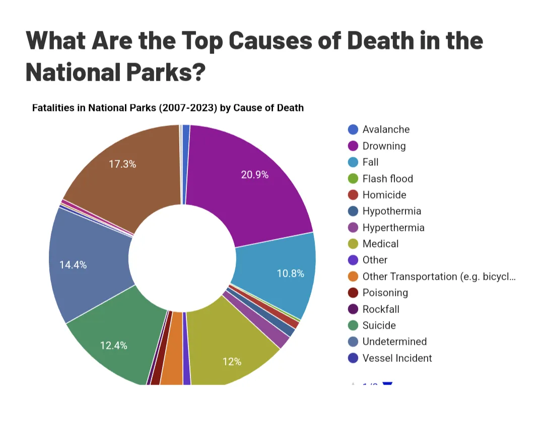
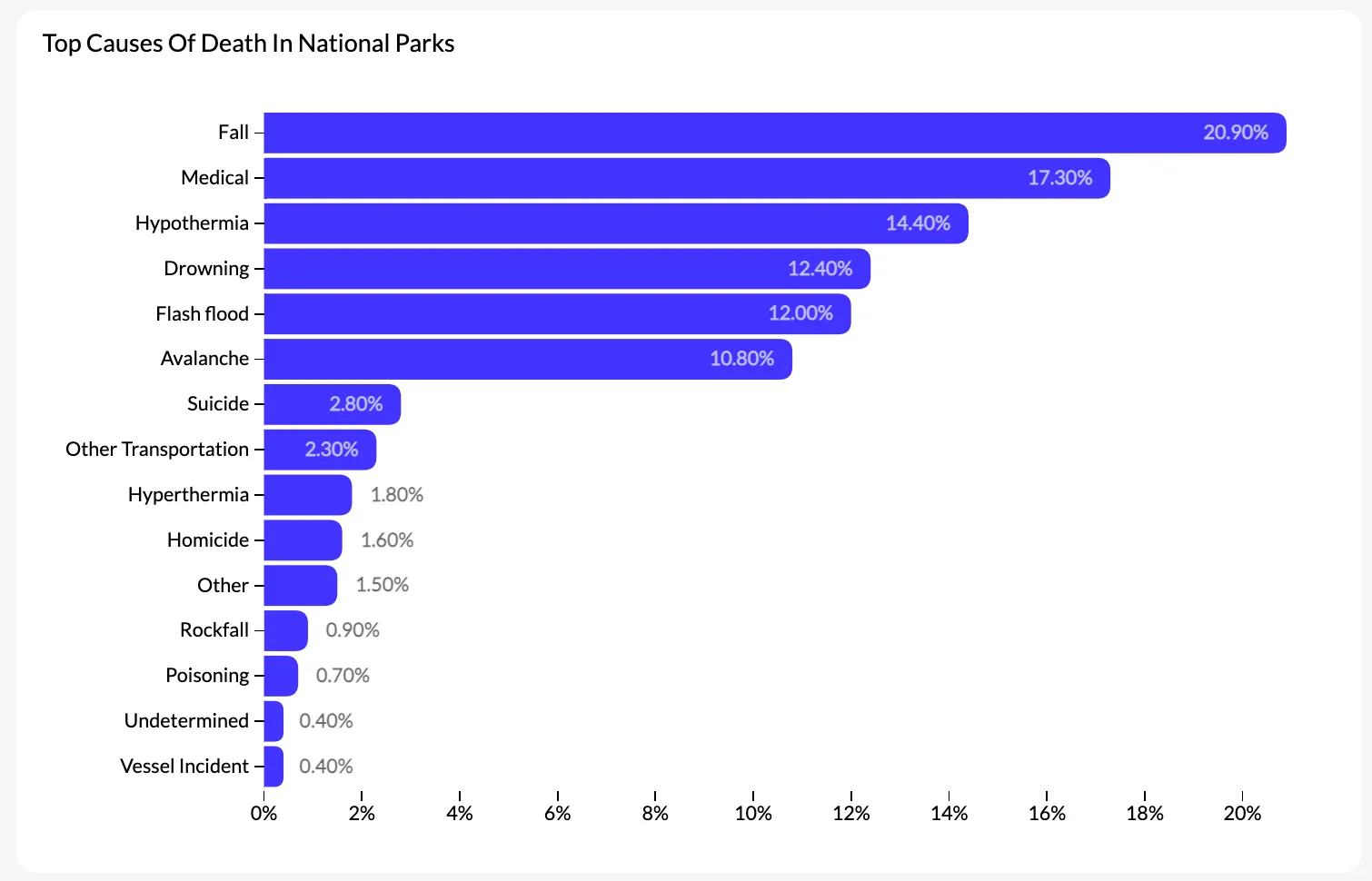
Bad data visualization in dashboards: the most common product mistakes
The examples of bad data visualization that circulate online — maps with incoherent color scales, pie charts with seventeen slices — are easy to spot and easy to dismiss as somebody else's problem. The visualization mistakes that actually cost product teams are subtler, and they show up in dashboards that look fine at first glance.
One of the most common is dashboard overload: putting every available metric on a single screen because it feels more complete. The result is that users can't identify what's important, so they stop using the dashboard altogether. Luzmo's research found that 72% of users regularly bypass dashboards by exporting data to Excel — often because the dashboard doesn't help them answer the specific question they have.
A second mistake is showing data without context. A number like "conversion rate: 3.4%" tells the user almost nothing without knowing the previous period, the industry benchmark, or the segment it's measuring. Charts that show a single value in isolation force the user to supply the context themselves, which most won't do.
A third issue specific to embedded analytics is using the same dashboard design for users with very different roles. An executive looking for a summary and a power user running a detailed analysis need fundamentally different views of the same data. A single dashboard that tries to serve both usually serves neither well.
Good embedded analytics design starts from the question the user is trying to answer, not from the data available. Luzmo AI takes this a step further by letting users ask their own questions in natural language — reducing the need to anticipate every use case in the dashboard layout upfront.
Bad data visualization vs. misleading data visualization: is there a difference?
Bad data visualization and misleading data visualization often get used interchangeably, but they describe different failures.
A bad data visualization is one that fails to communicate clearly. The data is accurate; the chart just makes it hard to read. A pie chart with too many segments, a line chart with no axis labels, a color scheme that makes it impossible to distinguish categories — these are presentation failures. The reader can't extract the insight, not because the insight isn't there, but because the chart gets in the way.
A misleading data visualization is one that communicates something that isn't true. A bar chart whose y-axis starts at 60 instead of zero makes a 5% difference look like a 300% difference. A line chart that selectively shows only the months where a metric improved gives a false impression of consistent growth. A map that uses absolute values instead of per capita rates makes dense population centers look disproportionately significant.
The distinction matters because the fix is different. Bad visualizations need better design choices — cleaner layouts, more appropriate chart types, stronger labeling. Misleading visualizations need a different relationship with the data itself: more honest axis scaling, more complete time ranges, more appropriate normalization.
Both are genuine problems, but misleading data visualization does active damage to decision-making in a way that bad data visualization doesn't. A confusing chart gets ignored; a misleading chart gets acted on.
A map with poor use of colors
Here is an example of a map, showing the number of US Americans with ancestry from different European countries.
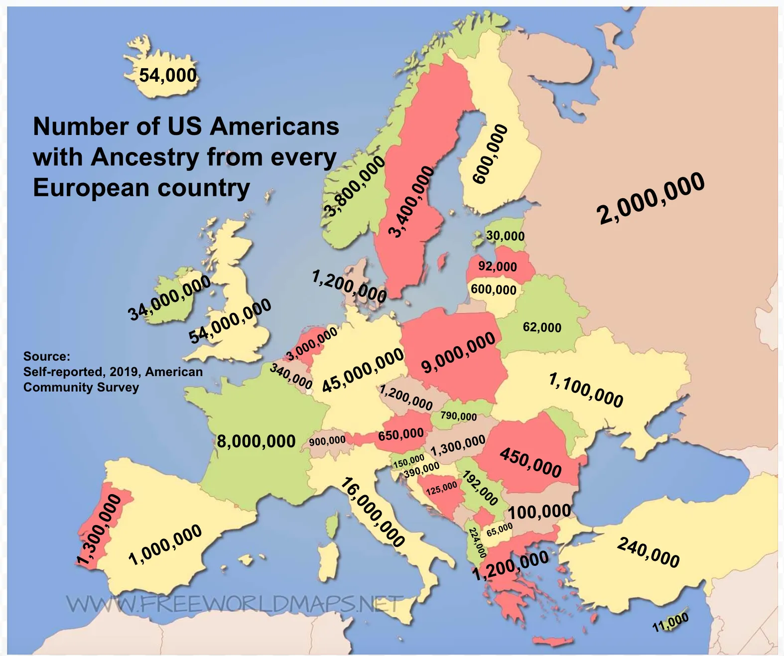
It does not take long to figure out what is wrong with this visualization. According to data visualization best practices, colors should be used strategically to amplify the main message. Colors are not labels and should not replace them.
In this case, the colors make no sense whatsoever as the same color is used for different values on the map. Here is what a good use of colors looks like in a map chart:
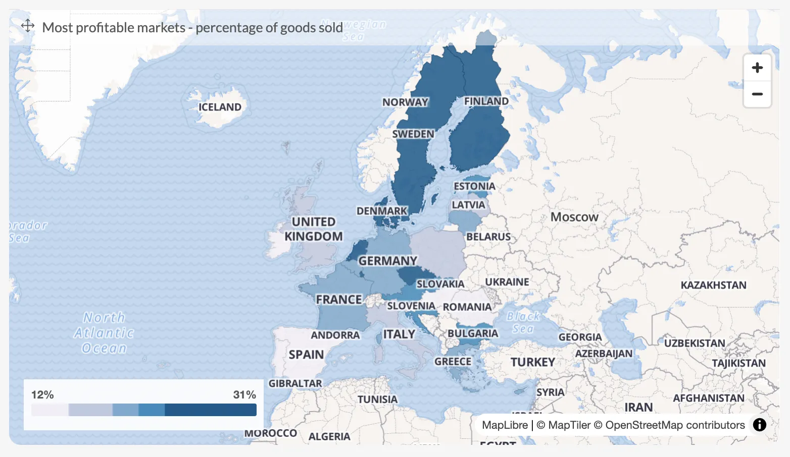
This chart is more effective because of the good use of the color scale. The lightest colors have the lowest value, and the darker the color gets, the higher the value. Using different shades of the same color to show values on a scale is a good use of colors for data visualization.
Improper use of the y-axis
Political campaigns have a tendency to twist the truth and this bar chart is a great example of that.

The two results are very close to each other (46% vs 47%) but the wrong scale of the y-axis makes it seem like the bar on the right is significantly bigger than the one on the left.
In this case, the difference is easy to see with a human eye. However, the more data you add and the more complex your charts become, the harder it becomes to spot this kind of bad data visualization.
Here is another example where the x-axis is stable but the y-axis is questionable, to say the least:
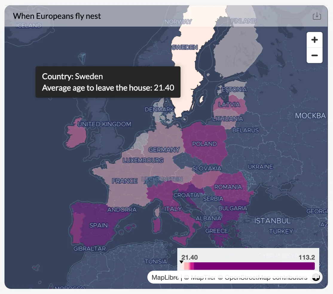
Choosing the wrong type of visualization
At first glance, this seems like a regular infographic. But if you want to draw some conclusions from it, you’ll soon be left scratching your head.
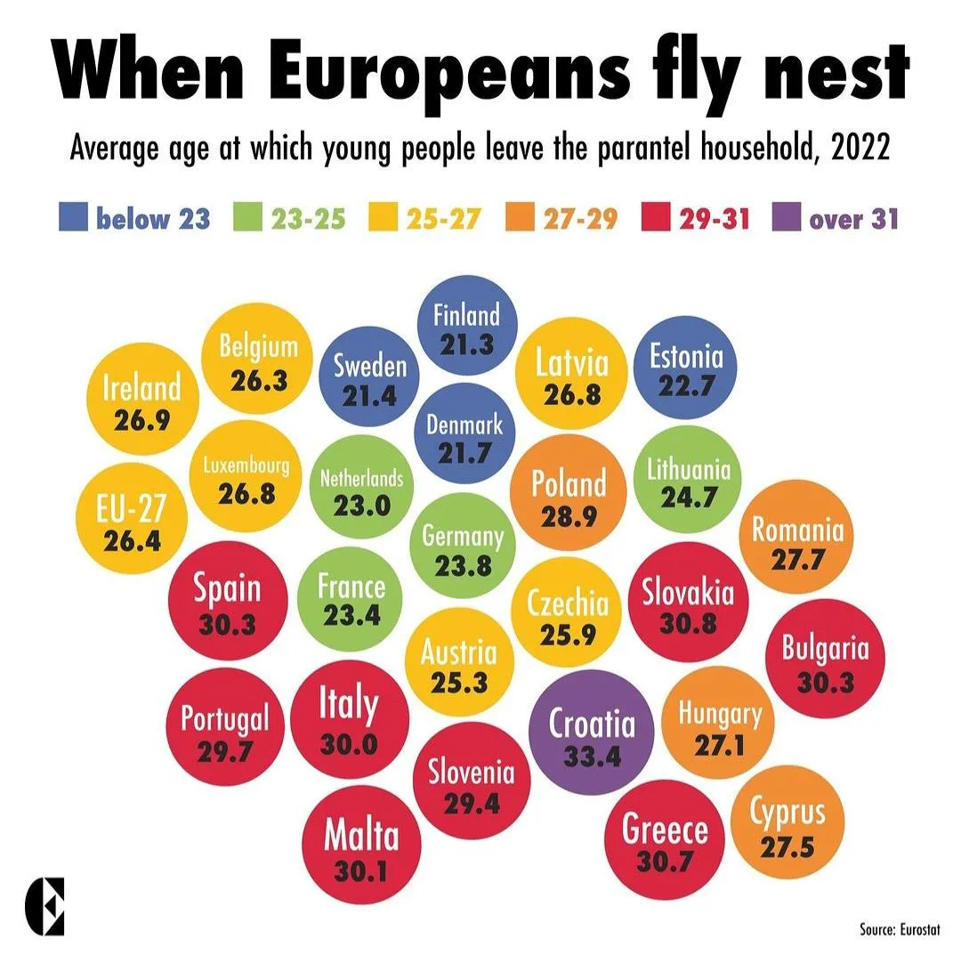
The graph should display the different ages at which young people leave their parents’ homes in European countries.
The main reason why this is a poor data visualization example is because of the chart type. These balls or clouds tell the reader nothing and in fact, confuse them even more. Ideally, this should be a map, a line chart, or something along those lines.
The wrong use of legend (and colors)
This chart shows the most used messaging apps broken down by country. If you want to break into a new market, this could help with decision-making, but there’s only one problem.
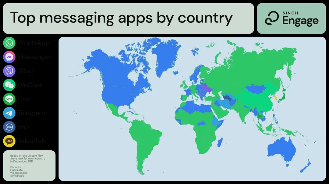
You don’t have to be colorblind to realize that the colors are too adjacent to each other to get anything meaningful out of the visualization. Also, the legend is practically useless as it does nothing but lead to misinterpretation of data.
Driving misinformation by putting data out of context
This grim data visualization shows the number of serial killers per country in the world, ranked on a bar chart. There are two problems with it.
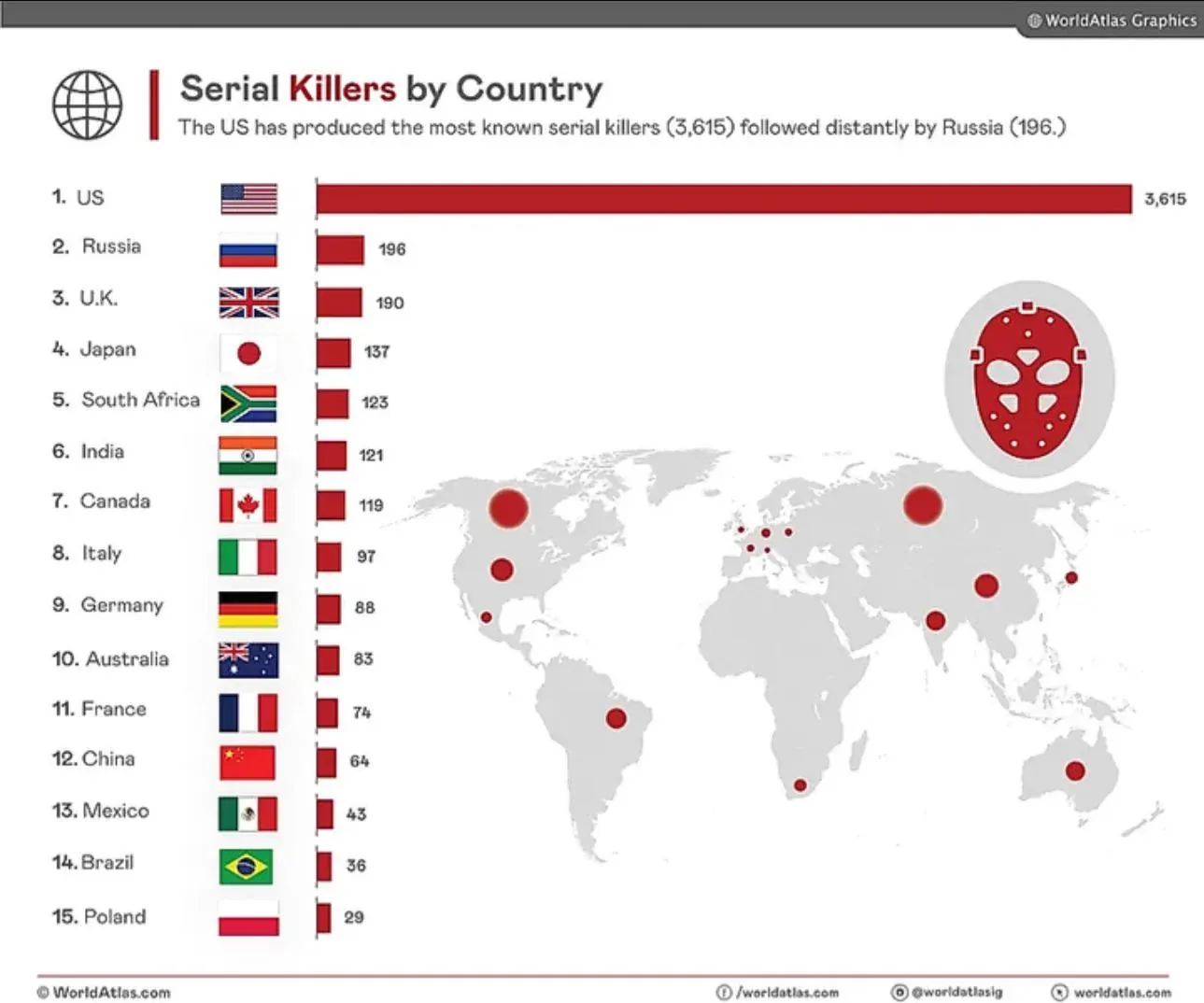
The first one is that the values in the bar graph show the absolute number of serial killers per country. In other words, the number of serial killers are not shown in proportion to the inhabitants of the country.
If you compare a country of +300M inhabitants (like the US) with a country of 67M inhabitants (like the UK), you’re comparing apples to oranges. The end result is a huge horizontal bar for the United States, which is just a poor example of data analytics.
The second issue is the map below the chart simply makes no sense in relation to the chart data. It’s unclear what the dots represent, and there are no tooltips or info panels to provide context.
Pie charts and donut charts: tasty but not very effective
We’ve talked about pie charts and donut charts numerous times on the Luzmo blog. In business intelligence applications and elsewhere, they are hard to read and interpret. This donut chart shows the number of outbound airport passengers, comparing the values from 2019 and 2024.
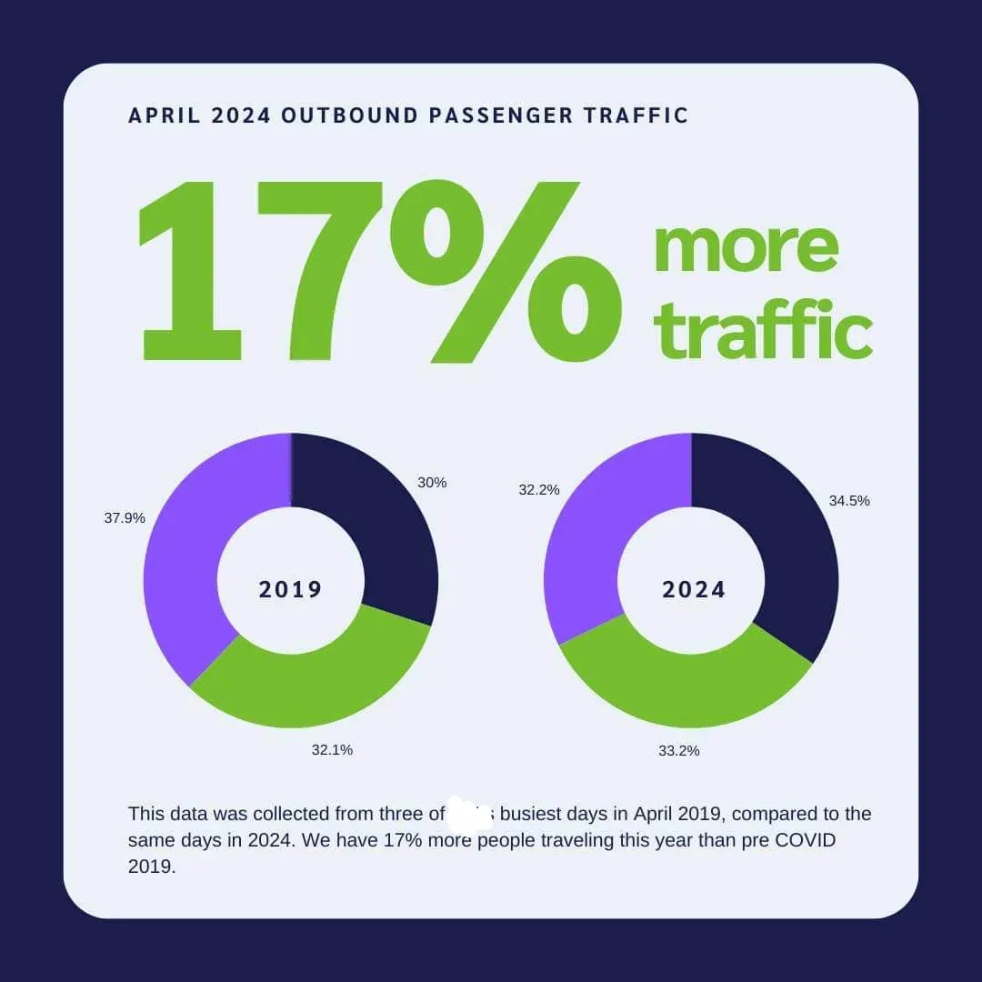
Even if there was a legend below, comparing the data sets and making logical conclusions is incredibly difficult.
Here is one more chart that tries to simplify the underlying data but in the end, makes things even more complicated and confusing:
If you’re looking for a better alternative to donut and pie charts, we suggest using bar charts.
A scatter plot that tells nothing
This is an example of a scatter plot comparing different digital strategy consulting services.
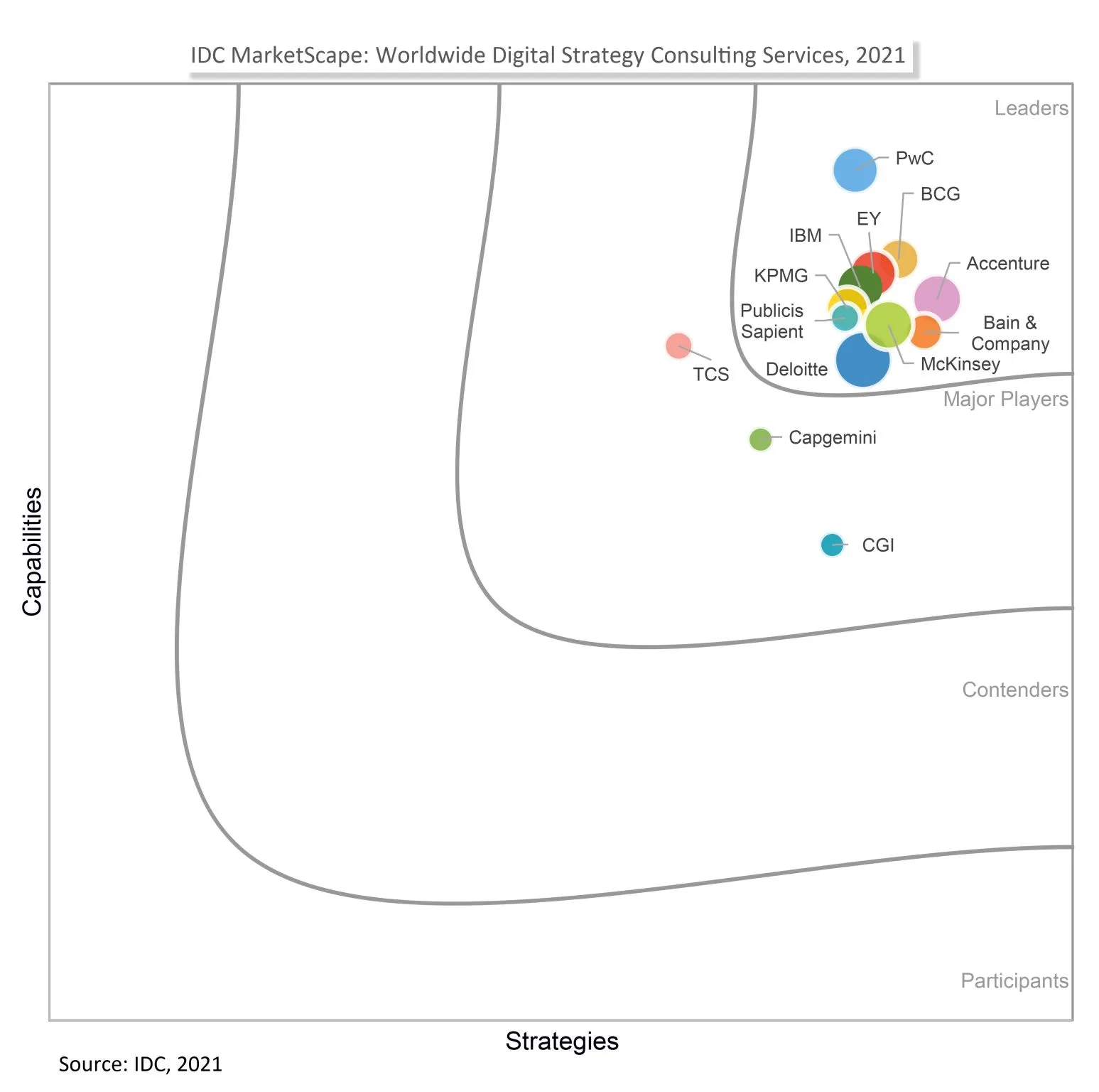
In this case, the problem is that when everyone is a leader, no one is a leader. In other words, the problem is in the choice of the visualization type.
Data visualization best practices to follow in 2026
The good news? Users are very clear about what they want. According to our report, 42% say their top request is more interactivity, while 38% want dashboards they can customize. And more than half would actually pay more for dashboards that deliver real insights.
We’ve covered this topic many times before, so let’s give you a quick recap of the most important data visualization best practices to follow. If the underlying data science is done right, just follow these tips to make your dashboards, spreadsheets and reports easier to understand and read.
- Create visualizations with a specific target audience in mind
- Use your colors carefully - up to 6-8 colors per visualization, and use them to reinforce a message, not tell a story
- Avoid excessive detail and cluttering up your visualizations
- Use the right type of visualization for the purpose you have in mind
- Highlight only the most important information in the visualization
- Keep all your visualizations on one screen
- Use legends and tooltips to explain what is happening in the visualization
- Provide context for your data whenever possible
- Use the layout of the visualization to tell a story
- Structure the visualization so that the most important information is displayed first
Check this out: how to use ChatGPT for data visualization and how to use AI for data visualization
How to fix bad data visualization: a practical checklist
Most bad data visualizations can be improved by working through a short set of questions before publishing or sharing a chart.
- Can you describe what this chart shows in one sentence? If not, it's probably trying to communicate too much at once. Simplify the view or split it into two separate charts.
- Is the chart type matched to the data structure? Time series data belongs on a line or area chart. Categorical comparisons belong on a bar chart. Part-to-whole relationships belong on a donut or pie chart with five segments or fewer. If the chart type doesn't match the data structure, the visual will fight the insight.
- Does the axis start at zero? For bar and column charts, a y-axis that doesn't start at zero will exaggerate differences. There are legitimate exceptions — line charts showing small fluctuations in a large baseline, for example — but they should be deliberate, not default.
- Is there enough context to interpret the number? A metric without a comparison point — a previous period, a target, a benchmark — forces the reader to supply context they may not have. If the number is good or bad, the chart should make that clear without requiring extra knowledge.
- Can your audience read this without help? If a chart requires a verbal explanation to make sense of it, the chart isn't finished. Test it by showing it to someone unfamiliar with the data and asking them to describe what they see.
For embedded analytics specifically: Luzmo AI can generate chart suggestions based on your data structure, which helps avoid the most common chart type mismatches before they reach end users.
Wrapping up
Bad data visualizations lead to costly errors. Your target audience won’t be able to read and understand them and make data-backed decisions. What seems like a small confusion can lead to massive consequences for your business.
If you want to create a dashboard for your SaaS product, we can help you make sure you choose the right type of visualization. In Luzmo, you can use dashboard templates to get the right kind of chart or graph for your needs.
Luzmo pricing is built to scale with your product. Plans start at €495/month for Starter, €1995/month for Premium, and custom pricing for Enterprise, so you can choose the right level of flexibility, customization, and scalability as your analytics needs grow.
Sign up today and build your next product dashboard for free!
FAQ
All your questions answered.
What makes a visualization misleading or “bad”?
Bad visualizations distort data interpretation. This includes truncated y-axes that exaggerate change, 3D effects that obscure values, and choosing visuals that don’t match the data’s story. The goal is clarity: the reader should not have to guess what the data means.
How can I evaluate if a chart design is effective?
Assess whether your audience can quickly extract the main insight. If most users struggle to answer the intended question after viewing the chart, redesign it. Techniques like A/B testing visuals or asking unbiased users for interpretation help validate effectiveness.
Do color and design choices really affect understanding?
Yes. Color ramps should communicate intensity or categories, not distract. Accessibility matters:
What separates a simple chart from an insightful one?
An insightful chart reveals patterns that align with business decisions or hypotheses. Simplicity matters - every element should be intentional. A chart that just shows data is different from one that helps the reader act on the data.
Written by

Ship the future of your data
Let us show you what Luzmo can do for your product.

Leave your e-mail and one of our analytics experts will reach out to you