10 Data Visualization Best Practices for Improved Decision-Making

When you’re watching a bad movie, it doesn’t take more than a few minutes to figure out that you’re not going to wait for the credits to roll out. It’s similar to data visualizations - the great ones are promising from the start. The bad ones never get to the point and make you wonder why you wasted your time on them.
Great data visualizations can tell stories and turn raw data into actionable insights. Today, we’ll show you how to go from boring dashboards to beautiful visualizations that make an impact.
Why great visualizations matter
We’re no longer in the age where data was in the form of Excel spreadsheets and ugly pie charts. Nowadays, visualized data points help highlight key metrics and KPIs that help the right target audience make smart decisions more quickly.
For example, a marketing manager can take a look at a dashboard with all of their campaign performance for the year, focusing on ROI and channel effectiveness. Good data visualization helps them see in seconds that SEO is their top-performing channel.
With effective data visualization, the person reading does not have to be a data analyst to understand what is going on and take action.
Best practices for data visualization to use in 2024
Whether you want to create infographics or improve your dashboard design and simplify complex data, these are some ways to tell effective data stories with visual elements.
Create visualizations with a specific user in mind
Imagine you have one dataset, but two different people reading your dashboard: a CEO and a product marketing manager. These are two different use cases and the result will be two entirely different dashboards.
Depending on who is reading, you’ll choose a different:
- Order of elements and widgets (what goes first in the dashboard)
- Level of detail (main KPIs vs. granular data view)
- Types of charts (simpler vs. complex)
- Additional information (tooltips that explain different elements in the dashboard)
If the stakeholders who are reading are higher up on the company ladder, you’ll generally present data that is more general, while department managers and business users will require more granular information.
Use the right type of visualization for your data
Every modern data analytics tool has a wide array of visualizations to choose from. But just because you have all these choices, it does not mean that you can pick the ones that look great and call it a day.
Depending on the type of data you’re working with and the kind of effect you want to get, you’ll choose different visualization types.
For example:
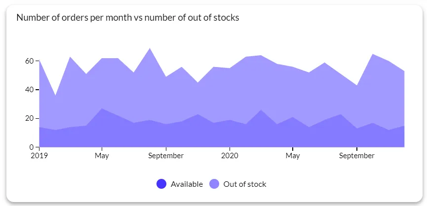
- Line chart or line graph: for tracking the evolution of a specific quantitative value
- Bar chart: to answer the question of “how many” for different categories in a specific time period
- Scatter plot: to discover the connection between two or more variables
- Heatmap: to show values for a main variable across two axis variables as a grid with squares in different colors
- Box plot: to summarize data measured on an interval scale
If you’re not sure which visualization type to use, this flowchart is an excellent starting point. Also, most data visualization tools nowadays come with templates for different use cases, already filled with the most suitable visualizations for your target audience.
Gather, prepare, and clean your data before visualization
Garbage in = garbage out. Even the best data analysts and engineers can’t create actionable dashboards with bad data. Before you even touch your data visualization tool, make sure you pull all the data from your data sources, clean it, and structure it so it is ready for visualization.
Some of the steps you should take include:
- Handling missing data
- Removing duplicates
- Standardization of data formats
- Correcting errors
- Handling inconsistencies
- Data normalization and transformation
- Data validation
This ensures that the end product is a visualization that not only looks good but accurately represents the data you have.
Avoid excessive detail
When we say detail, we mean the things that clutter up your dashboard without adding any functionality or value.
For example, “$1.6B” is much easier to process for the human brain than “$1,648,745,659.51”. When you can, abbreviate things so that they take up less space on the dashboard.
Also, don’t use fancy visualizations just because they are available. For example, a word cloud may look interesting to you while you’re creating it, but it will clutter up the dashboard and not add any value - unless you’re analyzing large chunks of text.
Use colors consistently and thoughtfully
You have an entire color palette to choose from in your dashboards, but it’s best to stick to 6-8 main colors. Anything more than that will confuse the reader instead of giving them a coherent message.
Remember that colors are not labels and cannot replace them. On the off-chance that someone color-blind is reading your dashboard, they should still be able to understand what you’re trying to say.
You can, however, use colors to reinforce your message with semantic coloring, like this:
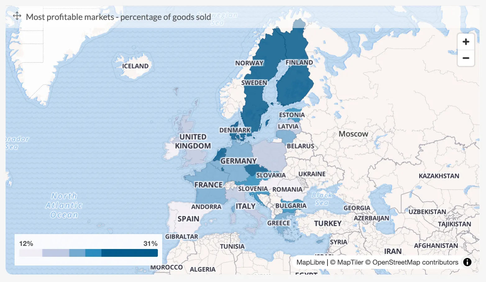
Sequential scale: with multiple categories with different quantities, use colors with different brightness to highlight that quantity. For example, dark blue for higher values and light blue for lower values.
Diverging scale: for cases when you have a meaningful break point between two values. For example, if you have a temperature scale, the higher temperatures will be on the left in red, the break point will be in the middle in white, while the colder temperature will be on the right, in a blue-ish color.
Qualitative scale: if there is no difference in quantity, use colors to denote qualitative differences. For example, you have a poll where you ask participants about their satisfaction with a course. On a chart, you’d mark “very dissatisfied” with deep red, “dissatisfied” with a lighter red, all the way to “very satisfied” with a dark shade of green.
Use the right data visualization tool
If you don’t already have a preferred business intelligence tool, choosing one is going to feel like a labyrinth. Data visualization is just one aspect of how a good BI tool works, but it’s crucial if you want to get the best data visualization results for your business or end users.
Here are some common data visualization tools to consider.
Luzmo - for embedded analytics in SaaS products
Microsoft’s Power BI - for on-premise data visualization for internal team members
Tableau - for teams that need a large choice in visualizations when creating dashboards on-premise or in the cloud
ThoughtSpot - for decent visualizations with AI-powered conversational analytics
Highlight only the most important information in a visualization
You can choose the right chart but still make it useless with your use of color. If everything is highlighted, that means that nothing is important, or everything is important. Either way, it’s not good.
To display data in an actionable way, only highlight the section in your charts that has the most important takeaways for the reader.
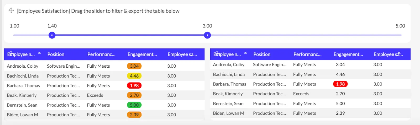
Example of employee satisfaction: highlighting only the employees with low engagement score - so you can take action on what requires the most urgent attention.
Keep visualizations on one screen
When visualizing data, consider how the end user will be viewing your dashboards. Humans don’t have amazing short-term memory and you don’t want to force them to scroll up and down to see correlations or outliers.
Instead, show all the most important visualization elements on one screen.
Provide context for your data
Use data in a smart way and tell the end user what they are reading. For example, adding the title “Survey results” and a few charts, expecting the reader to understand everything on their own - is the wrong approach.
Instead, give clear titles to your sections and when possible, add a few words to explain the basic idea of the visualization. If your data visualization tool has this feature, you can also add tooltips.
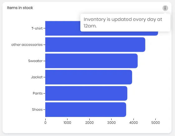
These are small icons (typically labeled with a question mark) that the reader can hover over to get more information. This is an excellent way to provide all the information without cluttering up a dashboard while adding some interactivity to the mix.
Tell a story with your dashboard layout
When you look at the most popular dashboard templates, you’ll start to see patterns. The most important information is always in the top left, while the least important info goes in the bottom (right).
Show your most important data points first, in the top left corner of your dashboard, then move on to the right and add supporting data that helps tell the story. The lower you go in your dashboard, the less significant the data should be. Make clever use of white space to separate the important from the not-so-important data points.
Wrapping up
Data visualization is not just converting numbers into fancy charts. When done right, data visualization helps the reader understand complex data just by looking at a single image. And with that information, they can make better business decisions and get more value from your product.
If you have a SaaS app, you don’t have to struggle with complex BI tools that don’t embed in your tool properly or connect to your data sources. Get Luzmo and we’ll help you create, embed, and launch your new SaaS dashboard in hours - not weeks or months.
Written by

Ship the future of your data
Let us show you what Luzmo can do for your product.

Leave your e-mail and one of our analytics experts will reach out to you