How To Make Dashboards Load 25x Faster (And What We Learned)

Imagine you’ve built the fanciest charts you can imagine for your software product. Complete with all the bells and whistles: great visualizations, slick styling, super interactive, and tailored to your users.
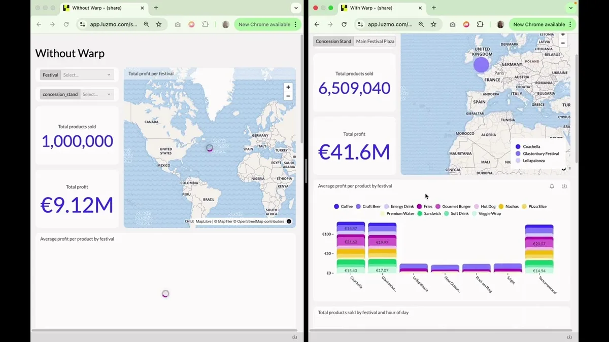
Now imagine it takes more than a minute to load that dashboard:
😖 Your customer’s frustration grows.
😖 Their attention goes wandering (away from your platform).
😖 Their trust in your product is chipping away.
Sadly, it’s a reality for many SaaS builders. 31% of SaaS companies say performance is one of their biggest struggles with building client-facing analytics. Loading time is one of the hardest things to optimize, especially when you’re dealing with millions of data rows.
You need a good data model to build speedy dashboards, but optimizing your data sources takes an incredible amount of time and effort.
So what if you could improve your data infrastructure without spending weeks fine-tuning your database or building complex data models? What impact will it have on your loading time?
We put it to the test, and ran some benchmarks. We compared:
- A non-optimized PostgreSQL database
- The same data source, accelerated with Warp, Luzmo’s one-click acceleration layer
The difference? Dashboards loaded up to 25 times faster.
See it for yourself below, where we loaded them side by side:
Let’s break down what we found, and how you can speed up your analytics without the data modeling headache.
How We Tested Dashboard Performance
When dashboards load slowly, your users notice — and not in a good way. We wanted to see just how much of a difference data source optimization can make. So we set up a real-world performance test in Luzmo.
What we built
We created a mock dashboard to put our assumptions to the test. Imagine you work for a hospitality business that operates concession stands across major music festivals. You need a dashboard to monitor in realtime:
- Which concession stand is the most profitable overall
- Which festivals are most profitable
- Which food and beverage items sell best
- What times of day are best for sales
- …
Millions of transactions happen during those festivals, so our dashboard mirrors the same kind of complexity you’d see in this scenario (and in many other real software use cases):
- Big, growing datasets — like product sales that increase over time.
- Aggregated metrics — like item prices, profit, and aggregated sales.
- Complex dimensions — you can slice metrics per concession stand, festival, product, location, or a combination.
The mock dashboard below runs on a table of 11.11M rows:
Why 11.11M? We specifically wanted to benchmark the loading speed on different data volumes, so we use the ‘concession stands’ to load more (or less) data. Each has a volume 10x bigger than the previous one:
- Souvenir Corner: The smallest stand with 10k transactions
- Beverage Garden: A slightly bigger stand with 100k transactions
- Gourmet Food Court: One of the top concession stands with 1M transactions
- Main Festival Plaza: The highest-traffic stand with 10M transactions
Adding up all those transactions leads to a dataset with 11.11M rows.
Try filtering it to get an idea of how fast your dashboards could become, even with millions of data rows!
What we tested
We tested our dashboard on different variables to compare loading times, focusing on three factors:
- Data source optimization: a standard PostgreSQL database vs the same PostgreSQL database, optimized with Warp (Luzmo’s data acceleration layer)
- Chart complexity: simple charts like number widgets (with light queries) vs complex charts like maps and pivot tables (with heavy queries)
- Data volume: smaller datasets (10k and 100k rows) vs large datasets (1M and 10M rows)
Let’s break down the results and see just how much faster a tuned database made our dashboard.
Before we continue… What is Warp?
Warp is Luzmo’s acceleration layer that helps your dashboards load faster on non-analytical data sources (e.g. operational data sources like PostgreSQL). It works by copying your data into a high-speed data store that’s designed for analytical queries. This means your dashboards run faster queries without needing to change your database or do complex data modeling.
It’s perfect for SaaS teams who don’t have an in-house data scientist, or don’t have time to rebuild their data model and infrastructure and optimize it for reporting and analytics use cases. Warp works with your data infrastructure, and turns it into something more suitable for reporting.
With or without Warp? 3 things we learned from benchmarking
Faster loading times with optimized databases
Our main test in this experiment was to benchmark how much impact an optimized data source will have on loading times. To do this, we loaded the dashboard with two different datasets:
- PostgreSQL (non-optimized): We let queries run directly on a standard PostgreSQL database, with no partitioning or manual tuning. We only added an index on the concession stand ID, which we use for multi-tenant filtering. With this index, the data source can optimally retrieve only that tenant’s data, avoiding timeouts when having to scan through all 11.11M data rows.
- PostgreSQL + Luzmo Warp (optimized): We added Luzmo’s Warp acceleration layer — designed to optimize query execution without you needing to set up an analytical data source yourself.
So the question remains: is the optimized database always better?
👉 It depends.
With an optimized database, we saw consistent results around 1 second or lower. The complexity of a chart matters, but the biggest performance gains happen when playing with the data volume.
- For large datasets (>1M rows), our Warped dataset consistently outperforms a standard PostgreSQL.
- For small datasets (<100k), the difference in loading time is minimal, and sometimes even better on a standard PostgreSQL.
Let’s unpack that in more detail.
Speeding up complex charts
In our festival dashboard, we used different chart types with different aggregations to compare the loading speed. For example:
- Simple charts, like number widgets showing total products sold, which only retrieve one aggregated value from the data source.
- Charts with medium complexity, like column charts and heatmaps, slicing product sales and profit by different categories.
- Complex charts, like pivot tables or maps that require heavy aggregation, grouping, and geo-lookup.
Let’s say we load a dataset of 1M rows and compare the different charts. The result?
👉 Complex charts load up to 5 times faster with Warp.
With a non-optimized data source, the query times varies largely:
- 394ms (median) for a simple number widget
- 4s 533ms (median) for a complex pivot table
If we ran the same queries on a Warped dataset, we saw much smaller differences:
- 408ms (median) for that same number widget
- 902ms (median) for that same pivot table
Instead of 5 seconds, it takes less than a second to load massive amounts of data in a pivot table.
For simpler queries, however, there’s not much of a difference: both data sources load reasonably fast.
Try filtering below to compare between different chart types.
Speeding up large data volumes
Our dataset has multiple concession stands, each with a different sales volume:
- 10K rows
- 100K rows
- 1M rows
- 10M rows
This way, we could filter the dashboard on one concession stand at a time to see how more (or less) data affects loading speed.
Now let’s continue on the same example above, but use a dataset of 10M rows. How does this impact the average loading time of charts?
👉 On average, charts were loading up 25x as fast with Warp.
On standard PostgreSQL, the query time varies largely:
- 310ms (on average) for 10k rows
- 28s 20ms (on average) for 10M rows
If we ran the same queries on a Warped dataset, we saw much smaller differences:
- 802ms (on average) for 10k rows
- 1s 105ms (on average) for 10M rows
Instead of 28 seconds, it takes roughly 1 second to load massive amounts of data with Warp.
Note that these are averages. Imagine you pick a chart with high complexity, the difference in loading time will be even bigger. Try simulating it for different charts below!
P.S.: You’ll notice that for lower data volumes, there’s not much of a difference: the plain PostgreSQL dataset sometimes even loads faster, but the gains are minimal.
Simulate the impact of Warp on your dashboard
We ran the benchmarks, now it’s up to you. Want to know whether Warp makes sense for your use case? Run your numbers below and see how much faster performance you can expect.
When dashboards load in seconds, not minutes, your users stay engaged. They trust your product, and stay in your app instead of exporting data to Excel or giving up altogether.
And it’s not just about today. Data grows. By optimizing now, you can avoid building up performance debt that slows your product down later, when your database stores millions and millions of records.
Finally, speed shapes perception. A fast, smooth analytics experience makes your product feel premium. Your users don’t see the effort behind the scenes. They just see a tool that works right away when they need it most.
Ready for faster dashboards?
Our benchmark proved it: optimized data sources can load dashboards up to 25 times faster, especially when dealing with large datasets and complex charts. You can get those speed gains without spending weeks on data modeling or adding performance debt.
If you want dashboards that scale, keep users engaged, and don’t slow down as your data grows — the right data setup makes all the difference.
See it for yourself: try Warp or book a demo to see how fast your dashboards could be.
Written by

Ship the future of your data
Let us show you what Luzmo can do for your product.

Leave your e-mail and one of our analytics experts will reach out to you