45 Dashboard Statistics Every SaaS Should Know In 2025
Dashboards are everywhere. Banking apps, fitness apps, your software tools at work. But are people actually using them? What value do they still bring, and what are the biggest struggles?
In this article, we’ve rounded up the most essential statistics on client-facing dashboards for anyone who’s looking to build them for their software platform. Learn what’s working, what’s broken, and where dashboards are heading next.
From adoption rates and user satisfaction to AI-powered trends, you’ll find all the insights you need to build smarter, faster, and more impactful dashboards.
Let’s dive in!
Dashboard adoption and relevance in 2025
How widely are dashboards in SaaS apps used today? Do product leaders still believe in them as a value-adding feature? Find out how much momentum dashboards still have (or don’t).
- Widespread adoption: 78% of SaaS companies embed dashboards in their software products. (Source)
- Roadmap importance: 61% of software teams consider in-app analytics as an important feature on their roadmap. (Source)
- Growing skepticism: 43% of SaaS professionals believe dashboards are on their way out. (Source)
- Loyal advocates: 41% still believe dashboards are here to stay, and will always have a purpose. (Source)
- On the fence: 16% are undecided, but believe dashboards will have to evolve to stay relevant. (Source)
- AI as replacement: 41% believe dashboards are losing relevance in an AI-first world. (Source)
- Traditional reporting: 29% argue dashboards still serve a purpose, especially for standard reporting. (Source)
- Decision power: 30% think dashboards need to become more actionable, tailored and contextual in order to drive better decisions. (Source)
Takeaway: Dashboards are still a standard feature in SaaS, but their future depends on innovation, not tradition.
User satisfaction and utility
Are dashboards delivering value, or are product teams building them to tick a feature box? See how helpful users find dashboards, and how often they’re actually using them to make decisions.
- Daily usage: 50% of users interact with dashboards every day. (Source)
- Mediocre satisfaction: Users rate dashboards just 3.6 out of 5 on average. (Source)
- Lack of impact: 40% say dashboards don’t support decision-making. (Source)
Takeaway: Dashboards are being used—but not necessarily loved. Most fall short of helping users do what matters most: take action.
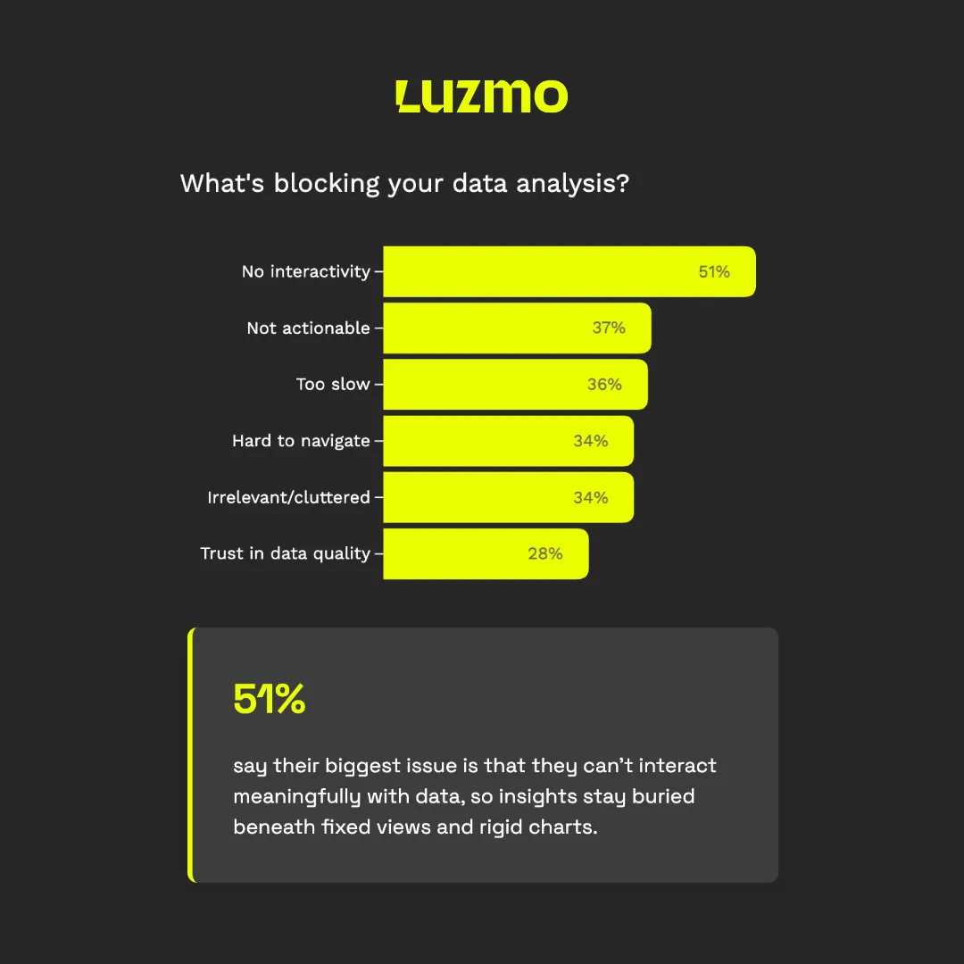
Biggest blockers for data analysis
These stats uncover what’s missing in many dashboards: dynamic, personalized experiences. Without interactivity, users struggle to explore data and answer questions in real time.
- Limited interactivity: 51% say dashboards lack meaningful ways to interact with data. (Source)
- Unclear insights: 37% find the data shown isn’t clear or actionable enough. (Source)
- Too slow: 36% say it takes too long to find the right insights they need to support their decisions. (Source)
- Hard to navigate: 34% spend too much time figuring out how to use dashboards. (Source)
- Clutter: 34% find dashboards too cluttered or containing too much irrelevant information, making it harder to find valuable insights. (Source)
- Trust: 28% say they don’t trust the quality of data in dashboards. (Source)
Takeaway: Static charts aren’t enough. Users need personalized, responsive dashboards that guide them toward insights.
Build challenges for SaaS teams
Here we look at what it takes to build and maintain dashboards in a SaaS product. Understand why many teams struggle to ship fast and iterate often.
- Low confidence: 67% of SaaS teams has low confidence in the value of their in-app analytics offering. (Source)
- Long dev cycles: 41% of companies spend over 4 months building dashboards. (Source)
- Ongoing maintenance: 19% describe dashboard development as a “never-ending project.” (Source)
- Set-up time: Only 49% is satisfied with the time it takes them to implement in-app analytics. (Source)
- Feature requests: 39% of SaaS teams get more than 10 user requests per month that ask for specific insights, dashboards or other analytical features. (Source)
- Support load: 12% of SaaS teams even get more than 30 analytics requests per month, proving how quickly dashboards fall out of sync with user needs. (Source)
- Customer demand: 38% of SaaS teams says keeping up with changing customer demands is their biggest challenge when building dashboards. (Source)
- Customization: 36% of SaaS companies struggle to build dashboards that are customized to different user needs and tailored to a user’s context at scale. (Source)
- Dashboard design: 31% say they find it difficult to design dashboards that are both functional and visually appealing. (Source)
- Performance: 31% struggle to offer dashboards that load fast and present accurate, real-time information. (Source)
- Dev resources: 28% doesn’t have the resources in-house to build dashboards for their users. (Source)
- Go-to-market: 27% say it takes too long to build dashboards into their application. (Source)
Takeaway: Building dashboards in-house can drain resources and slow you down. Teams need composable tools to stay agile.
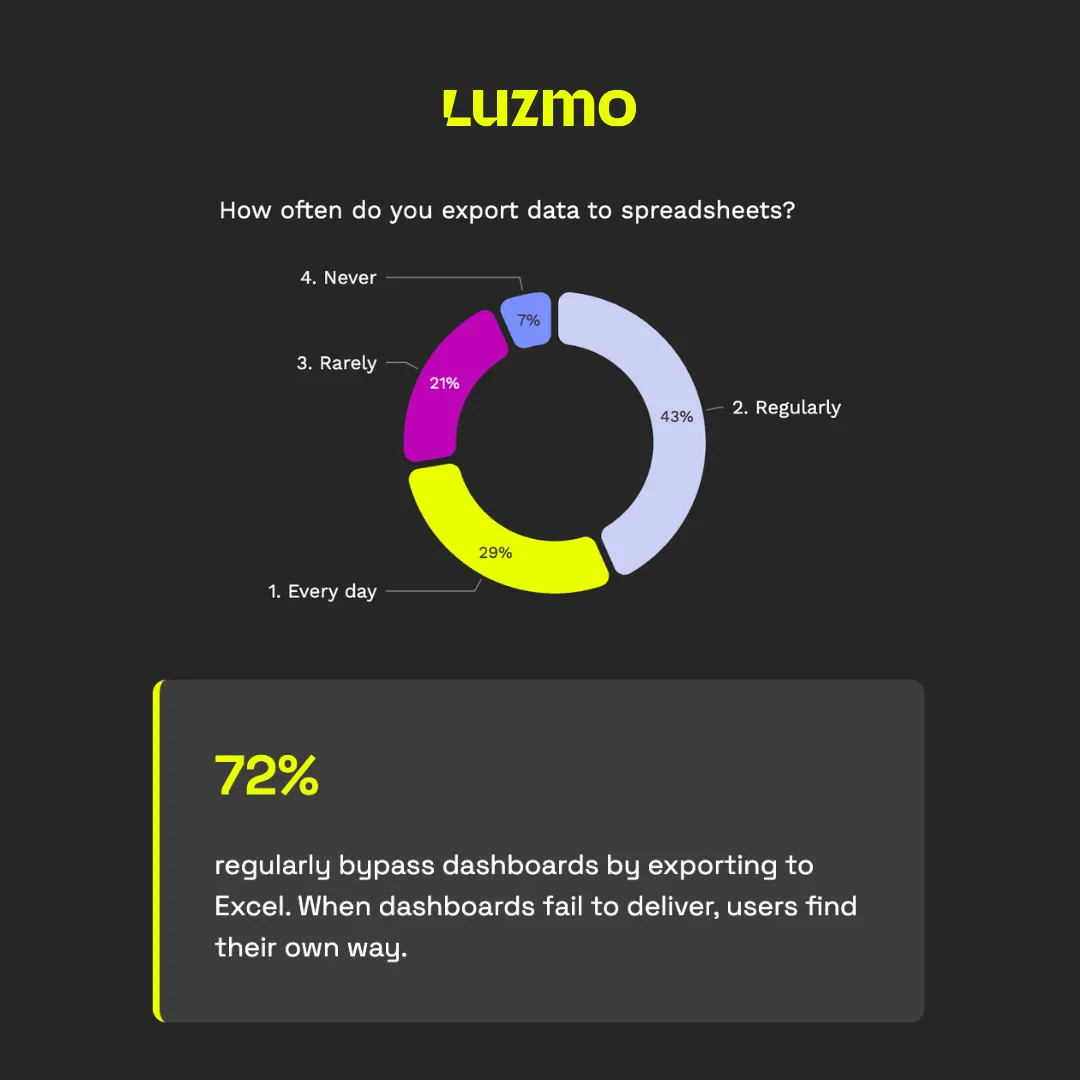
Dashboard workarounds
If users can’t get what they need from your dashboard, they’ll find workarounds. These stats highlight the real cost of bad UX and broken trust in analytics.
- Daily exports: 29% of users export data to spreadsheets every single day. (Source)
- Dashboard bypassing: 43% regularly skip dashboards to do their own analysis in Excel or spreadsheets. (Source)
- Export requests: 32% say better export functionality is a top feature need. (Source)
Takeaway: If users leave your dashboard to make decisions, it’s not doing its job. You’re losing both trust and engagement.
Most requested dashboard functionalities
What do users actually want from in-app analytics? These are the features SaaS customers request most often—proving that interactivity and intelligence matter more than ever.
- Interactivity: 42% of users want dashboards that allow them to explore and manipulate data through filters, drill-downs and other interactive features. (Source)
- Customization: 38% prioritize dashboards that adapt to their role, preferences, or region. (Source)
- Real-time insights: 32% expect up-to-date data to support faster decisions. (Source)
- Insight summaries: 31% value auto-generated takeaways that explain what the data means. (Source)
- Predictive analytics: 28% of users want to see what might happen next, not just what already happened. (Source)
- Automated alerts: 26% request alerts that notify them when important changes occur. (Source)
Takeaway: Users want dashboards that do more than display data. They want tools that guide them, adapt to them, and proactively surface insights.
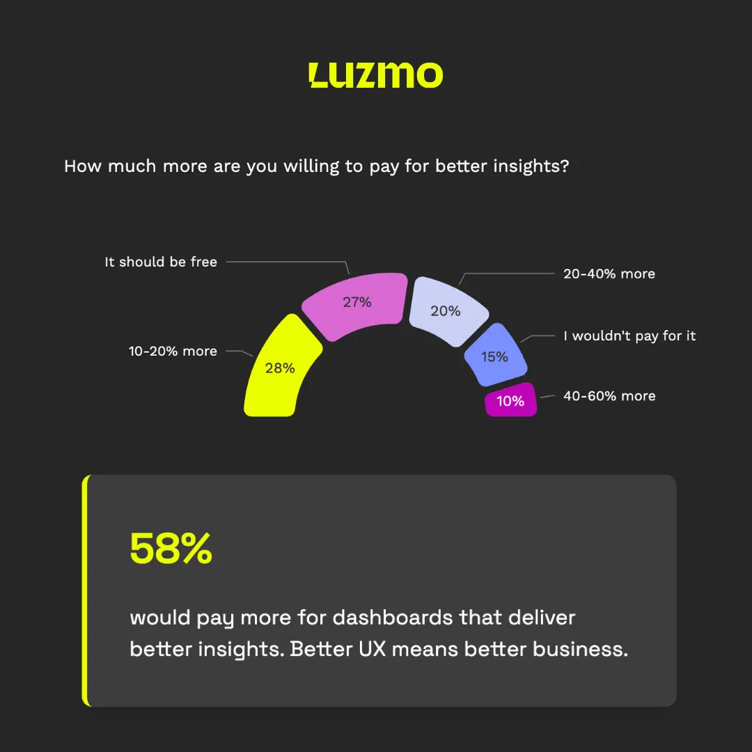
Revenue potential and willingness to pay
Dashboards aren’t just a product feature—they can be a revenue opportunity. These stats show that users value insights enough to pay for a better experience.
- Revenue potential: 58% of SaaS users would pay more for decision-enabling dashboards. (Source)
- Premium upsell: 10% of users would pay as much as 40-60% more on their license to get better insights from their software tools. (Source)
- Commodity: As much as 27% say dashboards should be available at no additional cost in their software tools, they expect it as basic value. (Source)
Takeaway: Smart, insight-driven dashboards aren’t just sticky. They can become a monetizable feature.
The impact of AI on dashboards
AI is changing how users interact with data. These stats show growing interest in analytics that doesn’t just display data, but helps explain it too.
- Efficiency gains: 78% of users say AI has transformed their work for the better. (Source)
- Insight sourcing: 76% of SaaS leaders believe AI-powered analytics could help uncover hidden value and insights they’d otherwise miss. (Source)
- Competitive edge: 70% of SaaS leaders believe AI-driven dashboards and insights will become a key differentiator for their software product. (Source)
- Smarter interface: 31% of users want dashboards that surface insights automatically using AI, making it one of the top feature requests. (Source)
Takeaway: The future of dashboards isn’t static—it’s smart, conversational, and deeply integrated into user workflows.
Final Thoughts
Dashboards aren’t dead. They are, however, overdue for reinvention.
The data shows that while dashboards are widely adopted, they’re not always helpful, actionable, or easy to use. SaaS teams are spending too long building dashboards users don’t love. Meanwhile, users are bouncing to spreadsheets and asking for more intelligent, interactive ways to explore data.
The good news? SaaS teams that rethink the dashboard experience with interactivity, personalization, and AI have a real opportunity to deliver value users will pay for.
Want to build dashboards your users love, with half the effort? At Luzmo, we help SaaS companies embed fast, beautiful, and AI-enhanced dashboards that drive decisions. Without 6-month dev cycles.
👉Let our experts show you what your next-gen dashboard experience could look like.
Written by

Ship the future of your data
Let us show you what Luzmo can do for your product.

Leave your e-mail and one of our analytics experts will reach out to you