Grouped Bar Chart: Definition, Examples and Best Use Cases
A basic bar chart is one of the most popular chart types for showing a distribution of data points. You’ve seen them used everywhere, from your Microsoft Excel to data visualization tools such as Power BI or Tableau. A grouped bar chart is the upgraded version of this chart type.
Today, we’ll show you when to use bar charts, and what to avoid.
What is a grouped bar chart?
A grouped bar chart (also called a clustered bar chart or a grouped bar graph) is a visualization type that shows data using rectangular bars for multiple categorical variables instead of one. Multiple bars are grouped based on a particular category or group.
Every group represents a set of related data points, and within each group, bars are color-coded or shaded differently to designate a subgroup. The height or length of each bar represents its numeric value.
If you’re building analytics into a product, modern embedded analytics platforms make it easy to create and analyze grouped bar charts without heavy development work. With Luzmo Studio, teams can design and configure grouped bar charts visually and embed them directly into their applications. Luzmo IQ can then help surface trends or patterns in the data automatically, while Luzmo AI enables users to ask questions about their charts and generate insights instantly, making it easier for end users to understand and explore grouped comparisons.
Best use cases for a grouped bar chart
Grouped bar charts are best for situations where you need to compare multiple categories and subcategories side by side. Here are some specific examples you can use to get inspired.
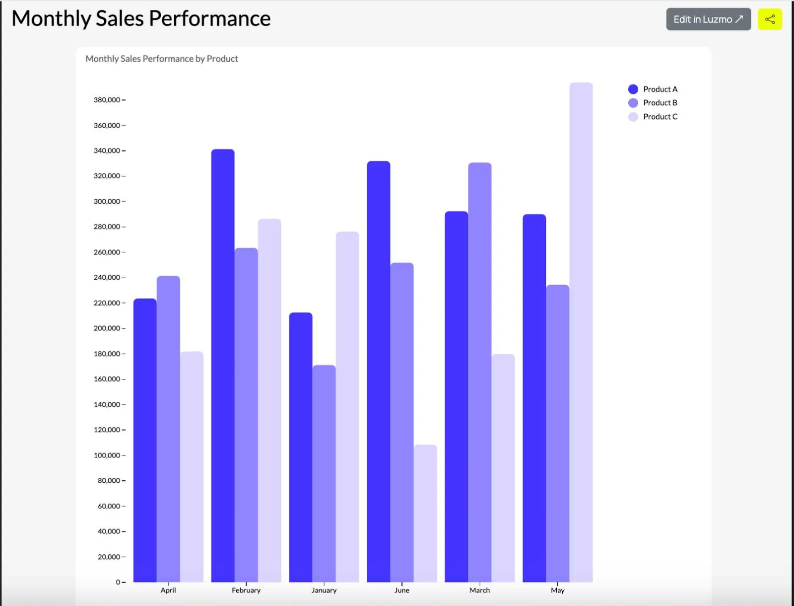
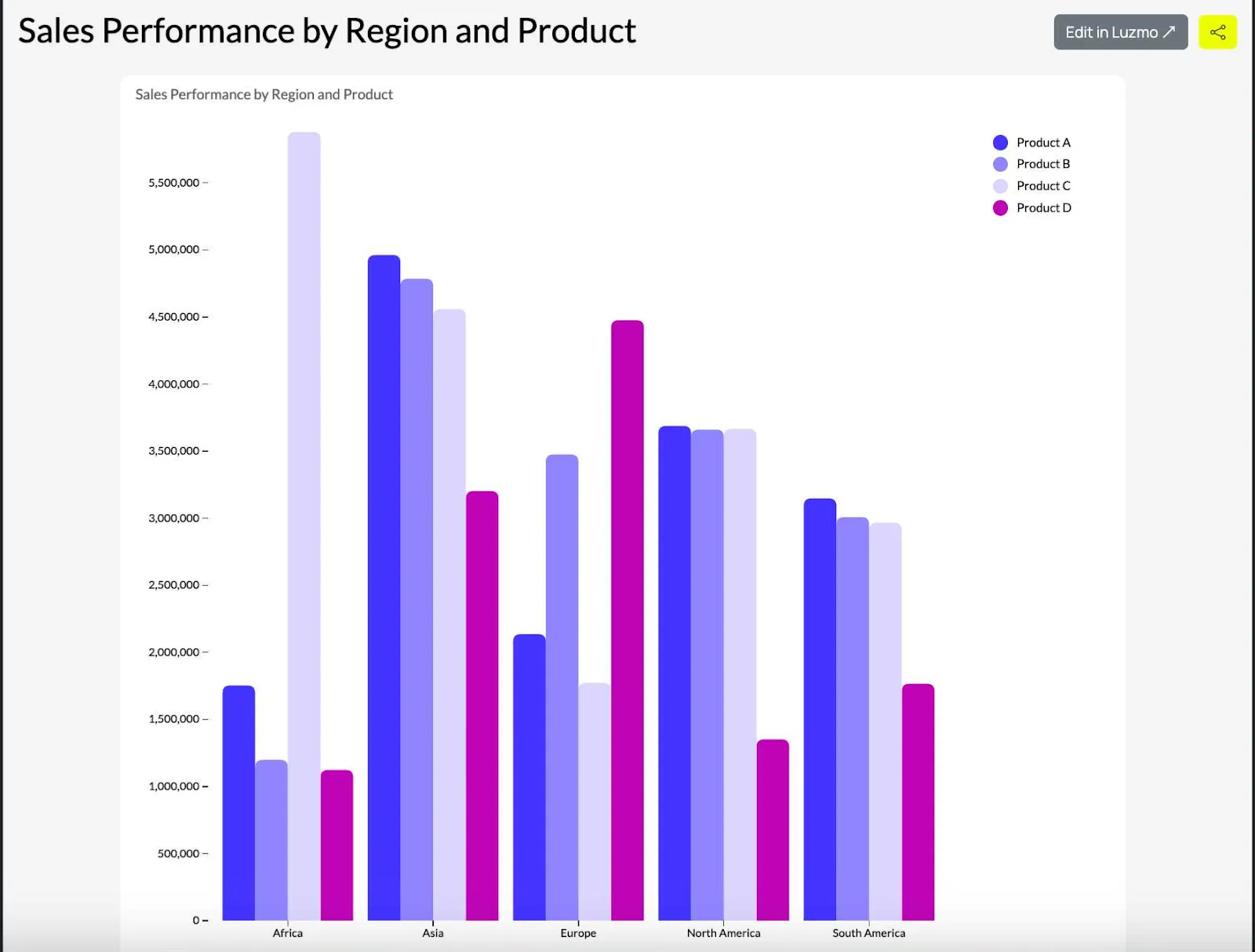
Comparing subcategories within categories
Comparing sales performance of different products (subcategories) across different regions (categories). Each group is a different region, while each bar in a group denotes one product and its sales performance.
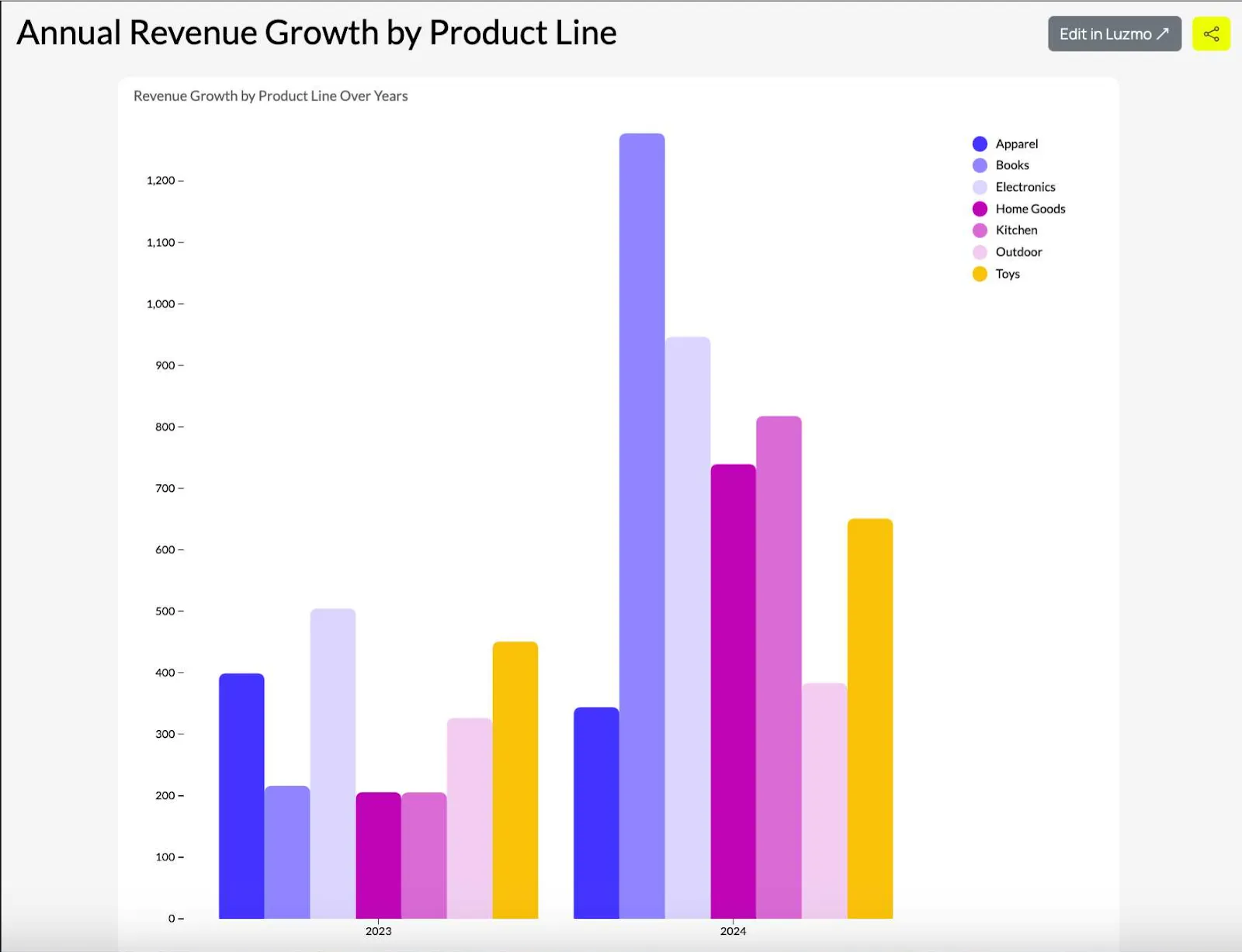
Tracking changes over time for multiple categories
Showing the annual growth of revenue for different product lines (subcategories) over several years (categories). Each group in a time series is a year, and bars are the different product lines.
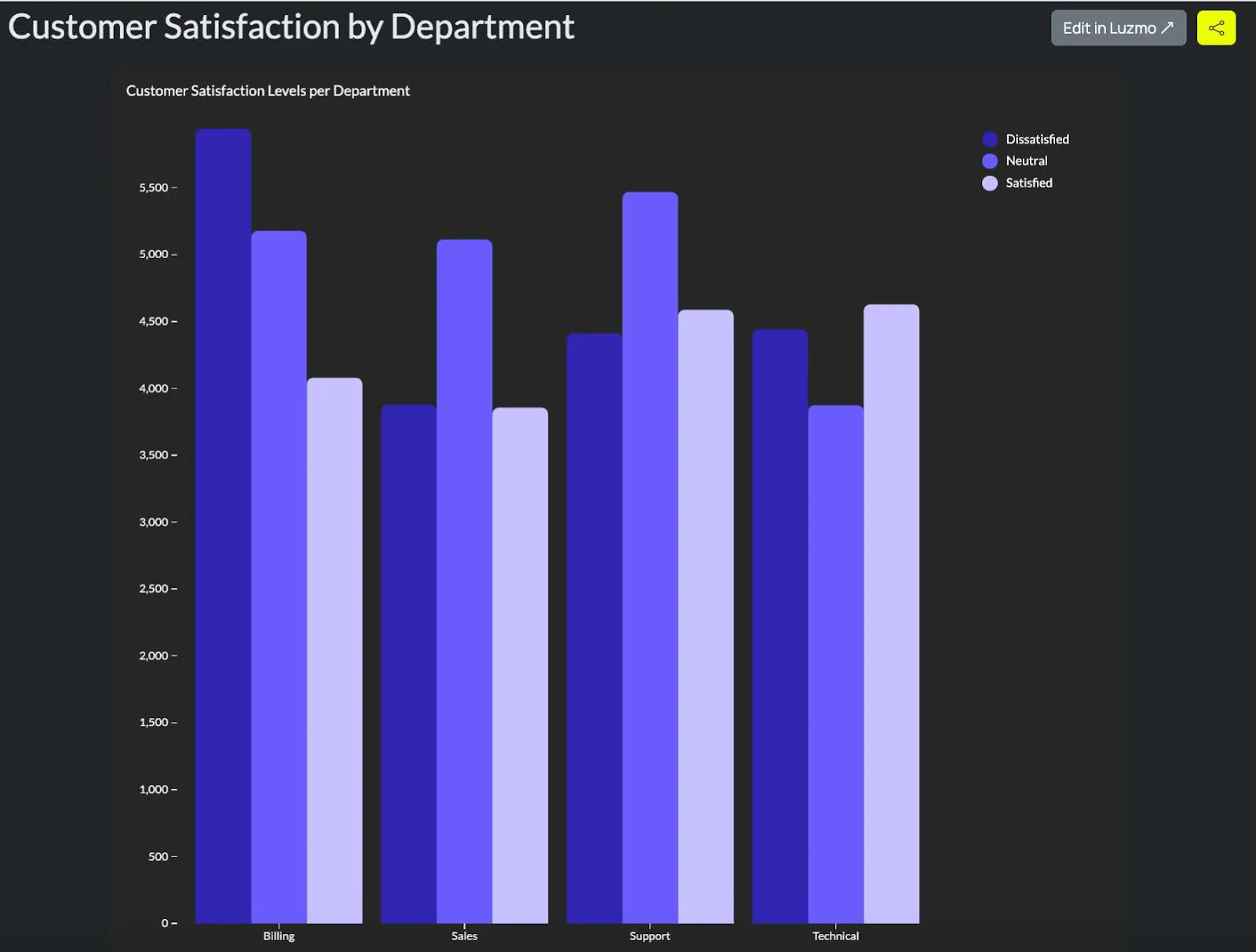
Showing survey or feedback results
Showing customer satisfaction levels (e.g. satisfied, neutral, dissatisfied) across different service departments (categories). This chart shows how each department performs in terms of customer satisfaction.
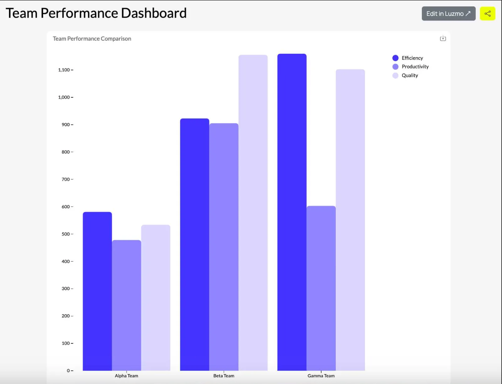
Comparing performance metrics across departments or teams
Showing team performance based on different metrics such as productivity or efficiency (subcategories) compared across different teams (categories).
grouped bar chart
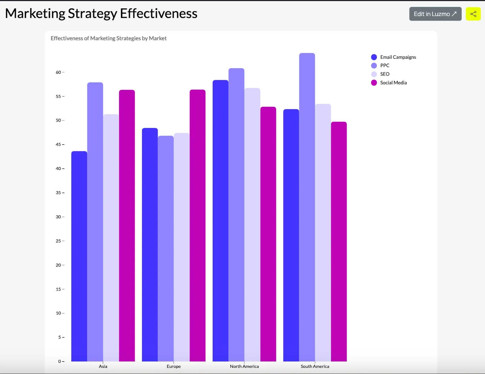
Comparing different methods or techniques across several conditions
Displaying the effectiveness of different marketing strategies (subcategories) applied to different markets (categories).
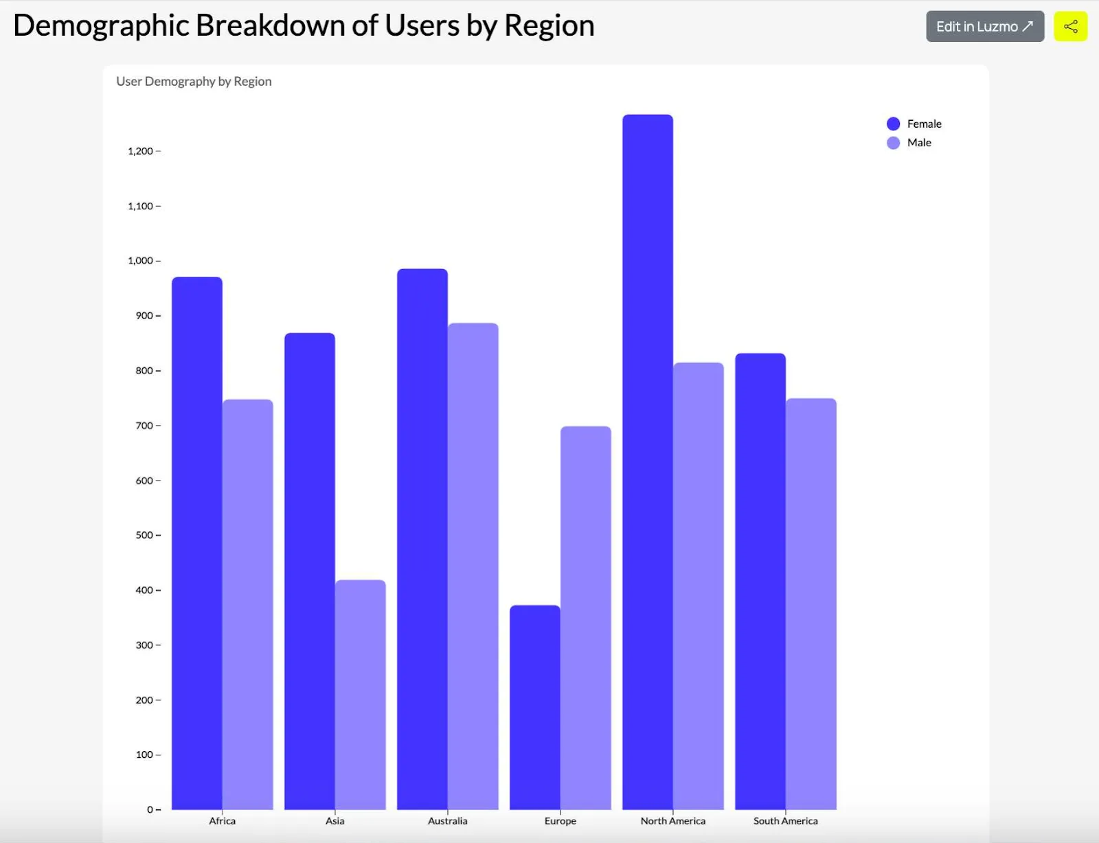
Showing demographic comparisons
Showing a demographic breakdown (subcategories male and female) of customers or users across different regions or countries (categories).
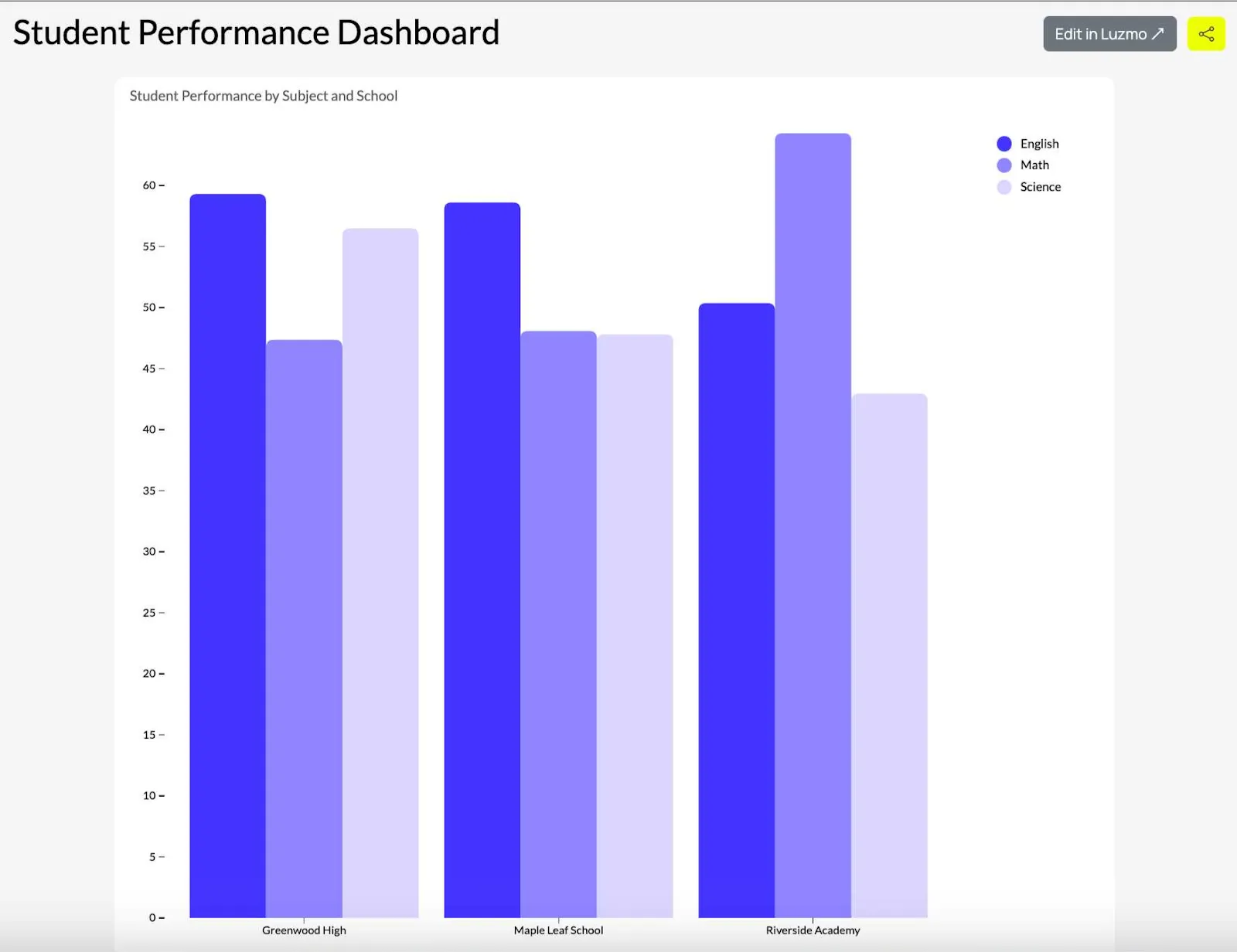
Comparing test results across conditions
Showing student performance (subcategories: math, English, science, etc.) across different schools or grades (categories).
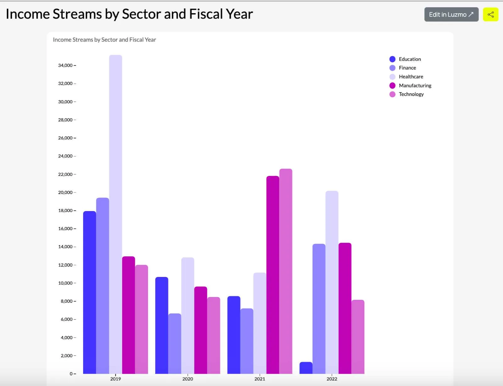
Financial data analysis
Comparing income streams from different sectors (subcategories) for different fiscal years (categories).
When not to use grouped bar charts
Like any other visualization type, grouped bar charts have their limitations. Here are the situations when you should avoid them.
With complex relationships
If you want to show complex correlations or hierarchical data, grouped bar charts won’t work as well. Instead, use a heatmap or a stacked bar chart.
When you have too many groups or bars
With too many categories or bars, seeing the individual values and metrics can be difficult. Instead, use a stacked bar chart or a dot plot.
When showing continuous data
If your dataset shows data in a continuous line, line charts or scatter plots are better for showing trends or relationships over time.
When you have too many data points per group
With too many bars in each group, it becomes difficult to distinguish between them, even with different bar colors. Instead, use a heatmap or a box plot.
For percentage-based comparisons
When you want to show parts of a whole in a side-by-side comparison, a pie chart or a stacked bar chart is a better choice.
Top tips for using grouped bar charts
If you want your grouped bar charts to communicate data clearly and effectively, here are some useful guidelines.
Limit the number of groups and categories
Keep the number of groups and bars for each chart to a handful. If you have too many, the chart won’t be readable.
Use contrasting colors
Each bar in a group should have different and contrasting colors. This allows the reader to differentiate between categories at a glance. Don’t worry about picking something for a color palette.
Add a clear legend
Explain to the reader what each color and bar means in a legend next to the chart. Alternatively, use a tooltip that shows once the reader hovers over the bars and numerical values.
Align axes and labels properly
Make sure that the x-axis and y-axis are aligned with the labels for groups and bars. It should be easy for the reader to follow horizontal and vertical axes.
Sort groups logically
Arrange the groups in a logical order, e.g. descending/ascending values or logical groupings. This makes it easier for the audience to compare values in similar groups.
Mind your spacing
Groups and categories should have enough space between them to avoid them from merging. The white space makes it easier to read the chart and avoids confusion.
Label your bars with values
Assign numerical values to your bars with actual data points to make the charts more readable.
Avoid having too many colors
Having too many colors in a grouped bar chart makes it difficult to read and understand. Stick to a handful of colors provided in the chart template in the visualization tool that you’re using.
Add relevant annotations
Add annotations for key data points and numeric values to draw the reader’s attention to information that they should not miss.
Use consistent bar widths
Each vertical and horizontal bar should have the same width to avoid confusing the reader.
Visualize your data with Luzmo
If you want to show dashboards in your software, there is no better choice than Luzmo. It’s not just our choice of visualization types, even though we have more than 50 you can use for different goals and data types.
Luzmo embeds directly in your product with a great API, connects to various data sources, and is easy to customize, so it looks and feels like it belongs in your tool. No Python or Javascript code required, no complex pricing and the setup takes just a few hours.
Luzmo offers transparent pricing to fit teams at any stage. The Starter plan begins at $495/month (billed annually) for teams launching their first customer-facing dashboards, with essential drag-and-drop analytics and quick-start branding. The Premium plan, our most popular option, starts at $1,995/month (billed annually) and unlocks full white-labeling, advanced analytics, and AI-assisted dashboarding for growing platforms. For larger organizations with custom deployment, security, and compliance needs, the Enterprise plan offers custom pricing with dedicated infrastructure and flexible hosting options.
Book a free demo with our team to learn more!
FAQ
All your questions answered.
What is the difference between a grouped bar chart and a stacked bar chart?
A grouped bar chart displays multiple bars side-by-side for each category, allowing you to compare subcategories directly across groups. A stacked bar chart, on the other hand, stacks subcategories on top of each other within a single bar to show how they contribute to a total. Use a grouped bar chart when you want to compare values across multiple subcategories clearly, and a stacked bar chart when you want to show how parts make up a whole.
How many categories should a grouped bar chart have?
For the best readability, grouped bar charts should generally include no more than 4–6 groups and 3–5 bars per group. Too many bars or categories make the chart difficult to read and compare. In such cases, other visualizations like heatmaps, dot plots, or stacked bar charts may work better.
What tools can you use to create grouped bar charts?
Grouped bar charts can be created using spreadsheet tools such as Excel or Google Sheets, BI tools like Power BI and Tableau, or embedded analytics platforms. If you're building analytics inside a product, embedded analytics tools like Luzmo allow you to generate grouped bar charts and other visualizations directly within your application while connecting to multiple data sources.
Written by

Ship the future of your data
Let us show you what Luzmo can do for your product.

Leave your e-mail and one of our analytics experts will reach out to you