Which Data Set is Best Shown as a Dashboard?
Dashboards have become the heartbeat of modern analytics. They turn raw data into a living view of performance. They help teams monitor trends, measure progress, and communicate insights. But one question never fades: which data truly belongs on a dashboard?
Below, we answer 15 questions that help you decide what’s dashboard-worthy, how to design it, and how dashboards shape smarter data analysis.
#1 What type of data is best for a dashboard?
Dashboards thrive on data that changes often and carries measurable meaning. That means sales revenue, customer signups, churn rates, marketing campaign performance, or operational efficiency metrics. Static or rarely changing data doesn’t benefit from real-time monitoring — it’s better suited for reports.
The best dashboards focus on metrics that tell an ongoing story. For instance, a SaaS company might visualize monthly recurring revenue, churn, and new trials, while an e-commerce team might display website traffic and sales conversions. Dashboards transform these live data streams into visual indicators that guide action and help teams react quickly.
#2 How does data visualization affect understanding?
Data visualization converts raw numbers into patterns people can interpret instantly. Charts and graphs simplify complex analysis into visuals that make sense at a glance. A dashboard built around strong design helps users identify outliers, track trends, and connect cause and effect faster than scanning spreadsheets.
When metrics are visualized clearly, decision-makers can move forward. For example, an upward line trend on one dashboard shows campaign growth instantly, while a red downward arrow signals something’s wrong — all without needing a deep data science background.
That’s the real power of visualization: clarity through simplicity.
If you want to get inspired, check out our article: 34 Top Chart Types for Data Visualization →
#3 Which industries benefit most from dashboards?
Almost every industry relies on dashboards today, but some sectors have turned them into critical infrastructure.
- Sales teams use dashboards to track quotas, revenue growth, and lead progress.
- Marketing teams measure campaign ROI, social engagement, and ad performance.
- Healthcare professionals monitor patient flow, occupancy, and health outcomes in real time.
- Manufacturing uses dashboards to control production speed, downtime, and quality rates.
Each industry has unique key performance indicators, but the goal remains the same — to gain visibility, track performance, and support decisions that improve business outcomes.
Dashboards provide that unified view across diverse data sets.
#4 What data should not go on a dashboard?
Not every piece of information deserves dashboard real estate. Unstructured data or overly granular records can overwhelm users. For example, individual customer transactions are better handled through reports or databases, not displayed as thousands of data points on a single screen.
A dashboard’s role is to summarize. So, think of it as an executive summary, not an audit trail. Focus on key metrics that guide action rather than dump unprocessed data that slows down the experience and confuses your audience.
#5 What makes a good business dashboard?
A good business dashboard balances focus, functionality, and design. It defines a clear purpose — like tracking revenue, effectiveness, or costs — and aligns every metric with that purpose.
Thus, use meaningful KPIs that reflect progress toward real goals. Limit each dashboard to a handful of metrics that matter most, and avoid cramming everything onto one page. Add comparison lines, targets, or benchmarks so users know what success looks like.
When stakeholders can look at the dashboard and instantly interpret performance, you’ve done it right.
#6 What are examples of data sets that fit dashboards?
Data sets that work well in dashboards share three traits: they change frequently, they measure performance, and they lead to action.
Some examples include:
- Monthly or weekly sales performance numbers to track targets.
- Website analytics and conversion rates to evaluate marketing success.
- Customer feedback and sentiment scores to improve satisfaction.
- Operational metrics, like order fulfillment speed or cost per item.
- Project timelines, milestones, and blockers for team progress.
These data sets translate naturally into custom visualizations that tell stories over time and help teams take corrective steps before issues grow.
#7 How do dashboards help teams?
Dashboards bring alignment and transparency across departments. Instead of buried spreadsheets or emails, everyone from analysts to executives can access one shared view of performance. This shared visibility helps teams stay focused and address issues before they escalate.
For developers, dashboards also serve as monitoring tools — tracking system performance, app uptime, and user activity. They can highlight success and pinpoint weak spots.
See? The real value lies not just in the data itself, but in how dashboards turn it into a collaborative loop that keeps everyone accountable.
#8 What kind of visualizations work best?
Choosing the right visualization defines how effectively you present data. Each chart type serves a specific purpose:
- Pie charts show distribution and proportions.
- Line charts capture movement over time and highlight trends.
- Bar charts compare categories side-by-side for quick insights.
- Maps visualize geographic spread, such as regional sales or users.
Interactive dashboards also let users hover, filter, or zoom into details, creating a personalized experience. Always match the visualization to your question — not the other way around. A cluttered mix of visuals can confuse more than clarify.
#9 Should dashboards replace reports?
Dashboards and reports serve different needs. Reports provide detailed analysis, context, and narrative. Dashboards offer real-time, high-level views meant for quick decision-making. A report might explain why sales dropped, while a dashboard only shows that sales dropped.
In practice, both tools complement each other. A good workflow combines a live dashboard for daily monitoring with a monthly or quarterly report for deeper storytelling.
Therefore, remember: Dashboards are for speed; reports are for depth.
#10 How should users interact with dashboards?
Dashboards work best when they’re interactive and customizable. Users should be able to filter data by timeframe, product line, or geography. A sales manager might zoom in on one region; a marketer might track a specific campaign.
Interactivity turns dashboards into flexible analysis tools that serve multiple audiences. A static dashboard may look pretty but limits discovery. Interactive dashboards give users control to focus on what’s relevant. They also encourage curiosity and deeper engagement with the data.
#11 What practices help build effective dashboards?
Building great dashboards takes more than design skills. Follow these practical steps:
- Start with a goal. Define what decisions the dashboard should support.
- Select key metrics. Avoid adding every possible measure.
- Keep it simple. One clear idea per page for better focus.
- Use color intentionally. Highlight trends or alerts, not decoration.
- Test with users. Make sure it’s readable and intuitive.
Dashboards are communication tools first, analytics tools second. When they tell a clear, actionable story, teams naturally rely on them more.
#12 How can dashboards improve performance?
Dashboards give teams the ability to monitor key metrics in real time. For instance, a dip in conversion rates can be spotted and corrected before it affects quarterly performance. Over time, these small, timely corrections compound into major performance improvements.
They also bring accountability. When everyone can see progress toward goals, motivation rises. And visible results push the team forward.
The outcome? Faster feedback, better planning, and measurable growth.
#13 What are the benefits of dashboards for stakeholders?
For stakeholders, dashboards translate complex business data into accessible insights. Executives can monitor company health at a glance, marketing teams can prove ROI, and product leaders can track usage or churn trends.
Dashboards also strengthen transparency and trust. When information is accessible to everyone — not just analysts — teams make informed decisions faster. Instead of long meetings filled with conflicting reports, everyone looks at the same metrics and works toward the same goals.
#14 What challenges appear in dashboard projects?
Dashboards face real-world challenges, too. We can point out:
- Data security and access control - as always, sensitive information needs protection.
- Inconsistent data sources - mismatched inputs cause unreliable insights.
- Poor goal definition - dashboards become cluttered without a clear focus.
- Overload of metrics - too many charts can distract users from what matters.
Overcoming these challenges starts with alignment — defining clear ownership, clean data pipelines, and transparent processes. Without that, dashboards risk becoming pretty but pointless.
#15 What’s the takeaway for anyone planning a dashboard?
A dashboard is not a place to dump data. It’s a narrative tool that transforms information from different sources into understanding. Every chart, metric, and color choice should serve a clear purpose — helping someone make a faster or smarter decision.
Think of your dashboard as a living reflection of your business priorities. When goals shift, the data should shift too. That’s how dashboards stay relevant.
When done right, dashboards become systems that reflect how your organization grows. They turn information into action and numbers into stories worth reading.
How Luzmo turns any data set into a powerful dashboard
Once you know what data belongs on a dashboard, the next question is how to bring it to life.
That’s exactly what Luzmo does — it bridges the gap between raw data and engaging, interactive data dashboards your users can actually act on.
How? Well, Luzmo has a lot to offer.
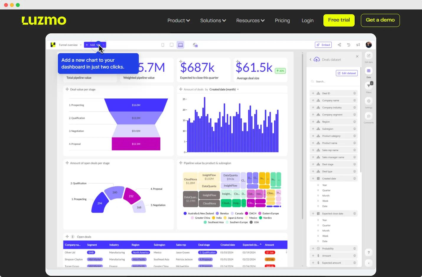
Luzmo Studio is the starting point.
It’s built for speed and simplicity, letting you create branded, interactive dashboards with drag-and-drop tools. You can embed them directly into your app, give users self-service analytics, and localize data views by language, currency, or timezone. It’s secure, scalable, and fast — no need to worry about backend performance or complex data pipelines.
For teams that need deeper control, Luzmo Flex extends that power to developers.
It’s an SDK that blends code-first flexibility with Luzmo’s visualization engine. You can build custom analytics experiences, connect your own components, and scale to millions of users — all while Luzmo handles data queries, caching, and access control in the background.
And if you want to make your analytics smarter, Luzmo IQ adds AI-powered insights on top.
It lets users ask questions in natural language and get accurate, visual answers. Whether you embed a chatbot, an executive summary, or intelligent search inside your app, IQ turns every user into an analyst without adding complexity.
Experience how data feels when it’s done right: Open the demo app →
Bring your data to life with Luzmo
Your question about which data set is best shown as a dashboard is a really relevant one. After all, a well-built dashboard starts with clarity. It should help you move forward and display only that information, which will guide your decisions.
And when dashboards focus on what really matters, they stop being decoration and start becoming direction.
That’s the difference Luzmo helps you achieve. Instead of endless reports and static charts, you get living dashboards that show what’s happening right now. You can track progress, spot trends, and share insights instantly. Everyone sees the same picture — no digging through spreadsheets or waiting for updates.
Ready to turn your data into insight that drives growth? Try Luzmo for free to see how clear, actionable dashboards can transform the way you work.
Written by

Ship the future of your data
Let us show you what Luzmo can do for your product.

Leave your e-mail and one of our analytics experts will reach out to you