How to Build Your Own Custom Chart in Luzmo
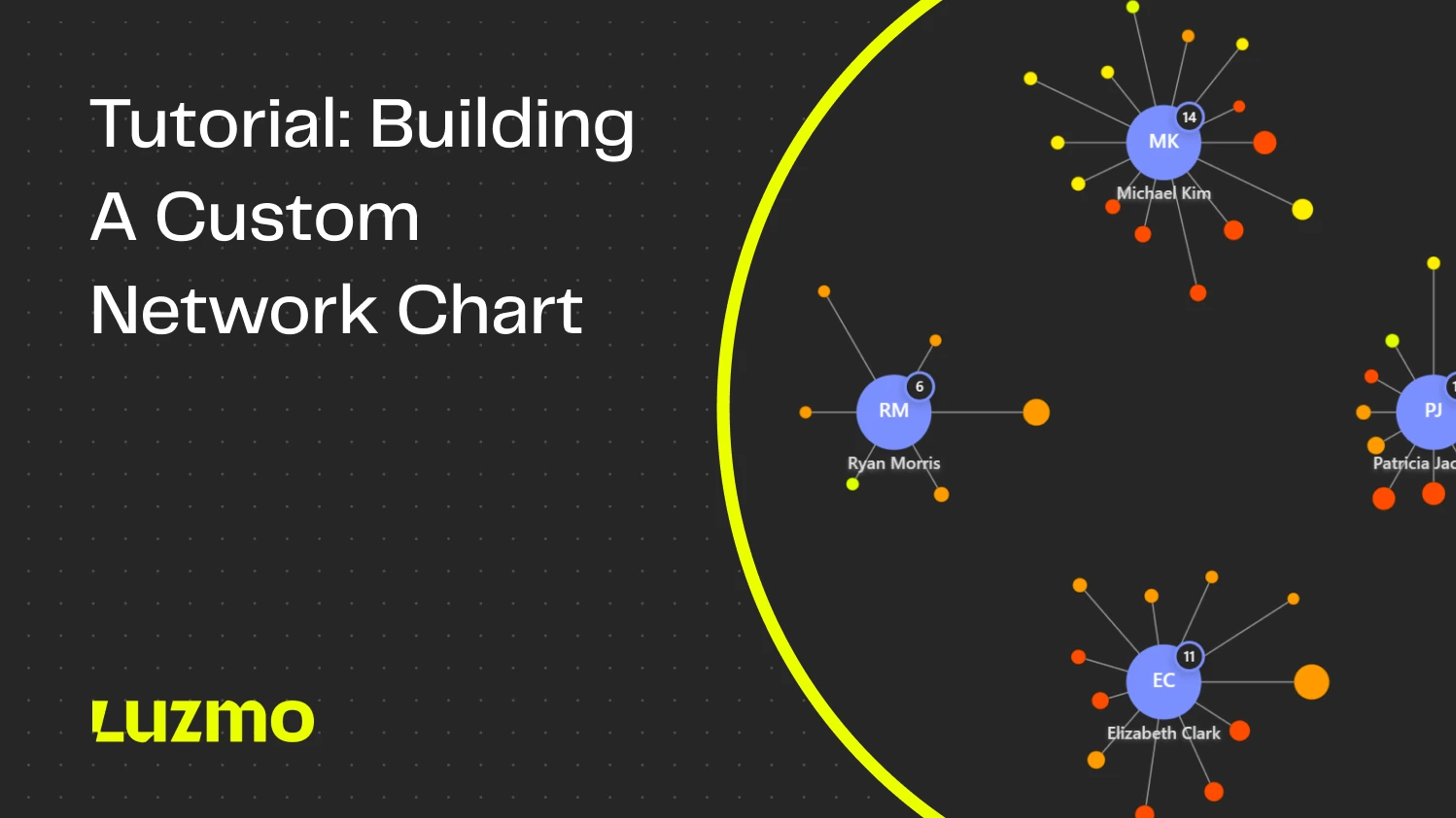
Imagine you’re building a CRM. You’re trying to show users how their sales reps are connected to open deals across regions. A simple bar chart won’t tell you enough, and a table isn't visual enough to see the bigger picture. So you’ve got a brilliant idea for a chart that would make it all clear: a network graph linking reps and deals.
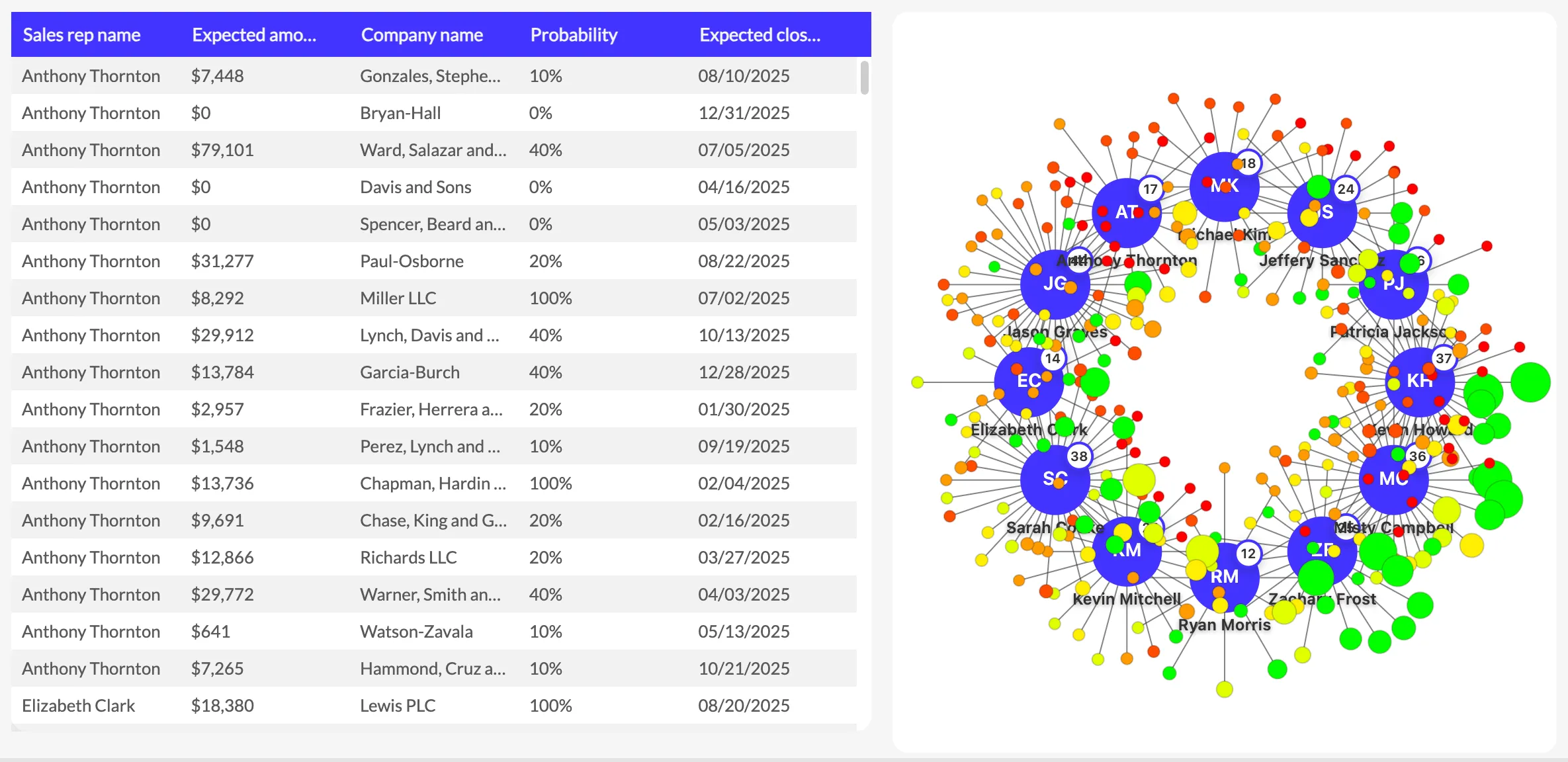
Sales data visualized in a table vs a network chart
But there’s one big problem. Your current chart library or embedded BI tool doesn’t support it. You’re boxed in. What now?
Sure, you could build it as a stand-alone item. But do you really want to slap a chart on top, and lose out on all of the good stuff that makes it feel part of a whole? No connection to filters, no interactive links between charts, no native theming, no smooth UX?
Luckily, you don’t have to settle. Blending a custom chart with other parts of your app is no longer like stitching a patch onto a tailored suit. You can have it both ways: the unique visualization you want and the native experience your users expect.
In this tutorial, we’ll take you through all the steps to build a custom chart in Luzmo: from conception to deployment in your app.
What Are Custom Charts in Luzmo?
Custom charts in Luzmo are your gateway to true flexibility. You don’t need to wait for new charts to appear on our roadmap, or submit feature requests for an obscure chart type that no one else than your organization might find useful. You can create your own chart type instead!
With custom charts, you write the code for any visualization, push it to Luzmo, and use it in your dashboards just like any of our built-in charts.
But the true magic of custom charts? Luzmo handles all the heavy lifting: data querying, filtering, theming, cross-chart interactivity. You focus purely on how your visualization looks.
What We’re Building Today
In this tutorial, you’ll build a network chart:
- 👉 Each sales rep is a node in the network.
- 👉 Open deals are smaller nodes connected to their assigned rep.
- 👉 The bigger the node, the higher the value of the deal.
- 👉 The color of the node reflects probability of winning.
Here's a preview of the end-result:
We’ll start from a blank slate and end with a drag-and-drop chart, ready to use in Luzmo. You can use the custom charts builder repo on GitHub to get started quickly!
If you’d rather follow along with a guided video tutorial, check out the recording of the live coding session with our Product Manager, Yannick, below.
He’ll walk you through 4 simple steps:

- Set up the custom chart builder
- Define the data slots for your chart
- Write the visualization code
- Upload the chart to Luzmo and use it on a dashboard
What You Need Before Starting
Before you get started, make sure you have the following things at hand so you can follow all the steps:
- Access to Luzmo (you can grab a free trial here)
- Your own dataset (e.g. CRM deals with sales reps, deal amounts, probabilities) or use our sample dataset
- IDE (we used Visual Studio Code)
- Node.js + npm installed
- Luzmo’s custom chart builder on GitHub
- Optional: AI coding assistant like Cursor or Claude
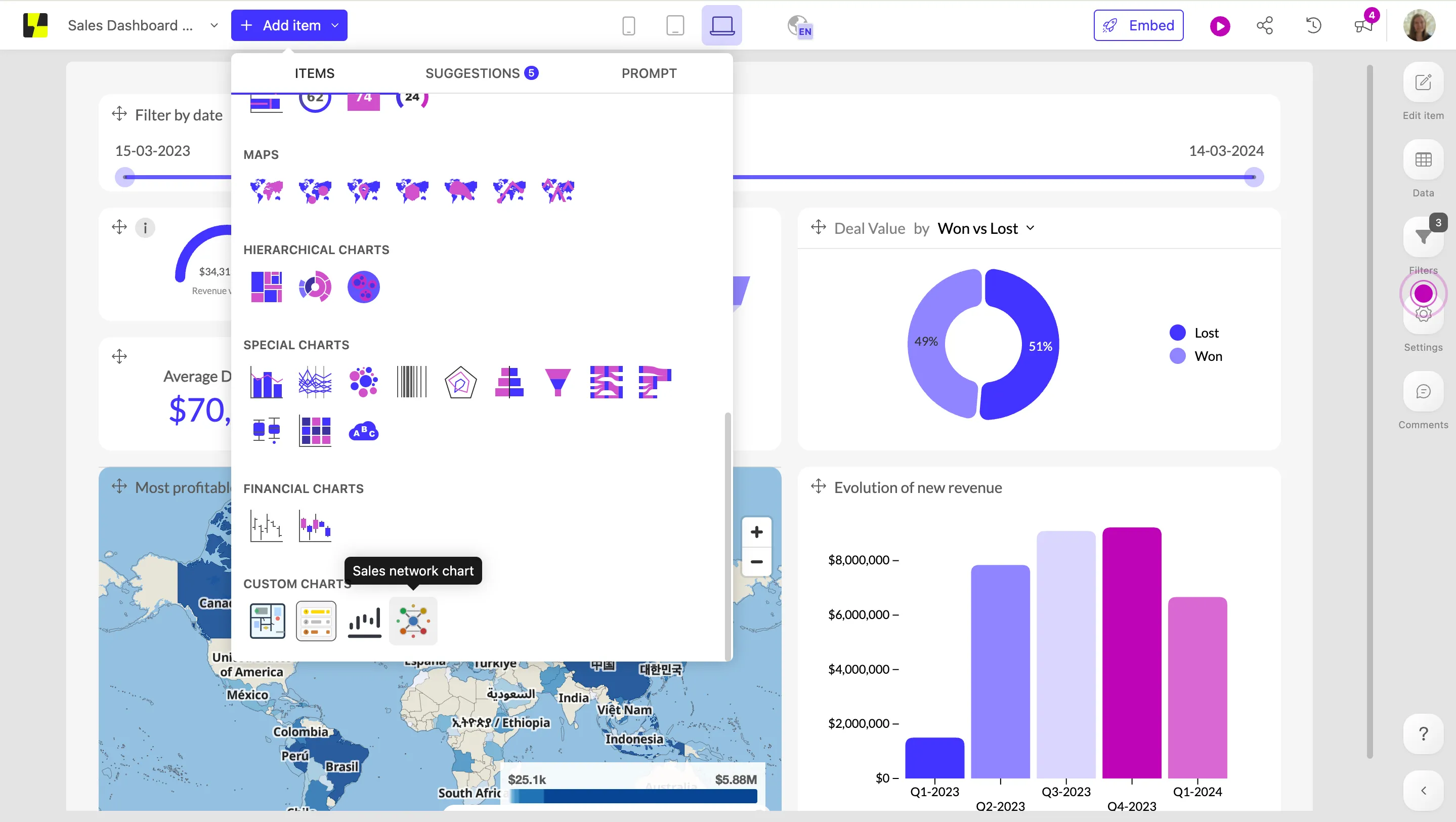
Step 1: Set up the custom chart builder
To get started quickly, we created a GitHub repo with a complete workflow to develop custom visualizations for Luzmo. Start by cloning the repo:
Now install the dependencies and start the builder:
Log in with your Luzmo account (or create one if you haven’t done so yet) to connect your data. We used a sample dataset with sales deals, which you can grab here if you want to build on top of it.
If you prefer using your own sales data, you can:
- use one of our database connectors to connect your own CRM data
- export a small sample from your CRM and upload it as a simple CSV file
Now that we have the workflow and the data set up, we can get to work.
Step 2: Define your chart slots
Every Luzmo chart works with slots, the place where you feed data to your charts. This is where you define which data columns you can add onto your chart from a dataset.
As a simple example, let’s say you want to create a bar chart showing closed revenue per sales rep:
- Closed revenue = your value, aka the metric you’re visualizing
- Sales rep = your category, aka the variable you’re analyzing the metric against
For a bar chart, the slots are pretty simple, but our network chart is a little more complex. We want to visualize all of the following information:
- Sales rep name
- Company name
- Deal amount
- Deal probability
- Expected close date
To define all of these slots, you will need to edit the manifest.json file. In this part of the README, you’ll find a lot of helpful information on how to define those custom slots. Or alternatively, you can feed the README to an AI coding assistant to speed up the process, like we did.
We used the following prompt in Cursor:
I want to create a network graph that visualizes sales reps and their deals.
I need the following data:
- Sales rep name
- Company name
- Deal amount
- Deal probability
- Expected close dateUpdate the manifest.json to contain these 5 slots. Refer to the README.md and the slotschema.ts if needed.
💡The file slotschema.ts is a validation file that makes sure your slots are configured correctly and will flag any inconsistencies.
Here's the code it generated for our 5 new slots.
Now that we have our slots defined, creating a chart will be easy once we have built the front-end visualization. As a user, all you will need to do is drag the right data onto the slot. Luzmo takes care of all the heavy lifting that happens behind the scenes: querying the data, rendering it in the chart, and making sure you can only drag the right type of data onto the chart.
Step 3: Write your visualization code
To build the visualization, we will need to implement the render methods in chart.ts. Similarly, we will use Cursor to guide us step by step.
You can try to build the entire chart with one prompt, but we recommend keeping the scope small. For better results, we’re going to build it part by part, so you can iterate as much as needed for each component of the visualization.
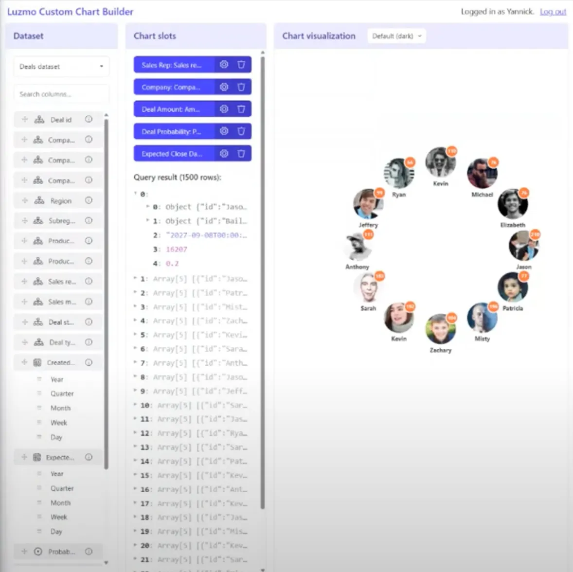
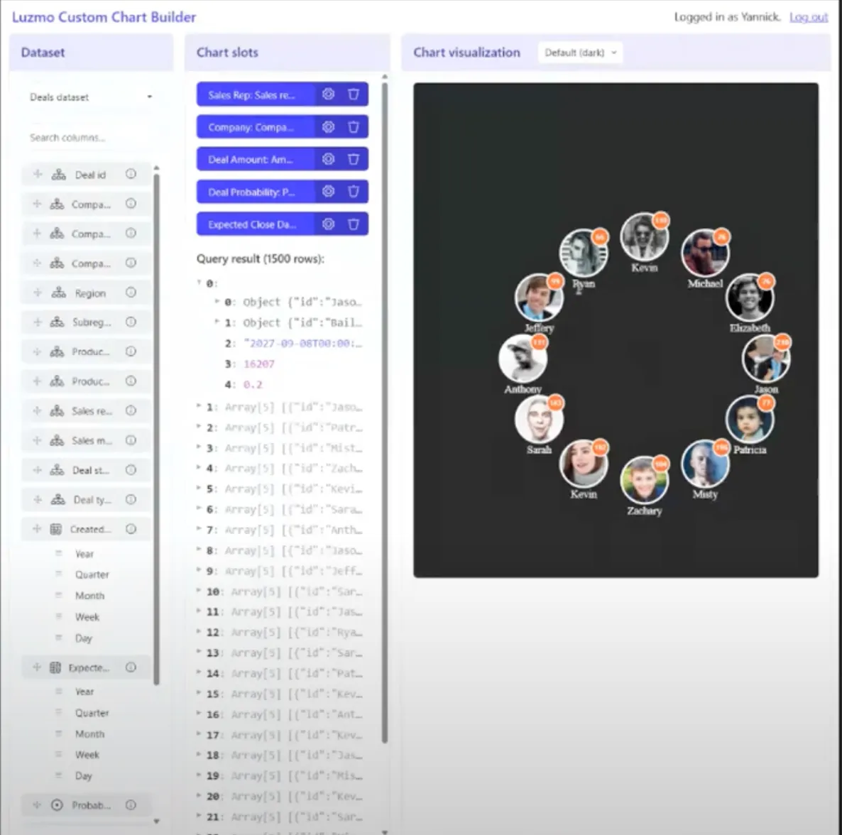
First, we want to have a bubble to represent each sales rep in our dataset, showing a headshot of said rep. We give Cursor some input on the visual concept with the following prompt:
Implement the @render method for my network chart. Start with drawing a circle per sales rep. Position them in a circular pattern in the chart. Use an image of the respective sales rep inside the circle. Use a placeholder website: pravatar.cc.
💡Pro tip: You can easily render images in custom charts! All you need is a column in your dataset that contains the links to the images. Then, it basically works the same as any other data type. Our current dataset doesn’t contain images, so we used placeholder images from a fake avatar generator.
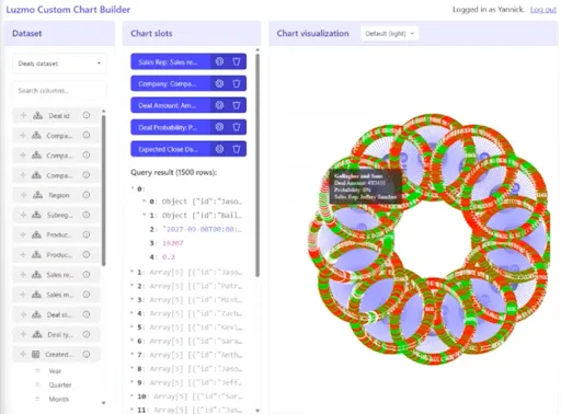
Here’s the result, which looks pretty good! We got what we needed, and it added a marker with the number of deals for each rep as a nice bonus.
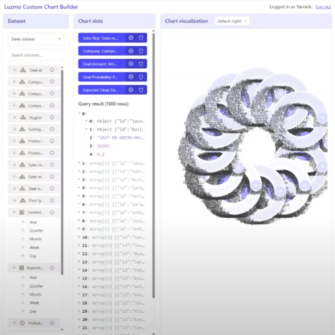
Now that we have our sales reps, we want to add a circle for each deal associated with each rep. The bubble should be bigger or smaller depending on the size of the deal. Let’s go back into Cursor with the following prompt:
For each sales rep, add their deals as a circle close to them, positioned around them in a circular pattern. Draw a connecting line between the sales rep and the deal.
Here’s the result… It looks like we’ll need some tweaking this time!
Sometimes tweaks are easy, but others will require more effort. For example, the black dots are just text labels that we can clean up by removing a few lines of code.
For other changes, we’ll iterate on the chart with a second prompt to get closer to what we want. We are combining a few steps here:
- Changing the styling of the chart we generated with the first prompt
- Adding a color to the circles by deal probability, like we set out in our requirements
Please adjust the styling of the circles as follows. Keep them small enough. Don't add a border. Color the circles by deal probability from red (0 probability) to green (1 probability). Keep in mind that the probability is always between 0 and 1.
Here’s what we ended up with:
We did a few more iterations to get it pixel-perfect, but you probably get the idea by now. So instead of taking you through more prompts, let’s have a look at our resulting network chart:
We've added some extra filters so you can play around with the chart and see it live in action! If you want to view the full code, check out the project on GitHub.
Bonus: add theming support
Now we’ve built the visualization, but what if you want to further customize it? Let’s say your network chart gets embedded in multiple places in your platform, and you want it to fit in seamlessly, everywhere it shows up.
Supporting multiple themes is already baked into Luzmo, so if you want this functionality added to your custom chart, it’s done in just a few steps! We’ll show an example of adding themes, but you could just as well add localization, support for multiple devices,…
In your chart code, look for ‘options’ and find the ‘theme’ property. With this property, you can dynamically style different parts of your charts: the font, background color, main color, border rounding,...
We will be adding two styling options, light and dark mode, by feeding this back into Cursor:
Use the options.theme object to style my chart. Use the ThemeConfig type from @theme.d.ts
Style the background of the chart using the itemsBackground property.
Style the text of the sales rep according to the background of the chart: if it’s dark mode, the text label should be white and vice versa.
Et voilà, you can switch between light and dark mode:
Step 4: Upload the chart to Luzmo
The heavy lifting is done! Now that our visualization code is ready, we can upload it to Luzmo. Once uploaded, you and your teammates (or clients) can create hundreds of network charts just by using drag and drop.
Go to package.json and run the following command:
This step will use your code and the custom chart definitions to create a new folder "custom-chart-build-output" at the root of the project, with a ZIP file "bundle.zip". This zip file contains the finished chart, ready to be uploaded to Luzmo.
💡Tip: you can also upload a custom icon for your chart, which will show up on the dashboard editor modal for your users.
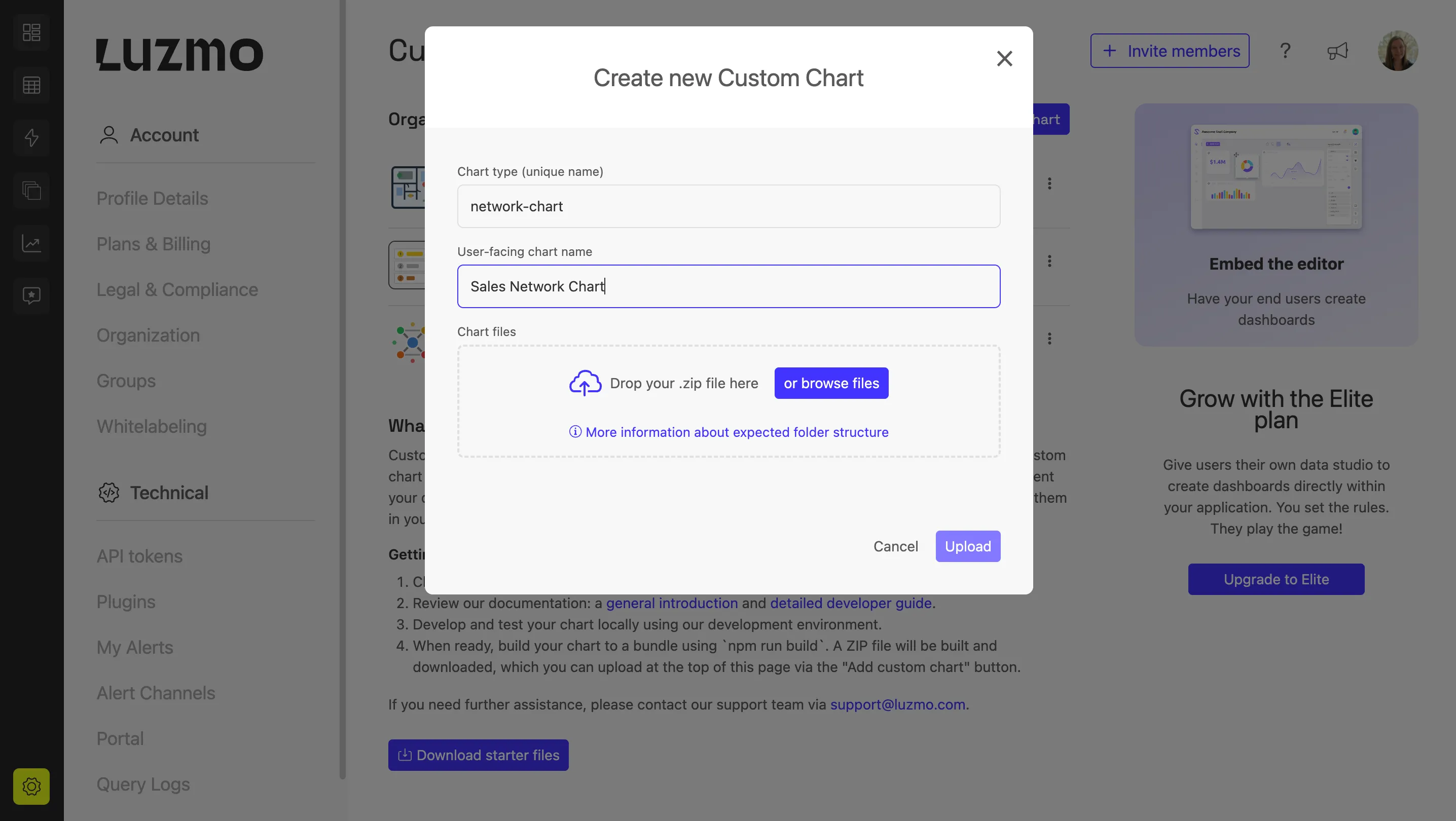
What your custom chart looks like in Luzmo
To upload your chart, go to Luzmo and browse to: Settings > Custom Charts. Click on “Create Custom Chart”.
Here, you can set a name for your chart, and add the label under which you want it to appear for your users. Upload your zip file and you’re done!
Your custom chart is now available in the dashboard editor with all interactive features. Simply drag and drop your data onto the chart and see how easy it becomes to create custom visualizations, fully interactive with other elements on your dashboard.
Build charts that fit your data, not the other way around
Honestly, your users don’t care if your dashboard has 15+ chart types. They care about seeing the right data in the right way, with the least effort possible. But most analytics tools box you into the same basic visuals: bar, line, and pie chart on repeat.
When your data doesn’t fit that box—think Sankey diagram, a funnel with custom steps, a network graph—you’re stuck. Either you say no, or you hack together a standalone chart that breaks the flow of your product.
Custom charts in Luzmo fix that. You get full control over how your data is visualized, while still enjoying all the out-of-the-box power of Luzmo: data filtering, interactivity, theming, cross-chart linking, and a slick UX. Everything in one experience without dirty workarounds.
Curious to try it out? Start a free trial, or get advice from our product experts to figure out what type of chart you need for your data.
Written by

Ship the future of your data
Let us show you what Luzmo can do for your product.

Leave your e-mail and one of our analytics experts will reach out to you