Dashboard Reporting: Examples, Types and Best Practices

We’re swamped with data in every aspect of our lives - just look at what your phone collects about how you use it every day. But in a business environment, data is much more important than knowing how much time you spend on TikTok daily.
For important and quick insights, today’s businesses use dashboards to distinguish the important information from the noise, keep their finger on their business's pulse and optimize their processes.
Today, we’re going to show you how dashboard reporting works and why you should care about it.
What is dashboard reporting?
Dashboard reporting is the process of visualizing KPIs and metrics in real-time in order to give business users key insights about their processes and operations. Unlike reports, dashboards use visual elements such as graphs, charts, and tables to help the end-user understand the data, rather than throwing numbers at them and hoping they understand something.
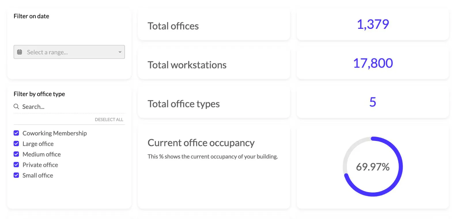
Dashboards use data visualization to turn numbers into insights that can be used to make business decisions. For example, if you have an app for workspace management such as Zapfloor, you can create a dashboard that tells your customers what space is leased, what kind of occupancy they have, unit type, and more.
Instead of staring at an Excel sheet, business users can view graphics that can guide their decision-making and help them drill down into data and explore it on their terms.
Benefits of dashboard reporting
A great dashboard can help you automate the bulk of your data processes and get insights quickly. If you’re still stuck on using spreadsheets, here are some of the major benefits of using dashboards.
Real-time data
Dashboards plug into data sources to get data in real time. If you’re looking at a dashboard on a Friday at 4 PM, you’re looking at the data from that same time period. There is no delay and you don’t have to wait for hours or weeks to get business intelligence insights.
For example, if you process lots of important data at once for your eCommerce store, you can find out which products sell the best by the hour and when you need the highest level of customer support.
Faster insights
Understanding business performance from an Excel spreadsheet is not impossible but it’s much easier to see those data points in context when they are in the shape of a graph. An Excel AI bot like FormulaBerry can bridge the gap by turning raw spreadsheet data into instant insights, making dashboard creation even more efficient for spreadsheet-heavy teams.
Especially for non-tech-savvy users, dashboards allow faster data comprehension. You don’t need to be an expert to find out which product is the most sold in a quarter or which sales rep is killing it while someone else is struggling to book calls.
Stakeholder buy-in and data democratization
Your CEO or fractional CMO won’t need a team of data analysts to understand your marketing or sales performance. You can create dashboards for different audiences:
- One for your direct manager
- One for the CMO
- One for the CEO
- One for the board of investors
All with different levels of insight. This has several benefits.
First of all, getting stakeholder buy-in becomes easier as the leadership team knows the key metrics regarding your business. They don’t need handholding and explanations - as they have a dashboard adapted to their depth of knowledge.
Second, it fosters data democratization. You no longer need a degree in data analysis to understand the metrics that drive your business. This makes the entire organization more data-driven and efficient.
Creating a data culture in your business
Thanks to data democratization, business-level insights aren’t reserved only for the special few. Everyone in your business, from individual contributors to the C-level, can dig into interactive dashboards and explore data on their own terms.
Besides enabling your team to get actionable insights, dashboards help your entire business become more dependent on (and guided by) data, rather than instinct or gut feeling.
Types of dashboards
All dashboards have the same purpose: to help unlock business insights by visualizing your key performance indicators. Having said that, there are a few main types of dashboards you should be aware of.
Analytical dashboards
These dashboards facilitate in-depth data analysis and exploration. Depending on your chosen dashboard tool, they allow users to analyze data at a granular level.
Strategic dashboards
These are the dashboards that support long-term decision-making. These are the kind of dashboards you would present to a CEO, investor boards, or valuation services companies to help them see the long-term vision for the company or product.
Operational dashboards
These dashboards give real-time insights into day-to-day business operations. Think PPC dashboards to monitor AdWords competitors, ongoing paid marketing costs or email marketing dashboards to stay on top of metrics like open rates.
Tactical dashboards
They sit somewhere in between strategic and operational dashboards. They don’t focus on real-time or long-term insights. Instead, they focus on medium-range goals and objectives and help decision-makers to find the best ways to achieve them.
How to create a business dashboard
To create business dashboards, it’s best to start off with dashboard reporting tools such as Luzmo. Dashboard software comes pre-loaded with templates and the best KPIs for different use cases. Regardless of the software you choose, this is the basic process for creating dashboards that lead to data-driven decisions.
Choose your objectives and KPIs
To make informed decisions about your business, you first need to determine the most important metrics for your business. Tools such as Luzmo come with pre-built dashboard templates that can help you choose the most important metrics based on your use case.
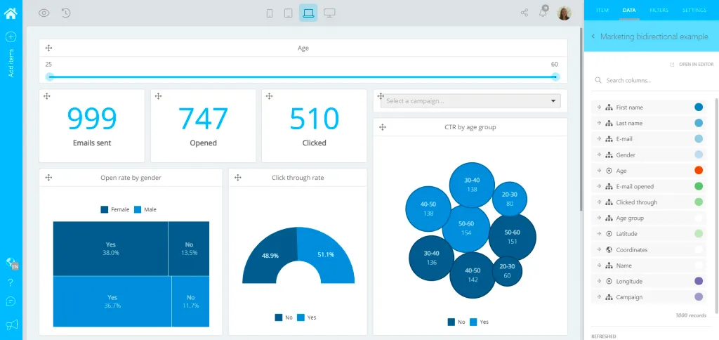
But ultimately, it’s up to you to determine the KPIs that are the foundation of your dashboard. For example, a marketing dashboard will include KPIs such as conversion rates, bounce rates, website traffic, session length and others.
Choose your dashboard software
We won’t just shove Luzmo as the best tool for creating dashboards just because it’s ours. The dashboard software should be chosen based on more than just pricing. Certain tools are better for certain types of dashboards. For example:
- Luzmo - best for in-app embedded analytics dashboards
- Looker Studio - best for web analytics dashboards (Google Analytics, Google Ads, Google Search Console)
- Agency Analytics - best for marketing dashboards (social media platforms, various marketing tools)
- Tableau - best for on-premises analytics dashboards
For example, if you run a marketing agency, you could choose Looker Studio or Agency Analytics as your ideal choices. If you want to embed a self-service analytics dashboard in your SaaS app, Luzmo is the way to go.
Collect and integrate your data
Your chosen dashboard tool should come with pre-built integrations to your most important tools. For example, Looker Studio has integrations with Google Analytics. If there are no direct integrations, the tool should offer API access so you can easily connect your data to your dashboard.
For example, you may want to get Hubspot fields for a KPI dashboard that revolves around this CRM. If you need a large number of sources, choose a tool that can streamline the integration functionality, rather than something your developers will spend months on.
Model and transform your data
Most reporting software accepts normalized, fully modeled data. This means that you can’t just connect e.g. Mailchimp data to Agency Analytics, if there is no immediate integration.
To bypass shoddy data being the basis for your dashboard, you need to model and transform your data. You can do this with one of many available ETL tools on the market today.
With the right choice of tools, you won’t need a data analytics expert to go from raw data sets to insights.
Create the dashboard visualizations
This is where visualization tools in your dashboard software do the heavy lifting. Based on the data sources you have, you should create visualizations that present this data in a way that is easy to understand.
Tools such as Luzmo and Agency Analytics have a large number of dashboard templates to choose from. On the other hand, tools like Looker Studio are lacking in this department and are far from being user-friendly.
Figuring out which dashboard type to choose and which visualizations best depict a certain type of data makes all the difference. Make sure to choose a tool that helps your team members choose the appropriate visualizations for their intended use case.
Wrapping up
Creating a reporting dashboard is not just about using fancy widgets to impress your C-level executives. When done right, dashboards can empower your entire team to make more data-driven decisions and create a data culture in your company. And if you embed this dashboard in your app, it can create additional value for your customers, reduce churn and unlock expansion revenue.
At Luzmo, our goal is not to help you create just any type of dashboard - but we excel at embedded dashboards for SaaS apps. Get in touch with us today and we’ll show you how you can add a dashboard to your app in days - not weeks or months.
Written by

Ship the future of your data
Let us show you what Luzmo can do for your product.

Leave your e-mail and one of our analytics experts will reach out to you