How to Build a KPI Dashboard in 5 Easy Steps

Could you imagine watching a basketball match without anyone keeping the score?
Sure, you could track the score yourself for a while, but after some time, the crowd would just get confused and not know what’s going on.
The same goes for your business - keeping track of your key metrics is crucial if you want to stay on top of your game and achieve success. The best way to do that? A KPI dashboard.
Today, we’re going to show you what a KPI dashboard is, why it matters and how to create one in just a few steps.
What is a KPI dashboard?
A KPI dashboard is a document containing important metrics and KPIs (key performance indicators) that are the most relevant to your business. Unlike a report (which contains historical data), a dashboard is updated in real time to show the ongoing progress of your operations.
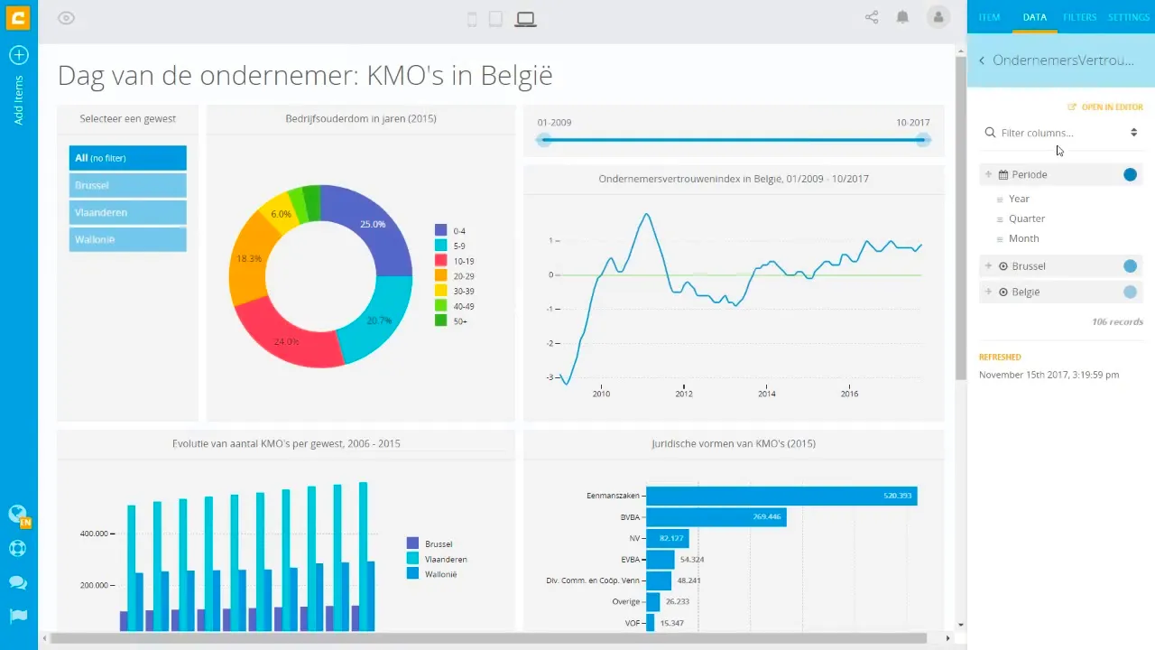
A dashboard usually contains visualizations of KPIs and data points rather than just raw data. This means tables, charts, graphs, and other ways to visualize data to track and measure your strategic goals.
There are many different types of KPI dashboards, depending on their intended use case. Examples include:
- SaaS dashboards
- Sales dashboards
- Marketing dashboards
- PPC dashboards
- SEO dashboards
- Financial dashboards
- HR dashboards
- And many others
While the uses might differ, most KPI dashboards will look similar, apart from the actual KPIs. But why would you even bother creating one and measuring your business performance in this way?
The benefits of using a KPI dashboard
No matter what type of business you run, having access to relevant data is crucial if you want to stay in the loop and make better business decisions. Here are some reasons why you should consider using a KPI dashboard in your workflow and business.
Access to data in real time
Whether you use a dashboard yourself or create one for your customers, there is immense value in having access to real-time data KPIs. For example, giving your SaaS customers an overview of their ad spend in a dashboard in your tool could help them make important decisions about their budget on the spot. Another example is Heroic Rankings, managed link building agency, that offers link building velocity reports to their clients to showcase progress in real time with the use of a backlink checker.
Data visualization
The human brain processes visuals 60,000 times faster than plain text. If you want to interpret and understand a lot of data really quickly, visualizations such as graphs are the way to go.
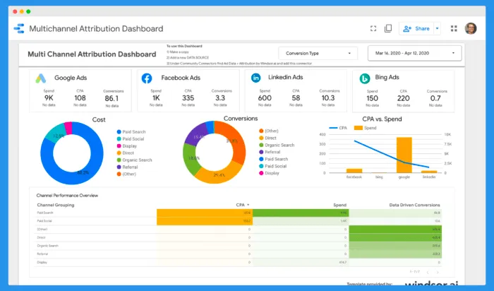
Dashboards offer a large variety of visualization types, so you can choose something that best suits your type of KPIs and your intended audience. For example, a sales team can benefit from a pie chart showing the best sources of new customers broken down on a monthly basis in a sales dashboard.
The ability to set and track goals
With a KPI dashboard in place, your team or your customers can set important business goals and easily track them. As dashboards update in real time, you’ll be able to see if you’re e.g. closing new sales, solving new customer complaints, improving customer satisfaction, increasing your conversion rate or something else.
Besides a drill down of your existing performance, dashboards allow you to do forecasting based on your current results. For example, a marketing team can predict the typical ROAS of a campaign by taking a look into the performance of ads in the previous months.
The ability to find problems before they escalate
If you can spot an emerging problem ahead of time, you’ll have a better return on investment and a more efficient business. Business intelligence from KPI dashboards can help you spot huge issues such as churn that are bleeding your revenue.
Now let’s go through the practical steps of creating a KPI dashboard.
How to create a KPI dashboard in 5 easy steps
The specific steps you take depend on the type of KPI dashboard you want to create and the tools you’ll use. However, the steps are similar for every use case.
Determine your KPIs
The most important step is deciding which KPIs you want to track for yourself or your customers. The right KPIs will largely depend on your main business goal or the problem you’re trying to solve for your customers.
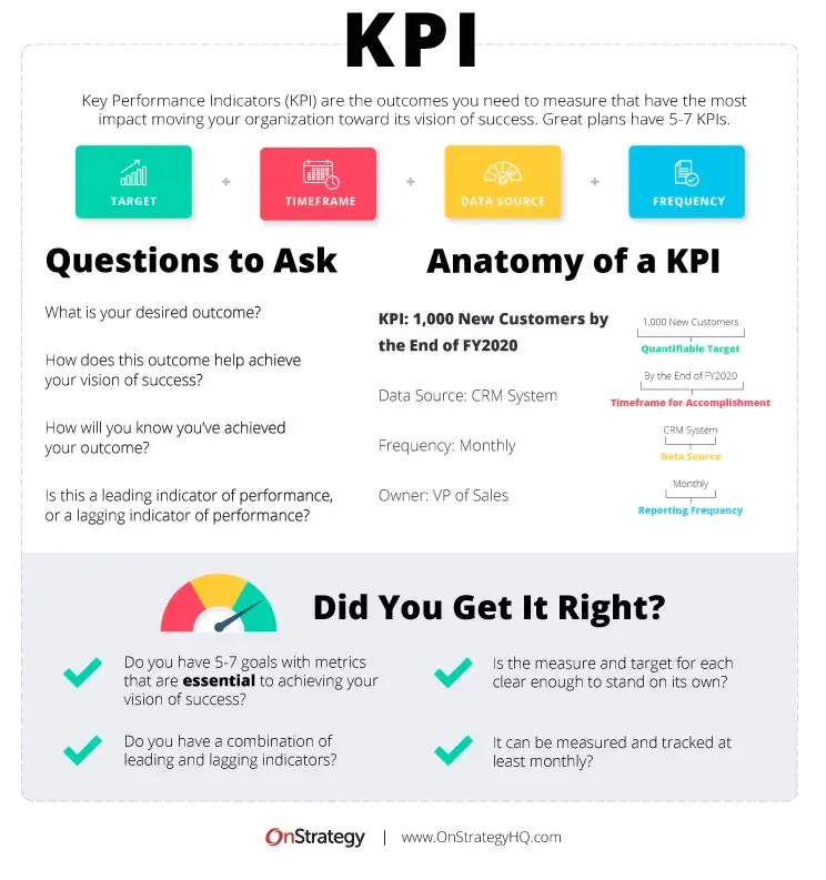
A KPI or key performance indicator is a quantifiable measure of a performance in a certain field. It needs to have a specific objective and it needs to be time-bound. For example, growing the number of outbound sales through cold emails or calls by 30% in a quarter is a KPI. On the other hand, growing your outbound sales is not a KPI as it is not specific, measurable or time bound.
For an example in the SaaS world, a business proposal software can have a KPI dashboard that tracks the number of sent, read, and signed business proposals over a certain time period.
Most good KPI dashboard tools will come with a variety of templates you can use to get started. If you are still determining where you would get started, KPI dashboard templates are a good inspiration.
Choose a dashboard tool
Creating dashboards manually is very time consuming and usually requires some knowledge of programming, data science, and basic design. Luckily, there are plenty of dashboard tools that allow you to just connect your data from various sources and create a dashboard in very little time.
Your dashboard tool should support your use case (e.g. SaaS), and your data sources and have a variety of ways to do data visualization. Last but not least, it should be easy to implement and share with your customers.
Luzmo ticks all the boxes, as it lets you connect a vast number of data sources thanks to our connectors and flexible API. But more on dashboard tools later - let’s get to the next step.
Connect your data sources
The building block of every good dashboard is the data. For example, if you’re building a marketing dashboard, it’s crucial that your tool connects to Facebook and LinkedIn. If you’re building a SaaS dashboard, you want to connect the data from your app, which usually requires an API and a bit of coding knowledge.
This is probably the most important criterion for choosing your dashboard tool. If it does not have the necessary API and data sources, creating dashboard mockups and visualizing data becomes very complicated and expensive, very fast.
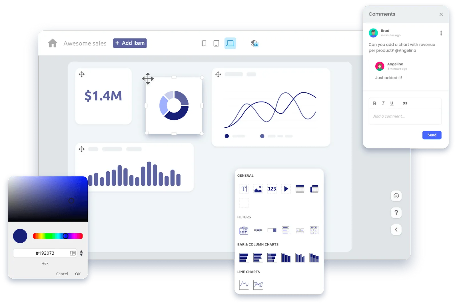
Visualize your data
To make data-driven decisions (whether for yourself or your customers), you need to visualize your datasets. This means turning data into bar charts, pie charts, line graphs, Gannt charts, plot charts and many other visualization types.
A good dashboard tool will offer all the visualizations you can pick up in Excel + a bunch more. Once again, you can refer to templates within the tool if you’re struggling with choosing the right visualizations and widgets.
And if you’re looking for a tool to help you decide what to visualize and how, this is a great resource.
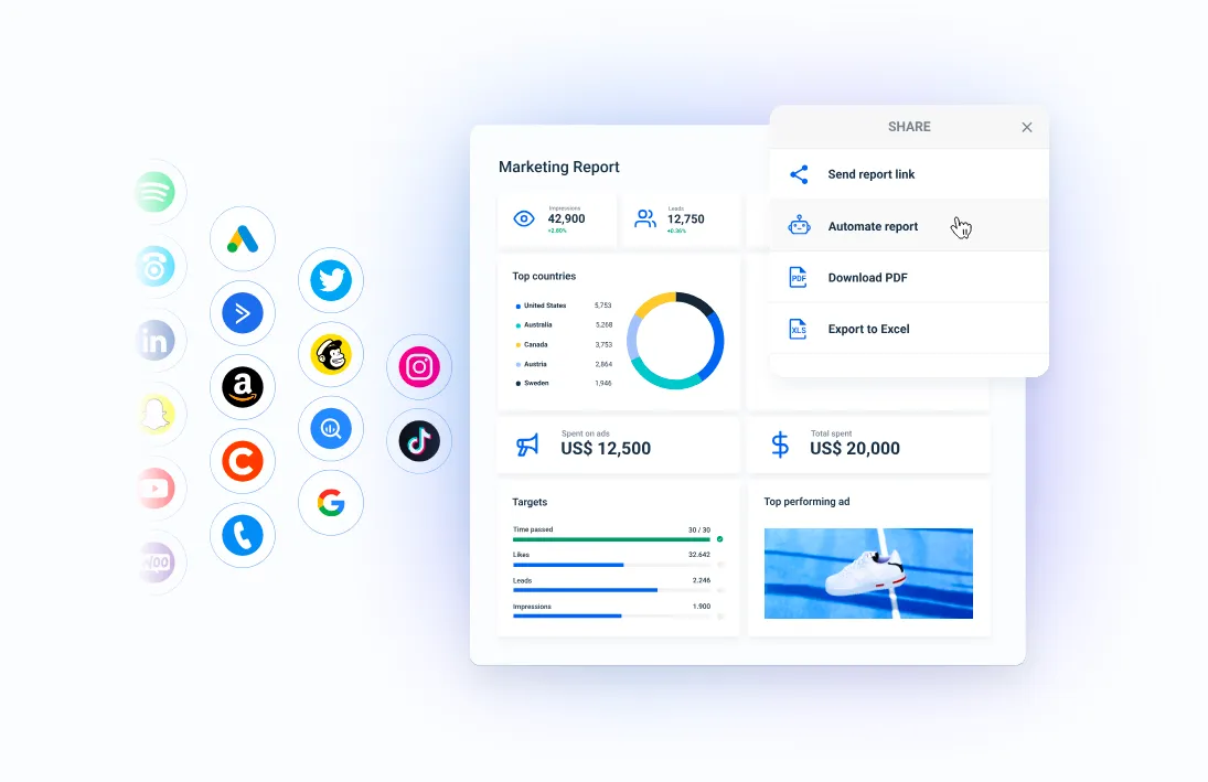
Share the dashboard with your team or customers
When the dashboard is complete, you need to get it in front of the right stakeholders or your customers. For example, a finished dashboard in Luzmo needs to be embedded in your SaaS product. Doing this is effortless because you can copy and paste the code to add it to your website and product.
Then it’s a matter of changing the dashboard’s style (design) to make it fit into your product. And thanks to our handy dashboard builder, you can get the design to fit in seamlessly.
Also, we let you extend the dashboard creation to your customers with our embedded dashboard editor, so your own customers can customize the dashboards that show up in their SaaS product.
These are the basic steps for creating a KPI dashboard. Now let us take a look at the KPI dashboard software you can use for this job.
Best KPI dashboard tools
There are very few businesses nowadays that build their own dashboards from scratch. Instead, they use dashboard builders that are best suited for the job, allowing them to go from an idea to a completed dashboard design very quickly.
Luzmo - best for embedded SaaS dashboards
Do you have a SaaS product and want to make decision-making easier for your customers? Luzmo is the best solution for embedded SaaS dashboards as it allows you to create and embed dashboards in hours instead of days or weeks.
Simply connect your data sources with our connectors or API and choose a template and you can add a dashboard to your product. While most other dashboards have complex processes for embedding dashboards, Luzmo shines when it comes to ease of use.
You can start your free trial today and give it a go!
Whatagraph - best for marketing dashboards
If you want to build a KPI report or dashboard for your marketing agency clients, this is probably the best tool you can use. With more than 40 different integrations, you can connect a variety of social media platforms and tools like Google Analytics, Google Search Console and others.
It has 100+ templates for different types of reports and dashboards and a fairly intuitive drag-and-drop builder. Pricing starts at $223 per month and there is no free trial available at the time of writing.
Looker Studio - for basic website analytics reports and dashboards
There are two Looker products - the basic Looker and Looker Studio. The Studio app is built for businesses and agencies looking to track a variety of business metrics. It works flawlessly with Google products, such as Analytics, Search Console, Google Ads and Google My Business. If you use these tools alone for your dashboards, using Studio will be free.
However, to use other connectors, you’re going to need a third-party tool such as Supermetrics. This adds cost and increased complexity, so it’s not ideal for busy marketers and agencies. For a clearer breakdown of the expenses involved, you might want to check out Supermetrics pricing to see how the subscription fees can quickly add up.
Tableau
This powerful business intelligence tool helps you aggregate, clean up and visualize your data. And when it comes to visualizations in dashboards, Tableau has the most varied choice of graphs and charts among its competitors.
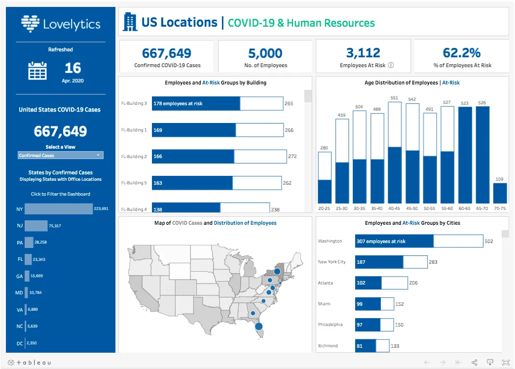
Its incredible capabilities come at a cost and getting started with the tool requires plenty of learning and training. Moreover, it does not fare well with embedded analytics and it can be very pricey.
9 steps to finding KPIs that actually move your business forward
Key Performance Indicators—KPIs—can be a growth engine, a reality check, or, if you get them wrong, just dashboard noise that nobody truly uses. Companies of all sizes wrestle with them: What to measure? Who owns what? Why do so many “top SaaS KPIs” turn into empty numbers? The answer is that meaningful KPIs aren’t plucked from someone else’s template. They’re discovered, refined, and relentlessly tested against the realities of your business.
The right KPIs bring focus, speed, and alignment. They let you spot trouble before it hits the P&L. They push your team to act, not just report. But finding those numbers—the few that matter—requires more than picking from a list. It’s about process, not perfection. Here’s a practical, experience-driven path to KPIs that actually work.
Step 1: Start with your real goals (not someone else’s scorecard)
It’s easy to start KPI-hunting by googling “best B2B KPIs” or copying dashboards from a competitor or a well-known SaaS app development brand. But metrics only have meaning in context. Your business goals are the bedrock for all meaningful measurement.
Ask yourself: What is this business truly trying to accomplish in the next year or two?
- Launch a new product line?
- Break into a new market?
- Reduce churn?
- Improve profit margins?
- Speed up onboarding or customer adoption?
Every KPI should directly map to a core objective. “Because everyone tracks it” isn’t enough. No goals, no KPIs. If you can’t tie the number to a specific strategic outcome, it’s a vanity metric—no matter how many dashboards feature it.
**Example:
**If your company is laser-focused on reducing customer churn, don’t just blindly adopt MRR Growth Rate because a famous SaaS company tracks it. Instead, get crystal clear: “Our #1 goal this year is to cut churn from 5% to 2.5%.”
Step 2: Map out your growth levers
Goals are great, but you can’t push on an outcome directly. For every big business goal, there are a handful of “levers” you can pull to get there.
If your goal is to increase annual revenue, those levers might include:
- Winning more new deals (acquisition)
- Increasing deal size (expansion)
- Improving renewals (retention)
- Optimizing pricing
- Leveraging referral marketing through tools like ReferralCandy to amplify word-of-mouth and incentivize customer advocacy
Lay out these drivers and examine the full funnel: from the top of the pipeline down to expansion revenue. If a KPI doesn’t clearly map to one of these levers, it’s probably a distraction.
**Example:
**A SaaS development company with sluggish growth realizes their real bottleneck isn’t new signups, but low onboarding activation. Suddenly, “activation rate in first 7 days” becomes the KPI that’s more predictive—and actionable—than pure signup volume.
Step 3: Balance leading and lagging indicators
KPIs come in two flavors: lagging (outcomes you measure after the fact) and leading (inputs or signals that predict those outcomes).
- Lagging: Churn rate, revenue booked, NPS, closed deals
- Leading: Product adoption events, trial-to-paid conversion, demo requests, engagement with onboarding
You need both. Lagging KPIs help you report and celebrate. Leading KPIs help you react and improve before it’s too late.
Find the connection: If your lagging metric is “monthly recurring revenue,” what’s the earliest upstream indicator you can track (like number of sales-qualified leads or demo completions)?
**Example:
**If customer success discovers that a customer who uses three key features in week one is 4x less likely to churn, then “number of customers activating three features in week one” is now a critical leading KPI.
Step 4: Get the right people in the room
KPIs are often set by leadership, but rarely do they bring in the folks actually closest to the data: product managers, sales reps, marketing ops, customer support, and even finance.
Why does this matter? Because the people on the front lines know which metrics are honest signals of progress, and which are just “dashboard wallpaper.”
Get cross-functional. Schedule a workshop. Ask:
- Which numbers actually make us pay attention when they move?
- Where have we missed warning signs in the past?
- What’s a number we track, but never use to drive action?
**Example:
**Sales might flag that “calls made” is tracked, but it’s really “first meetings booked” that predicts deals. Support might point out that “tickets closed” is less useful than “issues resolved without a follow-up.”
Step 5: Define what success looks like, and how you’ll measure it
A KPI without a benchmark or a target is just a number. Before you commit, define:
- What does “good” actually mean?
- Where are you now, and what’s a stretch, but achievable, improvement?
- How will this KPI be measured: which tool, which report, which data source?
- Who owns the metric and updates it? (Accountability matters.)
Make it granular: “Increase onboarding activation rate from 45% to 60% by December, measured weekly in Amplitude, owned by Product.”
Don’t settle for “improve onboarding.” Specific, time-bound targets focus teams and clarify priorities.
**Example:
**Instead of “decrease response times,” try “80% of support tickets responded to within 2 hours, every week, measured in Zendesk.”
Step 6: Filter for actionability and relevance
Before you add a KPI to your dashboard, run it through a “so what?” filter:
- Can we actually influence this metric through daily work?
- If it goes up or down, will we change something?
- Does this metric align with our business priorities right now?
- Is it easy for everyone to understand? (If not, explain it or simplify it.)
If a metric is nice to know but not actionable, it’s dashboard clutter. Only track what drives behavior and decision-making.
**Example:
**Tracking “page views” might be interesting, but if nobody acts on it, it’s not a KPI. “Product pages with >5 minutes average time-on-page” tied to demo requests? Now you’re onto something.
Step 7: Pressure-test and scenario-plan your KPIs
Draft KPIs always look good on paper. But reality is messy. Ask hard questions:
- If this number moves, do we know why?
- Can it be gamed—intentionally or not?
- Does it truly reflect progress, or is it just easy to measure?
- How will external factors (seasonality, regulation, competitor moves) affect this metric?
Work through “what if” scenarios. If the KPI never changes, or always goes up, it’s probably not useful. If it’s easy to fudge, you’ll get reporting games instead of business growth. Consider integrating tools like the best coworking app to accurately track and adapt KPIs in real-time collaborative environments.
**Example:
**If “tickets closed per day” leads to agents rushing resolutions, but not helping customers, swap for “customer satisfaction after ticket resolution.”
Step 8: Visualize and socialize KPIs
Don’t let KPIs collect dust in quarterly reports. Make them visible.
- Set up dashboards everyone can access.
- Share progress regularly—at standups, all-hands, or in team Slack channels.
- Celebrate when you hit a KPI, and dig in when you miss.
The goal is to build a culture where the right numbers are front and center—so people start connecting actions to results.
When a team sees a KPI tick upward after an experiment, the loop closes: “We did this, and it moved the number.” That’s motivation and learning in one.
**Example:
**A product team posts a weekly chart of onboarding activation. The entire company starts brainstorming ideas when it dips, not just product or support.
Step 9: Revisit, refine, and retire your KPIs regularly
Business isn’t static, and neither are your KPIs. Revisit them quarterly, or after any major pivot. Ask:
- Did the KPI really drive decisions, or did it fade into the background?
- Is this metric still aligned with our top priorities?
- Has a new opportunity, risk, or product line emerged that needs measuring?
- Are we seeing any “KPI fatigue” (too many numbers, not enough meaning)?
Be ruthless. It’s better to kill an irrelevant KPI than let it become background noise.
**Example:
**After expanding into enterprise, a SaaS development company finds that their old signup-focused KPIs don’t matter as much. Now, sales cycle length and expansion MRR become front and center.
Bonus: Avoid the KPI graveyard—less is more
It’s tempting to track dozens of metrics “just in case.” But every extra number dilutes focus. A short, sharp set of KPIs (5–7 per team or goal is plenty) beats a sprawling dashboard every time.
KPIs are only powerful if they drive action, focus energy, and change behavior. With the growing impact of eCommerce on business strategy and customer interaction, aligning KPIs to digital outcomes is more critical than ever. More numbers, more confusion. Fewer, sharper metrics, more momentum.
KPIs are not magic. They’re a process—a cycle of setting, stress-testing, acting, and revisiting. The right KPIs are a living, breathing part of your strategy, not just dashboard wallpaper.
Choose numbers rooted in your real goals, that link to actionable levers, and that your team actually cares about. Bring frontline staff into the process. Benchmark and visualize them. Pressure-test for loopholes. And above all, don’t be afraid to drop metrics that stop serving you. Whether you're optimizing a SaaS funnel or scaling a marketplace for electronics, the same principle applies: KPIs should fuel decisions, not dashboards.
The right KPIs make hard decisions easier, surface both problems and opportunities faster, and unite your team around what actually matters. That’s how you spot the signal in the noise—and that’s how you move your business forward, one real result at a time.
Build your next KPI dashboard in hours - not weeks
A dashboard is one of the easiest ways to show a wealth of important information in one place. No matter who the intended audience is, they can use the data from the dashboard to make smarter business decisions and get the most out of a product or service.
If you’re looking for a tool that will you help build amazing dashboards for your SaaS customers - look no further. Sign up for your free trial of Luzmo and delight your customers with beautiful and functional dashboards today!
Written by

Ship the future of your data
Let us show you what Luzmo can do for your product.

Leave your e-mail and one of our analytics experts will reach out to you