What is Data Storytelling and How to Use Data for Great Stories

Data is everywhere, but raw numbers alone don't drive decisions – stories do.
In a business world driven by analytics, data storytelling bridges the gap between data and actionable business insights. Whether you're a marketer trying to show ROI, a product manager highlighting trends, or a business leader making decisions – learning how to tell a compelling story with data can make or break your strategy.
In this guide, we’ll walk you through how to nail data storytelling, share key techniques for using data visualizations effectively, and provide practical tips to make sure your story not only resonates with your audience but also drives them to take action.
What is data storytelling?
Data storytelling is more than presenting charts and numbers – it's the art of transforming data into a narrative your audience can easily understand and engage with. The goal is to communicate key insights in a way that encourages action, not just comprehension.
Think of data storytelling as a three-part process:
- Data: The raw numbers and facts.
- Visualizations: The charts and graphs that simplify and display this data.
- Narrative: The story you craft to guide the audience through the insights in the data.
For example, consider an eCommerce business running Facebook ads. Instead of showing a table of performance metrics, you could present a clear line graph demonstrating how the return on ad spend (ROAS) is dropping over time, despite a consistent budget. This visual tells a clearer, more actionable story – your marketing campaigns are losing effectiveness, and action is needed.
Why data storytelling matters for business
Effective data storytelling helps organizations make faster, more informed decisions. It bridges the gap between complex data sets and everyday business insights. When done well, it can:
- Improve decision-making. Clear data stories allow stakeholders to grasp key trends and act on them faster.
- Build trust. Data-backed stories are harder to refute than opinions or assumptions.
- Engage non-technical audiences. You don’t need a background in data analytics to understand a well-crafted data story.
Key elements of good data storytelling
A good work of fiction needs to have a plot, setting, characters, point of view, and conflict. With data, things are a bit simpler.
To create compelling data stories, you need to combine the right elements:
- Context: Why was this data collected? What prompted the need for visualization?
- Narrative: How do the data points connect? Why should your audience care about them?
- Insight: What’s the key takeaway or core message you want to communicate?
- Action: What do you want your audience to do after seeing the story? This could be adjusting a marketing campaign, improving customer onboarding, or cutting costs.
- Supporting visualizations: Additional charts or data points that reinforce your narrative.
The role of data visualization in data storytelling
Almost every language worldwide has its version of “A picture tells a thousand words”. Or numbers, in this situation.
Let’s look at this simple comparison:
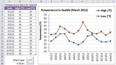
On the left, you’ll see a table showing temperatures in Seattle compared day to day. On the right, a line graph shows the same data. Which do you think is easier to understand?
The more complex the data, the more it is necessary to use data visualization to make it easier to understand. Visualization not only tells a story but helps break down complex ideas into narratives that anyone with just about any background can understand.
Visualization is the backbone of data storytelling. It simplifies the understanding of complex datasets, ensuring your audience grasps key points quickly. But to make it effective, you need the right visualizations.
Here are some ways data visualization helps with storytelling.
Good data visualization supports decision-making
The true power of data visualization is its ability to transform complex data into insights that anyone can understand – no expertise is required. While data analysts collect and organize the information, decision-makers need clear, actionable insights quickly. Well-designed visuals like line graphs, bar charts, infographics, or scatterplots can instantly turn rows of data into digestible information. To go further, some teams use AI-powered ad optimization tools to translate performance data into real-time campaign improvements.
For example, a CEO doesn’t have hours to sift through detailed reports. They want to quickly see their best-performing products to direct marketing and R&D investments accordingly. Visualization allows them to see trends and performance metrics at a glance, eliminating the need for guesswork.
Engaging your audience through data visualization
Data storytelling makes your product more accessible to non-technical users. Whether you're building a SaaS tool or a consumer product, most users aren't data experts. They need simplified, actionable insights to make decisions. With data storytelling, you empower your customers to be more data-driven, even if they have little to no background in analytics.
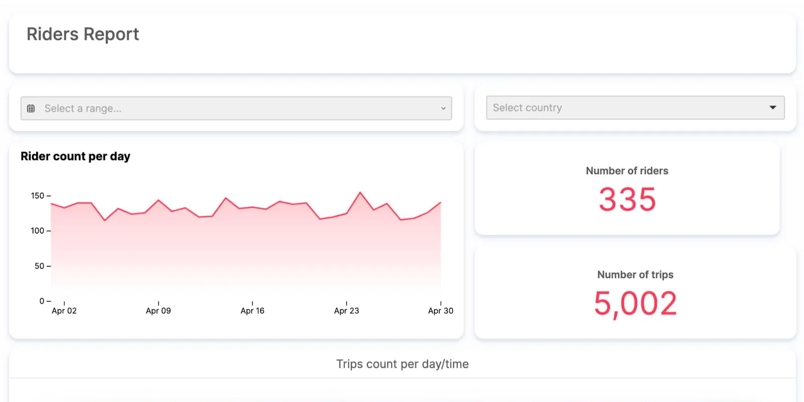
A perfect example is our client, Sentiance, a mobility insights company. Their customers track vehicles in real time using smartphone data. With data visualizations, they can instantly see where their fleet is, how many riders they have, and even safety metrics – all without needing to be data scientists. Dashboards help users edit, slice, and dice data to get exactly what they need.
Even if your product doesn’t provide every business insight, tools like Luzmo’s embedded dashboard editor allow users to customize data views and create personalized reports that speak to their unique needs.
Building trust with data visualizations
Clear, data-backed visuals not only help users understand trends but also build credibility. Let’s say one of Sentiance’s customers suspects a driver is misusing company vehicles. A simple data visualization can confirm this, showing the driver's repeated personal stops. Without data to back up the claim, this would be hard to prove.
By turning raw data into clear visuals, you establish trust. Your users know that the insights they see are accurate, helping them feel confident in their decision-making process. With tools like Luzmo, you can give your users the power to uncover these insights and make informed choices quickly.
Enhancing business intelligence through data visualizations
Integrating data visualizations into your business analytics strengthens decision-making processes. When you're presenting data in a visual format – so, when you’re telling stories – it’s much easier for key stakeholders to quickly interpret trends and uncover insights.
For example, social media teams analyzing campaign performance could benefit from visualizations showing engagement metrics over time. A good data story can also be a part of a compelling narrative that can help persuade their managers into e.g., investing in a new activity.
With tools like Power BI and Luzmo, businesses can analyze data efficiently, providing the clarity needed to act on those insights. Whether you’re tracking customer churn or product performance, data visualization helps you highlight the important data points that support data-driven decisions. This clarity is key to maximizing the potential of your business intelligence efforts.
Simplifying complex data analysis with visual storytelling
Data science can often feel overwhelming, especially when large datasets need to be processed. Visual storytelling simplifies complex data analysis by distilling massive amounts of information into easy-to-read charts, graphs, and dashboards. Microsoft’s Power BI is one such powerful tool that helps businesses analyze data without requiring deep data science knowledge.
With visualization tools, even learners or non-technical staff can tell better data stories. These tools allow anyone to slice and dice data, helping them find insights that lead to real-world decisions. For example, in a sales report, a line graph showing trends over time will have a far greater impact than rows of numbers in a spreadsheet, enabling more informed business analytics. It’s just one of the data storytelling examples that can be applied in no time.
Five tips to tell better data stories
Data storytelling can transform raw numbers into meaningful insights, helping your team or stakeholders make smarter decisions.
Let us show that using the example:
Imagine you're part of an eCommerce company facing a drop in customer retention over the past year. You’ve collected plenty of data on customer behavior, but how do you turn that data into a compelling story that can lead to actionable solutions?
The five tips below will guide you on how to use your data to tell a better story – one that engages your audience and drives meaningful business results, such as improving customer retention.
Research your audience
Before crafting your data story, you need to know who you're telling it to. In your eCommerce company, the CEO will likely want high-level data insights – like customer retention trends – while the marketing manager needs more granular data on campaign performance and customer segmentation.
To tell a great data story, tailor your visualizations to each audience:
- For instance, when presenting to the CEO, focus on a big-picture graph showing customer churn over the past year so they can make the right business decisions.
- For the marketing manager, provide more detailed insights, such as specific customer segments and the impact of recent social media campaigns on retention rates.
Research your audience’s needs to create data visualizations that speak directly to them.
Build visualizations around one core message
Every good data story should have a single, clear message. In your eCommerce scenario, the core message is that customer retention has declined, and something must be done. Instead of presenting a massive dashboard with dozens of metrics, focus on the main issue.
Start with a line chart showing how customer churn has increased over the last 12 months. Then, build the story by adding supporting visuals that break down customer segments, buying behaviors, or changes in your social media efforts that could be driving the trend.
Keeping your story focused on one key message, you ensure your audience remains engaged and understands the importance of taking action.
Choose the right visualizations
We actually wrote a post on chart types you can choose for data visualizations. We included 29 chart types, but they are only barely scratching the surface. If you’re just starting, you can get stuck wondering which of these numerous visualization types is the right one.
Choosing the right visualization is essential to telling your story effectively. In your case, tracking customer retention over time would benefit from a line chart to show the downward trend.
However, to compare how different customer segments contribute to churn, you might use a bar chart.
If you're analyzing campaign performance on social media to see which ads resonated with high-retention customers, a scatterplot can highlight the correlation between ad engagement and retention rates.
Do your research on the best visualization type for each part of your story so the data is presented in a way that's easy to interpret and drives action.
For example, using Tableau might not be the right idea if you're working with a small dataset or if you're more comfortable with simpler tools like Excel or Google Sheets. In these cases, basic charts and graphs might suffice.
And if you’re stuck wondering which type of visualization to use, this flowchart can help.
Narrate the story
Visualization alone isn't enough – you need to guide your audience through the insights. In your eCommerce company’s case, after showing the line graph of customer retention decline, explain the data behind it.
Highlight specific periods when churn spiked and connect it to potential causes like product changes or ineffective campaigns.
Use clear section titles in your dashboards, such as "Customer Churn Overview" and "Retention by Segment." If a scatterplot shows the impact of social media campaigns, use tooltips or notes to explain each cluster of data points.
Providing this narrative ensures your audience understands why the data matters and how it connects to the bigger picture.
Finish with a strong call to action
The end of your data story should motivate your audience to act. After walking your eCommerce team through customer retention data, the next step is to focus on solutions.
For example, suggest improving the onboarding process or increasing personalized offers to high-churn customer segments.
Show preliminary data that supports the recommended actions. If customers who received personalized offers had a lower churn rate, include that as proof of the strategy's effectiveness.
The climax of your story should highlight what actions need to be taken, and the resolution comes when your team applies the insights to improve retention.
In this example of an eCommerce company facing customer churn, data storytelling transforms raw numbers into actionable insights.
Following these five tips, you can craft a data narrative that is clear, focused, and effective in driving business intelligence decisions. Your data story becomes not just a presentation but a roadmap to better customer retention and business success.
Common mistakes in data storytelling and how to avoid them
- **Overcomplicating visuals
**Simple is better. Don’t overcrowd your charts with too much data. Stick to one or two insights per visualization to keep things clear. - **Ignoring context
**Always provide background information. If you’re showing a drop in website traffic, explain the cause, whether it’s due to seasonal trends or a marketing shift. - **Using the wrong chart types
**A common mistake is selecting a chart that doesn’t align with the data. Use a line chart for trends, bar charts for comparisons, and pie charts for proportions. - **Focusing on data, not the story
**Don’t throw numbers at your audience without connecting them to a narrative. Explain why the data matters and how it impacts their decisions.
Wrapping up
Data storytelling turns numbers into images that make a difference. No matter what industry you’re in and who your target audience is, data storytelling provides valuable insights in a way that your key audiences can understand even the most complex information.
Go from raw data to beautiful visualizations with Luzmo. We can help you add embedded analytics dashboards to your product so you can tell a story and drive change.
You don’t need better communication skills or data scientists on your team.
You need Luzmo.
Sign up today and give it a free spin for 10 days.
FAQ
All your questions answered.
What is data storytelling?
Data storytelling is the practice of turning data insights into a compelling narrative that helps an audience understand complex information. It combines data, visuals, and narrative to communicate clear, actionable insights and drive informed decisions.
What are the 4 pillars of data storytelling?
The four pillars of data storytelling are data, visuals, narrative, and audience. Data provides the facts, visuals simplify complex information, narrative connects the dots, and the audience shapes how the story is told for optimal engagement.
What is the difference between data storytelling and data visualization?
Data visualization is the use of charts, graphs, and visuals to display data. Data storytelling goes beyond visualization by adding narrative and context, making it easier for audiences to grasp insights and make data-driven decisions.
How do you analyze data to tell a story?
To analyze data for storytelling, first identify the key insights, then organize the data into a clear structure. Use visuals to simplify complex information, add context, and craft a narrative that ties everything together for your intended audience.
Why is data storytelling more effective than showing data alone?
Data storytelling is more effective because it combines visuals, narrative, and insights to engage the audience. It turns raw numbers into an understandable, memorable story, making it easier to drive action compared to just presenting data. For example, Spotify runs their own “Wrapped” comparisons with stories built on data.
Written by

Ship the future of your data
Let us show you what Luzmo can do for your product.

Leave your e-mail and one of our analytics experts will reach out to you