20 Data Visualization Examples To Inspire Your Data Projects in 2026

The best way to make smart business decisions is by looking at data. But data on its own is pretty hard to interpret - infinite rows of numbers that make no sense at all. Visualization makes data come alive and transforms that data to beautiful, functional charts, graphs and tables.
Today, we’re going to show you some amazing examples of data visualizations. Use these to get inspired and create your own data visualizations in your preferred data visualization tools.
Most popular graphs for data visualization
Data visualization is a rather broad term - there are many different ways to visualize data. Depending on the type of data you’re working with, the effect you want to achieve and the audience viewing the visualization, there are a few different choices you can make.
Some of the most common chart types include: bar charts, line charts, column charts and pie charts.
As Luzmo is a tool used for data visualization in SaaS, our customers use various types of charts to present data points to their users, directly inside their SaaS applications. Here are the most popular types of charts in Luzmo:
1. Number charts
2. (Pivot) tables
3. Donut chart
4. Column chart
5. Line chart
6. Bar chart
The reason why these visualization types are the most popular is because they are the best-known. Also, they fit many different general use cases across industries and dashboard types.
If you’re looking for something a bit more specific, these chart types can fit the bill:
- Funnel charts (e.g. for marketing or sales funnels)
- Gauge charts (for monitoring different targets)
- Scatter plots (for finding correlations between data points)
- Heatmaps (for understanding data distribution)
If you’re new to data visualization, choosing the right visualization type can be challenging. Our article is a great starting point for understanding which visualization type is the most suitable for your needs.
Data visualization examples by industry
Different industries have different types of datasets and data visualization needs. As a source of inspiration, we’ll include some of the most common industries and the ways they turn raw data and metrics into data visualizations that help with decision-making.
Recruitment dashboard
Whether you’re a small startup or an enterprise company filling hundreds of roles per year, recruitment can get messy.
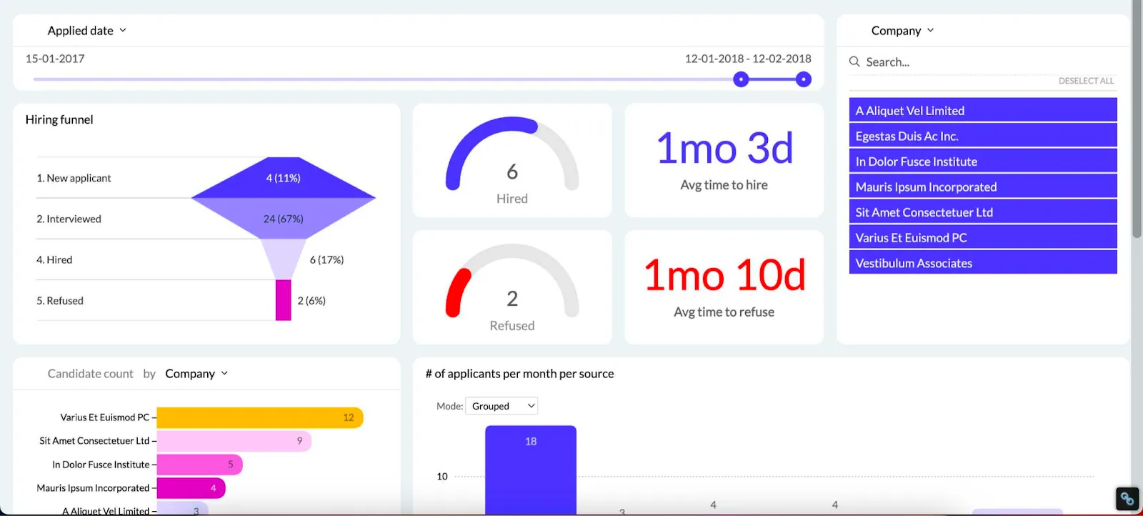
This recruitment dashboard gives you a bird’s eye view of your hiring pipeline. From key metrics such as time to hire and cost of hire, all the way to viewing individual candidates, you have it all in one place.
Whether you work in a staffing agency or have an in-house HR team, this dashboard can be customized to meet all of your HR reporting needs.
Google Analytics dashboard
Anyone who has a website can benefit from using Google Analytics. But its latest version, Google Analytics 4, is not well-known for its ease of use. Luckily, there is a Google Analytics dashboard that has all the right business intelligence data in one place.
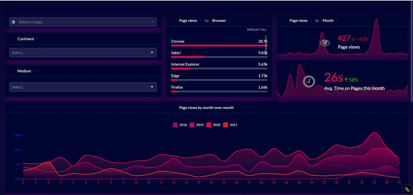
This dashboard can show you key website metrics, such as bounce rate, conversion rate, session length, top-performing pages and more. The types of data visualizations in Google Analytics are rather limited, so this dashboard allows you to choose the right visualization for your target audience.
Property management dashboard
If you’re a real estate and portfolio manager, having real-time access to your key data is crucial. With this property management dashboard, you can use data analysis and visualization to keep track of what is rented and when and how many tickets are coming from which unit.
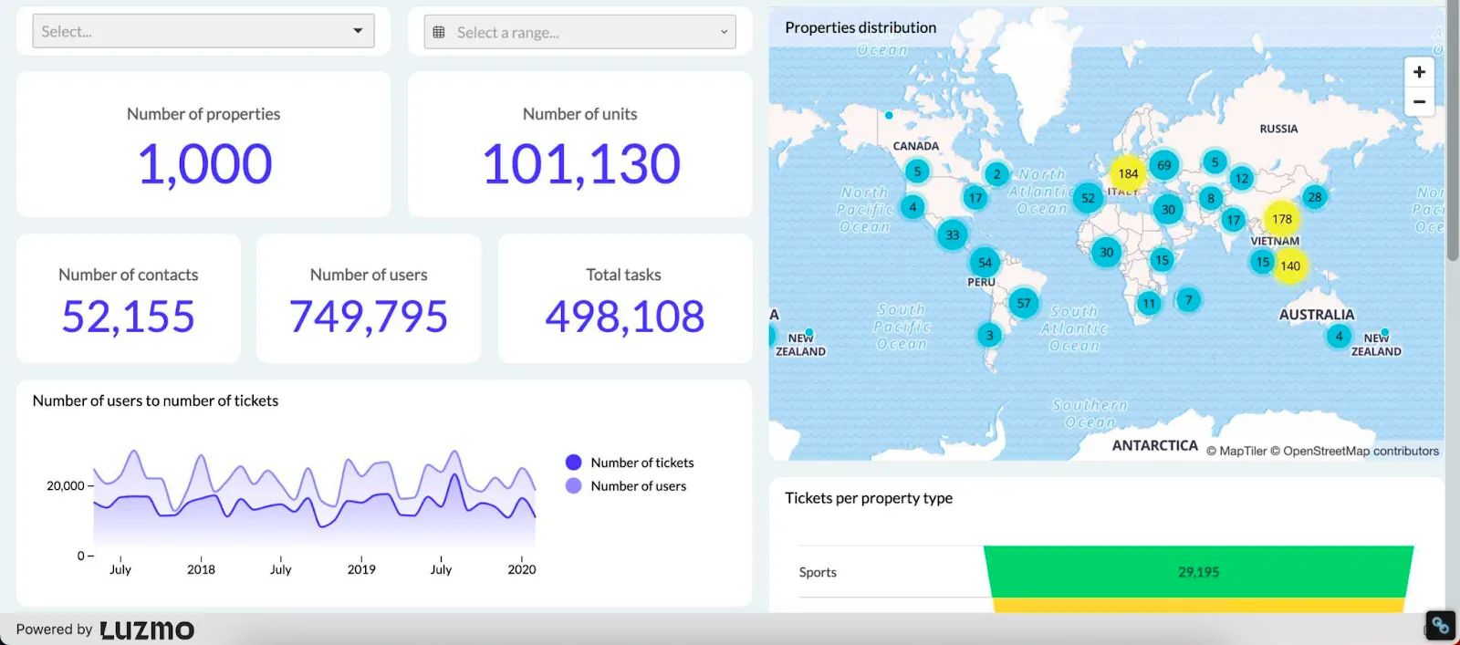
In this dashboard, you have different visualization techniques at play, showing property managers and other stakeholders exactly what is happening with their properties.
E-commerce dashboard
E-commerce stores often face an enormous amount of data scattered around in different spreadsheets. If you have a large number of products and website pages, tracking your sales from a single dashboard can be daunting.
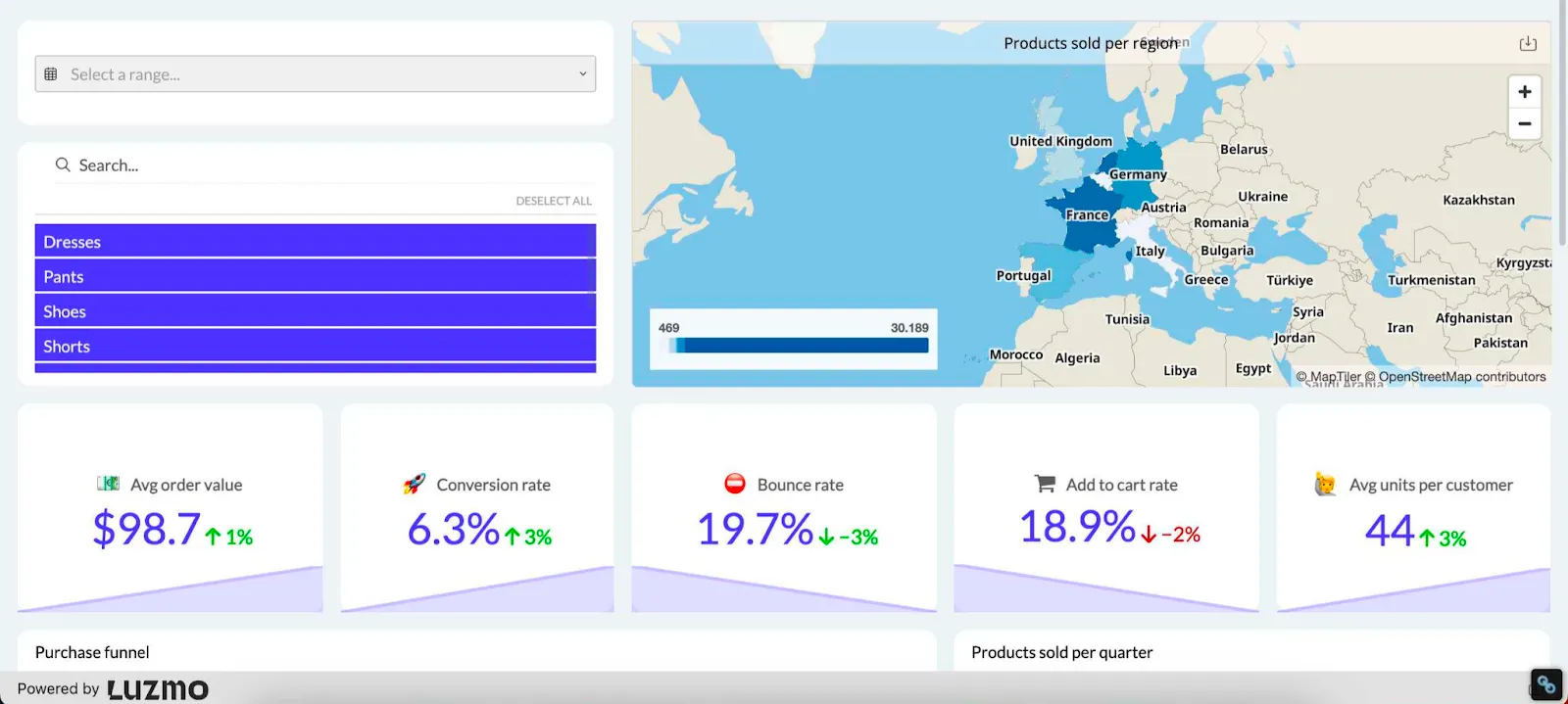
This dashboard helps you become a more data-driven e-commerce store owner, without employing complex data analytics or hiring a team of data scientists. Find your most important KPIs, such as the average order value, conversion rate, add-to-cart rate and others.
Google Ads dashboard
This dashboard is a good example of how using non-proprietary tools can yield great results. Instead of logging into your Google Ads dashboards every day, keep track of all of your data sets in our Google Ads dashboard.
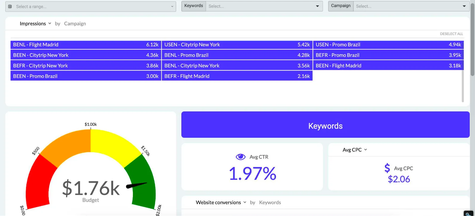
It has all the right visual representations of your Google Ads conversions, key demographics, cost per click, click-through rates and many others.
Sales pipeline dashboard
Beautiful data visualizations are great, but it’s even better when you can tell data stories with them. This specific dashboard helps you with visualizing data throughout the sales funnel.
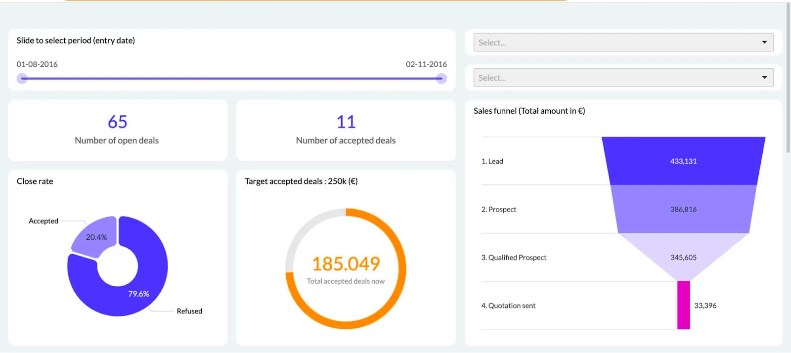
Choose from a variety of visualizations in this dashboard type: funnel chart, gauges, stacked bar charts and more. Instead of using overly complex BI tools such as Tableau, you can grab some of the best data visualization examples in Luzmo - from our pre-made template library.
Examples of interactive data visualization
The true value of data visualization comes from interactivity - when the user can drill down and explore the visualizations on their own. We have data to back up that claim too: out of the five most-used objects in Luzmo, three of them are filter elements.
This means allowing the end-user to see exactly what they want from the data visualization.
With Luzmo Studio, SaaS teams can build and embed fully interactive dashboards directly into their product, giving users complete control over filters, drill-downs, and custom views. On top of that, Luzmo IQ enables natural-language analytics so users can ask questions about their data, while Luzmo AI automatically surfaces insights and generates relevant visualizations - turning exploration into actionable decision-making.
Apogea’s 3D models of the construction process
Take a look at the visualization below:
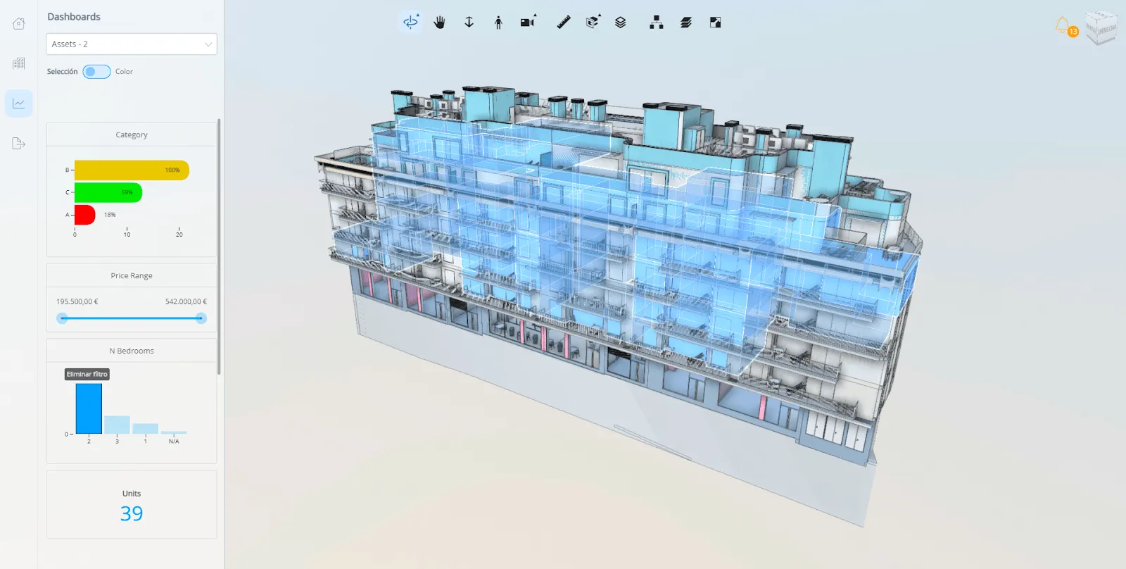
This is just one angle and view of what Apogea offers to their end-users. They use 3D models in their construction process so that their customers can filter and view different bits of real estate. For example, if you use filters in the charts on the left, you can get color-coded visualizations of apartments of a certain size and value.
Riskonnect offers data exploration to their users
Riskonnect is a risk management SaaS that deals with large data sets and customers that require complex reports. With plenty of users requesting customized reports, Riskonnect decided to go one step further and offer self-service reporting through Luzmo.
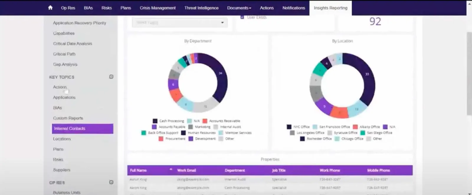
To help their customers get insights from Riskonnect, the app introduced dashboard templates the users could edit and tweak to their liking. Bar graph, area chart, bubble chart - these are some of the many visualization types they could use. Compared to getting insights from Excel exports (which is what they previously did), these dashboards were a game-changer.
Selligent uses data visualizations to determine the success of email marketing campaigns
Most email marketing tools today offer analytics to their users, helping determine the best emails, campaigns, segments, subject lines and more. Our customer Selligent decided to go one step further and create visualizations for email campaign performance.
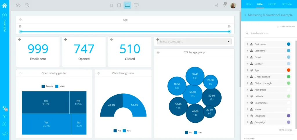
There wasn’t a multitude of data sources - just Selligent’s marketing platform. The end result is an email marketing visualization dashboard covering the entire sales funnel. And as an added bonus, their customers could create their own self-service dashboards too.
Creative examples of data storytelling: our top community picks
If you take a look around online communities, there are plenty of excellent examples of storytelling with data that can get you inspired.
The ones we selected show you that regardless of your topic, visualizations should capture the attention of your audience and explain why they should care about the data. Last but not least, these visualizations should tell them how to take action.
But even if you have lots of data, finding the right angle for building a dashboard can be tough. These examples will show you that the possibilities are virtually endless.
The most popular brands on Cyber Monday by state
This infographic sourced from r/dataisbeautiful shows the most popular brands people shop for on Cyber Monday across states in the USA.

While it’s not as detailed as a full-blown dashboard, this is a superb example of how a map with some logos can tell a great story.
How certain habits impact your health
This useful graph comes from Redditor HeroJournal and describes the impact of everyday habits on headaches:
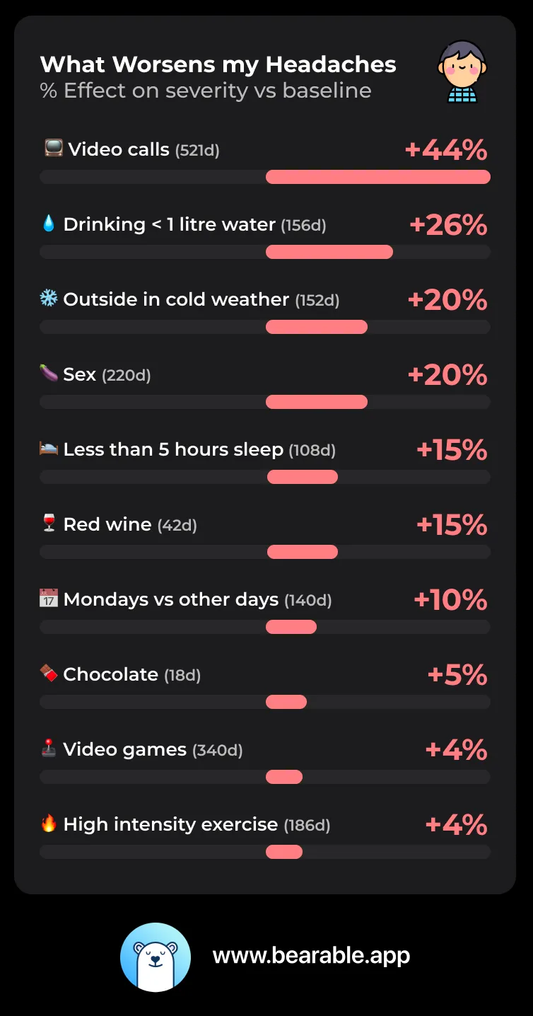
While quite a bit of this data is subjective, this graph is still an excellent starting point for someone who wants to learn more about improving their health.
A visualization of worldwide flight paths
Author AndreEgeli created this beautiful visualization of all the flights going back and forth around the world.

Media sentiment analysis of the Israel/Palestine war
Redditor SmilgaNir created this visualization of the media sentiment analysis of the Isreal/Palestine war.
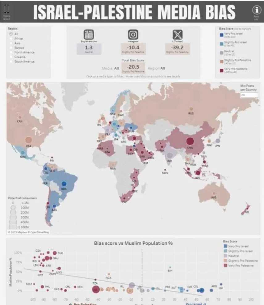
While it is handy, bear in mind that the data is based on English-language media outlets only.
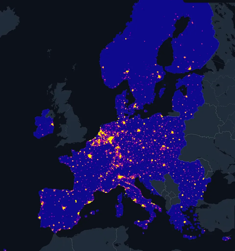
Population density of EU countries
Another one from AndreEgeli, this one shows the population density of countries in the European Union.
The risk of natural disaster in the United States
This Redditor created a visual representation of how likely the states in the USA are to encounter natural disaster, each color-coded to signify the extent of risk.

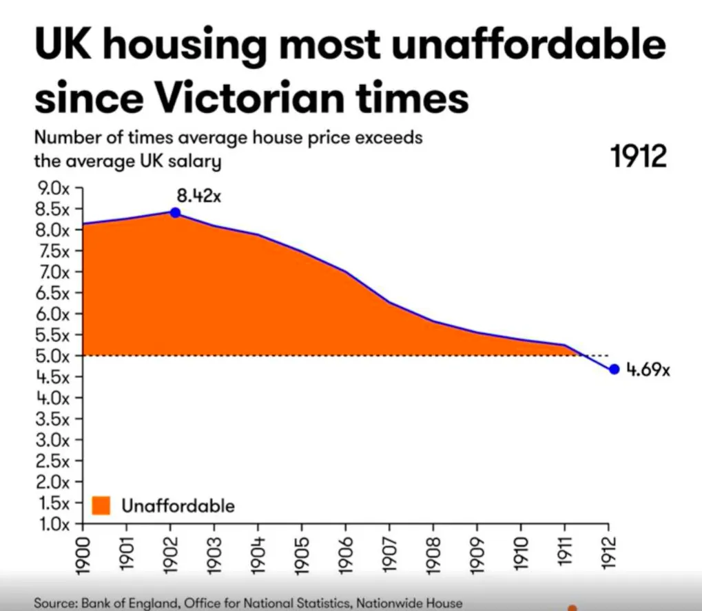
UK housing price increases over time
This rather glum piece of data visualization comes from Redditor jcceagle. They created a video timelapse of the prices of housing in the UK over time. Unsurprisingly, the video shows that the housing in the UK is at its most expensive in 2024.
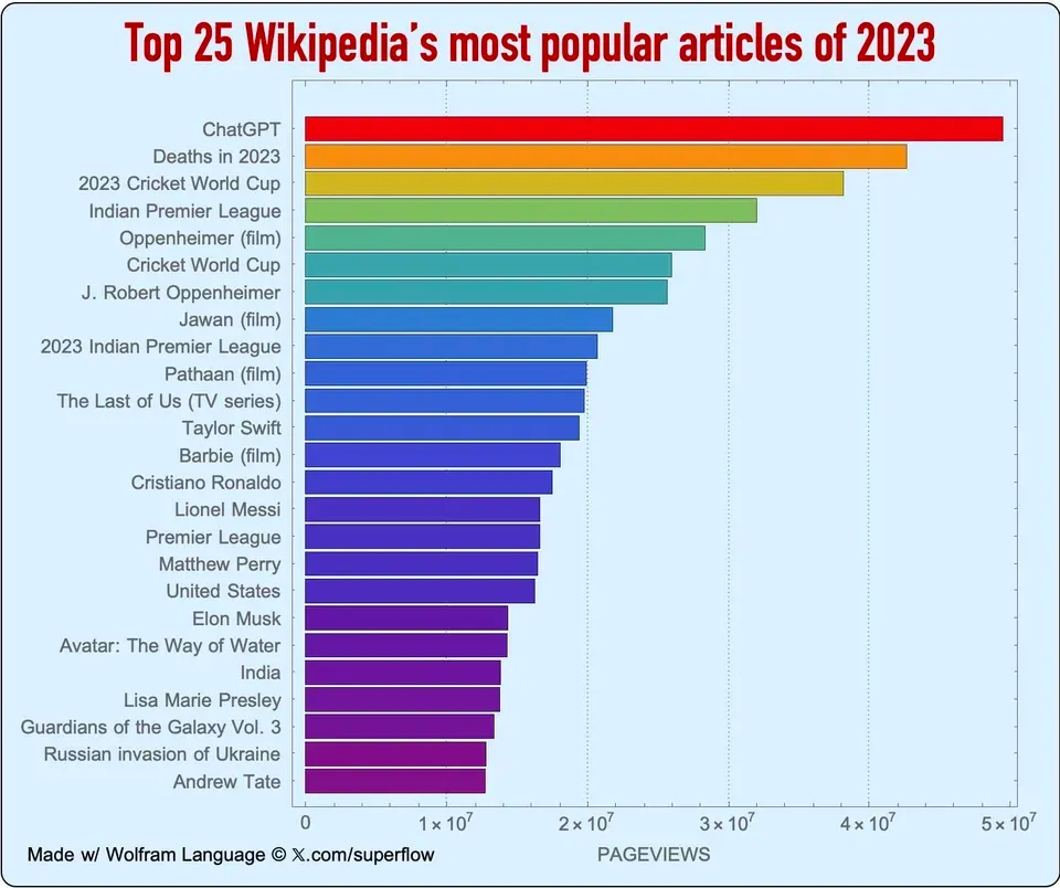
Most popular Wikipedia articles in 2023
Unsurprisingly, ChatGPT takes the cake for the most viewed article in the last year. You can find this along with some other insights in this visualization by sataky.
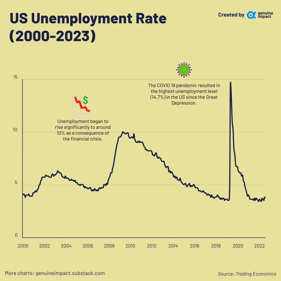
Unemployment and the impact of the COVID-19 pandemic
In another piece reflecting the dark corners of history, Redditor giteam shows that the pandemic brought the highest level of unemployment in US history since the Great depression.
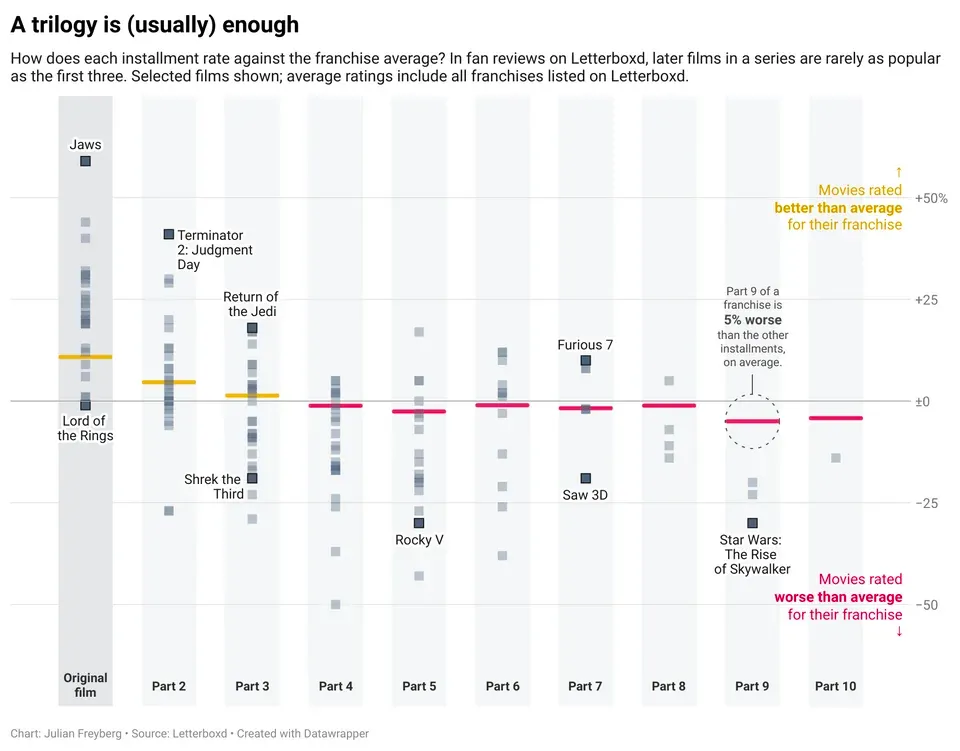
Franchise movies are bad (and there is data to prove it)
This Redditor took it upon themselves to prove that with each new sequel, a movie franchise gets worse.
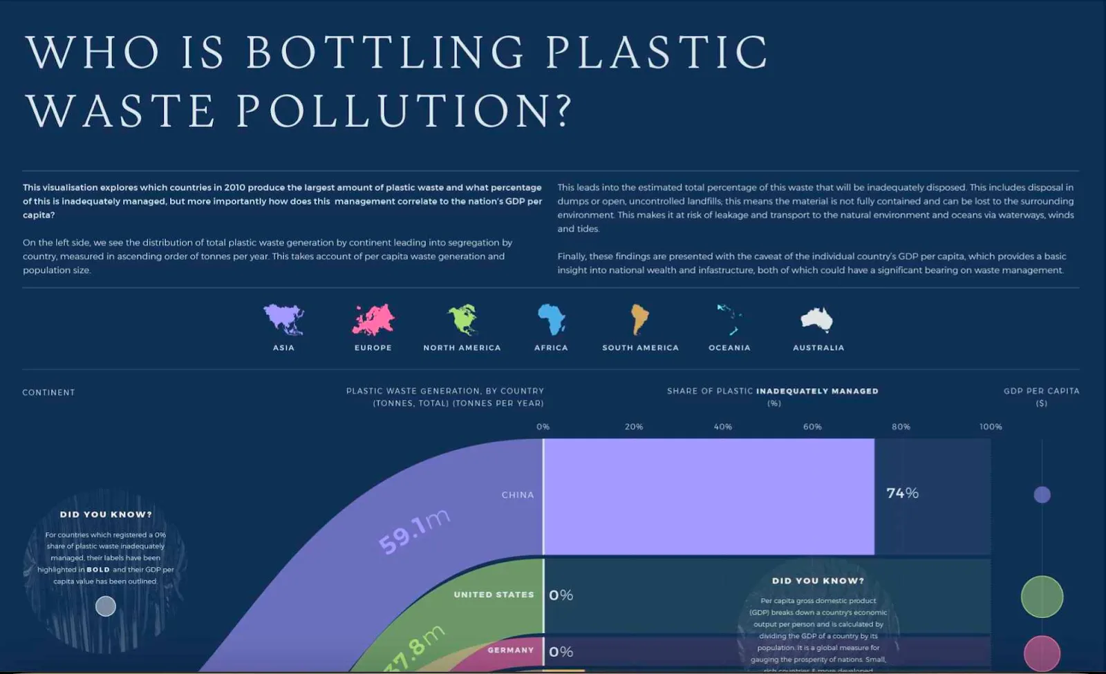
The source of plastic in our oceans
Unfortunately, we can’t screenshots this entire beauty of an infographic, so you might have to click through to the original source on Behance. Here you can see the biggest pollutants causing the buildup of waste in our oceans.
Start visualizing your data today
Great data visualizations help you not only become more data-driven but also tell stories. It uses graphs, charts, histograms and more to reveal the hidden patterns that you would otherwise miss when analyzing your data. When you tell stories, you engage the person who is reading them, helping them understand and care for the data.
If you have a SaaS product and you need an easy and interactive way to show data visualizations to your users, say no more.
With Luzmo, you get a complete embedded analytics stack: Luzmo Studio lets you build and embed interactive dashboards that match your product’s design, Luzmo IQ enables users to explore data using natural language, and Luzmo AI automatically generates insights and visualizations from your datasets. Plans start at $495/month, making it easy to add powerful, scalable analytics without the overhead of traditional BI tools or unpredictable pricing models.
At Luzmo, we can help you set up a dashboard in your product in a matter of hours - not weeks or months.
Book your free demo and we’ll show you how.
FAQ
All your questions answered.
What makes a data visualization effective?
An effective data visualization is clear, relevant to its audience, and aligned with a specific goal. It should simplify complex datasets, highlight key insights, and make it easy for viewers to take action. Choosing the right chart type and enabling interactivity — such as filtering or drill-down — significantly improves usability and engagement.
How do you choose the right chart type for your data?
The right chart type depends on what you want to communicate. Bar and column charts are ideal for comparisons, line charts for trends over time, scatter plots for correlations, and heatmaps for distribution. Understanding your audience and the story you want to tell is just as important as understanding the data itself.
Why is interactive data visualization more powerful than static charts?
Interactive visualizations allow users to filter, drill down, and explore data on their own terms. This transforms dashboards from static reports into dynamic decision-making tools. Instead of passively viewing information, users can uncover deeper insights and focus on what matters most to them.
Written by

Ship the future of your data
Let us show you what Luzmo can do for your product.

Leave your e-mail and one of our analytics experts will reach out to you