Sisense vs Tableau: Business Intelligence Tools Comparison [2026]
![Sisense vs Tableau: Business Intelligence Tools Comparison [2026]](/assets/migrated/9a9ca3bdb116c2cc.webp)
Today’s world operates on data, and providing the right data at the right time can make a world of difference for your product users.
To add value for your existing customers and excite new ones, there is a simple hack - giving them access to the most important data in your app.
You can do this with an embedded analytics dashboard.
Sisense and Tableau are two popular business‑intelligence tools for product teams, and this updated article examines how Sisense and Tableau compare for embedded analytics. For a full picture of one side of this comparison, read what Sisense is today.
Why embedded analytics matters for SaaS
Embedded analytics means integrating analytics dashboards into your SaaS application so your users can explore their own data. For example, imagine a fitness app adding an interactive dashboard to show users the distance they ran, exercises completed or calories burned. Giving customers access to KPIs and metrics about their app use helps them define long‑term OKRs and improves engagement. It also boosts customer retention, lifetime value and lowers acquisition cost through a compelling use case that delivers actionable insights. You can either build such dashboards in‑house or buy an off‑the‑shelf BI solution. In this article we consider the second option and compare Sisense vs Tableau for embedded analytics.
Sisense: the good and bad sides
During 2025 Sisense repositioned itself as an Analytics Platform‑as‑a‑Service. The company rolled out Sisense Intelligence, a unified AI suite that features an assistant for natural‑language analytics, Narrative for auto‑generated summaries and tools for forecasting and trend analysis. In the same period Sisense introduced semantic enrichment, a new navigation interface with a Compose SDK design mode and a centralized connection manager for organising data sources. Other updates included dashboard co‑authoring, a default Analytical Engine for better query performance and a cloud‑native Elasticube Cloud with directional relationships. These enhancements make Sisense more capable as an embedded platform.
On the plus side, Sisense offers fast speed on large datasets thanks to Elasticubes. Its dashboard editor is flexible, the Embed SDK offers granular permission control and AI features help lower the learning curve. Sisense Blox even lets you build custom widgets without code.
However, pricing is opaque and generally high, many advanced capabilities are cloud‑only and embedding dashboards still requires developer expertise. The ELT system behind Elasticubes can feel complex, and small SaaS teams may find the platform heavy despite its strengths.
Tableau: the good and bad sides
Owned by Salesforce, Tableau provides one of the most popular data‑visualization tools. It offers several components - Tableau Desktop, Tableau Cloud, Tableau Prep, Tableau Server, Tableau Public, Tableau Data Management and integrations with Salesforce. In 2025 Tableau unveiled Tableau Next, which adds agentic analytics and an External Embedding SDK so developers can embed analytics across any web application. New conversational tools like Concierge in Lightning allow users to ask natural‑language questions and get answers in context. Tableau also introduced Semantic Learning to improve agent responses, improved visualization and layout tools, and released a Google Workspace integration for embedding vizzes in Docs and Slides. These enhancements make Tableau more intuitive than earlier versions.
Tableau remains a leading BI tool with strong visualization, a wide range of connectors and the ability to analyze millions of rows quickly. The new agentic features offer more interactive dashboards and learning‑curve reduction for business users. However, the product still caters primarily to enterprise reporting rather than embedded SaaS use cases. Beginners may find the interface busy, embedding usually requires experienced developers and some advanced AI features are available only in premium tiers.
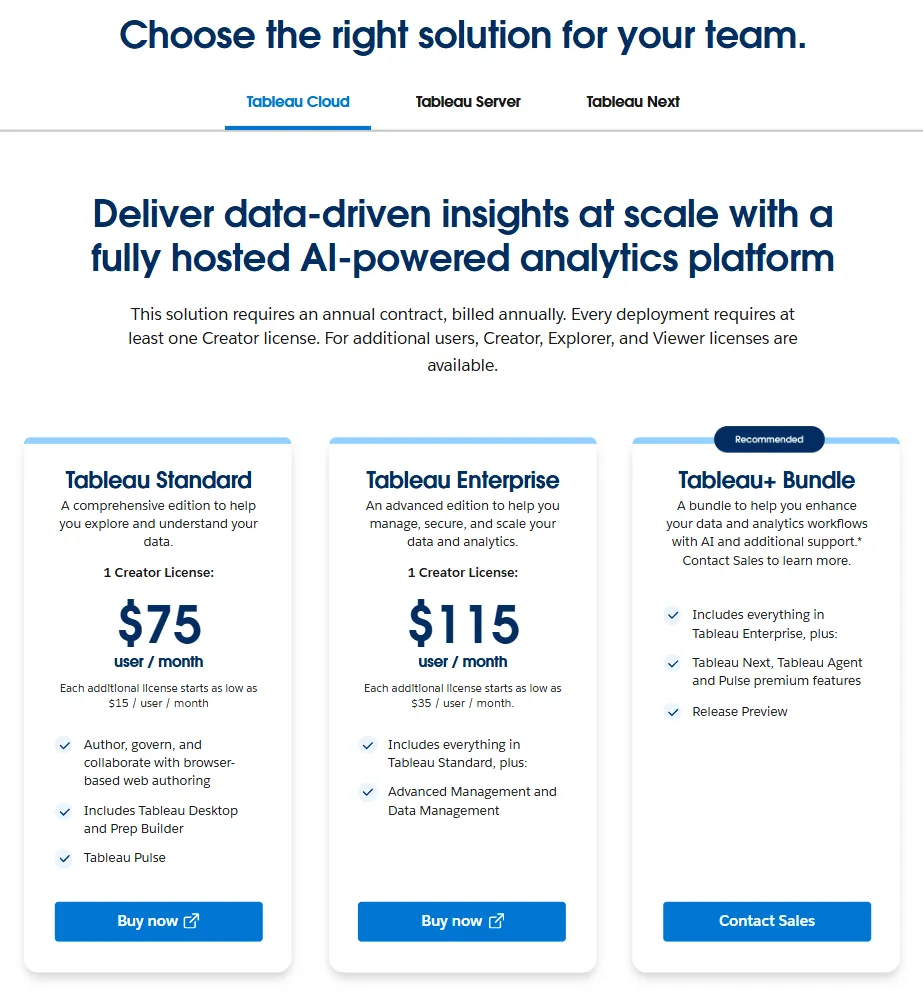
Pricing is per user: a Tableau Creator licence is roughly $75 per month while the Enterprise tier is about $115 per creator per month. Premium agentic features are bundled in Tableau+ and require a custom quote. Total costs can climb quickly, especially if you also need Tableau Server infrastructure or separate Explorer and Viewer licences.
Sisense vs Tableau: pricing and total cost of bi platforms ownership
Budgeting for embedded analytics isn’t straightforward because both vendors hide full pricing behind sales conversations.
Estimates for Sisense range from about US $10k to over US $100k per year depending on deployment and scale. Cloud editions often cost more than self‑hosted versions, and embedding modules like Compose SDK may incur extra fees.
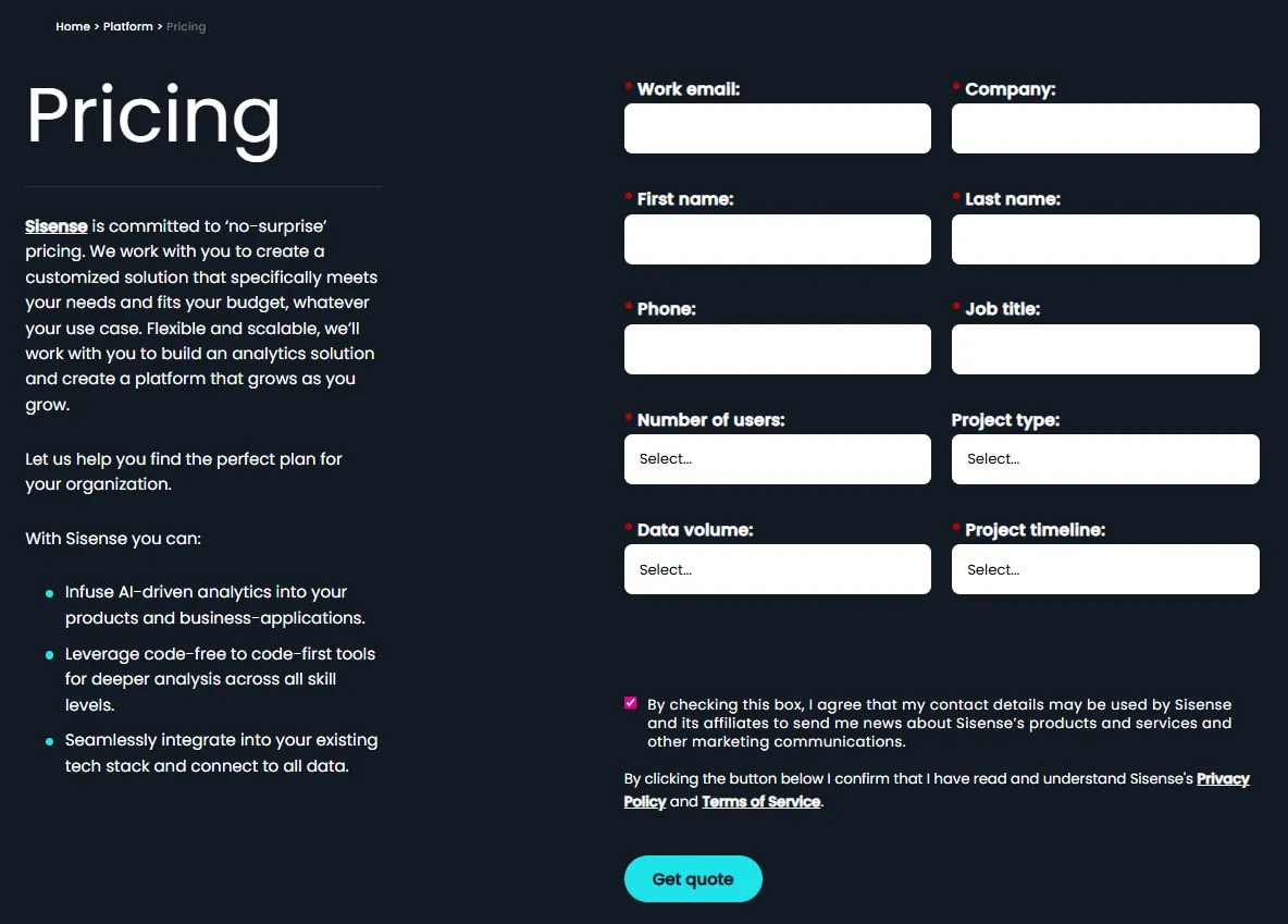
Tableau publishes base prices: the Standard plan costs around $75 per month for a Creator licence and roughly $15 per viewer, while the Enterprise plan costs about $115 per creator per month. Premium agentic features are bundled in Tableau+ and require a custom quote.
Both pricing models can result in a high total cost of ownership when you factor in extra users, developer time and add‑ons, so it’s essential to discuss terms with sales and consider whether alternative BI platforms might offer better value.
Which business intelligence [BI] tool should you choose? Detailed comparison verdict
Both Sisense and Tableau are powerful business‑intelligence tools, but their orientations differ.
Sisense excels in developer control and AI‑assisted workflows via its Compose SDK, centralized connection manager and co‑authoring features. These make it attractive for companies that want deep customization and are willing to navigate a steeper learning curve.
Tableau offers unmatched visualization and a broad ecosystem, and its 2025 updates improve embedding and conversational capabilities. However, per‑user licensing and an enterprise focus may not fit every embedded scenario.
Your choice depends on budget, the need for self‑service versus custom integration and whether you have developers to manage the platform. If you’re comparing Sisense vs Tableau vs Power BI or Looker, consider piloting each solution to see which aligns with your use case.
Other considerations and alternatives
Many teams compare Sisense vs Power BI or Tableau vs Looker when evaluating analytics tools.
Tableau claims that you can embed dashboards in minutes, but real‑world projects often take longer and rely on Tableau Server infrastructure.
Sisense covers complex data sources and allows building custom widgets with Blox, yet using Sisense may require more training and configuration than expected.
Because Tableau operates on a per‑user licence model, costs can skyrocket when you have many viewers. Unlike Tableau, Luzmo was built specifically for embedded analytics.
When you compare Sisense and Tableau to other BI solutions, consider total cost of ownership, scalability and long‑term roadmaps.
If you think Sisense or Tableau might be overkill, exploring other BI platforms or booking a demo will help you make an informed decision.
Luzmo: an all‑round alternative to Tableau and Sisense
Sisense and Tableau evolved from on‑premise roots, but Luzmo was designed specifically for embedded analytics.
Our architecture screams ease of use, and our recent updates add conversational AI and modular tooling.
Luzmo IQ lets users ask questions in natural language through a chat widget, returns AI‑generated summaries and supports workflow integrations like Slack.
Luzmo Studio provides a drag‑and‑drop builder with dozens of chart types, responsive design and multi‑language support.
For developers who need fine‑grained control, Luzmo Flex exposes a code‑first SDK, and the Agentic APIs offer modular endpoints for semantic search, formula generation and chat‑style assistants.
Together these products give SaaS teams both low‑code and code‑first options, transparent pricing and quick integration - a compelling alternative to Tableau and Sisense for teams that want to visualize data with minimal friction.
Luzmo’s pricing is built for predictability and scale, unlike the opaque or enterprise-heavy models of Sisense and Tableau. Plans start at €495/month for Starter and €1,995/month for Premium, with Enterprise options available for larger deployments. Combined with Luzmo Studio for dashboard creation, Luzmo IQ for natural-language analytics, and Luzmo AI for instant chart and insight generation, teams can deliver embedded analytics without worrying about per-user licensing or usage-based cost spikes.
Final thoughts on choosing between Sisense and Tableau
Choosing between Sisense, Tableau and an alternative like Luzmo depends on your priorities.
Tableau might suit organisations that need enterprise‑grade reporting, strong governance and have the budget for skilled developers.
Sisense excels at giving developers deep control over the data model and sisense allows you to embed custom widgets, which may be ideal if you have complex requirements and coding resources.
Luzmo stands out for its transparent pricing, fast integration and emphasis on embedded use cases.
Power BI and Tableau are often compared too, and some teams still reach for Excel or PowerBI and Tableau for quick reports, but modern SaaS teams increasingly favour a platform built for embedding.
Whatever BI software you select, ensure it aligns with your product vision and delivers the interactive dashboards and insights your users expect.
If you feel like that's Luzmo, get your free trial now.
FAQ
All your questions answered.
What do Sisense and Tableau offer for data analytics?
Sisense and Tableau offer strong data analytics features, with Tableau known for powerful data visalization tools and Sisense focused on flexible modeling and handling almost any data source.
How do the platforms compare for data analysis and visualization capabilities?
Tableau excels in visual exploration and visualization capabilities, while Sisense provides customizable models for deeper data analysis workflows.
Is Tableau easy for business users?
Yes, tableau supports an intuitive interface designed for tableau users who want to analyze data quickly and build a tableau dashboard without coding.
What limitations should I know about Sisense?
Sisense requires more setup, but sisense also gives developers flexibility. Many sisense customers like its ability to scale, and sisense users appreciate its custom modeling options.
How is Tableau licensed compared to Sisense?
Tableau operates on a per-user basis, while Sisense typically uses custom pricing structure contracts. Some teams use Tableau for predictable pricing, while others choose Sisense for tailored deployments.
Which tool is more powerful overall?
Both are powerful, but Tableau gives fast visual insights, and Sisense gives deeper backend control—ideal for teams who want something like Sisense in terms of flexibility or something like Tableau for visual clarity.
Who should pick which tool?
If you need fast dashboards for users to create insights visually, Tableau fits. If you need heavy backend prep unlike Sisense, Tableau may be simpler; if you want developer control vs Sisense, teams often prefer Sisense. Some companies want a mix like Sisense and Tableau combined.
Written by

Ship the future of your data
Let us show you what Luzmo can do for your product.

Leave your e-mail and one of our analytics experts will reach out to you