What is a Dashboard in Data Analytics?
When people talk about data dashboards or data analytics dashboards, they often refer to a visual interface that brings together raw data from multiple data sources, highlights KPIs (Key Performance Indicators/Key Performance Metrics), shows key data points, helps users explore data, identify trends, and make informed decisions.
At a high level:
- A dashboard is a dynamic, interactive view of historical and current data, often with real-time data or near–real–time updates.
- Its purpose is to present complex data in a digestible format, usually via data visualizations (line charts, line graphs, bar charts, pie charts), enabling users to derive meaningful insights and take action.
- A well-built dashboard surfaces actionable insights rather than overwhelming users with every metric.
Let’s unpack how these pieces fit together.
Why Dashboards Matter: From Raw Data to Actionable Insights
Imagine you have volumes of raw data — website logs, marketing ad spend, CRM records, product usage logs, financial transactions. You want to transform that into something useful: not just numbers, but understanding. A dashboard is the bridge.
It helps you do the following:
- Track progress: See how your business is performing today vs past periods (using historical data)
- Monitor key metrics: Focus on KPIs like revenue, churn rate, conversion rate, customer lifetime value (CLTV), etc.
- Detect deviations: With real time data, you may spot drops, spikes, or anomalies early
- Compare multiple dimensions: Channel vs geography, campaign vs cohort, time series vs categories
- Explore data: Use interactive elements to drill into segments or underlying data
- Support data analysts: An analytical dashboard can assist deeper data analysis
- Promote data-driven decisions: Teams act not on hunches, but backed by numbers
In marketing, for example, dashboards often integrate Google Analytics data (website traffic), ad platform metrics, email campaign stats, CRM conversions, and usage data. A combined view gives insight into which marketing campaigns drive value, how users behave, and where to invest further.
How Data Analytics Dashboards Work
Turning raw data into a functioning dashboard involves multiple layers:
- Data sources & integration. Dashboards often pull data from multiple sources (databases, APIs, Google Analytics, CRMs, product logs). This requires data integration: combining and aligning data from disparate origins.
- Cleansing & transformation. Raw data may be inconsistent, incomplete, or noisy. Before presenting it, you need to handle inaccurate or incomplete data, unify formats, and aggregate in meaningful ways.
- Aggregations, indexing, and caching. To support fast, interactive dashboards, many systems store precomputed summaries or use caching so queries don’t always re-scan every raw record.
- Visualization & presentation. This is where data visualization is critical. Use line graphs / line charts to show trends over time; bar charts to compare categories; pie charts where proportions matter (though overuse is risky); tables when detailed specific data points matter.
- Interactivity & exploration. To transition from a simple view to deeper insight, dashboards include interactive elements — filters, date selectors, drill-downs, toggles, tooltips.
- Refresh / real-time updates. Depending on the use case, the dashboard may refresh constantly, hourly, or daily, so that users see up-to-date data or current data when needed.
Types of Dashboards: Operational, Strategic, Analytical
Dashboards are often grouped by purpose and audience. Knowing these types is key to designing well.
Operational Dashboards
- Focused on current data, real-time data, or near-real-time metrics
- Designed for teams managing day-to-day operations, support, steps in a sales process, customer service, etc.
- Emphasize recent changes, anomalies, system health, campaign performance at a glance
- Example: A live site traffic and error rate view (akin to the Google Analytics real-time dashboard)
- These dashboards help users react quickly and manage ongoing flows
Strategic Dashboards
- Focus on long-term goals, trends, and high-level KPIs
- Emphasize historical and current data, trend lines, comparisons, forecasts, projections
- Used by executives or leadership to monitor business performance, set direction, evaluate macro shifts
- Less about granular detail, more about alignment with strategy
Analytical Dashboard (Tactical / Exploratory)
- Blend of detail and overview for data analysts or power users
- Allow deeper data analysis, segmentation, cross-filtering, comparisons
- Help data analysts generate hypotheses, test correlation, find deeper patterns
- Can combine metrics across operational and strategic layers
In practice, a dashboard platform (e.g. Luzmo) might allow you to switch between operational, analytical, and strategic views depending on user role or needs.
Design & Best Practices: Presenting Data Effectively
To make dashboards that are both useful and usable, follow these principles:
Clear purpose & audience alignment
Begin by asking:
- Who will use this dashboard (executive/operator/analyst)?
- What key data points or key performance indicators (KPIs and metrics) truly matter?
- What decisions should this dashboard enable?
Don’t assume that all data is equally important. Pick metrics that directly support decision-making.
Visual hierarchy & layout
- Place your most critical data in high-attention zones (top-left, upper area)
- Adopt a structure like the “inverted pyramid”: summary → trends → details
- Limit the number of visualizations. Too many charts = clutter
- Maintain consistency in chart styles, fonts, card layouts, legends
Choosing the right visual elements
- Use line charts/line graphs to show trends over time, e.g. monthly revenue, user growth
- Use bar charts to compare categories such as channel performance or product lines
- Use pie charts sparingly for simplistic proportional breakdowns
- Include tables when detailed specific data points are essential
- Always label axes, units, legends, and contextual thresholds or benchmarks for clarity
Interactivity & exploration
- Filters, date pickers, segment toggles help users tailor what they view
- Drill-down or click-through to deeper dashboards
- Tooltips or on-hover details to preserve clean layouts while allowing deeper inspection
- Highlighting or cross-filtering to show relationships across charts
Performance & responsiveness
- Pre-aggregate or cache heavy computations
- Ensure fast rendering even with complex data
- Optimize queries and indexing
- Design for responsive or adaptive layouts so dashboards work across devices
- Adopt refresh strategies: some metrics need real-time data, others are fine with hourly or daily updates
Data integrity & governance
- Document how each KPI is calculated and from which source
- Track data lineage to manage inaccurate or incomplete data
- Build checks, alerts, or confidence scores to flag suspicious metrics
- Ensure version control for dashboard definitions (models, structure) — frameworks like Mod2Dash formalize this concept, allowing versionable dashboard models.
- Consider mixed-initiative tools or recommendation systems (e.g. MEDLEY) that help suggest visualizations based on analytic intent.
Challenges & Pitfalls
Even high-potential dashboards often fail due to:
- Incomplete or inaccurate data: If underlying data is flawed, any insight becomes questionable
- Metric explosion: Overloading with metrics dilutes impact and confuses users
- Performance bottlenecks: Sluggish dashboards discourage usage
- Mis-matched audience: Presenting operational details to executives or high-level metrics to operators
- Drift in metric definitions: If conversions, growth definitions, or attribution logic change, dashboards quickly become outdated
- Low adoption/trust: Without transparency, users may ignore dashboards
One strategy to catch data issues: use data quality dashboards that monitor coverage, completeness, nulls, duplicates, and raise alerts when anomalies appear.
How Luzmo Can Help with Dashboards
As a platform built around dashboards, Luzmo is uniquely positioned to offer users both operational and strategic dashboards that translate analytical data into meaningful insight.
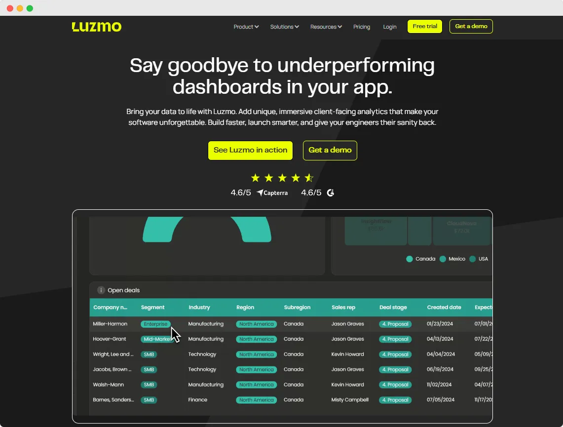
Below is how Luzmo can assist organizations to display data, analyze data, and unlock deeper value across domains from sales performance to user behavior and marketing campaigns — all while supporting modern dashboard capabilities like predictive analytics and augmented analytics.
Unified Dashboard Infrastructure Across Use Cases
Luzmo enables you to build a business dashboard solution that handles types of data ranging from current performance to historical data. Whether your needs call for:
- marketing dashboards,
- sales dashboards,
- healthcare dashboards,
- retail dashboards,
- project dashboards,
- or website dashboards,
Luzmo supports integrating multiple sources — CRMs, ad platforms, analytics systems like Google Analytics, internal databases, and more.
This data integration ensures that your dashboards present a holistic view of important data and key metrics in one place.
Because Luzmo supports both operational dashboards (for real-time or near-real-time tracking) and strategic dashboards (for long-term trend analysis and planning), you can cater to different stakeholder needs. Your operations team might watch a real-time dashboard, while executives use a strategic dashboard plotting revenue growth, customer lifetime value, or expense forecasts.
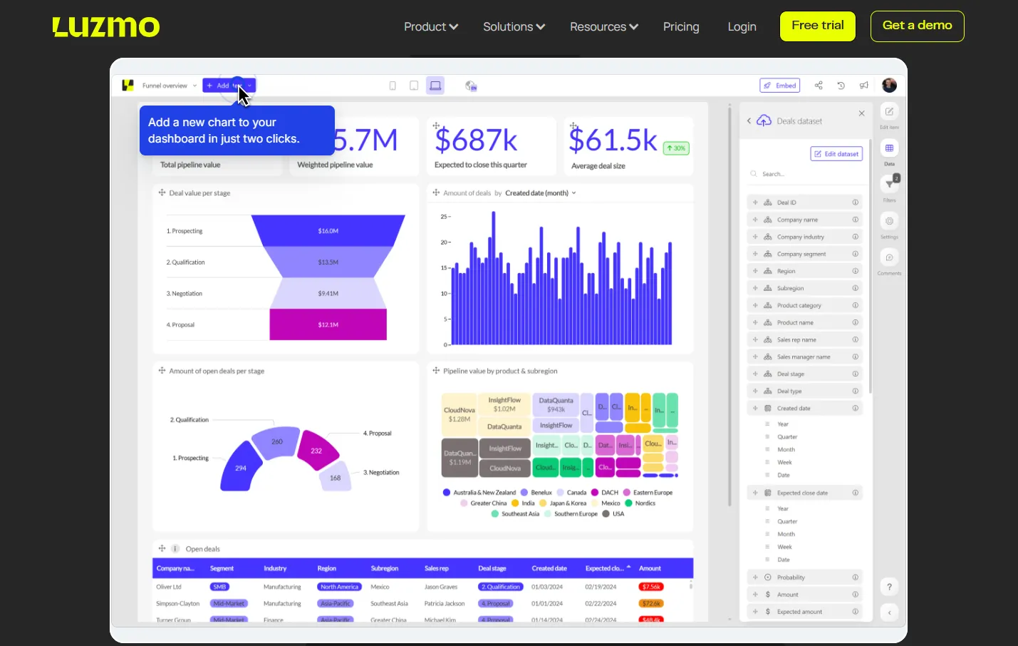
From Raw Data to Analytical Data Dashboards
One of Luzmo’s core strengths lies in handling raw data and transforming it into insightful displays. The platform captures raw and messy inputs, applies cleaning and transformations, and loads them into dashboards that allow users to interact, filter, and explore data. The analytical dashboard layer enables detailed data breakdowns: users can switch from a high-level summary to deeper drill-downs into campaign or product-level metrics.
Advanced dashboard tools in Luzmo support rich visualizations — line charts/line graphs, bar charts, pie charts, tables, heatmaps, and more — so you can match the data visualization style to your metric. For example, a line graph may track daily active users, while bar charts compare sales by region, and pie charts offer a snapshot of traffic sources.
Supporting Predictive & Augmented Analytics for Future Outcomes
Modern dashboards must go beyond descriptive statistics. Luzmo offers built-in support or integration capabilities for predictive analytics, enabling your dashboards to surface projected trends, forecasted revenue paths, or alert you to deviations from expected patterns. Coupled with augmented analytics, the platform can suggest anomalies, correlations, or recommended next steps — helping users go from passive observers to proactive decision-makers.
By combining historical data and current performance, Luzmo’s predictive components allow organizations to anticipate future outcomes — e.g. “If campaign spend continues at this rate, we expect X new customers next quarter.” This elevates dashboards from simple monitors to decision support systems.
Metrics, Business Context & Domain-Specific Views
Because Luzmo is built for versatility, you can tailor dashboards by domain.
- For a sales dashboard, you’ll emphasize sales performance: revenue per rep, win rate, pipeline velocity, contract value, and variance from quota.
- For marketing dashboards, you might show conversions, spend vs ROI, funnel drop-offs, or attribution across channels, integrating Google Analytics or ad platform data.
- In healthcare, dashboards could monitor patient flow, wait times, and outcomes.
- In retail, inventory turnover, footfall, and sales per SKU.
Across all these, Luzmo ensures business metrics and key performance metrics are consistent. The platform gives users transparent definitions and data lineage, so what “conversion rate” or “revenue” means is always clear.
Key Benefits & How Data Dashboards Work at Scale
With Luzmo’s dashboard software, organizations get:
- A single interface to analyze data across domains, integrating financial data, sales, marketing, operational streams.
- Ability to gain deeper insights through drill-downs, filters, and interactivity rather than static charts.
- Consistent best data dashboards practices built in (performance optimization, responsive layouts, intuitive UX).
- Real-time alerts or threshold monitoring so users don’t miss shifts in current data.
- Scalability: when you have many users or large datasets, Luzmo’s architecture ensures dashboards remain snappy and responsive.
- A path toward data-driven decisions, with dashboards offering guided insights and predictive signals, not just historic reports.
Because Luzmo is designed from the ground up as a dashboard provider/platform, it encapsulates all layers — from ingestion and aggregation of raw data, to rendering modern dashboards that support operational, analytical, and strategic use cases.
With the right configuration, Luzmo becomes the nerve center for how organizations monitor business performance, uncover hidden trends, and plan their next act.
Over to you
Ready to move beyond dashboards that just show “what was”? With Luzmo, your dashboards can surface insights you act on — combining operational and strategic dashboards, predictive analytics, and augmented analytics so you can monitor current performance and anticipate future outcomes.
Don’t let valuable metrics stay buried — elevate your dashboards to a strategic asset.
Start a free trial or book a demo with Luzmo today to see how your data can drive smarter, faster decisions.
Written by

Ship the future of your data
Let us show you what Luzmo can do for your product.

Leave your e-mail and one of our analytics experts will reach out to you