Data Reporting: Definition, Examples and Best Practices

The average business creates immense amounts of data every passing second. Customer data, purchase history, interactions with your website, steps in the sales funnel… The list goes on and on. And when someone important in a business (or your customer) wants to see that data, you need reporting.
Data reporting turns data points into useful insights that a manager, CEO, customer, or client can use to guide their decision-making. Today, we show you all you need to know about data reporting.
What is data reporting?
Data reporting is the process of reporting on data - taking data points from various sources, distilling them in a form that is easy to understand, and finally, wrapping it up in the form of a report.
The audience for a data report can be a large number of people:
- Your direct manager
- A C-level executive
- An investor
- A customer who wants insights about how they use your product
- A client who needs a performance update about their campaigns
A data report is more than a list of numbers and raw data points. It’s a curated collection of information presented in a way that helps readers derive value from it. And the best part is - you don’t have to be a data analytics expert to create data reports.
Why is data reporting important for a modern business?
Just collecting data is a good start. But reporting on that data can benefit just about everyone in your business, from leaders to end-users.
Informed decision-making
Equipped with the right metrics and KPIs, business leaders can make the right decisions at the right time. A data report about a business’ sales numbers tells the CFO which channels are performing well, which sales reps perform the best, what products/services are (not) selling and more.
Performance monitoring
Data reporting can give you real-time access to your sales, marketing, and overall business performance. You can measure performance through static reports or interactive dashboards, which use visualizations to give you true real-time data access.
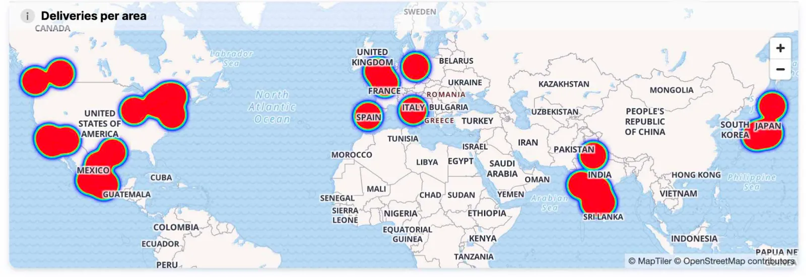
Imagine seeing how many visitors your website has in real-time and which landing pages they are on - you can do that.
Identifying trends and patterns
To make important business decisions, you first need to spot trends and patterns in your data. For example, you could pull data from various data sources, such as your CRM, website analytics tool, sales dialer and other tools. You can then use data visualization to see trends and patterns in data.
For example, you could see that a certain product category is selling poorly in the last quarter and that you need to pull in a different direction or work on a new ecommerce SEO strategy to see improvements such as focusing on keywords that convert into sales.
Accountability and transparency
Early on in my career as a manager, my CMO told me one thing that struck me: to make someone succeed, make them own a KPI. Data reporting does just that - it tracks metrics and KPIs for every business functionality and every role.
This makes your team more accountable as it’s easy to see who is in charge of what operations and what kind of outcomes they are producing.
Regulatory compliance
In some industries, data reporting is not just about actionable insights. Reporting on data is necessary as business intelligence is built into these industries by default - you need to track and monitor data to stay compliant. Think healthcare, government, cybersecurity, and other industries that require strong password management, among other things.
Competitive advantage
When you collect data and pay attention to key performance indicators, this shows you which areas of your business need improvement. Whether it’s financial reports or marketing reports, you get accurate data that helps you find out what to automate, eliminate or improve.
Types of data reporting
The reporting process and the final outcome are different based on your data collection, data reporting tools and the audience reading your reports. These are some of the main types of reports you can use in your business.
Real-time reports: a reporting system where data is constantly fetched from data sources to the report, giving accurate, real-time data.
Ad-hoc reports: custom reports built upon request. For example, a CEO needs to make some data-driven decisions and they request a financial performance report for the quarter.
Regular reports: planned reports created and sent out at regular intervals, e.g. once per week, month, quarter.
Descriptive reports: reports not only showcasing data, but also covering key takeaways and conclusions based on said data.
Prescriptive reports: reports that provide data analysis and prescriptions on what could be done in the future to achieve better results.
Predictive reports: these reports are based on historical data and they make predictions about future performance.
Actionable tips for improving data reporting
If you want to kiss Excel spreadsheets goodbye and take your data reporting to the 21st century, here are a few tips on how to improve your data reporting process.
Build the report according to the audience
Before you start collecting data or build any data visualizations or graphs, think about the most important person(s): the one reading the report. The data sources, formats and visualization types you choose need to be based on that persona.
For example, a CMO won’t need the same level of search visibility tool insights insights from a tool like Ahrefs Brand Radar as a Head of Content or a Head of Growth. A customer who only uses one set of features won’t need the same dashboard as someone who uses your product to the full extent with all of its plugins and add-ons.
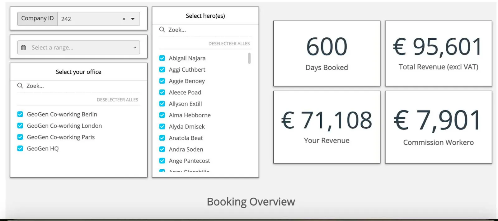
One way to solve this problem is to offer self-service reporting and allow your end-users to create the kind of reports that suit their needs.
Define the goals and objectives before creating a data report
What are you trying to achieve with the report? Do you want to get actionable insights about past performance? Predict future performance? Find out which processes can be automated, eliminated, or improved?
Collecting data for the sake of collecting data is bad, and so is creating reports just to tick a box. Reports are important initiatives that need to exist for a reason. Without that reason, your decision-makers won’t fully grasp the importance of data in front of them.
Use the right tool for the job
There are countless tools that can create reports and dashboards. But not every tool is ideal for every type of report under the sun.
For example, just using Google Sheets can be enough to create a simple work report. Looker Studio is an excellent app for reporting on Google Analytics, Google Search Console, and Google Ads - for website traffic, paid ads stats, and more. Power BI is a great tool for on-premise BI reports for enterprise demographics. Embedded analytics platforms like Luzmo Studio make it easy to build and embed dashboards directly into software products, while Luzmo IQ and Luzmo AI help users explore data, generate visualizations, and uncover insights using AI-powered and natural language interactions. This makes reporting more accessible and actionable for both internal teams and end users.
Visualize your data
In its basic form, data has limited usability. Showing rows of numbers in a visual format helps your target audience understand the data better and draw conclusions more quickly and efficiently. Some examples of visualizations include:
- Bar charts
- Line graphs
- Histograms
- Scatter plots
- Pie charts and donut charts
- And many others
When numbers are visualized, they become effective data - as the person reading the report can understand the data and take action based on it.
Choose the right visualizations
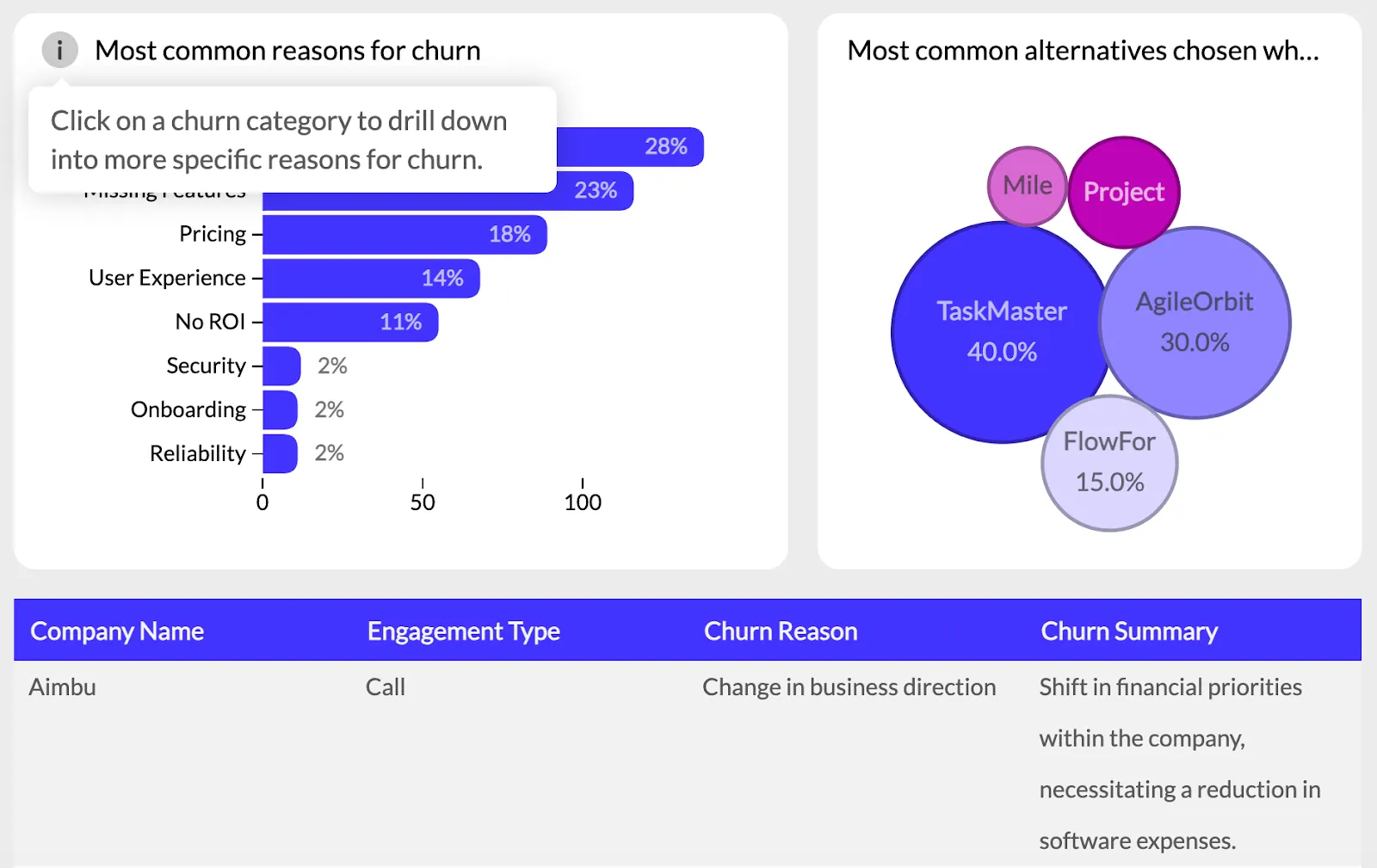
Just because it can be a pie chart, it does not mean it should be. There is a right and wrong type of dashboard for every type of data and intended use case. For example, pie charts are great for showing proportional data, while histograms are great for showing the distribution of continuous data.
Choose the type of visualization based on the data you’re working with and the effect you want to achieve. Some tools such as Luzmo come with report and dashboard templates that have pre-built visualizations for the right use case.
Give context to your data
While visualizations tell a story, they don’t tell the whole story and sometimes the end-user can struggle with telling what is what. You can help them come to the right conclusion by giving them tooltips and insights for each visualization.
In Luzmo, users can hover over these tooltips to get additional information about a visualization. This is especially handy for users who are not tech-savvy and don’t understand all the data points you’re delivering them.
Structure your report in a logical way
In communication, there is a concept called BLUF or Bottom Line Up Front, where you deliver the most important information first, followed by all the information that is less important. In short, it’s a reverse pyramid.
Put the most important information first as this will allow decision-makers to catch up with it before moving on to the supporting information. For example, you can show the total sales and conversion first before going into a breakdown of all the specific sales channels.
Wrapping up
Data reporting is no longer nice to have - it’s a necessity for a business that’s driven by outcomes and tangible results. It may seem like reporting is a complex topic, but thanks to reporting tools, the process of collecting, analyzing, and visualizing data is mostly automated. All you have to do is determine who your audience is and what data they need to see.
At Luzmo, we can help you create stunning reports and dashboards to share with customers within your SaaS app. Give your end-users additional value from your tool, drive new revenue, and beat the competition on the basis of product usage.
Get in touch with our team so we can show you how to add an embedded analytics dashboard to your app! Plans start at $495/month for Starter, $1,995/month for Premium, with custom Enterprise pricing available as your reporting needs scale.
FAQ
All your questions answered.
What is the difference between data reporting and data analysis?
Data reporting focuses on presenting data in an understandable format, such as dashboards or reports, while data analysis involves examining data to uncover patterns, relationships, and insights. Tools like Luzmo Studio help teams create dashboards for reporting, while Luzmo IQ and Luzmo AI enhance analysis by automatically identifying trends and helping users explore their data.
What tools are best for modern data reporting?
Modern data reporting tools include spreadsheet software, business intelligence platforms, and embedded analytics solutions. Platforms like Luzmo Studio allow teams to embed dashboards directly into their applications, while Luzmo IQ and Luzmo AI help users generate reports and insights automatically using AI-powered analytics.
How can businesses make data reporting more accessible to non-technical users?
Businesses can make data reporting more accessible by using visual dashboards, automated reporting tools, and AI-powered analytics. Instead of relying on manual reports, tools like Luzmo Studio allow teams to create user-friendly dashboards, while Luzmo IQ and Luzmo AI help users explore data and generate insights using natural language, making reporting easier for everyone.
Written by

Ship the future of your data
Let us show you what Luzmo can do for your product.

Leave your e-mail and one of our analytics experts will reach out to you