How To Use AI For Data Visualization

Data visualization has been around for ages. As early as the 1800s, people like Jon Snow were using data visualization on hand-drawn maps to show which water pumps were causing cholera outbreaks.

Over the years, we evolved from static drawings to online dashboards and advanced business intelligence tools. Today, anyone – not just data analysts – can make data-driven decisions by exploring their data in interactive dashboards.
And yet, new ways of data visualization are on their way. The arrival of artificial intelligence is changing the way we analyze data. In this article, we explore how you can use AI to bring your data visualizations to the next level.
Why use AI tools for data visualization?
Although AI can be overwhelming at first, there are so many ways in which it will add value to your data visualization process.
First off, the potential time gains are massive. Think of how much time it might take someone who has no experience with data visualization to create a dashboard in BI tools like Power BI or Tableau. Now think of a ChatGPT-like interface where you can start asking questions like:
- How much revenue did we make last quarter?
- Which sales reps brought in the most revenue?
- How does it compare to the same period last year?
Now imagine getting rich, interactive visualizations in return. Instead of taking an entire day, you get visualizations done in just a few seconds.
A lot of manual work can be replaced with automation, and not only for visualizations. Also the interpretation of charts and graphs becomes easier with AI. You could use AI to draw some potential hypotheses from your data and summarize them in plain English.
Finally, AI is known for uncovering patterns with high precision. If we overlook certain trends as humans, rest assured that they won’t slip through the cracks so easily when using AI or machine learning algorithms.
5 ways to use AI for data visualization
Not sure how to get started? Here are some ideas to get you going in the right direction.
Create dashboards using natural language
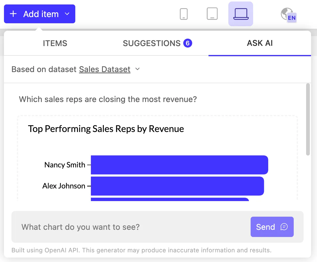
One of the most obvious use cases of AI in data visualization is to create dashboards using natural language. Users can type out whatever insights they need in plain English, and AI will turn raw data points into visual a chart—or even a complete dashboard. For example:
- “Show me the most common reasons for quitting”
- “Compare the average sick days of leavers with the company average”
- “Now map it against the average employee satisfaction score”
If you’ve ever created a report or dashboard before, you’ll know that the process can be lengthy. For example, say you’re an HR manager and you notice the turnover rate of your personnel has started to increase. To do a deeper analysis, you need to find out what factors influence this, where to find that data, how to present it visually,...
The result is usually a lengthy back-and-forth with a data analyst. Now imagine going through that process with AI as your buddy. For each question you ask, you’ll get visualizations in return.
Expect to see this feature being added to more and more BI solutions. In Luzmo, for example, you can already hook up any data source and start asking away.
Get suggestions on which data to visualize
If you’re not a data scientist or data analyst, it’s difficult to make sense of all that complex data at once. Even the first step – choosing what to visualize – can be overwhelming:
- What information do you or your target audience need to make informed decisions?
- Which data should you visualize to get that information?
- Which visualization techniques are best to get your desired results?
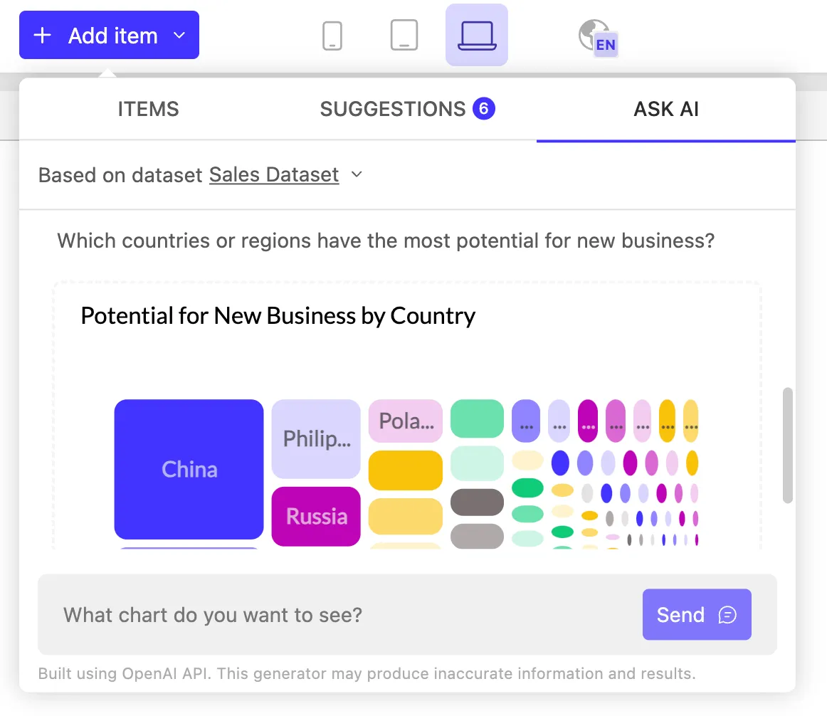
AI can help, not only through natural language processing, but also through auto-suggestions. In Luzmo, for example, you can connect any dataset, and our AI will come up with the best-suited charts for that dataset.
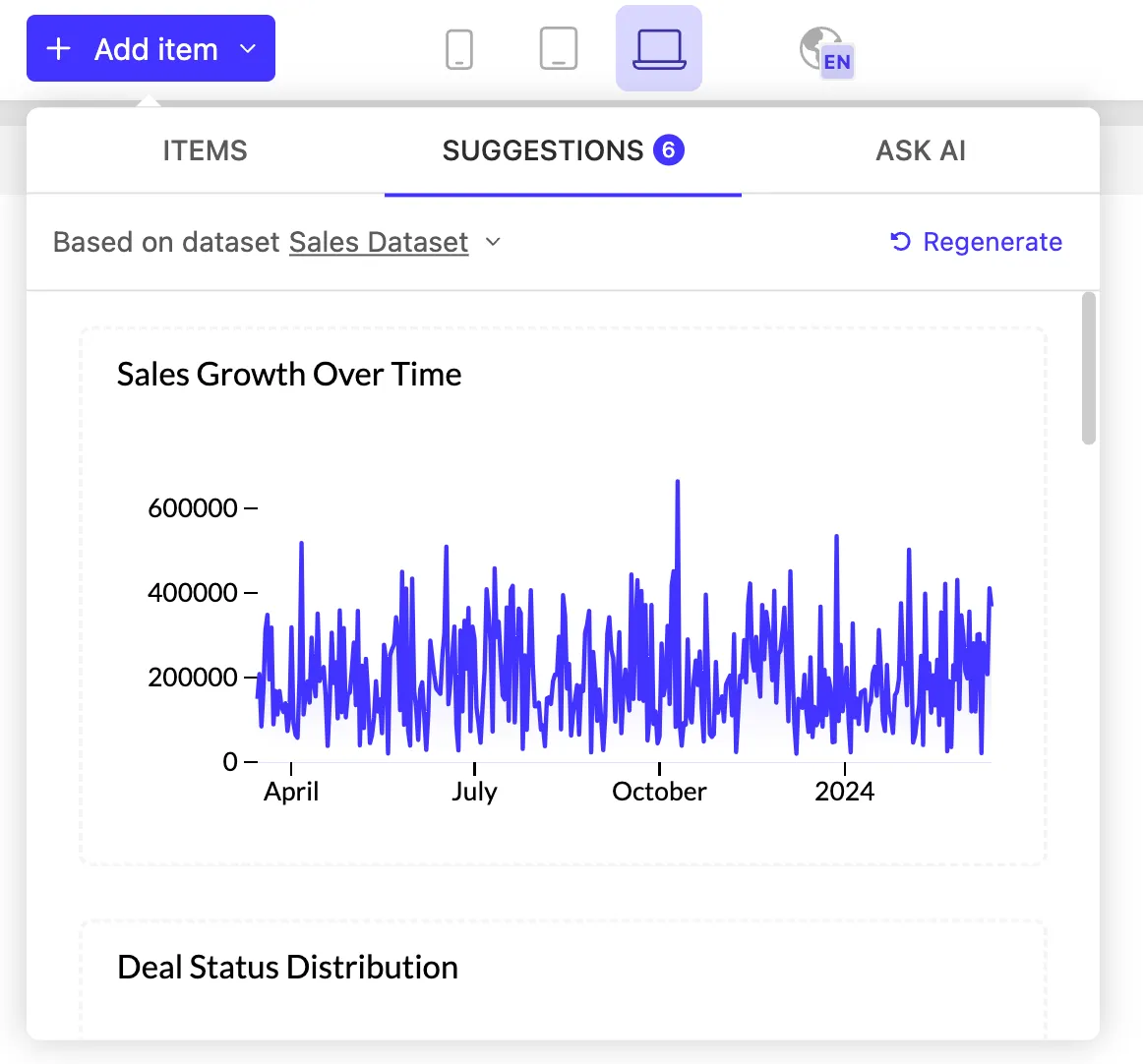
So if you don’t know whether it’s best to use a bar chart, heat map, or any other chart type, let AI do the heavy lifting on visual representations. Put your time and focus into exploring these interactive visualizations and finding the insights you need to make better decisions.
Workflow automation
Clean and structured data is a must for good data visualization. Garbage in is garbage out, so without well-structured data pipelines, it will be difficult to build useful and easy-to-use visualizations.
Data workflows like data cleaning, data modeling and ETL can be tedious to set up, but luckily, AI can lighten some of the load.
For example, when working with complex datasets, AI can help you come up with advanced SQL queries to ensure your data visualizations load quickly and smoothly.
As another example, AI models can detect outliers or missing values, and save you hours of manual work. Generative AI tools can help you out with all sorts of Python or JavaScript code snippets to speed up your data workflows, so you don’t have to do the heavy lifting.
Have a look at this demo, where we used ChatGPT to come up with a mock dataset, which you can use for any data projects you’re working on.

Predictive analytics
When we think of AI today, large language models (LLMs) are the first thing that come to mind. However, machine learning algorithms are another subset of AI that can bring tremendous value to data analysis. It can learn from data, detect patterns, and automate decision-making.
Predictive analytics, for example, can take your data visualizations to the next level. Many businesses can benefit from data forecasts to make better, future-proof decisions:
- Risk assessment: make predictions about the maintenance of buildings, machinery, etc. to avoid downtime or hazards.
- Finance: forecast cash flow, revenue, or financial investments to make better financial decisions.
- Customer behavior: make predictions about shopping behavior or the likelihood of repeat purchases based on past buying behavior.
One of our clients, Strobbo, built an advanced machine learning algorithm to forecast personnel needs. They use Luzmo to visualize these personnel insights in interactive dashboards.
For example, you can also use an AI music generator into their user interface to enhance the user experience, creating a more engaging and personalized environment for reviewing these insights.

Create interactive prototypes faster
With the latest advancements in generative AI, you no longer need to rely on text only. If you want to use your voice, or imagery as input – it’s all possible. For data visualization, innovative AI models like GPT-4-vision can help you build a dashboard prototype in mere seconds.
At Luzmo, for example, we created a tool called Instachart to create interactive dashboard mockups. Upload a dashboard screenshot, Figma mockup, hand-drawn sketch or other formats, and Instachart will turn it into a working dashboard.
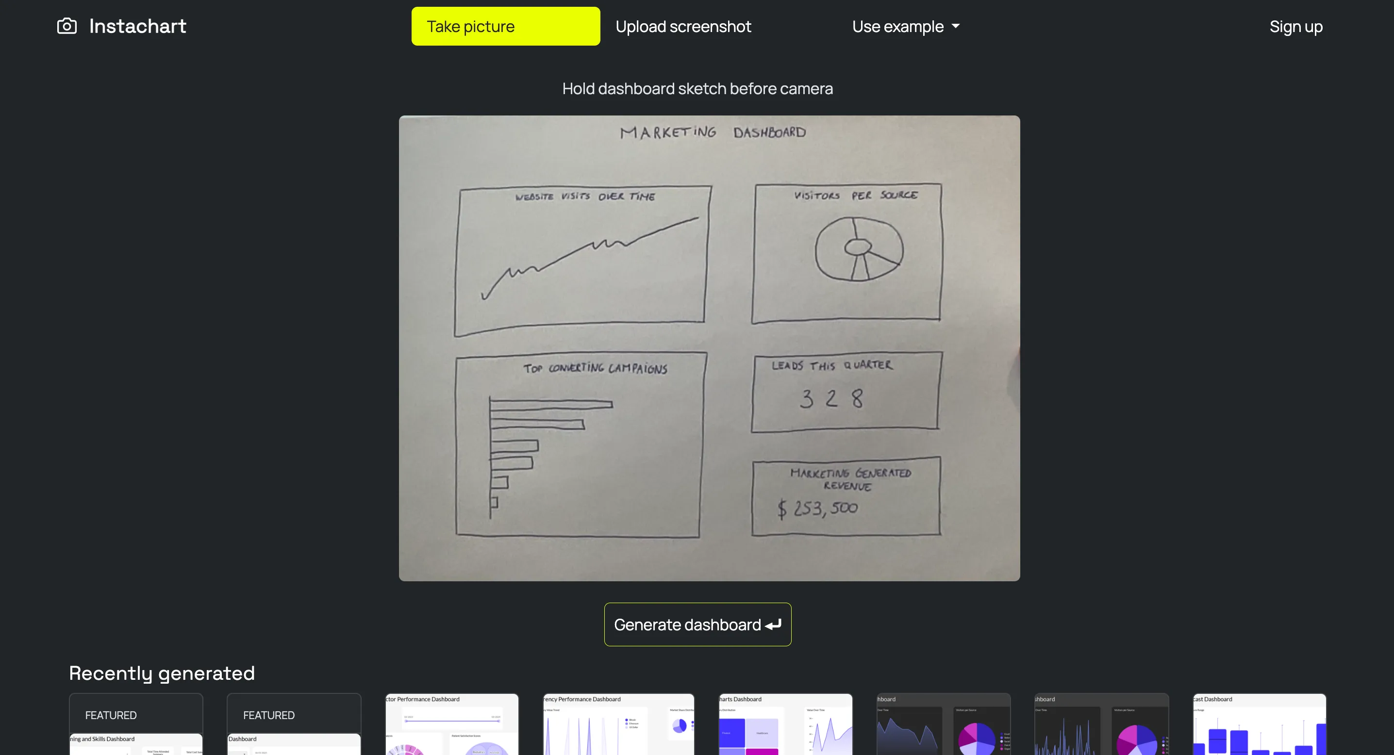
For SaaS product builders, this cuts down the research and prototyping stage from weeks to only seconds.
Best AI data visualization tools
If you want to get started using AI for data visualization, here are a few BI tools that have launched AI features in their product suite, as well as newer AI tools that help with data visualization.
Luzmo
If you’re building a SaaS product and need user-friendly data visualizations, Luzmo is your go-to analytics platform. Our entire product has been built up to enable easy and fast embedding within web apps, with all the bells and whistles you need. It’s highly interactive and customizable, meaning your product users can easily derive actionable insights in seconds.

It comes with some cool AI features like auto-suggested charts and prompt-based chart generation. And if you’re a developer, you’ll love their API-first approach. Hook up Luzmo’s embedded analytics to any data source, external software, or your AI model of choice!
Instachart
This free tool comes in handy when you need inspiration for your data visualizations, or when you want to create a mockup for your dashboard in just a few seconds. Instachart is an AI-powered tool that lets you upload a dashboard screenshot, a sketch or a Figma mockup, and immediately turns it into an interactive BI dashboard.
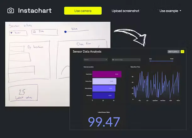
We created this tool at Luzmo to help product builders go from idea to dashboard quicker, without the need to code. It will automatically generate dummy data for your dashboard, but you can easily replace it with your own data and metrics.
Tableau
This business intelligence giant is a popular choice for data science and data analytics professionals doing internal reporting projects. Perfect for handling big data, this BI tool offers a wide variety of data visualizations.
In terms of AI, Tableau stands out for its predictive capabilities, with insight recommendations. It now also offers something called data stories: it adds explanations to your dashboards in an instant. Useful for a quick summary of new insights!
Microsoft Power BI
Power BI is another powerful traditional BI tool, along with the likes of Tableau. It supports a variety of data sources, from simple Excel spreadsheets to advanced data warehouses, and is known for its powerful analytics capabilities on top of its visualization layer.
Definitely not for beginners, but its AI options are very powerful. You can connect Azure Machine Learning algorithms to Power BI e.g. sentiment analysis, language detection, or image tagging. You’ll also need a separate license, so be prepared to dig deep in your pockets.
ThoughtSpot
ThoughtSpot is a self-service BI platform and fits this list well because of its primary focus on AI. It promises users the ability to explore data and get insights using nothing but plain English. You simply ask ThoughtSpot for the insights you need, and you’ll get charts and dashboards in return.
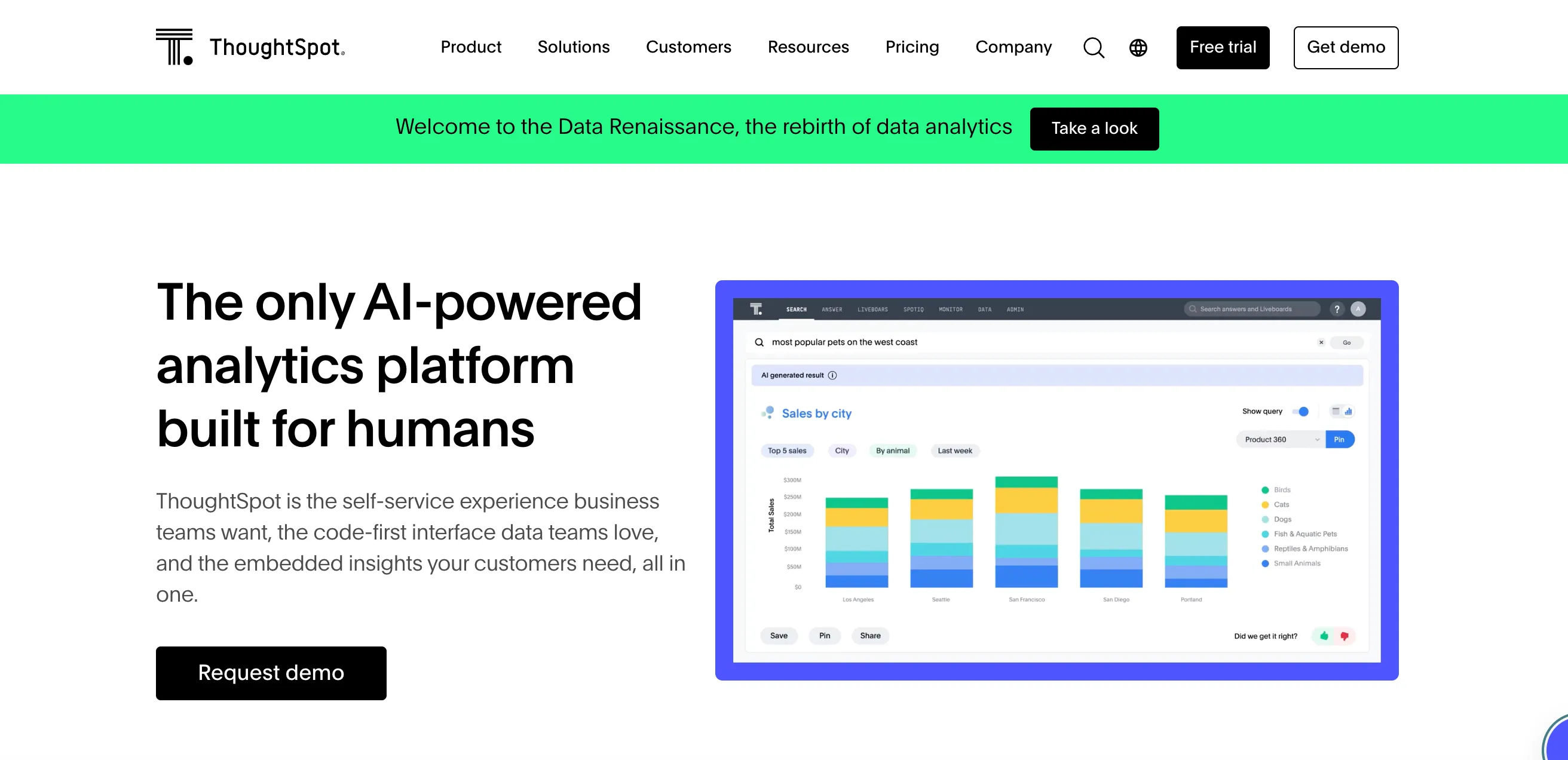
Although powerful, our ThoughtSpot research shows that the AI features are far from perfect. You’ll still need a data scientist at hand to help prepare your data before you can dive into analysis.
Conclusion
Artificial intelligence and LLMs can help you automate the boring data visualization tasks, so you can focus on the things that matter. Especially in SaaS teams, engineers and data scientists are already spread thin.
The 5 examples above should already help you speed up data visualization. And if you’re looking for a tool to help you with it all, look no further than Luzmo. Besides our native AI features, we connect easily to any AI models you are already using thanks to our open API.
Grab your free 10-day trial today, and build your first user-facing dashboards in days, not months!
Written by

Ship the future of your data
Let us show you what Luzmo can do for your product.

Leave your e-mail and one of our analytics experts will reach out to you