12 Top Data Visualization Techniques for Data Storytelling

Eggs, flour, sugar, baking powder, milk and butter. Give them to the right person, and they’ll make a delicious cake. In the hands of someone unskilled, the mix of these ingredients is a mess that is not pretty to look at or consume. The same goes for data visualization.
Two people starting with the same datasets can tell two different stories. One that tells you what changed in the data and how, and gives clear insights to the person reading. The other, a confusing mess of graphs and charts.
The difference between the two is effective data visualization. Today, we take a look at data visualization techniques: your available choices and when to use each one.
What is a data visualization?
A data visualization is a graphical representation of different data. Instead of raw data in the form of numbers, you can use data visualization to communicate data more clearly and easily, in a way that is geared for your target audience.
For example, instead of a table with hundreds of data points, you can give your audience a bar graph explaining all that data in a way that is easier to understand. Effective data visualization helps turn numbers into stories that foster better decision-making.
You’ve seen data visualization examples many times before, from graphs in Excel to infographics, all the way to complex datasets visualized as dashboards in business intelligence tools.
Choosing the right type of data visualization is crucial because it helps you tell the story behind the data. For example, bar charts are ideal for comparing categorical data, while pie charts are better suited for showing proportions of a whole. Understanding which visualization to use and when can make the difference between clear insights and confusing charts.
While some analytics tools offer tutorials on choosing the right visualization, many leave that decision entirely up to the user. Platforms like Luzmo Studio simplify the process by letting teams quickly build and test different chart types inside their dashboards. At the same time, Luzmo IQ can automatically detect trends and patterns in datasets, and Luzmo AI allows users to ask questions in natural language to generate charts and insights instantly.
Today, we’ll show you which visualization techniques work best for different types of data so you can turn raw numbers into meaningful insights.
Top data visualization techniques to use and understand in 2024
You don’t need to be a data scientist or some other data analytics expert to become a master at presenting data in an insightful way. Once data analysis is finished, all you need to do is choose the right visualization type based on the data you’re working with and the kind of story you want to tell.
Bar charts
This is the best type of visualization if you want to compare several categories over time. The horizontal bars show the growth in a category over time. The longer the bar, the bigger the value - it’s that simple. For more insights, you can group data from different subcategories in the same bar - just use a different color scheme to separate them.
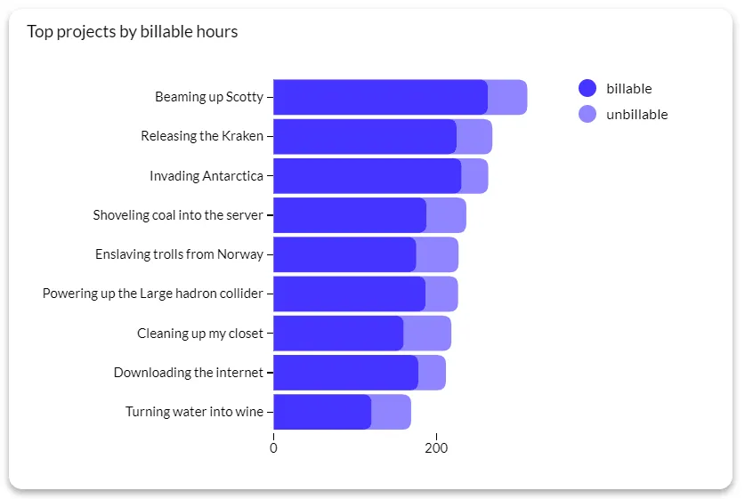
Best for: comparing categories, ranking items, frequency distribution.
Heat maps
A heatmap or a heat map shows values for one main variable across two axes as a grid. The grid is divided into squares, each in a different color. Variables have ranges like a histogram or a bar chart.
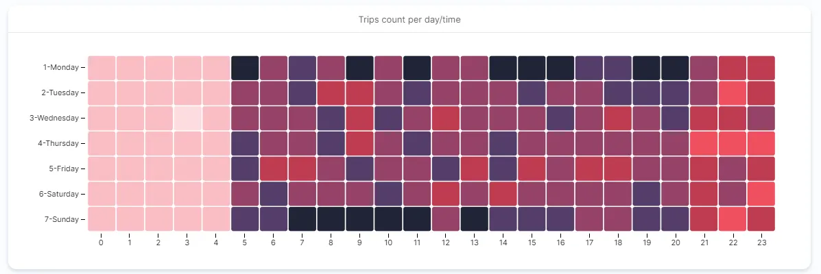
Typically, the darker the color in a heatmap field on a grid, the higher the value. Just by taking a glance at the colors in a heatmap, you can quickly draw conclusions about the underlying data.
Best for: recognizing patterns, doing correlation analysis, portfolio analysis, risk assessment.
Scatter plots
This is one of the best choices when you have two or more variables and want to discover the relationship between them. For two variables, you have the x- and y-axis, and the data point is located horizontally and vertically for each variable in the scatter chart.
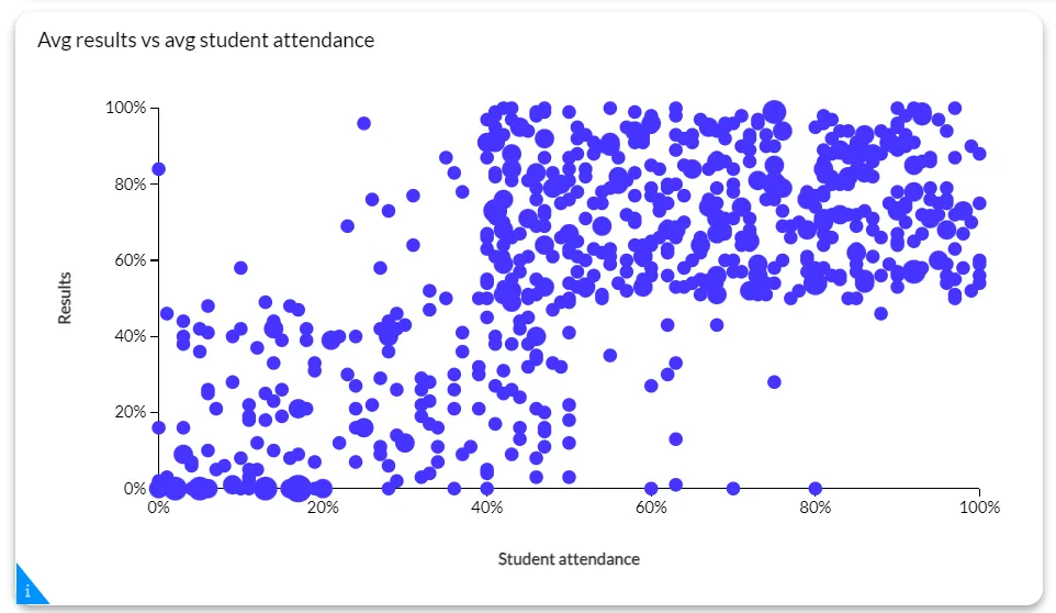
If the two data points are close on the chart, that means that there is a strong correlation between them. The bigger the distance, the lower the correlation.
Best for: correlation analysis, detecting outliers, identifying relationships between variables.
Treemaps
Show hierarchical data in a fun way or show proportions between different values in the same category with treemaps or treemap charts.
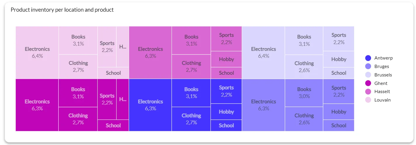
While it’s called a treemap, it has nothing to do with trees. It’s a table with squares in different colors, visualizing different categories. The bigger the rectangle is, the bigger the ratio of the part to the whole.
Best for: hierarchical data visualization, nested data categories, and quantitative data display.
Line chart/line graph
When you want to track the evolution of a quantitative value over time, a line chart is a solid choice for visualization. Line charts can show you trends and changes in data over time. You can also compare data from multiple values with many different curved or straight lines.
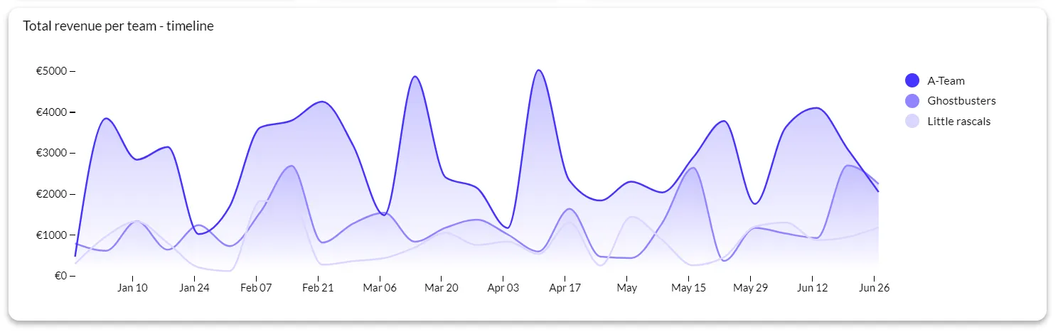
The y-axis is the quantitative value while the x-axis is the timescale or a sequence of intervals. The direction of the line shows you how the value is progressing over time.
Best for: analyzing trends, and comparing multiple data series.
Histograms
Histograms show you the frequency of numerical data through rectangles. On the vertical axis, you can see the frequency of the variable. On the horizontal axis, you see the value of the variable, such as days or months.
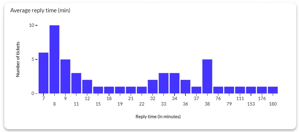
If you want to show the distribution of numerical data over a time interval, this is one of the most effective choices. Histograms and box charts are used interchangeably, but each has its own best use cases.
Best for: data distribution analysis, data preprocessing, finding outliers in big data sets.
Area chart
It’s similar to a line chart as it helps you track changes in data over time for one or more categories. Using area charts, you can easily compare data from multiple categories with multiple areas in a chart.
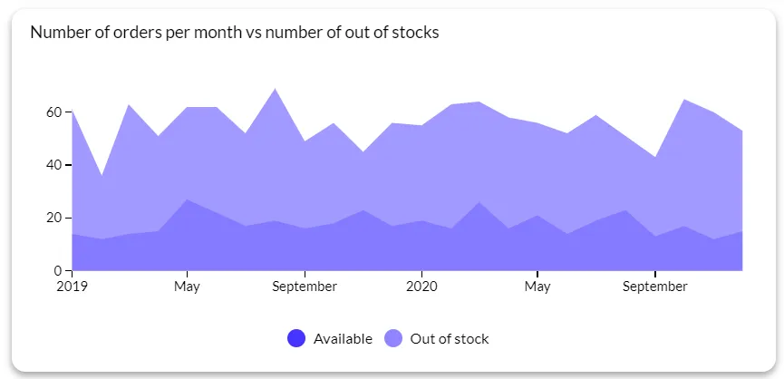
The main difference between line charts and area charts is that in the latter, you fill up the area below the line with color to show volume.
Best for: showing trends over time, comparison of stacked data, relationships of part to whole.
Box plots/Whisker plot
For exploratory data analysis, box plots are an excellent choice as they let you summarize data measured on an interval scale. Box plots show the distribution of data points, their variability and central value.
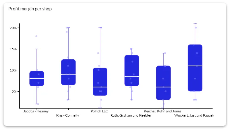
You can see both the spread and the outliers in a box plot, and this type of visualization does not take up much space in the average dashboard.
Best for: comparing data distributions, finding central tendency, and understanding data spread.
Word clouds
Word clouds, also known as tag clouds and text clouds are visual representations of text data. It’s a cloud with a list of words where the bigger size of the word means that the word is used more frequently in the text.
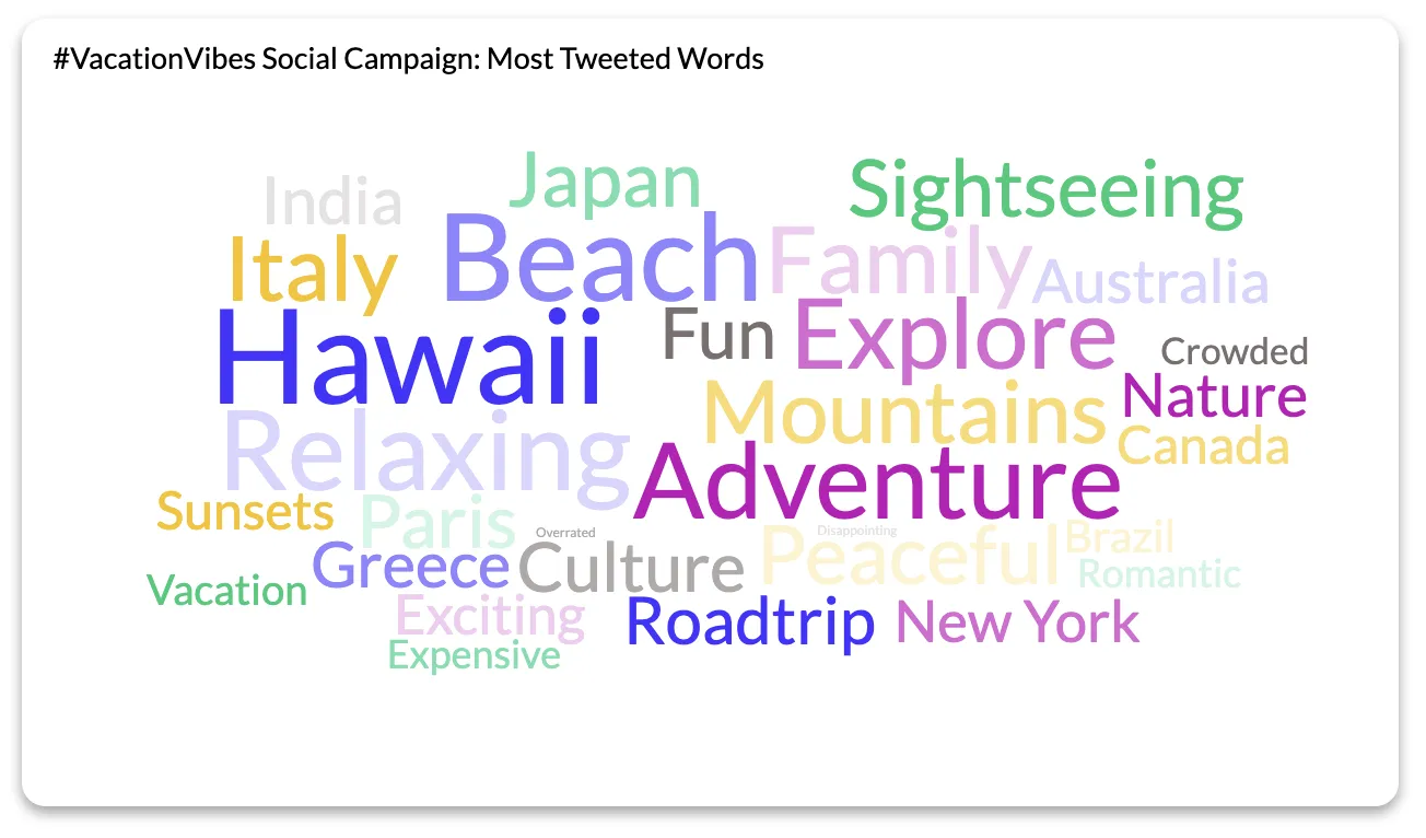
If you want to quickly and easily summarize the contents of a text document or a website, this is one of the top ways to get this done. Word clouds can be in different fonts and the words can be arranged in completely random ways.
Best for: data exploration, text analysis, visual communication.
Bubble charts
This is a colorful way to show how many values you have in each category. The higher the value, the bigger the bubble in the visualization. You can see an overview of your top categories at a glance.
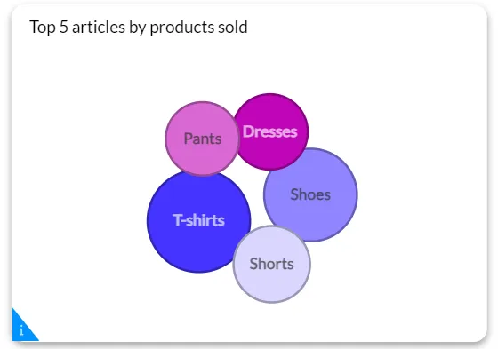
You can adjust the size and the number of bubble charts to show you the exact type of data you need, adding a layer of interactivity.
Best for: showing multivariate data, comparing multiple variables, showing trends and patterns.
Choropleth map
This is a statistical thematic map with colors that match a number range. It’s used to summarize a geographic characteristic of a certain area.
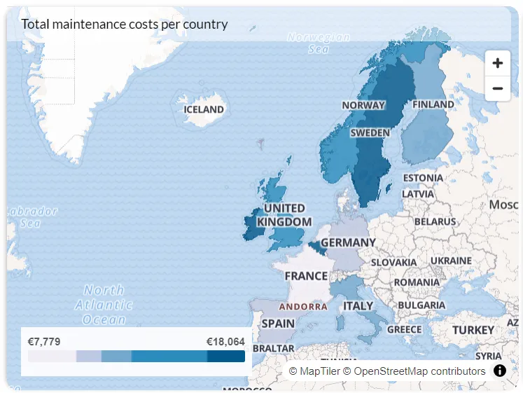
Best for: geographic insights, special patterns, and data distribution.
Network diagrams
This is the visual representation of the structure of a network, typically used to show relationships and connections between different entities, such as customers, products, transactions, or processes.
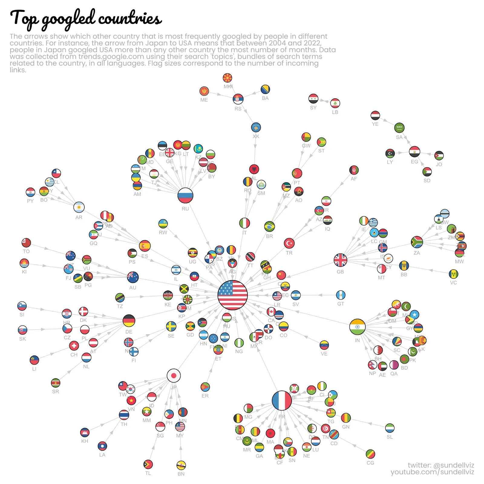
Best for: graphical representation of relationships, identifying patterns and trends, root cause analysis.
Top data visualization tools for modern businesses
All of these types of charts are typically not available in tools such as Excel. If you’re working with large datasets and you need to show important data to stakeholders in and outside of your business, you need BI tools with all the right visualization methods listed above.
Here are some tools that can do the job and turn unstructured data into visual elements that tell stories.
Luzmo
Built for SaaS businesses, Luzmo helps you turn data from your app into beautiful embedded dashboards. When you want to show actionable data insights to the end users of your app, Luzmo is the default choice.
It comes with a variety of visualizations that can help you turn complex data into visualizations that the end user can understand. It’s easy to embed into your app and connect to other tools thanks to a great API and a variety of connectors.
It’s easy to scale, comes with transparent pricing and you don’t need a team of data analysts to start using Luzmo.
Grab a free trial and see for yourself!
Microsoft Power BI
If you’re already in the Microsoft ecosystem and don’t mind the complex pricing scheme of this tool, Power BI will be right up your alley. It’s known for its wide range of visualization choices, from column charts to combo charts and waterfall charts.
Beware though, as you might need a data science expert who is proficient in Power BI to get the maximum out of this BI tool.
Tableau
For on-premise and cloud data analytics, Tableau is one of the best. Especially when it comes to data visualizations, as it supports many use cases, and visualization types and comes with extensive customization options out of the box.
Just like Power BI though, it may not be a good fit for beginners just getting into the world of data visualization, as there can be a steep learning curve.
PS. Check here for a more detailed overview of data visualization tools.
Conclusion
Effective data visualization makes all the difference between a boring table and a visual representation of examples of data storytelling that makes an impact. If you choose the right data visualization type, you can highlight the metrics and conclusions that help relevant stakeholders make important decisions. Choose the wrong technique, and all the hard work before the visualization goes to waste.
With Luzmo as your embedded SaaS dashboard choice, you can rest assured that you’re choosing the right technique every time. We have a library of templates, helping your end users go from data to actionable insights quickly.
Get a free demo today and we’ll show you how Luzmo works for your SaaS app!
FAQ
All your questions answered.
What are data visualization techniques?
Data visualization techniques are methods used to present data in graphical formats such as charts, graphs, maps, or dashboards. These techniques help transform raw numbers into visual patterns and insights that are easier for people to understand and interpret.
How do you choose the right data visualization technique?
The right technique depends on the type of data and the story you want to communicate. For example, bar charts are ideal for comparing categories, line charts work well for showing trends over time, and histograms are commonly used to analyze the distribution of numerical data.
Why is data visualization important for decision-making?
Data visualization helps decision-makers quickly identify patterns, trends, and outliers that might be difficult to spot in raw datasets. By presenting information visually, organizations can communicate insights more clearly and make data-driven decisions faster.
Written by

Ship the future of your data
Let us show you what Luzmo can do for your product.

Leave your e-mail and one of our analytics experts will reach out to you