What is Visual Analytics and Why is it Important?

Imagine you’re the CEO of a company and two teams come up to you with a strategy for increasing sales.
One gives you an Excel sheet with your last quarter’s sales numbers. The other gives you a dashboard to dig into and analyze individual products and date ranges. Which team do you listen to?
The second team uses visual analytics - visually portraying datasets and allowing you to guide your decision-making with data you can understand.
Today, we look at visual analytics and its place in the modern business environment.
What is visual analytics?
Visual analytics is the process of using tools and methods to analyze the visual representations of data. Instead of looking at raw data, visual analytics entails using graphs, bar charts, pie charts and other types of visualization to allow business users to make data-driven decisions.
The key benefit of visual analytics is the democratization of data analysis and data science. Through visual interfaces, even people who consider Excel to be rocket science can get business intelligence insights from the visualized data.
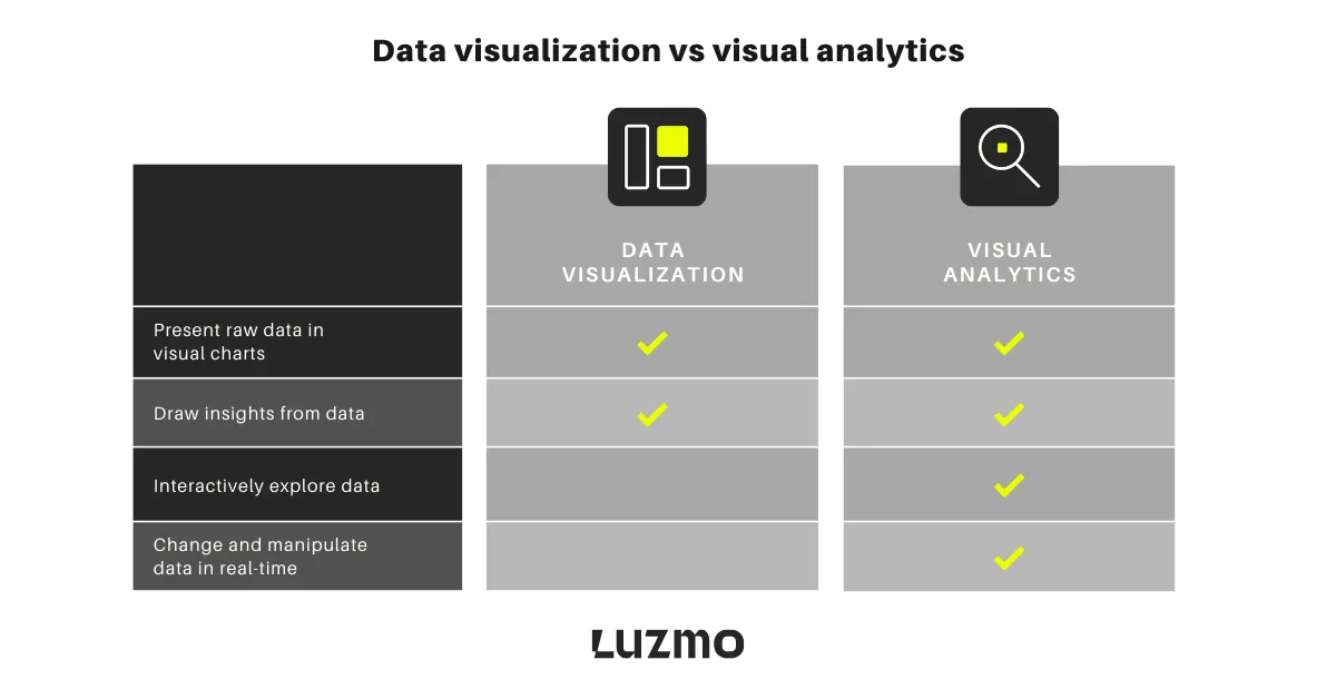
Data visualization vs visual analytics
The two terms are often bundled together but there are clear differences between them.
Data visualization means representing data visually and providing a clear and effective way to drive conclusions and insights from visual data.
The main objective of data visualization is to take data from its raw form and various data sources and turn it into visualizations that are easier to understand.
Examples of data visualizations include pie charts, histograms, bar charts, line graphs, heatmaps, and other visualization types.
Visual analytics combines data visualization with data analysis. It entails giving users access to visualized data so they can drill down into it and draw their conclusions.
The objective of visual analytics is not just to show raw data in a visualized form. The goal is to enable business users to interact with the data, ask questions, find patterns and correlations, and more.
Examples of visual analytics include dashboards and any other type of app that allows users to change and manipulate data in real-time.
The benefits of visual analytics
The main benefit of visual analytics is allowing for a better understanding of data for everyone and not just data analytics experts. However, there are a few more worth mentioning.
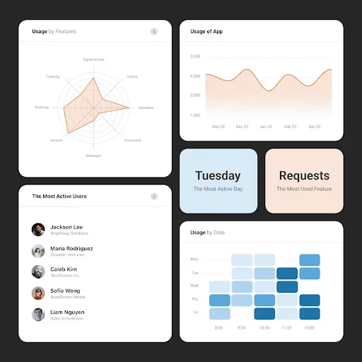
Data exploration - instead of static visualizations, visual analytics lets business users do a deep dive into complex data sets through intuitive interfaces. For example, you can use an e-commerce dashboard to find out the best-selling product in the home goods sections on weekends - so you can run paid ads on these days.
Improved decision-making - the barrier between data management and decision-making is removed as these interactive visual interfaces allow anyone to dig into data and make better decisions.
Forecasting, identifying trends and patterns - through advanced algorithms and machine learning, the average business user can identify trends and patterns and even make forecasts based on historical data.
Real-time analytics - since every visual analytics platform is connected to a variety of data sources through APIs and integrations, the user gets access to real-time data. For use cases where having timely access to data is crucial, this allows users to make important decisions rapidly.
Improved communication - analytics and big data is no longer a privilege of the data literate in your business. From the CEO to the individual contributor, everyone can understand visual analytics and explore data with their existing knowledge and skills.
Interactive dashboards - tools such as Luzmo allow you to tweak and change the dashboard view to find the information you need. For example, you can change the view from monthly to annual visitors on a website to see spikes in organic traffic and correlate them with search engine algorithm updates. You get hands-on, interactive data instead of a static view in a chart.
Several components power this type of visual analytics experience. Luzmo Studio allows teams to design and manage dashboards through a visual editor and embed them directly into SaaS applications. Luzmo IQ helps automatically surface patterns and trends across datasets, while Luzmo AI enables natural-language data exploration so users can ask questions and instantly generate charts or insights.
Collaboration and knowledge sharing - teams that typically don’t interact with data can get access to information about your customers, your product and key metrics. You can give your own SaaS product’s customers interactive visual representations of their product usage, which can foster collaboration in their own teams.
Data integration - visual analytics software like Luzmo is API-first, which means you can connect a vast number of data sources and have that data visualized. You’re no longer limited by built-in data connectors and integrations.
Whether you want to introduce a visual analytics process in your own team or you want to offer interactive analytics to your product users, the benefits are plenty.
Visual analytics examples to inspire you
Looking for ideas on how to take your analytics processes to the next level? Here are some great starting points.
Kenjo’s HR dashboards help end–users get more control of their data
Kenjo is an HR app used by over 1,000 companies globally. Those companies manage well over 40,000 employees and having access to their data is crucial. Traditionally, they would give customers access to their data via simple tabular reports.
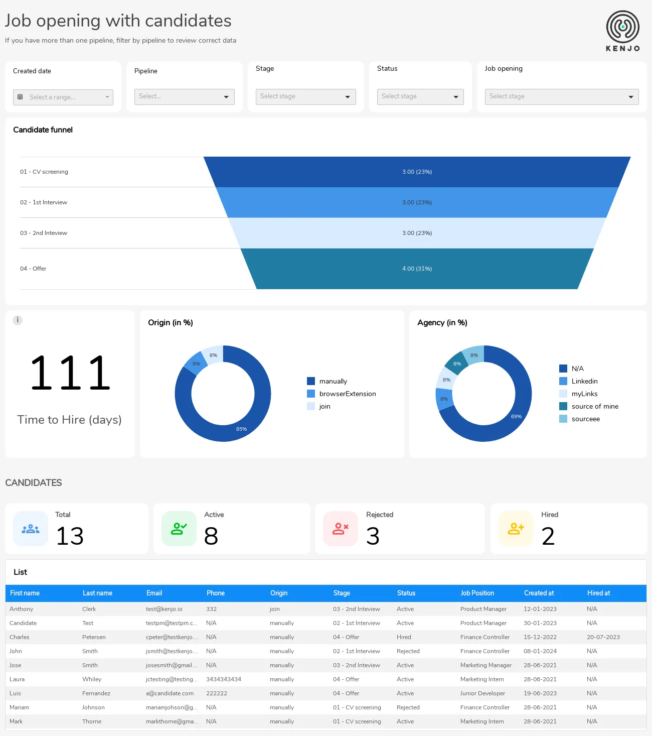
With an interactive visual analytics dashboard in Luzmo, they gave their customers over 30 dashboards to use. Within these dashboards, they can explore data about their employees and find the insights they need quickly.
Spaceflow reduces custom report requests
Spaceflow is a proptech SaaS business from the Czech Republic, and their main aim is to allow landlords to have full control of their property and tenant data. For resource booking, visitor management and requests, Spaceflow has all the features in one app. The problem is that over time, their customers started requesting custom reports on their data.
Instead of going through all that trouble, they used a self-service embedded analytics dashboard, which allows customers to explore their own data easily. The end result? 80% fewer custom analytics report requests.
Riskonnect allows customers to do self-service analytics
Riskconnect is a US-based software business for managing risk and compliance in companies. They handle everything from business continuity to social and environmental governance and as a result, collect a lot of data. With thousands of customers, they would get hundreds of requests for unique reports every month.
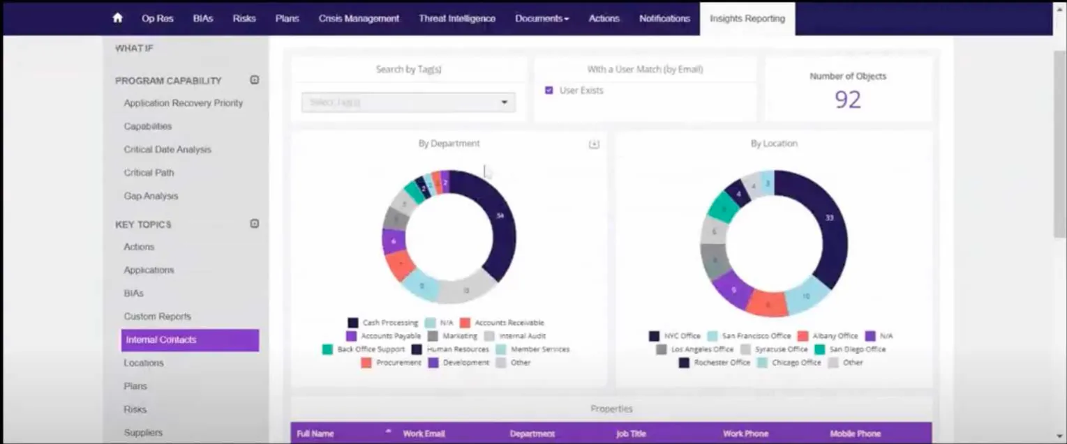
Once they created a self-service dashboard for their app users, they no longer had requests for custom reports, their customer service team had less workload and the overall customer experience skyrocketed.
Get started with visual analytics today
If you have a SaaS app, visual analytics can make your customers’ lives easier and improve your bottom line at the same time. With embedded analytics, your customers can explore their data on their own terms and understand how your product solves their pain points. At the same time, you can use those visual analytics to upsell them and increase expansion revenue.
The great news is that you don’t need a team of rocket scientists to get visual analytics in your product. Get a free trial of Luzmo and you’ll have an embedded analytics dashboard in your app in days - not weeks or months.
Book a free demo today and we’ll tell you more!
FAQ
All your questions answered.
What is the difference between visual analytics and data visualization?
Data visualization focuses on presenting data in visual formats such as charts, graphs, and maps. Visual analytics goes a step further by allowing users to interact with the data, explore patterns, and perform analysis directly through dashboards or interactive tools.
Why is visual analytics important for businesses?
Visual analytics helps businesses understand complex datasets more easily and make faster decisions. By combining visual dashboards with analytical capabilities, teams can quickly identify trends, patterns, and correlations that might be difficult to detect in raw data.
What are common examples of visual analytics tools?
Common visual analytics tools include business intelligence platforms, embedded analytics dashboards, and data visualization software that allow users to explore and analyze data interactively. These tools often connect to multiple data sources and present insights through customizable dashboards.
Written by

Ship the future of your data
Let us show you what Luzmo can do for your product.

Leave your e-mail and one of our analytics experts will reach out to you