13 Best Data Visualization Tools in 2026
A picture is worth a thousand words. Or updated for 2026, a picture that tells a story is worth its weight in gold. Data visualization means just that: turning numbers into interactive visualizations so that the person viewing them can understand what’s going on.
Data visualization is an integral part of business intelligence and data analytics. Once data is aggregated, cleaned, and analyzed, you can visualize it to understand the meaning behind the numbers.
Sure, you could use Excel for this, but why bother when there are tools built just for this job? Today, we take a look at the very best data visualization tools for business in 2026.
What is a data visualization tool?
A data visualization tool is a BI tool that takes datasets from various data sources, helps you analyze that data, and then visualize it to reveal actionable insights.
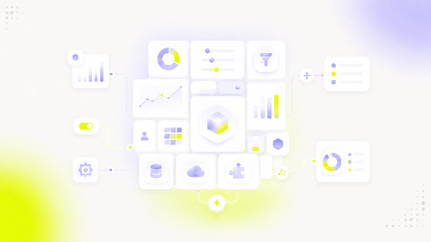
Data visualization is the last part of the data analysis process, and data is typically visualized in the form of reports and dashboards. They contain a variety of graphs, charts, histograms and other types of visualizations that make data more user-friendly and understandable.
Most commonly, data visualizations don’t do only visualizations, as that’s the final chapter of the data analysis process. All of the tools we’re going to discuss offer data analytics, transformation, cleaning, modeling, and more on top of visualization.
What to look for in a data visualization tool
Choosing the right data visualization tool is not easy because there is much more to consider than your budget. These are some of the many things to watch out for.
A large variety of visualization types
The best data visualization tools come with a big selection of visualizations for different types of data and use cases. These are some popular formats that should come out of the box:
- Bar charts
- Scatter plots
- Pie charts
- Heat maps
- Histograms
- Box plots
- Area charts
- And many, many other types of charts
Having this massive number of options is great, but you also need to know which metrics and KPIs correspond to the right visualization options. In other words, what type of visualization should you use if you want to show e.g. changes over time?
Help with choosing the right visualization type
Being able to choose from dozens of built-in visualization types is great, but which one is the best? If you’re not a data scientist, visualizing data can be a chore because you’ll be overwhelmed with the choice.
Great data visualization tools come with resources that help you choose the right visual analytics tool for your needs. For example, Luzmo has an Academy that shows the visualization techniques you can use in our tool, as well as which visualization type is best for specific use cases.
Also Tableau is well known for its rich library of resources that show which visualization type is the best for a specific scenario on this powerful tool.
Intuitive, drag-and-drop interface
Visualizing data should be a matter of a few clicks and not a complex process that requires hours of work. The bulk of the work should be done at this point, and visualizing the data should just entail choosing the visualization type and deciding where it fits in the dashboard.
Having the functionality of dragging and dropping is a great addition here, as it allows the end-user to pick and choose the order and the size of the different visualizations in the dashboard or report.
Having templates for data visualizations is massively helpful as well. For example, Luzmo has different templates for different use cases, such as a real estate dashboard. Templates allow you to quickly choose the best visualization types for the metrics you have available.
Integrations with the right data sources (or a great API)
To import data from other tools in your tech stack to your data visualization tool, it needs to have the appropriate set of connectors or integrations. For example, for a sales dashboard, you might require connectors with Hubspot, Salesforce or Zoho.
Great data visualization tools come with many connectors out of the box. If they don’t, they have a capable API that your developers can use to connect your data sources, so that your data can quickly be analyzed and visualized.
AI capabilities
Using artificial intelligence and machine learning is no longer nice to have - it’s a necessity. For example, our AI chart generator helps you create interactive data visualizations from your datasets in minutes.
AI in a visualization tool can help with many things: creating interactive charts from scratch, helping you choose the visualization for the right kind of stakeholders, doing a basic clean-up of your data and more.
The best data visualization tools in 2026
All of these tools are great performers in the field of data visualization, but none of them is perfect. Let’s go through each one and their top features, as well as their best use cases.
Luzmo - for embedded analytics
If you have a SaaS app and want to create embedded dashboards for your end-users, Luzmo should be your default choice. While most other tools on this list were built BI first, Luzmo was specifically designed to work for SaaS.
This means a few things. First, it’s easy to connect your Luzmo dashboards to your app via our API. You can then embed that dashboard into your SaaS app in a matter of a few hours - not days or weeks. Last but not least, we have an embedded dashboard editor, allowing your end-users to build their own dashboards based on the data from your app.
Help your customers with decision-making, unlock expansion revenue and make your product even more valuable for the end-user. The best part is that your customers don’t have to be data analysts or data science experts to use and understand dashboards built in Luzmo - there is almost no learning curve.
The best part is - you can try out the free version of Luzmo before grabbing a paid plan.
Microsoft Excel - for beginners in data visualization
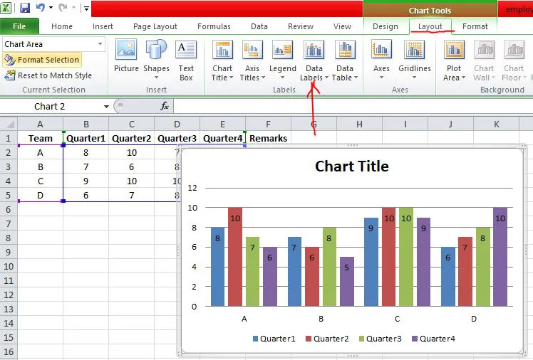
Everyone and their grandma has worked in Excel spreadsheets at some point in their careers. No surprise really - the tool has been around in some shape or form for more than 30 years. This gives it a unique advantage over the rest of the tools - you’re going to have an easy time with adoption in your team.
It allows you to create basic visualizations from your data with built-in formulas and autofilters for your data. You need some knowledge of data science to get the most out of this tool, but there are countless resources, guides and tutorials online.
It’s not exactly an enterprise solution or one that works well for teams, but it covers the basics well.
Tableau - for internal reporting
Tableau for data visualization is one of the best choices you can make for reporting internally. It has a wide range of products (Tableau Public, Desktop, Server and many others) for creating and sharing dashboards internally and externally - with your team and end-users.
It’s a household name in the BI world, for a good reason. For a visual representation of your data, it offers one of the widest selections of visualizations. On top of that, this data visualization software comes with numerous integrations and AI through Tableau Pulse and Tableau Agent. It’s easy to use and performs well with large data sets.
As for the downsides: it’s not the best at embedded analytics and it can get pretty expensive.
Microsoft’s Power BI - for users in the Microsoft ecosystem
If Excel is your jam and you want something that’s online, easy to collaborate on and share with other people in your organization, and has interactive dashboards, this is a solid choice.
One of the top benefits of using PBI is the connectivity with the Microsoft ecosystem - you can connect with Azure SQL, Dynamics 365 and other tools. Being in this system also means that your data is extremely secure.
It’s best if you already have a team that is used to Power BI because there is a pretty steep learning curve for new users. The customization options are not the greatest and the performance could be better with large datasets. Pricing is a similar issue to Tableau - so it might be worth looking into Power BI alternatives.
Sisense - for powerful data modeling and analytics
Sisense is a comprehensive BI tool threatening to make things complicated for the big players like Tableau and Power BI. It’s incredibly fast and has advanced analytics capabilities. Couple that with customization options for dashboards and reports (via its Compose SDK), HIPAA and GDPR compliance, Sisense Intelligence for AI, as well as strong embedded analytics features, and it’s a great combo for any sized business.
It all comes with a cost though - Sisense is a bit hard to learn, so you’ll need to spend a bit of time getting to know the product. On pricing, Sisense doesn’t publish full figures: it now offers a self-serve plan (with a free trial) plus custom enterprise quotes.
Qlik Sense - for large businesses
Qlik’s associative data model allows businesses to easily analyze and explore data on their own terms. It has rich integration options with databases, data warehouses and third-party business apps. You also get advanced features like predictive analytics, statistical analysis and machine learning.
Similarly to other enterprise solutions, it comes with a high price tag and requires a lot of time for learning. On top of that, the customer support is not the greatest, so if you get stuck - tough luck.
Looker - for enterprise data teams
Not to be confused with Looker Data Studio, this is a Google product built for advanced data analytics. Data modeling and exploration, detailed visualizations with security and governance embedded in the tool... are just some of the many pros of using Looker.
The easiest way to tell this is an enterprise product is the pricing: it’s sold through Google Cloud on a sales-led, annual-commitment basis and sits at the premium end (independent estimates run well into five or six figures a year). It’s also difficult for newbies, and customer support gets mixed reviews. For internal reporting in large companies, Looker makes sense.
Looker has added Gemini-powered conversational analytics and an Embed SDK, so AI and embedding have improved — but Looker for embedded analytics still assumes LookML expertise and premium budgets.
Domo - for businesses with large data sets
If you run a large business with large data needs, Domo is a capable choice for a BI tool. It’s built for the cloud, with features such as interactive dashboards where team members can collaborate. Domo.AI adds natural-language querying and AI agents, and Domo Everywhere handles embedded, customer-facing dashboards.
You’ll have to get in touch with Domo to get pricing info (it’s consumption/credit-based and not published), which is the first part of the problem. Then there is the fact that learning how to use this tool requires a lot of training if you’re new to the app.
Google Charts - for basic visualization needs
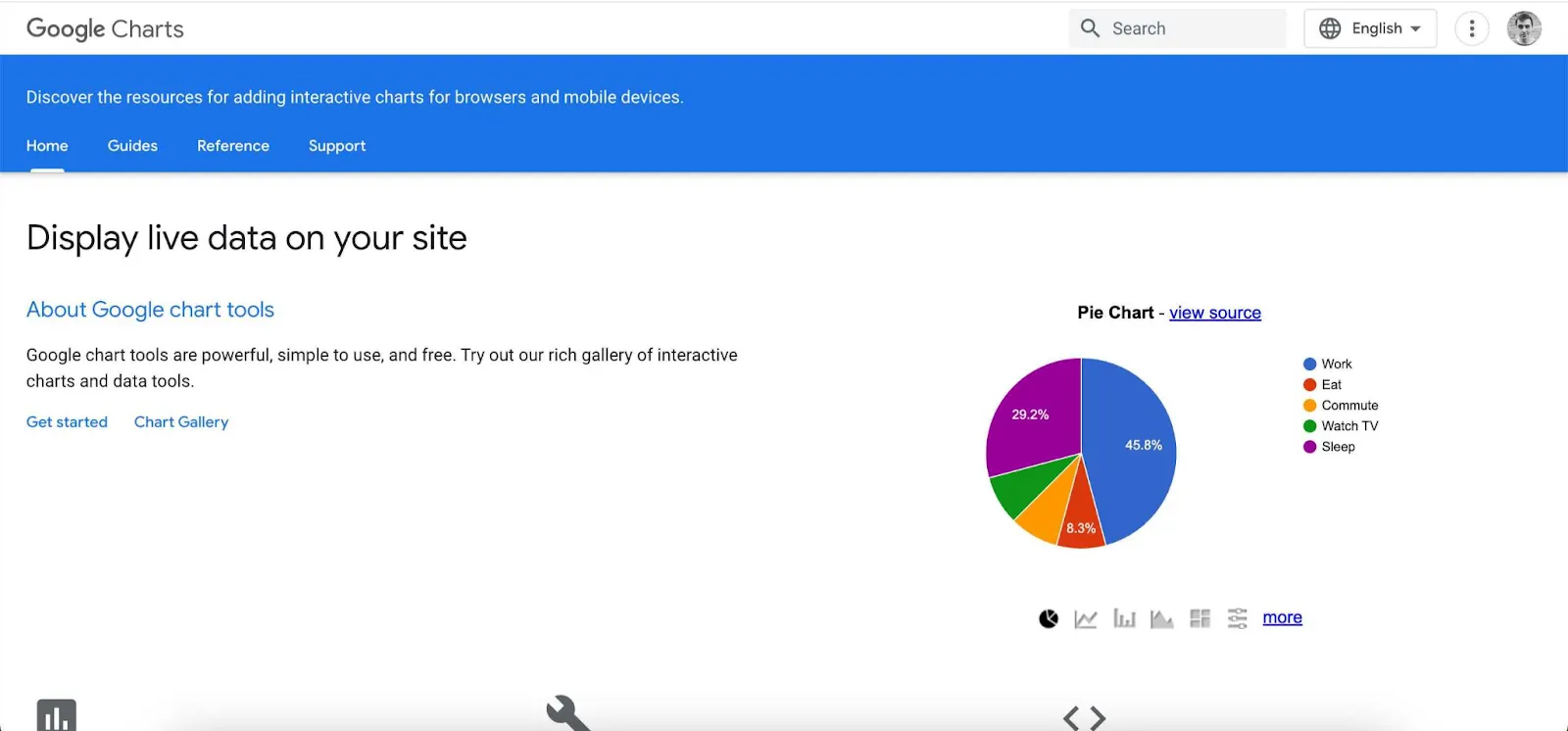
If you don’t need complex predictive analytics and hundreds of integrations, Google Charts is an excellent choice for beginners. Much like other products in the Google suite, it’s free and relatively simple to use. You can hook it up with a SQL database and create visualizations with limited customization options.
Some knowledge of Javascript and CSS is necessary if you want to get the max out of this tool. Also, like Google Analytics, you get limited choices in integrations. Visualization choices are not that great either.
If you’re looking to whip up a quick presentation for a meeting, this could be a solid choice.
Zoho Analytics - for businesses in the Zoho ecosystem
Zoho CRM is by far the most popular app with the Zoho name and if you’re already in Zoho, it’s a natural way forward. But there is more than that. Zoho Analytics is very easy to use and create visualizations in, and it has a wide choice of templates and visualizations.
There are 500+ integrations available so you can create detailed visualizations with a variety of third-party apps. It has a reasonable learning curve and getting started is not that difficult. Real-time collaboration and sharing are built into the app.
As for the downsides, it’s difficult to customize it if you have advanced needs and the pricing is far from ideal.
D3.js - for DIY enthusiasts
D3 is a Javascript chart library that makes it easy for developers to visualize their data. It’s one of the many choices of Javascript libraries and unlike the rest of the tools here, it’s not exactly a tool - it’s an open source framework for creating visualizations.
D3.js is popular with developers and data scientists for one key reasons: it gives them massive flexibility when creating custom charts. While this means more work and time invested, the end result is a custom piece of work.
That’s about it - you can turn data points into visualizations, but it’s going to require a developer to unlock all the visualization capabilities of D3.
Infogram - for infographics and light use
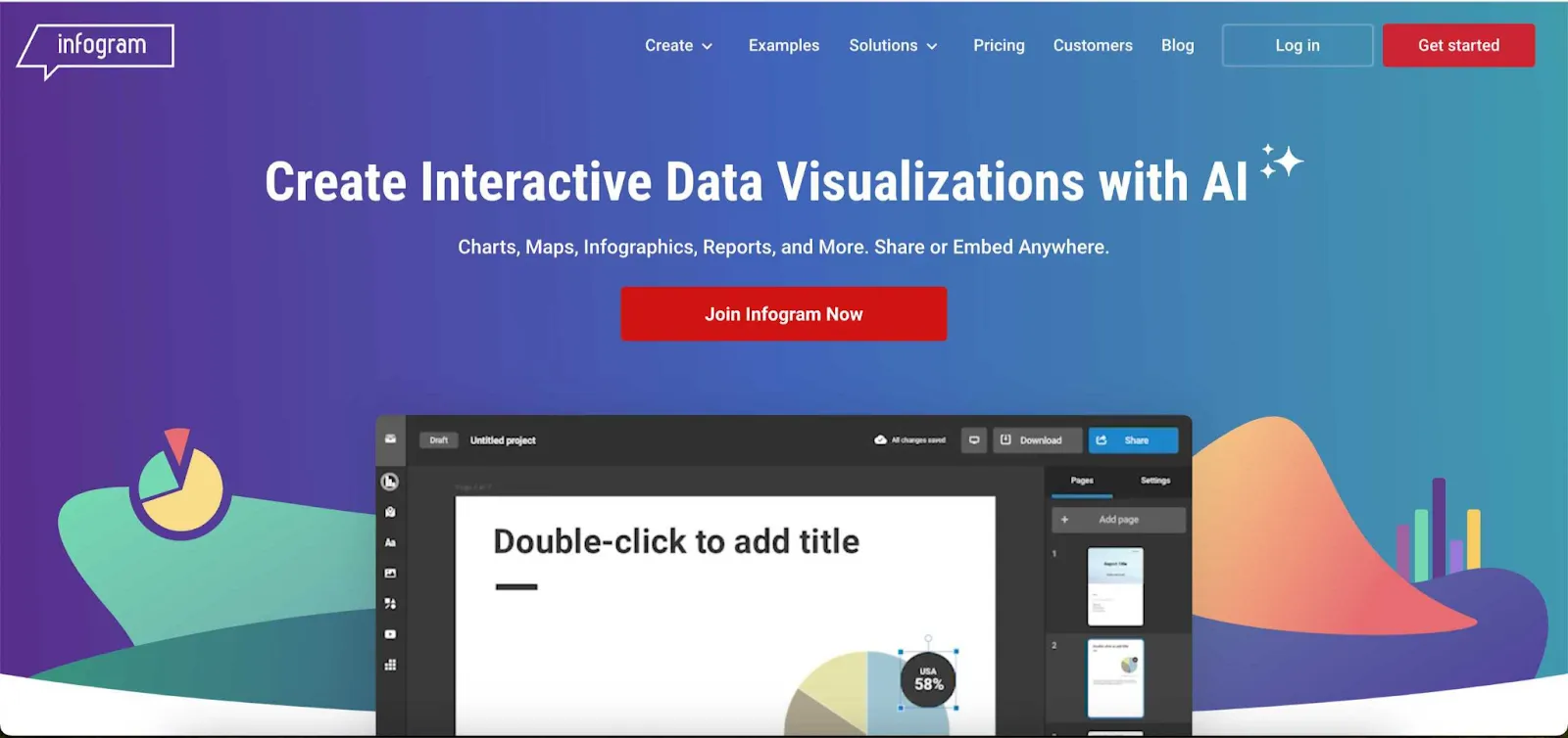
Infogram has been around for a while and it’s become the go-to tool for many users that need simple infographics, reports and dashboards to understand the meaning behind the numbers. It’s not as simple as it sounds, because you can import data from spreadsheets, CSV files and Google Sheets and create engaging visualizations in minutes.
It’s literally minutes because there are many templates to choose from and you’re likely to find something that fits your (basic) needs. Do not expect miracles and advanced data analytics use cases, but it does a decent job for your average social media post, whitepaper or other marketing collateral.
Datawrapper - for learning the basics of data visualization
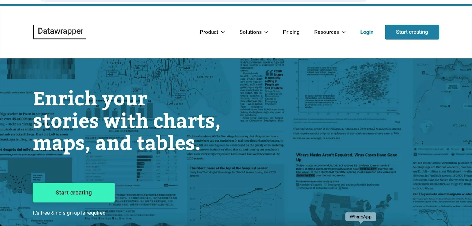
Similarly to Infogram, this is a tool for creating basic visualizations such as charts, maps and tables. It won’t help you make a case with the CFO about the financial projections for the next quarter, but it does help create visualizations that are easy to read and understand.
Datawrapper makes creating visualizations as simple as writing an email and it’s an excellent starting point for someone looking to learn the basics. But it also comes with limitations: in the choice of customizations and integrations, and the limitations in data size.
Conclusion
Choosing a data visualization tool is just as complex as selecting any other piece of software in a business setting. It’s important to consider that you’re not just choosing a tool for its ease of use for your data scientists and developers. You also need something that all stakeholders will find easy to understand and use.
And if you’re looking for a data visualization tool for your SaaS app, Luzmo is your top choice. Easy embedding, modern API, lots of visualization choices, and much more.
Written by

Ship the future of your data
Let us show you what Luzmo can do for your product.

Leave your e-mail and one of our analytics experts will reach out to you