Tableau Software for Data Visualization: Good Choice in 2026?

If you’re in a restaurant and ask the waiter for a soda, many will immediately ask: Coke or Pepsi? Buying a new phone? Most people look at Apple or Samsung. In analytics, the long-standing matchup has been Tableau vs. Power BI.
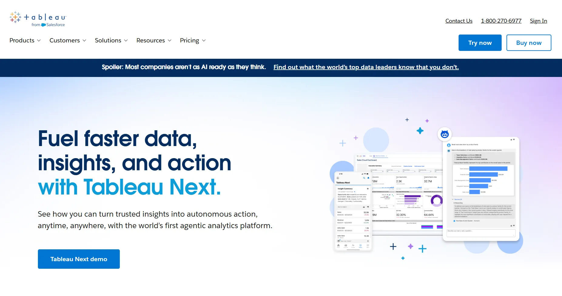
But Tableau has changed a lot in the last few years. It’s no longer only a tool for dashboards. With the release of Tableau Next, the company now positions itself as an agentic analytics platform - one that blends AI, trusted data, and automated actions to help teams explore data faster and act on insights with more confidence.
So before we look at the visualizations, let’s revisit what Tableau is today.
Tableau software: exploration of the basics
Tableau started in 2003 as a project from Stanford researchers who wanted a simpler, visual way to analyze data. Two decades later, it’s part of Salesforce and a central piece of their data and AI ecosystem. The platform now stretches far beyond charts: it includes Tableau Cloud, Tableau Server, Tableau Desktop, Tableau Public, Tableau+, and the new Tableau Next.
Under the hood, Tableau still relies on VizQL, its visual query language, but the 2026 experience looks and feels more modern. The drag-and-drop interface remains one of the reasons people love using Tableau - you can connect to your data, explore data, and visualize data quickly, even if you’re not an analytics expert.
The integration story is also stronger than before. Tableau connects to spreadsheets, databases, cloud warehouses, APIs, and Salesforce Data Cloud. From there, users can analyze, explore, and build dashboards through a familiar visual workflow.
Where things changed most is AI. Tableau now includes Tableau Pulse (AI-generated metrics and insights), Tableau Agent (its Einstein/Agentforce-based assistant), semantic learning, predictive insights, and agentic automation that help users move from a metric to a decision faster. These updates fit into Salesforce’s broader goal of creating a trusted, data-driven analytics platform for everyone - analysts, business users, developers, and IT.
You still get a friendly interface, a huge community, and thousands of learning resources. But compared with the early 2010s version of Tableau, today’s platform is more powerful, more connected, and more AI-driven.
Data visualization with Tableau at a glance
With more than 20 years on the market, there’s no shortage of opinions about Tableau. And while reviews often mention pricing or performance, most people agree on one thing: Tableau is still one of the strongest tools for visualizing data.
The platform was built around visual analytics from day one, and this part of Tableau has only become more polished. In 2026, Tableau layers new AI features on top of its classic drag-and-drop experience, helping users explore data faster and make sense of complex datasets without writing queries. Tableau Next expands this even further with semantic learning, smarter recommendations, and automated insights that support data storytelling.
The visuals follow modern best practices. You can experiment freely, ask questions, and reshape your dashboard as you work - which is why analysts, marketers, finance teams, and product managers all use Tableau to explore data and communicate findings across their teams.
Insight into the types of visualizations available in Tableau
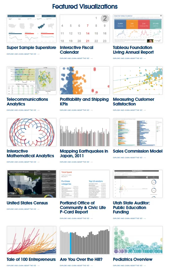
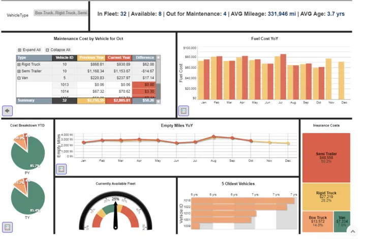
Tableau still shines as one of the most flexible tools for building charts, dashboards, and data stories. You can visualize almost every metric in multiple layouts and adapt each row or column to your workflow.
Here are some of the many visualization types in Tableau:
- Bar charts
- Line charts
- Area charts
- Scatter plots
- Pie charts
- Treemaps
- Heatmaps
- Bubble charts
- Bullet graphs
- Box plots
- Histograms
- Gantt charts
- Waterfall charts
- Funnel charts
- Radar charts
- Maps
- Dual-axis charts
- Pareto charts
- Word clouds
- Tree diagrams
- Highlight tables
- Text tables
With each major release, Tableau adds new visual elements, improved layout controls, and updated defaults to support better visual communication. And since the platform uses a semantic layer to understand your data, the newest versions can recommend chart types as you drag fields into the view.
Tableau even includes a fictional dataset called Superstore, which helps beginners practice analysis and explore how different charts behave when you drag and drop new fields.
What if you don’t know which visualization or chart to choose?
Not everyone knows the difference between a histogram and a bar chart, and Tableau understands that. The Help Center includes clear guidance on visual best practices, chart selection, and step-by-step instructions for every visualization type. Many resources now include AI-powered suggestions and examples from the wider DataFam community.
Whether you’re exploring your first dataset or building a complex dashboard, Tableau’s documentation and community make it easier to choose the right visualization for your goal.
Embed your first dashboard in less than 10 days.
TRY LUZMO FREE
Some things Tableau is not good at
Even with new AI features, Tableau still works best as an internal analytics platform. It’s strong when teams want to use Tableau to connect to your data, explore data, compare every row, column, or metric, and run fast data exploration through a familiar drag and drop workflow. Inside a company, Tableau transforms raw numbers into dashboards that help people use data and build real data literacy.
The limits appear when you try to visualize data inside your own app.
Basic embedding works through a short code snippet, and it’s fine if all you want is one dashboard for all users to explore. But the moment your product needs deeper integration, things get complicated. Tableau Cloud and Server still weren’t built with embedded-first best practices. When you try to combine custom logic, user roles, and product-level security, the setup grows quickly.
If you need different views for different users, strict row-level filtering, or dashboards in multiple languages and currencies, you’ll need substantial development effort. Supporting a clean, product-native experience - matching fonts, layouts, or hierarchy structures - also requires workarounds. Tableau can analyze data beautifully, but it doesn’t blend into your UX without engineering help.
Performance can also be unpredictable. Complex dashboards, large datasets, and heavy joins often load slowly or stall under peak traffic. Many teams report that embedded dashboards freeze when too many people try to analyze or filter at once, especially with live connections.
Customization is another limitation. You can control charts, but you can’t fully shape the UI around them. This matters when you’re building a product that needs your analytics to feel native, not bolted on.
In short: Tableau is excellent when you use Tableau inside your company to explore data and support data-driven decisions. But for embedded analytics in customer-facing products, the combination of performance, customization gaps, and integration overhead makes it less practical than tools that are built API-first.
Teams that outgrow these workflows often start by reviewing alternatives to Tableau.
Should you try Tableau for data visualization?
Absolutely, yes.
If your main goal is data analysis inside your company, Tableau is still one of the strongest data visualization tools available. It helps teams improve their business intelligence workflows by turning spreadsheets and databases into clear dashboards.
Even without deep technical knowledge, analysts and data scientists can work with data with Tableau, experiment with visual layouts, and move fast from a question to an insight.
The platform is backed by a large community, strong documentation, and years of best practices. For internal reporting, working with metrics, and understanding trends, it remains a reliable choice.
But when you need embedded analytics, dashboards inside your own SaaS product, Tableau becomes harder to work with. The setup, performance tuning, multi-tenant logic, and UI customization can slow down your product roadmap. Most teams discover quickly that Tableau wasn’t built for embedded-first experiences.
That’s where Luzmo fits in.
Luzmo gives you a full API-first toolkit to embed dashboards, AI insights, and advanced data experiences directly into your product, without the friction. You choose how everything looks, how it loads, and how each customer sees their own data.
Here’s how it works:
Luzmo Studio: build customer-facing analytics with full white-label control.
Luzmo Flex SDK: create flexible, innovative data experiences that go beyond standard dashboards.
Luzmo IQ: a conversational analyst that adds embeddable AI insights for every customer, powered by tailored recommendations and automated analysis.
Agent APIs: Trigger AI-driven actions, query insights, and guide users contextually inside your app.
With Luzmo, you can embed analytics in hours, not weeks, and everything stays responsive — even with large datasets or thousands of end users.
Luzmo also keeps pricing simple and predictable, unlike Tableau’s layered licensing model. Plans start at €495/month for Starter and €1,995/month for Premium, with Enterprise options available as your product scales. Combined with Luzmo Studio for dashboards, Luzmo IQ for natural-language insights, and Luzmo AI for automatic chart generation, you can deliver embedded analytics without worrying about per-user fees or performance-related cost spikes.
If you need a modern analytics layer for your product, Tableau’s strengths in internal BI won’t cover those needs. Instead, book a free demo and see how you can build a smoother, faster, more controlled analytics experience with Luzmo.
Written by

Ship the future of your data
Let us show you what Luzmo can do for your product.

Leave your e-mail and one of our analytics experts will reach out to you