 ChatGPT
 Perplexity
.png)
.png)
.png)
Build your first embedded data product now. Talk to our product experts for a guided demo or get your hands dirty with a free 10-day trial.


There's a test any PM can run on their own product. Open the analytics section and look at it with fresh eyes. Ask one question: does this feel like part of my product, or does it feel like something I attached to my product?
Most teams know the answer before they finish asking.
The fonts are slightly different. The button styles don't match. The filter controls behave differently from every other filter in the app. There's a loading flash when the section opens that doesn't happen anywhere else in the product. The color palette is close, but not quite right.
None of these are catastrophic failures. Users don't file support tickets about inconsistent border radii. But they feel it, and that feeling accumulates into something measurable: low analytics adoption. Users who open the analytics section once, don't find it useful, and never come back. Features that product teams spent weeks building, sitting quietly unused.
The problem isn't the data. The problem is the experience. And the experience starts with a set of design decisions most teams make without realizing they're design decisions at all.
When analytics is embedded via iframe (or even via web component but built as a standalone dashboard) it carries the design system of whoever built it, not yours. The vendor's fonts, the vendor's spacing, the vendor's interaction patterns. You can adjust colors and maybe swap a logo, but the fundamental experience remains foreign.
There are three signals users pick up on, usually without consciously registering them:
Different visual language. Typography, spacing, iconography, and color all communicate "this is the same thing" or "this is something else." When the analytics section uses a different typeface from the rest of the product – even a subtly different one – it breaks the sense of coherence. The user's brain correctly concludes that this feature came from somewhere else.
Disconnected interaction model. In most products, filters at the top of a page affect everything below them. That's the mental model users bring to analytics too. When they apply a date range or select an account and the embedded dashboard doesn't respond – because it's an iframe that can't receive state from the parent app – the experience breaks the contract. Users re-filter inside the analytics section separately. Some give up.
Context switching to get to data. When analytics lives on a dedicated Reports tab, using it requires leaving whatever the user was doing, navigating to Reports, finding the right view, and then navigating back. That context switch is friction. It's not friction that prevents users from accessing data – it's friction that quietly changes the calculation from "I'll check the data" to "it's probably fine." Over time, the feature atrophies.
These three signals (visual inconsistency, disconnected interaction, isolated placement) are the symptoms. The underlying cause is treating analytics as a separate product rather than a layer of your product.
Native analytics isn't a style choice. It's a set of technical and product decisions about how analytics integrates into the rest of what you've built.
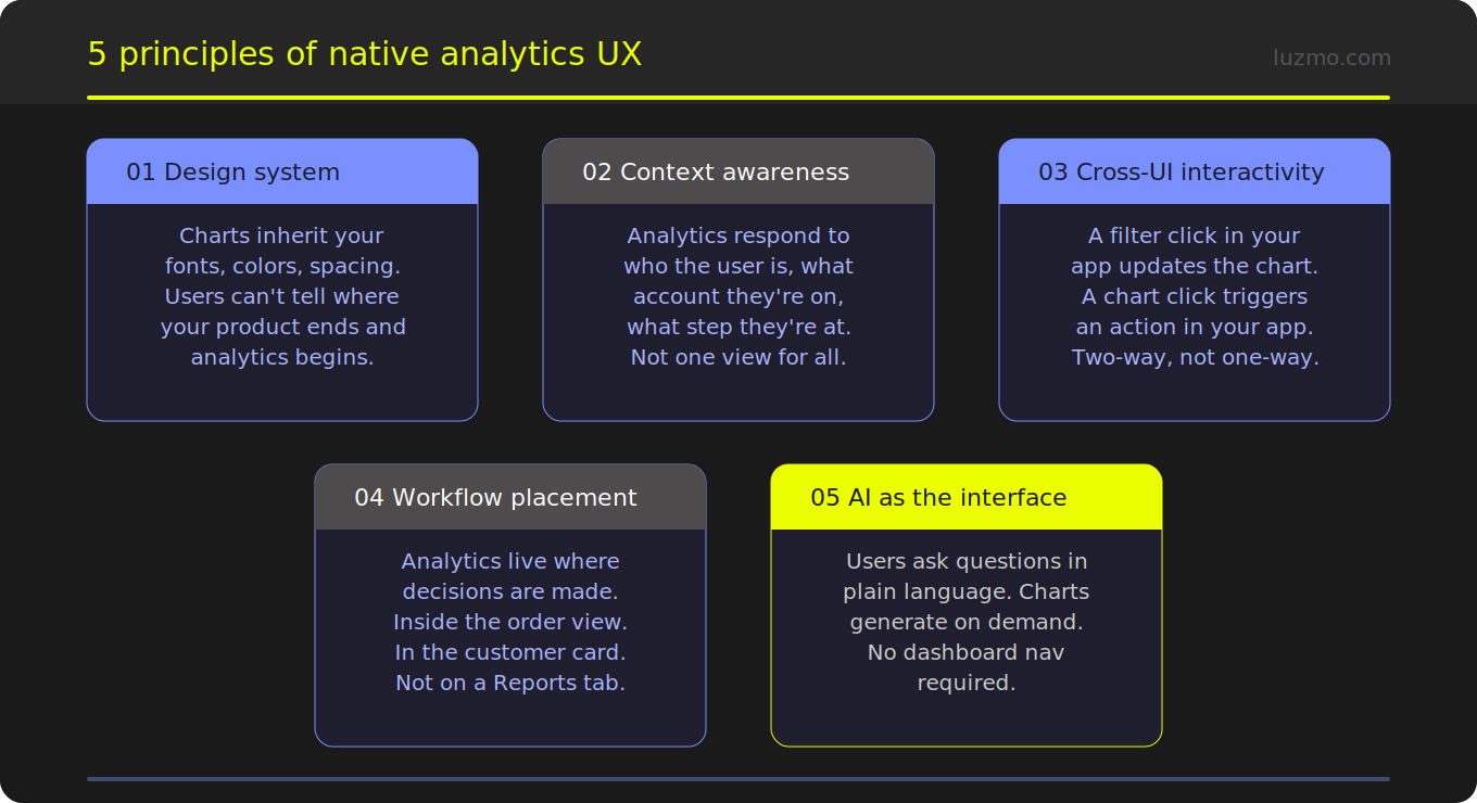
In a native implementation, analytics components inherit your design system. Fonts, colors, spacing, border radii, icon sets; all come from the same source of truth as the rest of your product. This isn't configuration in a vendor dashboard. It's CSS variables passing through to components that are part of your DOM, not isolated inside an iframe.
When done right, users genuinely cannot tell where your product ends and the analytics begins. The bar chart uses the same typeface as your data tables. The filter dropdown behaves exactly like every other dropdown in the app. The empty state messaging follows the same tone and visual style as your other empty states.
This sounds cosmetic. It isn't. Visual coherence is what makes a feature feel trustworthy. Users extend trust to things that feel intentional and consistent. Analytics that feel foreign get treated as foreign: optional, unreliable, not really part of the product.
A native analytics experience is context-aware. The data a user sees reflects who they are, what they're working on, and where they are in the product.
A support agent looking at a customer account sees analytics scoped to that customer – automatically, without having to filter. A manager in the HR view sees their team's data, not the whole company's. A salesperson reviewing a deal sees the pipeline metrics relevant to that deal stage.
This isn't just convenient. It changes the meaning of analytics from "go here to look at data" to "data is always relevant to what I'm doing." That shift in mental model is what drives adoption. Users don't open a Reports section when they're in the middle of a workflow. They do use data that's already relevant to the task in front of them.
In a native implementation, interaction flows in both directions.
This bidirectional communication is impossible with an iframe. It requires components that live inside your application's DOM, receive and emit events through standard JavaScript patterns, and integrate with whatever state management your app already uses.
When this works, the line between "analytics" and "the rest of the product" disappears. Clicking a bar in a chart opens the relevant customer record. Selecting a time period on a summary card updates the table below it. The data experience and the product experience become the same experience.
The most impactful placement question isn't "what should the Reports page look like?" It's "where are users making decisions, and is data available there?"
For most SaaS products, decisions happen in specific contexts: inside a customer record, on an order view, during an onboarding flow, in a project workspace. Those are the places where a chart or a KPI card or an AI-generated summary creates the most value – not on a dedicated analytics page that the user has to navigate to separately.
This is what composable analytics enables. Instead of embedding a dashboard as a single unit, you place individual components – a KPI card here, a trend line there, a natural language query interface at the point where users need to ask questions – exactly where they create value. The analytics is surgically placed, not bolted on.
Even well-designed analytics have an adoption ceiling: users who don't know what to look for don't look. They open the analytics section, see a dashboard full of charts, don't immediately find what they need, and close it.
An embedded AI query interface removes that ceiling. A user can type "why did my churn go up last month" and get an explanation, not a chart they have to interpret themselves. They can ask "which accounts are at risk" and get a ranked list with supporting data, not a table they have to filter and sort manually.
Luzmo IQ embeds this capability directly in the product – as a chat widget, as a search bar, as an automated summary that appears when the user opens a view. The AI doesn't replace the charts; it makes them accessible to users who would never have navigated to them otherwise.
Before shipping an analytics feature, run through these questions:
If the answer to any of these is "no" or "sort of," the analytics feature has a UX gap that's almost certainly showing up in adoption metrics.
The technical prerequisite for native analytics UX is having components that live inside your DOM, not inside a vendor's iframe. That means either building from scratch – which is a multi-month engineering commitment – or using an SDK that gives you composable analytics components you can style, position, and wire up to your application's state.
Luzmo Flex is the SDK layer. It handles data connectivity, query generation, caching, and multi-tenant security – the infrastructure that takes months to build correctly. Luzmo's Analytics Component Kit (ACK) is the component layer: individual chart types, filter controls, data tables, AI query interfaces, and KPI cards that inherit your design system and integrate with your DOM.
The combination means your development team is focused on the experience layer – where analytics lives in your product, how it responds to user context, what it triggers – rather than on the data infrastructure underneath.
The result is analytics that doesn't feel like analytics. It feels like part of the product, because it is.
Ready to see what native analytics looks like in practice? The interactive demo shows composable components in action. For the technical integration path, start with the developer documentation.

All your questions answered.
Why does analytics UX matter for adoption?
What's the difference between a well-styled iframe embed and a native analytics experience?
How does composable analytics change the placement question?
Does native analytics require more engineering effort than an iframe embed?
What does Luzmo IQ add to the UX picture?
Build your first embedded data product now. Talk to our product experts for a guided demo or get your hands dirty with a free 10-day trial.


