 ChatGPT
 Perplexity
.png)
.png)
.png)
Build your first embedded data product now. Talk to our product experts for a guided demo or get your hands dirty with a free 10-day trial.

![What Is Data Dashboard? [2026 Guide]](https://cdn.prod.website-files.com/64ccd6239abfeec743815b28/691b4be36cdea729703fb544_blog%20thumbnail%20(27).png)
In modern organisations, data is both the fuel and the compass.
Raw data from web logs, CRMs and marketing platforms can be voluminous and disorganised.
A data dashboard takes this complex input and turns it into an interactive overview.
Rather than sifting through spreadsheets or endless reports, you see essential key performance indicators (KPIs) and metrics on a single screen, update them in real time and drill into trends when necessary. But there's so much more to dashboards than this.
Let's get you through everything you should know about them in 2026.
A data dashboard is a dynamic view of historical and current numbers presented through visualisations. It brings together data from multiple sources, highlights KPIs and lets users explore data, identify patterns and make informed choices. Instead of reading rows of numbers, you see charts, graphs and tables that summarise what is happening.
Behind the scenes, several components turn raw data into a dashboard:
A dashboard pulls records from databases, APIs, Google Analytics, CRMs or other systems. Combining information from different origins is necessary to create a complete picture.
Raw data may be inconsistent or incomplete. Before it is visualised, it needs to be cleaned and formatted. Handling inaccurate or incomplete data early on prevents misleading conclusions.
To keep interactions fast, dashboards often store pre‑computed summaries or use caching so that every click does not re‑scan the full data set.
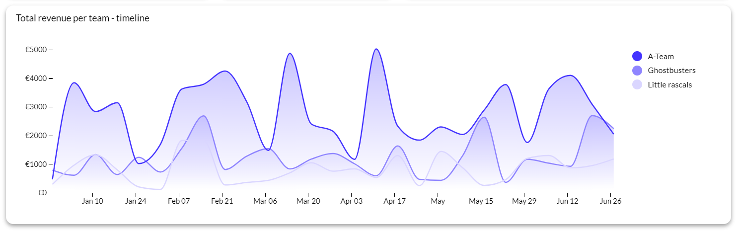
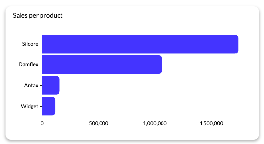
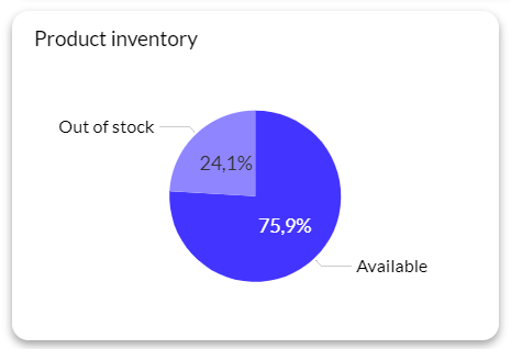
Visual elements such as line graphs, bar charts, pie charts and tables make it easier to interpret trends, compare categories or show proportions. A visual hierarchy puts the most important indicators where the eye lands first.
Filters, date pickers and drill‑downs help users tailor the view to their needs. Instead of passively viewing a static page, they can explore patterns across segments or time periods.
Depending on the use case, the data may refresh constantly, hourly or daily. Up‑to‑date information keeps the dashboard relevant.
Dashboards don’t replace detailed reports. Reports dig into context and narrative, while dashboards highlight real‑time performance for quick decisions. A good workflow uses both: a dashboard for daily monitoring and a report for quarterly storytelling.
Dashboards differ based on their purpose and audience. Understanding the main categories helps you choose the right layout and metrics.
Operational dashboards focus on current or near‑real‑time metrics. They help teams managing day‑to‑day processes, support queues or steps in a sales process.
For example, a live site traffic dashboard shows website visits and error rates so that a developer or support analyst can react quickly.
Operational dashboards emphasise recent changes, anomalies, and the health of systems. They usually update continuously and highlight alerts when something goes wrong.
A strategic dashboard concentrates on long‑term goals, trends and high‑level KPIs. This type of dashboard is used by executives and leadership to monitor business performance and set direction.
Instead of showing granular details, a strategic dashboard focuses on the big picture: revenue growth over several quarters or market share. Trend lines and comparisons to targets help leadership track progress toward strategic objectives.
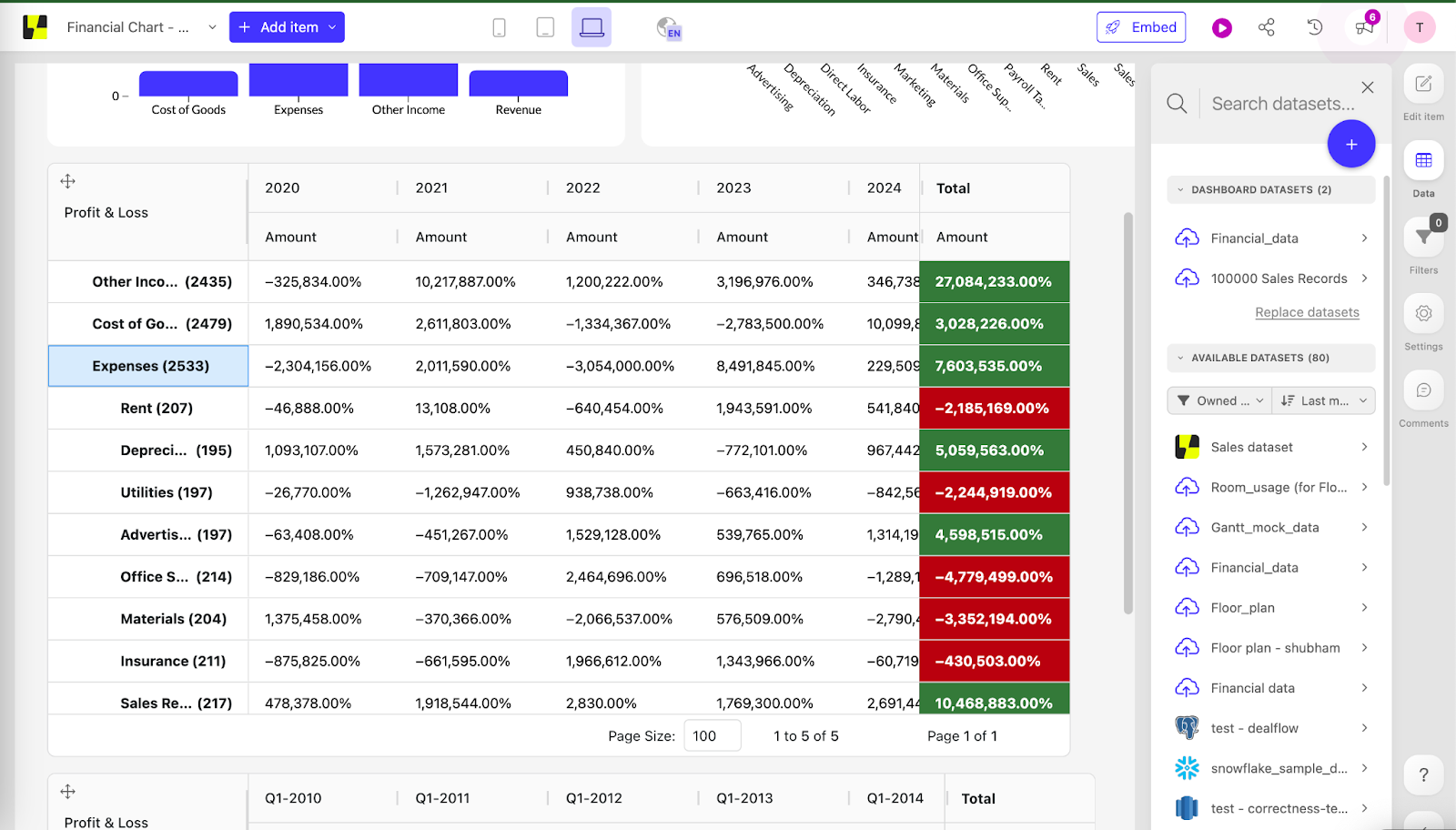
Analytical dashboards blend overview and detail. They enable deeper analysis by letting users segment data, cross‑filter variables, and test hypotheses.
Data analysts or power users rely on analytical dashboards to explore patterns and uncover hidden insights. These dashboards often integrate historical data and support drill‑downs from summary metrics to individual records.
Another category sometimes mentioned is the tactical dashboard. It delivers in‑depth analysis of a specific area, such as a marketing return on ad spend (ROAS) dashboard.
Tactical dashboards are aimed at managers in a particular domain. For instance, a marketing manager or a paid media manager. Plus, they combine operational and analytical details. To ensure the data feeding these dashboards is accurate, teams often integrate them directly with marketing asset management software to track content performance at the source.
A project dashboard tracks milestones and timelines for a specific project. It lets teams see progress and resource allocation without manually updating spreadsheets. Real‑time visibility helps project managers adjust schedules and communicate status to stakeholders.
In practice, a dashboard platform such as Luzmo often lets users switch between operational, analytical and strategic views depending on their role. For example, operations teams may watch a real‑time panel while executives use a strategic overview to plan future outcomes.
Not every data set belongs on a dashboard. Dashboards thrive on numbers that change often and carry measurable meaning. Good candidates include sales revenue, customer sign‑ups, churn rates, marketing campaign performance and operational efficiency metrics. Static or rarely changing numbers are better suited for reports.
Examples of data sets that fit dashboards include:
Avoid dumping all information onto a dashboard. Unstructured or overly granular records can overwhelm users. A dashboard is an executive summary, not an audit trail.
A successful dashboard depends on choosing the right KPIs. Before building a dashboard, ask who will use it, what information matters most, and what decisions the dashboard should support.
Pick metrics that directly support the goal. Too many metrics dilute the message and confuse the audience.
When selecting KPIs:
For example, a SaaS sales dashboard should highlight revenue or monthly recurring revenue.
Tooltips or small notes help non‑technical users interpret the data without cluttering the screen.
Anecdote: during a past marketing campaign, a team I know loaded every possible metric onto their dashboard. It looked comprehensive but no one knew where to focus. After a workshop, they removed unnecessary charts and highlighted the three metrics tied to their goal. The dashboard suddenly became useful because it told a story rather than listing random numbers.
Sales teams rely heavily on dashboards to track quotas and lead progress. An effective sales dashboard might track:
Sales leaders can see the performance of their entire team at a glance. For instance, a sales pipeline dashboard lets managers filter and sort through deals, identify which were accepted and why and examine why certain deals fell through. Such dashboards help plan new sales strategies and keep reps accountable.
A business dashboard provides a unified view across departments, from marketing to finance. When you align metrics with business goals, dashboards become actionable.
According to design best practices, the main goal should be easy to spot within five seconds. Use layout smartly: place important information at the top, make it larger and push less important details to the bottom.
Business dashboards are not static. When goals shift, the displayed data should shift too. Consider a project where marketing focused on brand awareness for six months. The dashboard emphasised impressions, reach and engagement. Once the objective moved toward lead generation, the team replaced those metrics with lead volume, cost per lead and conversion rate. Keeping the dashboard aligned with goals guarantees relevance.
Visualisation is central to dashboards. Data visualisation converts raw numbers into patterns people can interpret instantly. Charts and graphs simplify complex analysis into visuals that make sense at a glance. When metrics are visualised clearly, decision makers can move forward without needing a deep data science background.
Follow these guidelines when picking visual elements:
Colour choices matter. Limit yourself to two or three main colours for consistency and easy reading. Use the same colour to represent a category across different charts. The traffic light system (red, yellow, green) is a common tactic for highlighting progress toward targets. Remember that white space helps separate visuals and make the dashboard more readable.
See 34 types of charts for data visualization here.
Interactive dashboards empower users to explore data on their terms. Features such as filters, date pickers and segment toggles let users focus on the parts of the data that matter to them. Drill‑downs and tooltips enable deeper inspection without cluttering the main view.
For example, in a social media dashboard, end users can select specific platforms (e.g., LinkedIn) to see conversions coming from that channel. In a SaaS product, interactive dashboards can trigger actions directly. Inside an email marketing tool, users may segment their audience from within the dashboard and start a new campaign for that segment. Interactivity transforms dashboards from passive displays into decision support tools.
Data integrity is vital. If underlying data is flawed, any insight becomes questionable. To maintain trust in dashboards:
Anecdote: a finance team I know once built a dashboard to monitor revenue. For months, the numbers looked healthy until someone realised that one data source was missing refunds. Thahks to documenting sources and implementing data quality checks, the team prevented similar problems in the future.
Modern dashboards go beyond describing what happened. They can incorporate predictive analytics to suggest what might occur next.
Luzmo integrates predictive features to forecast trends, project revenue paths and alert users to deviations. By combining historical and current data, dashboards can display statements such as “If campaign spend continues at this rate, expect X new customers next quarter”. These projections turn dashboards into decision support systems.
Data analysts often need to dig deeper than a high‑level summary. Analytical dashboards help them generate hypotheses and test correlations across variables.
They may display scatter plots, histograms, heat maps and pivot tables.
Analysts can interactively slice data by cohort, region or product, and compare performance across time periods. The ability to filter and segment data quickly speeds up the analysis process and supports hypothesis testing.
Executives use dashboards to keep an eye on the health of the business. An executive dashboard summarises revenue, expenses, growth rates and other high‑level KPIs. It emphasises trends and projections rather than granular details.
For example, a strategic dashboard might show revenue growth alongside a forecast and highlight whether the company is on track to meet its annual target. Executives typically prefer simple visuals and a few key indicators.
The five‑second rule applies: they should understand the message within moments.
Dashboards bring alignment and transparency across departments. Instead of buried spreadsheets or emails, everyone from analysts to executives can access one shared view of performance.
This shared visibility helps teams stay focused and address issues before they grow.
Dashboards also strengthen transparency: when data is accessible to everyone, teams make informed choices faster.
A unified view reduces the time spent in meetings arguing over numbers and fosters a culture of accountability.
Dashboards help users explore data and identify trends.
For example, marketing teams can see how campaigns drive website traffic or conversions, and adjust budgets accordingly.
Product teams can track user behaviour within the application and identify which features are most used. Operations teams can monitor system performance and quickly spot anomalies.
Dashboards often include features like cross‑filtering and highlighting to show relationships across charts. These capabilities help users uncover patterns that might be missed in raw data.
Most dashboards combine information from multiple sources.
The ability to connect disparate sources is one of the features you should look for in data dashboard software.
Strong connectors pull information from different systems and bring it together in one clear view so teams see the full picture without juggling multiple platforms.
Real‑time accuracy is another key feature as data and visualisations should update automatically.
Custom visuals and layouts let users choose chart types, rearrange sections and adjust visuals so dashboards highlight what matters most.
Interactivity enables clicking, filtering and drilling into data. Sharing features let team members comment and set permissions.
Reliable performance keeps dashboards fast and stable even as data grows.
Alerts help users react quickly when something important happens. Templates inspire users who are just starting to build dashboards.
There are many tools on the market. One of them is Luzmo.
Luzmo is a tool for embedding analytics into SaaS products. Its developer-friendly SDK makes integration straightforward and gives full control over the user experience. Customisation is extensive: fonts, colour schemes and chart types can be adjusted so the dashboard feels native to your product. Performance stays fast at any scale, and multi-tenant architecture ensures every customer views only their own data.
Similar to how white label email marketing platforms let agencies rebrand campaigns for their clients, Luzmo’s white-label approach ensures dashboards carry your product’s identity rather than a third-party tool’s branding.
But most teams want more than charts. They want an analytics layer they can shape around their product. That’s where Luzmo’s core building blocks come in.
Luzmo Studio gives product teams a visual, drag-and-drop dashboard builder that works without heavy coding. You can build interactive dashboards in minutes, embed them natively, and let end users personalise layouts, filters or widgets. Studio handles the design foundation so your team can launch analytics fast, keep brand consistency, and avoid the long development cycles usually tied to dashboard work.
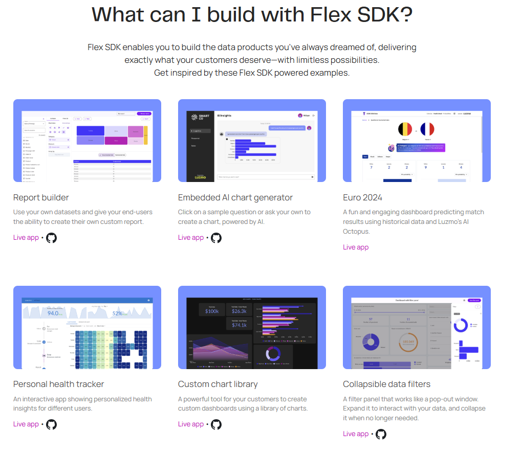
For technical teams that need deeper control, Luzmo Flex SDK is the code-first option. Flex SDK lets developers create fully custom analytics experiences, merge their own components with Luzmo’s charting engine, and drive interaction between the app and the analytics layer. It’s ideal for products that need bespoke behaviours, advanced UI logic, or analytics woven tightly into the core workflow rather than sitting on a standalone dashboard page.
When the goal is to give users answers instead of charts, Luzmo IQ adds AI-powered insight directly into the user journey. It enables natural-language questions, automated summaries, and contextual suggestions that help users discover insights without digging through filters or exporting data. Because IQ can be embedded anywhere, you can place AI-driven analytics exactly where users make decisions - inside a feature or custom page.
[https://www.youtube.com/watch?v=n_9Ra2UkGvo&t=10s]
Together, Studio, Flex, and IQ form a composable system for building client-facing dashboards that feel like a natural extension of your SaaS product.
You can start with out-of-the-box dashboards, add custom components when needed, and layer AI on top for deeper intelligence. No matter the setup, the dashboards remain fast, secure, multi-tenant and fully branded.
If you want analytics that blend into your product, scale with your roadmap, and give users useful insights instead of exports, Luzmo brings all the pieces together in one platform. Try it for free now or book a demo.
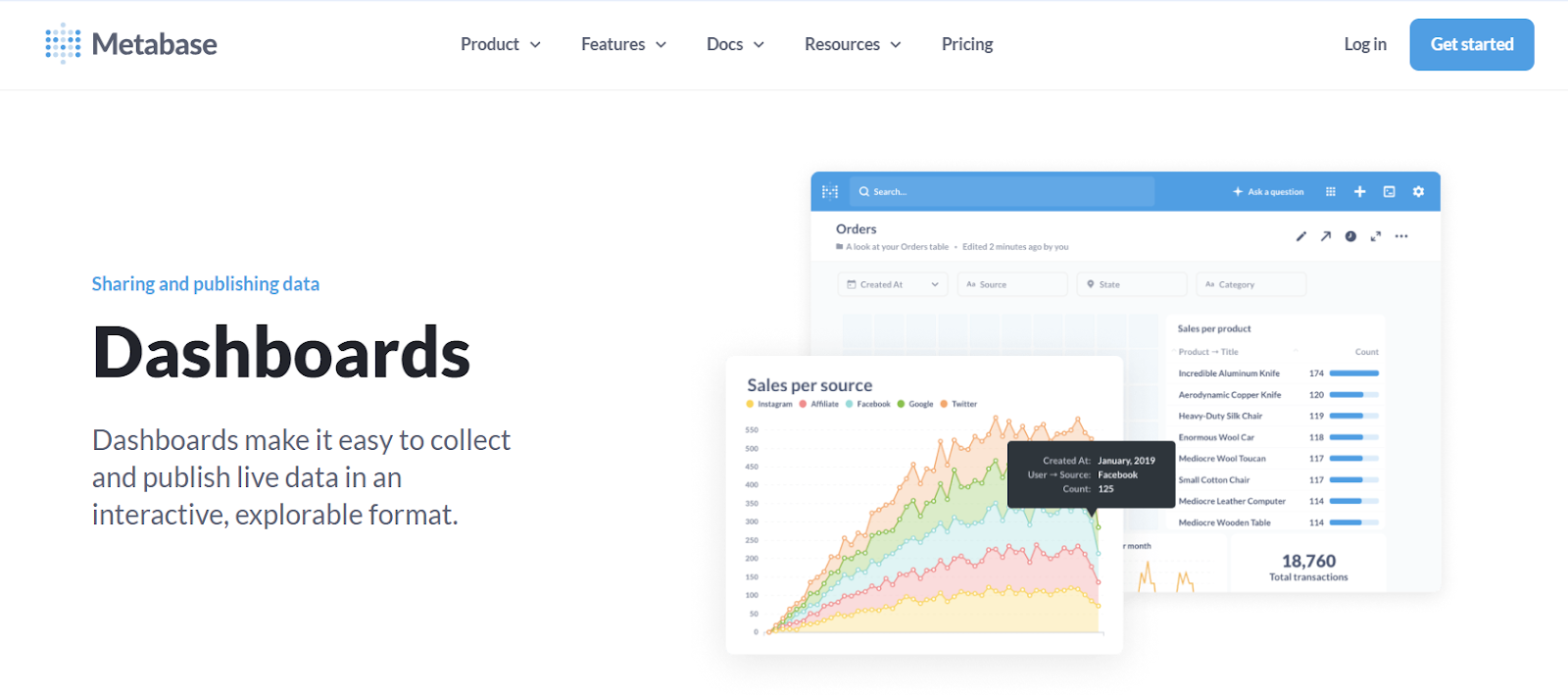
Other tools include:

Looking at concrete examples can inspire your own dashboards:
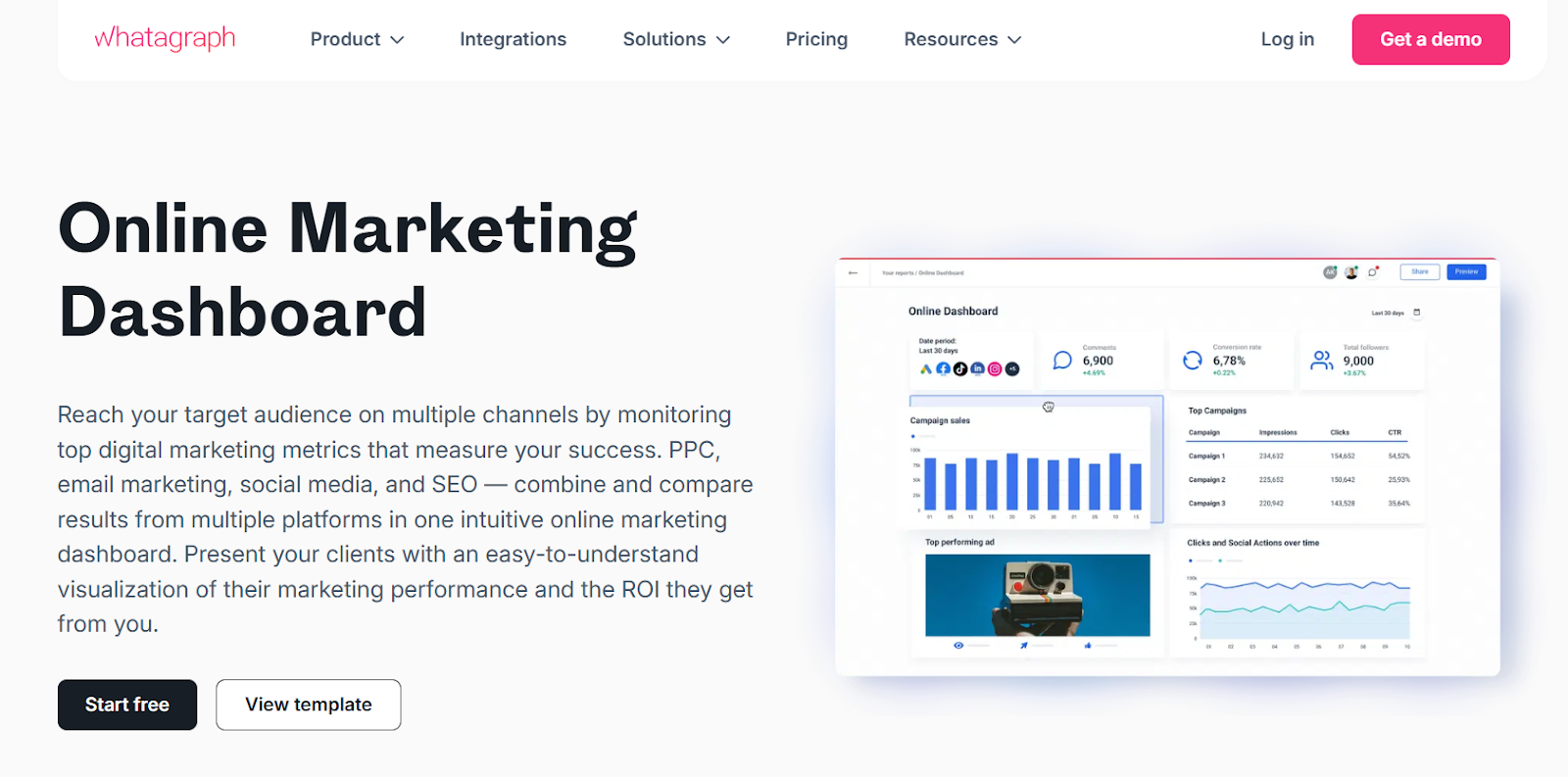
Email marketers track open rates and click‑through rates. A data visualisation dashboard in Luzmo shows real‑time and historical metrics, with a campaign overview, top‑performing emails and a map highlighting top countries. You can use this template in Luzmo and customise it to your needs.
An e‑commerce dashboard integrates data from multiple sources to show average order value, conversion rate, bounce rate and add‑to‑cart rate. There is also a breakdown of products sold per region and filters to choose different product categories. You don’t need to be a data scientist to interpret it.
Google Analytics 4 provides lots of data but can be hard to interpret. A dedicated dashboard summarises key performance indicators from GA so you can figure out what is happening on your website. Because the dashboard is interactive, you can choose different visualisations – scatter plot, bar chart, histogram (or others).
Recruiters must track many metrics to avoid losing great candidates. A recruitment dashboard gives an overview of metrics like time to hire and time to refuse, and shows the entire funnel. It helps you spot outliers and correlations to improve hiring decisions.
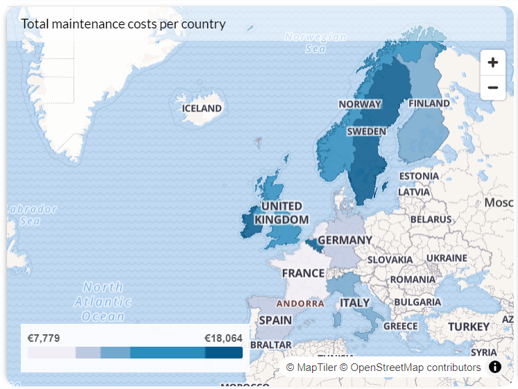
Property managers need to see data points for each property. Luzmo’s property management dashboard shows total properties, users and units on a map. It also displays tasks coming from users, enabling managers to drill into data in one place.
For paid advertising, having all metrics available in real time is important. A Google Ads dashboard summarises campaigns, click‑through rate and cost per click. Visual comparisons show how spend stacks up against your budget, and you can choose different visualisation types.
Sales professionals need an overview of their entire pipeline. A sales pipeline dashboard lets managers filter and sort deals to find out which were accepted and why. It reveals why certain sales fell through and helps formulate new strategies.
These examples show how dashboards translate complex data into clear visuals. Many of them are available as templates in the Luzmo app, and you can tailor them to your own metrics.
Dashboards often serve multiple audiences at once. Operations teams need real‑time metrics to react quickly, while executives need long‑term trends to guide strategy.
Luzmo enables both: you can configure dashboards to show live data for day‑to‑day management and aggregated data for strategic planning. The same platform handles current performance, historical data and predictive analytics, so you don’t need separate tools for different levels of decision making.
Dashboards democratise data. When everyone has access to the same metrics, decisions become data driven instead of based on intuition. Teams can identify patterns early, react to anomalies and track progress toward objectives.
For example, if a dip in conversion rate appears, a marketing team can adjust campaigns before it affects quarterly results. Over time, these small, timely corrections compound into major performance improvements.
Dashboards also bring accountability. Visible results push teams forward. Stakeholders can monitor progress toward their objectives and adjust actions accordingly.
In a culture where everyone can see the same data, decisions become more transparent and aligned with business goals.
Building dashboards isn’t always smooth. Common challenges include:
Overcoming these challenges starts with clear ownership, clean data pipelines and transparent processes.
Another pitfall is the over‑use of pie charts. People love them, but they can be misleading because it’s hard to compare slices by eyeballing. Consider bar or line charts instead, which are easier to interpret.
The future of analytics lies in dashboards that are intuitive, flexible and built for the people who use them.
Luzmo helps you transform raw data into interactive dashboards, whether you need a live operational board or a strategic overview.
Its drag‑and‑drop tools make building dashboards simple, and a developer‑friendly SDK integrates analytics seamlessly into your product.
You can customise everything from fonts to chart types so that the dashboard feels native, and multi‑tenant architecture means each customer sees only their own data.
Ready to turn your data into insight that drives growth? Try Luzmo’s free trial and discover how interactive dashboards can transform your decision making.
A data dashboard is a tool that brings together key metrics from different business data sources and turns them into a visual display that people can interpret quickly. It uses real time data visualization to present data as charts, graphs or tables instead of rows of numbers. Behind the scenes, the system pulls data from databases, apps and services, cleans it, aggregates it and displays it in one place. Because you can analyze data live, you can spot trends and act on them before problems grow.
There are several types of data dashboards suited to different business processes and audiences. Operational dashboards handle up to date data analysis in real time, tracking business metrics like website visits or order fulfillment. Strategic and executive dashboards focus on long‑term trends and high‑level KPIs for leaders, while an analytical data dashboard lets analysts drill into detailed data to find patterns. Choosing the right type helps teams track performance and make informed decisions.
Data integration means bringing together relevant data from multiple sources (such as CRM, finance, marketing and product systems) so a dashboard can pull data across the organization. With strong connectors, dashboards present data holistically rather than as isolated reports. This helps users see relationships between business metrics and avoid blind spots. Comprehensive integration also makes up to date data analysis possible because all updates flow into one place.
Interactive elements such as filters, date pickers and drill‑downs let users explore user behavior and customer behavior on their own terms. Rather than static reports, these features invite people to adjust the view, zoom in on detailed data or hide sections they don’t need. Such interactivity encourages exploration and yields key insights because users can tailor the view to what matters most. It also helps dashboards democratize data by making them accessible to non‑experts.
Executive dashboards show high‑level business metrics like revenue, growth rates and customer satisfaction in an easy‑to‑read visual display. They track performance against goals so leaders can make informed decisions without sifting through detailed data. Because these dashboards refresh continuously, they highlight emerging risks or opportunities in real time. A well‑constructed executive dashboard helps leadership communicate strategy and maintain focus on key metrics.
An analytical data dashboard digs deeper than a summary view by letting analysts slice and segment data. It often contains more complex charts like scatter plots, histograms or heat maps for spotting relationships. Analysts can examine user behavior across cohorts, regions or product lines and compare trends over time. By combining data integration with flexible visuals, an analytical dashboard helps uncover valuable insights hidden in detailed data.
Dashboards democratize data by putting key insights in front of everyone, not just a data team. Because dashboards are easy to read, people from sales, marketing or customer support can pull data and make up to date decisions without technical help. This shared access reduces bottlenecks and encourages a culture of informed decisions. When everyone works from the same numbers, teams stay aligned and accountable.
Customer acquisition cost (CAC) measures how much a company spends to win a new customer and is a vital indicator of marketing efficiency. By adding CAC to a dashboard alongside revenue and churn, teams can see whether campaigns are sustainable. Comparing CAC to lifetime value reveals if a business is spending wisely or overspending to grow. Monitoring CAC helps refine business processes and protects profitability.
Dashboards often include forecasting models that combine historical and current data to predict future trends. For example, they might project sales growth or estimate when an inventory shortage could occur. Visualizing such projections helps teams plan budgets and adjust strategy early. By surfacing emerging patterns before they’re obvious, dashboards produce valuable insights for strategic planning.
Key data dashboard examples include sales performance dashboards, marketing dashboards, project dashboards and product analytics dashboards. A sales dashboard tracks revenue per representative, pipeline velocity and win rates, while a marketing dashboard covers website traffic, conversion rates and campaign ROI. An executive dashboard summarises business metrics for leadership, and an analytical data dashboard lets teams dive into granular views. These examples show how real time data visualization turns complex information into clear, actionable stories.
Dashboards can pull user behavior data from product logs and display how people interact with features or content. They highlight drop‑off points, top features and customer satisfaction scores. By watching these patterns, product and customer success teams see where customers struggle and where they’re happy. This helps prioritise improvements and increase satisfaction.
Creating dashboards involves identifying the goals, choosing key metrics, integrating relevant data and selecting visual elements that tell a clear story. Teams decide which business metrics matter, then build charts and tables that represent them. They add interactive elements for exploration and context notes to explain changes. Good creating dashboards practice also includes testing with users to make sure the layout is clear and the insights are easy to find.
Because dashboards assemble data from across the business and present it visually, they make it easier to see correlations and anomalies. This helps teams spot issues early and identify which levers drive success. Rather than relying on intuition, decision makers use relevant data to back their choices. Over time, this habit of checking a dashboard leads to more consistent, data‑driven actions and valuable insights.
Dashboards refresh data automatically, so teams always work with current numbers instead of outdated reports. Up to date data analysis means that marketing can pause an underperforming campaign immediately, or finance can catch cash flow issues before they snowball. Continuous monitoring helps teams react quickly and adapt to changing conditions. In fast‑moving environments, this responsiveness can protect margins and accelerate growth.

All your questions answered.
What is a data dashboard?
What are the main types of dashboards?
What makes a good dashboard design?
Build your first embedded data product now. Talk to our product experts for a guided demo or get your hands dirty with a free 10-day trial.


