 ChatGPT
 Perplexity
.png)
.png)
.png)
Build your first embedded data product now. Talk to our product experts for a guided demo or get your hands dirty with a free 10-day trial.

.png)
Embedded dashboards are often the fastest way to add customer-facing analytics to a product. But as products mature, many teams start to want more control over the analytics experience.
Here's why the smartest software teams are looking for something in between no-code dashboard builders and building from scratch.
Drag-and-drop dashboard builders made embedded analytics easy. Connect a data source, design a dashboard, embed it in your app with a few lines of code, and suddenly your product has analytics.
For a lot of teams, that was a breakthrough. Getting a basic reporting layer into the product used to take months of custom engineering: designing charts, building queries, handling permissions, and wiring everything into the UI. Low-code embedded analytics platforms compressed that timeline to days.
But once analytics becomes a core part of the product, some teams run into a new challenge. The data is there. The insights are valuable. But the dashboard format isn’t always the best experience for how users actually explore and interact with their data.
The answer, it turns out, wasn't the data. It was the experience.
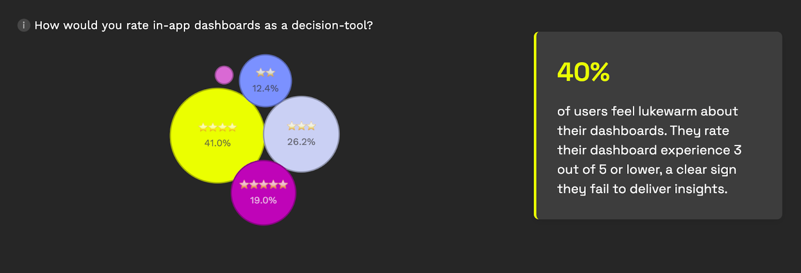
When Luzmo surveyed over 200 product leaders, data teams, and executives in 2025, the numbers painted a clear picture. 78% of companies already embed dashboards in their products. But only 60% of users say those dashboards actually help them make better decisions. The other 40% feel lukewarm at best, rating their dashboard experience 3 out of 5 or lower.
Think about that for a second. Four in ten users look at your analytics feature (the one you spent months building and integrating) and say "this doesn't actually help me decide anything." That's not a minor UX issue. It suggests the analytics experience isn't fully aligned with how users actually make decisions.
The underlying cause isn't that dashboards are inherently broken. Dashboard builders can dramatically accelerate how quickly teams can add analytics to a product. But those tools also rely on standardized layouts and interaction patterns.
You get a predictable interface, a fixed layout, and a set of interactions that the platform provider designed for the broadest possible audience. Your users, who are logging into your product with their specific workflows, get a reporting experience that feels like it belongs to someone else's workflow entirely.
There's a term product designers use when something in an interface doesn't belong: "foreign object." It's the button that clearly uses a different design system, the modal that loads slower than everything else, the section that requires a completely different mental model to navigate.
In some products, embedded dashboards can start to feel like foreign objects.
Even when the colors match and the logo is right, users can tell. The interaction patterns are different from the rest of the product. Filters work one way in your app and a slightly different way in the analytics section. Loading behavior is inconsistent. The "edit" or "customize" options (if they exist at all) feel like they belong to a separate tool bolted onto the side.
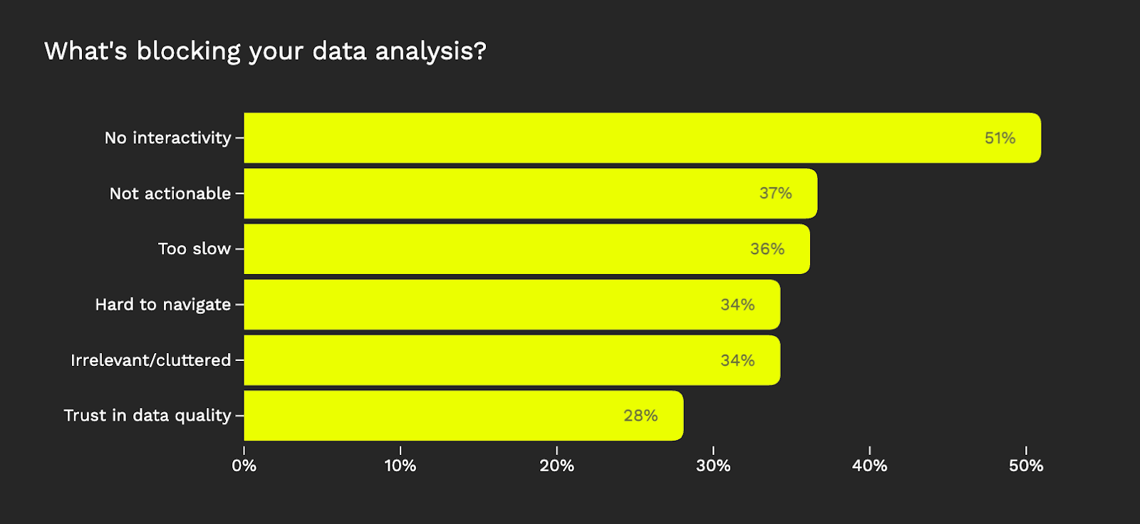
This isn't a cosmetic complaint. It has measurable consequences for product metrics. The same Luzmo research found that 34% of users spend too much time navigating dashboards, searching for insights that should be easy to find. And 37% said the data presented isn't clear or actionable. When your analytics section feels disconnected from the rest of the product, users don't just notice; they disengage.
The result is the "view-only dashboard" problem. Users can look at charts, maybe apply a filter or two, but they can't shape the experience to match how they actually work. They're consumers of someone else's reporting logic, rather than active participants exploring their own data. And increasingly, that's not good enough.
Here's the tension many software product teams face in 2026:
Option A: No-code dashboard builders. Fast to deploy. Low engineering effort. But the UX is largely defined by the dashboard framework: standardized layouts, predefined interaction patterns, and limited control over how analytics fits into your product’s workflows.
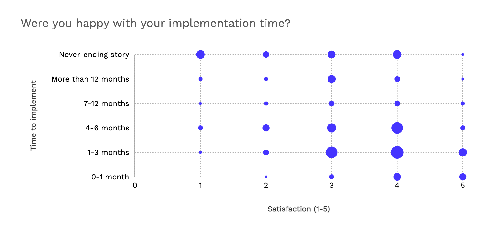
Option B: Build from scratch. Total control over every pixel. Your analytics looks and behaves exactly like the rest of your product. But you're looking at six to twelve months of engineering work, a dedicated team to maintain it, and every product enhancement to the reporting layer competes with your core roadmap for resources. Nearly half the companies in the Luzmo survey reported spending over four months just to get embedded dashboards live, and that's with off-the-shelf tools. Going fully custom multiplies that timeline dramatically.
For most of the last decade, these were the only two options. Either you used a dashboard builder and lived with the UX conventions, or you committed the engineering resources to build it all yourself. Teams that chose Option A often ended up frustrated by how "generic" their analytics felt. Teams that chose Option B often regretted the ongoing maintenance burden: every database schema change, every new chart type, every edge case in data formatting became their problem to solve.
Neither option is wrong in every situation. But an entire category of software companies (specifically, design-led scaleups with frontend engineering talent and strong opinions about UX) found themselves stuck in between. They needed more control than no-code dashboard editors offered, but they couldn't justify the investment of building a data engine from zero.
If this dynamic sounds familiar, it's because the rest of frontend development went through the same transition years ago.
In the early days, building a web application meant choosing between a monolithic framework (fast but rigid) or writing everything from scratch (flexible but painful). Then React, Vue, and the component library movement changed the game. Developers stopped choosing between "all or nothing" and started composing interfaces from modular, reusable building blocks. You could use a date picker component from one library, a data table from another, and wrap it all in your own design system. The heavy lifting (state management, rendering logic, accessibility) was handled by the component. The look, feel, and behavior were yours to define.
Analytics is now catching up to that same shift. The idea is straightforward: instead of embedding a complete, opaque dashboard (the no-code / low-code approach) or building every chart and filter and export function from scratch (the custom approach), you use a set of modular analytics components. Each component handles the data heavy-lifting (querying, aggregation, caching, rendering) while leaving the frontend control to your development team.
This is what some in the industry are starting to call "composable analytics." It sits between the two extremes that have defined embedded analytics for the last decade. Developers still write code, but the code is focused on composing and styling analytics components, not building a query engine or a charting library from the ground up.
Three things are converging to make this moment inevitable.
First, user expectations have changed. SaaS users in 2026 don't accept "here's a dashboard, deal with it." They expect to customize, filter, rearrange, and build their own views. 58% of the users in Luzmo's research said they'd pay more for analytics that help them make informed decisions. That's not a feature request. That's a revenue opportunity, but only if the analytics experience is good enough to justify the premium.
Second, frontend engineering has matured. Most scaling SaaS companies now have competent frontend teams working in React, Vue, or Angular. These teams are comfortable with component-based architecture. They need more than a no-code editor: well-designed analytics components that handle the data complexity so they can focus on the user experience. Giving them an iframe or a black-box embed is like giving a carpenter a pre-built cabinet when what they need is quality lumber and good joinery.
AI is where locked dashboards lose the argument entirely. Your users already expect to ask questions of their data in plain language and get something useful back. That expectation isn't coming, it's here.
The problem is that adding AI to a locked dashboard isn't your decision to make. You're waiting for the vendor to build it, design it, and decide how it behaves. And when they do, every user on every product gets the same experience.
Composable analytics changes that completely. Because you own the UI layer, you design the AI interaction yourself: where the prompt bar lives, how suggestions surface, what a generated chart looks like inside your product's context. The data engine underneath handles the hard parts. The experience on top is entirely yours.
That's not a subtle difference. It's the difference between bolting an AI feature onto your product and building one that feels like it was always there.
If you're a product manager at a data-driven software company, the question isn't really "should we have analytics in our product?" That ship has sailed: your competitors already do. The question is whether your analytics feature is a genuine differentiator or just a checkbox.
View-only dashboards that look like third-party add-ons don't differentiate. Self-service analytics that feel native, adapt to user workflows, and match the quality bar of the rest of your product: that's a competitive advantage.
And if you're a developer tasked with building that experience, you should ask yourself a couple of questions.
Do you want to spend the next two quarters building a data backend from scratch, and maintaining it indefinitely?
Or, would you rather focus your engineering time on the things that make your product unique:
while letting purpose-built components handle the analytics infrastructure underneath.
The embedded analytics market is moving beyond the binary choice that defined it for the last decade. No-code dashboard builders were the right answer when the goal was "just get dashboards into the product quickly." Composable analytics is the answer when the goal shifts to "build analytics that users actually want to use."
Luzmo is an embedded analytics platform built for modern software teams. From drag-and-drop dashboards to composable analytics components to embeddable AI-powered insights, Luzmo gives you the flexibility to build the analytics experience your users deserve. Get started →

All your questions answered.
Build your first embedded data product now. Talk to our product experts for a guided demo or get your hands dirty with a free 10-day trial.


