Funnel Charts: What They are and How to Use Them
Depending on your source, there are anywhere from 30 to 80+ data visualization types out there. Each of them helps portray data effectively for a different audience and use case. Funnel charts are some of the most popular chart types for showing stages in the sales process.
But just because a funnel chart is available in your favorite data visualization tool, it does not mean it is the right choice for every dataset. Below, we explain what funnel charts are, when to use them, how to create one, how to interpret conversion and drop-off rates, and when another chart type works better.
What are funnel charts?
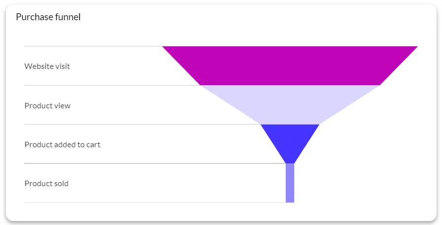
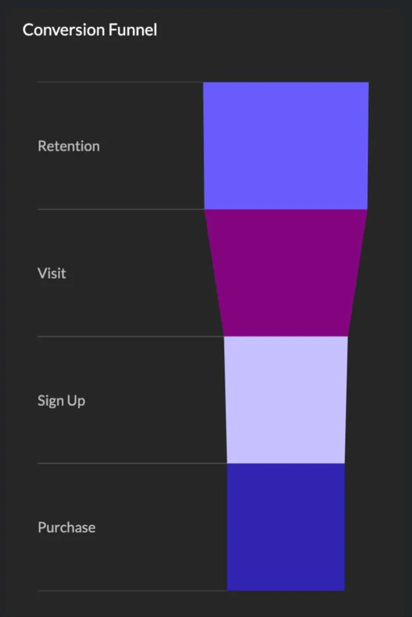
A funnel chart is a type of data visualization used to represent linear processes that involve multiple stages. The chart is literally shaped like a funnel, with the widest part at the top and the narrowest part at the bottom, showcasing how data or entities move through each stage of a process.
When to use funnel charts
For some use cases, funnel charts are the best way to visualize a piece of data. In others, something simpler such as a bar chart may work better. These are the best situations to make use of a funnel chart.
To analyze the sales funnel and pipeline
Visualize your sales process, from lead generation all the way to closed deals. This allows you to spot bottlenecks and find room for improvement in your sales process.
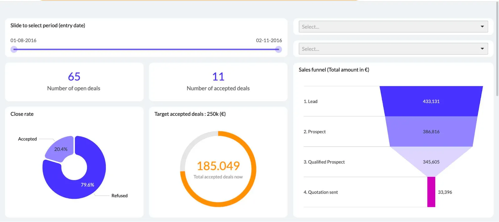
Besides that, you’ll see the conversion rates at each stage, so you’ll be able to investigate what causes customers to drop off and never complete the sales process.
To track the customer journey
Funnel charts can be used to track the stages of a process that someone goes through to become a customer. For example:
- Visiting a website
- Filling out a demo form
- Attending a demo
- Booking a sales call
- Signing a contract
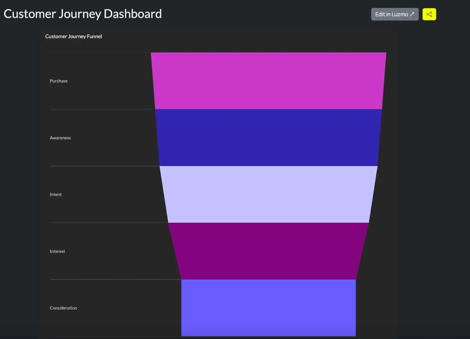
A funnel chart helps you keep track of the various stages in the customer journey and helps identify bottlenecks and opportunities to increase conversions at different stages in the journey.
Funnel data shows where prospects leave, but it does not explain why; notes from demo calls, captured with tools such as Fireflies AI, can add context by preserving the questions and objections raised before a prospect drops off.
To track marketing campaign performance
With funnel charts, you can track and measure the effectiveness of marketing campaigns, from the initial point of contact, such as a website visitor, to a paying customer.
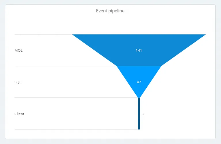
For example, you can use it to track email metrics for your subscribers and leads, from open and click-through rates to conversions, when someone finally buys from an email sequence you send out. You can also pair it with an email finder to grow your contact list and reach the right audience more effectively.
To oversee the product onboarding process
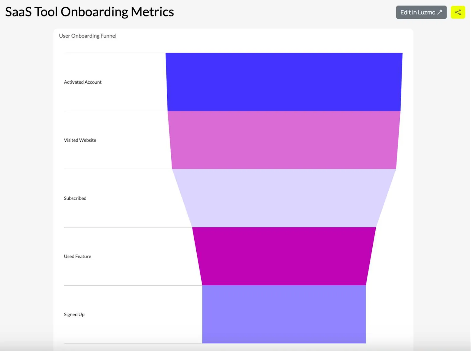
Onboarding in a SaaS product can have many points of friction and drop-off. A funnel chart is a great way to visualize this linear process: from the initial sign-up to exploring key product features, converting from a free trial to a paid account and becoming a regular user.
With the right dataset and data visualization tools, funnel charts can show you how to make your product stickier, increase retention and customer lifetime value while reducing churn.
Platforms like Luzmo Studio allow SaaS companies to embed interactive funnel charts directly into their applications, while Luzmo IQ and Luzmo AI help product teams analyze user behavior, detect drop-off patterns and generate actionable insights using AI-powered and natural-language interactions.
To track and visualize your recruitment process
Funnel charts can be used to visualize a recruitment workflow, from the first touchpoint an applicant has with your job opening until the moment they sign a work contract. Similar to tracking sales conversion progress, these funnels track how well candidates are progressing through different stages of the hiring process.
To oversee the e-commerce purchase funnel
A funnel chart can be adapted for use in the e-commerce sales funnel. The sales funnel looks slightly different since customers shop through categories, product pages and landing pages.
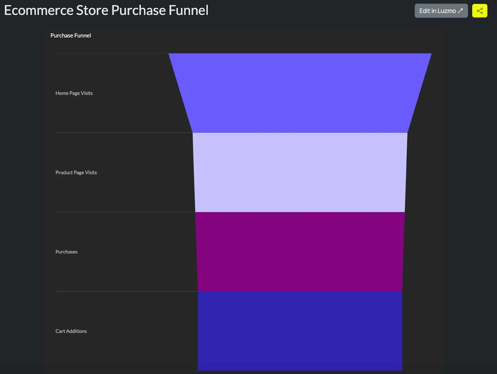
Besides tracking sales, e-commerce funnel charts can be used to improve order fulfillment, inventory management and other internal store processes.
To do a lead conversion analysis
If you have a complex sales funnel, you’ll want to understand at which point leads become customers. You may also need to see when a marketing qualified lead (MQL) becomes a sales qualified lead (SQL).
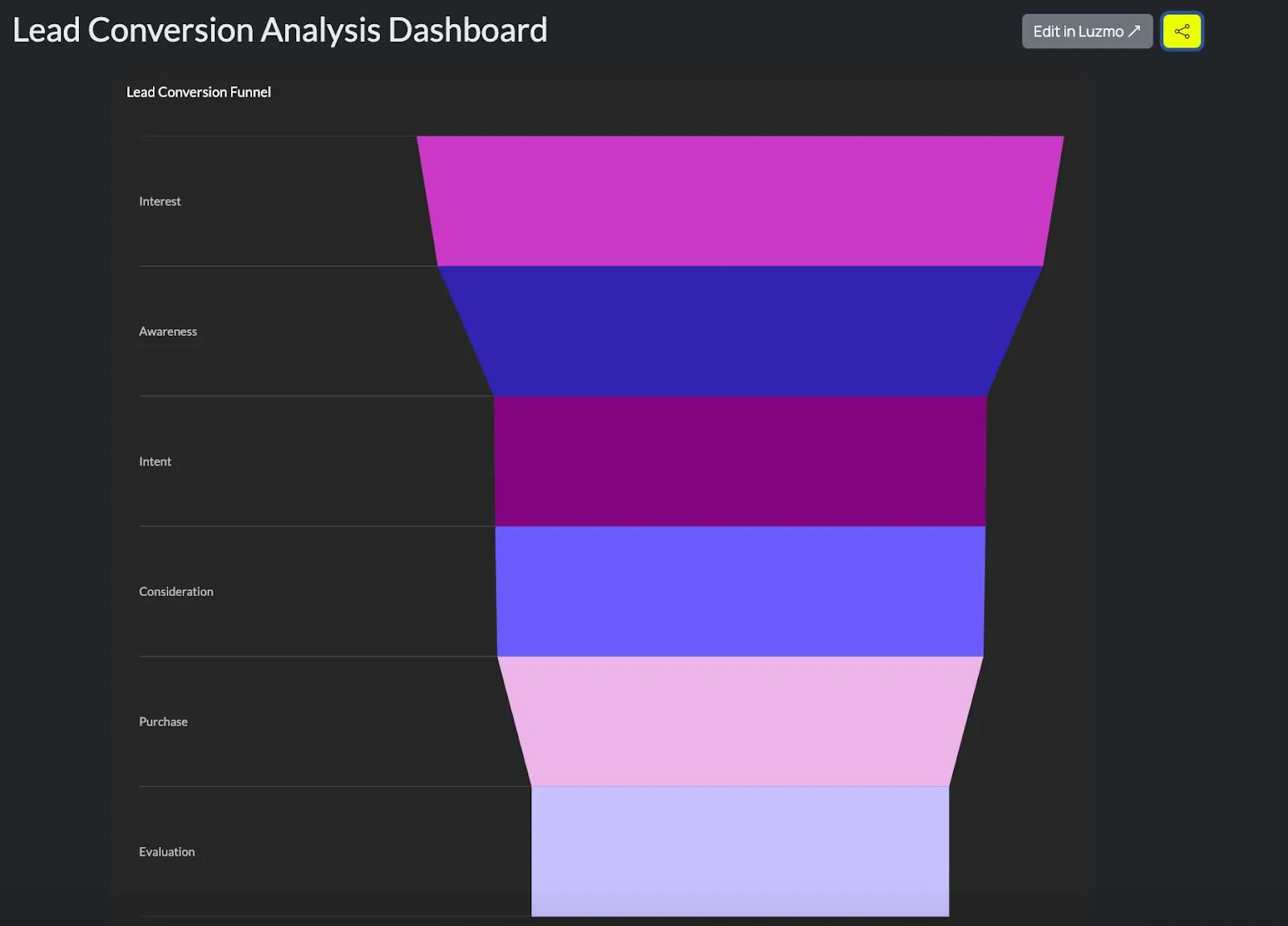
With the right templates, a funnel chart can show you what you can do to turn more marketing leads into completed sales.
When not to use funnel charts
As versatile as funnel charts may be, they have certain limitations and situations where they should not be used.
Comparing multiple categories: Funnel charts are best used to describe linear processes. They do not work well for comparing different categories. Instead, use bar charts or radar charts.
Displaying non-sequential data: If your data does not follow a clear, logical sequence, a funnel chart is not a good fit. Instead, use scatter plots or bubble charts.
Visualizing detailed trends over time: Line charts or area charts work better for this use case. Funnel charts are not well suited for time-based trends or patterns.
Analyzing data with equal stage sizes: If all of your stage sizes have the same or similar values, the funnel chart will look like a rectangle rather than a funnel, which removes much of its visual value. A bar chart or column chart will usually make the comparison clearer.
Showing cumulative data: Funnel charts are not designed for cumulative data that increases or decreases over time. Instead, use area charts or waterfall charts.
Describing highly complex processes: If your process has multiple stages or branches, a funnel chart can become misleading. Funnel charts do not handle complex branching well, and something like a Sankey diagram or a Gantt chart may be a better fit.
Presenting absolute numbers: Funnel charts are better for showing relative proportions or conversion rates between stages than for comparing absolute values. If exact comparisons matter most, use a bar chart or column chart.
Funnel chart examples: sales, onboarding, and marketing
Sales pipeline funnel
A sales funnel chart shows how many opportunities exist at each stage, from initial lead to discovery call to proposal to closed deal. The width of each stage represents the volume of deals at that point, and the drop-off between stages reveals where the conversion loss is greatest.
A funnel that narrows sharply between proposal and close might indicate a pricing issue, a competitor entering late in the deal or insufficient deal validation earlier in the process. The chart makes this structural problem visible in a way that a table of stage counts would not.
Product onboarding funnel
For software products, the onboarding funnel shows how users move through the activation sequence: signup, email verification, first login, completing setup and reaching the first meaningful action.
Drop-off at any stage is a signal that the step is causing friction. A funnel showing that 80% of signups verify their email but only 40% complete product setup identifies the setup flow as the highest-priority area for improvement. This is a more actionable framing than a general “low activation rate” metric.
Marketing campaign funnel
A marketing funnel chart tracks the journey from ad impression to click to landing page visit to lead form completion to qualified lead. Each stage has its own conversion rate, and the funnel makes it possible to compare performance across campaigns, channels or time periods.
If two campaigns have similar click-through rates but one converts to qualified leads at twice the rate of the other, the funnel reveals that gap and prompts investigation into what is different about the landing page experience or the audience targeting.
In embedded analytics, funnel charts are particularly valuable for giving end users visibility into their own conversion processes. A software product serving sales teams can embed a funnel that shows each customer's own pipeline stage distribution, updated in real time. Luzmo AI can surface funnel insights conversationally. A user who asks “where are most of my deals getting stuck?” can receive a funnel breakdown without needing to navigate to a dedicated analytics view.
How to create a funnel chart
A useful funnel chart starts with the process, not the visualization. Before opening a chart builder, define the sequence you want to analyze and make sure each stage represents a real step that users, leads, candidates or transactions can move through.
1. Define the funnel stages
Choose the major steps in the process and place them in their real chronological order. A SaaS onboarding funnel, for example, could use:
- Signed up
- Verified email
- Completed setup
- Used a core feature
- Upgraded to a paid plan
Avoid turning every click or micro-event into a separate stage. If the funnel has too many steps, the chart becomes harder to scan and the important drop-offs disappear into noise.
2. Prepare the data
At its simplest, a funnel chart needs two fields: a stage and a numeric value for that stage.
| Stage | Users |
|---|---|
| Signed up | 10,000 |
| Verified email | 8,200 |
| Completed setup | 5,100 |
| Used a core feature | 3,900 |
| Upgraded | 1,250 |
Keep the cohort and time window consistent. Comparing signups from one month with upgrades from an unrelated period can produce a funnel that looks convincing but does not represent a real user journey.
3. Add conversion and drop-off rates
Raw counts show scale, but percentages make stage performance easier to compare. Add stage-to-stage conversion rates and, where useful, the percentage of users lost at each step.
4. Build the visualization
Use a funnel chart in your BI or embedded analytics tool and map the stage field to the category or dimension and the numeric field to the measure. In an embedded product experience, Luzmo Studio can be used to surface the visualization directly inside the application where users already work.
5. Label the stages and highlight the biggest loss
Show the stage names, values and conversion percentages clearly. The viewer should not need to calculate the drop-off mentally. If one transition is responsible for most of the loss, call it out with a label, annotation or supporting metric.
The final chart should answer one question immediately: where does the process lose the most people or value?
How to calculate and interpret funnel conversion rates
A funnel becomes more useful when you look beyond the width of each stage and calculate what happens between them.
The stage-to-stage conversion rate tells you what percentage of people or items moved from one stage to the next:
Stage conversion rate = Next stage value / Previous stage value × 100
If 8,200 of 10,000 users verify their email, the conversion rate from signup to verification is 82%.
The drop-off rate shows the percentage that did not continue:
Drop-off rate = (Previous stage value - Next stage value) / Previous stage value × 100
In the same example, the drop-off rate is 18%.
You can also calculate the overall funnel conversion rate:
Overall conversion rate = Final stage value / First stage value × 100
If 1,250 users out of 10,000 signups eventually upgrade, the overall conversion rate is 12.5%.
These metrics answer different questions. Overall conversion tells you how efficient the entire process is. Stage conversion shows where performance changes. Drop-off rate makes the biggest losses easier to prioritize.
The most dramatic percentage drop is not always the most important business problem, though. A 50% loss from 100 users to 50 may matter less than a 15% loss from 100,000 users to 85,000. Look at both the percentage and the absolute number of users or opportunities lost.
It also helps to compare funnels across cohorts, acquisition channels, customer segments or time periods. A single funnel is a snapshot. Multiple comparable funnels can show whether a bottleneck is systemic or limited to one audience.
Finally, remember that a funnel chart explains where people drop off, not necessarily why. Product events, CRM data, support conversations, call notes and qualitative research can provide the context needed to turn the visual signal into an action.
Top tips for using funnel charts
When you create funnel charts, there is a certain set of rules that makes them more useful to your target audience.
Keep the stages clear and logical
Split up the stages, for example in a sales funnel, in a clear and logical way so that they are separate from each other. The progression from one stage to the next should be easy to follow.
Limit the number of stages
The ideal number of stages in a funnel chart is 3 to 7. Anything more than that and it can become cluttered with an odd funnel shape. Anything fewer than that, and you may be better off using something simpler such as a bar chart.
Use proportional sizing
The size of the stages in the funnel should be proportional to the data values. The bigger the value, the larger the piece of the funnel. This makes the chart easier to understand.
Highlight your drop-off points
Use annotations and data labels to highlight the points where potential customers drop off, for example in a sales pipeline visualization. This way, the viewer can see where the issues are at a glance.
Consider adding percentage labels
When you add percentages to the first and subsequent stages, the reader can see a clear progression in numbers in addition to looking at the size of the funnel stages.
Use clear titles and descriptions
Give your chart a name and label each stage in the funnel, ideally with a short description of what it represents. The viewer should understand the context and purpose without needing extra explanation.
Combine with other charts for deeper, more granular insights
Funnel charts are a great way to tell a story, but sometimes your target audience needs more information. Bar charts, line charts or even a well-designed pie chart can provide additional context and deeper insights.
Double-check your data for accuracy
From the first stage to the end of the funnel, the effectiveness of this visualization relies on the accuracy and quality of your data sources. Before you create and embed a funnel chart in a dashboard, make sure the data is standardized, clean and accurate.
Funnel chart vs. waterfall chart: which to use for conversion and financial data
Funnel charts and waterfall charts both show how a quantity changes as it moves through stages, but they are designed for different underlying data structures and questions.
A funnel chart is the right choice when you have a sequential process where volume decreases at each stage and you want to visualize the progression and the drop-off. The key assumption is that the stages are ordered and cumulative: everything at stage three passed through stages one and two. Sales pipelines, customer journeys and onboarding sequences all fit this structure. The funnel shape makes the conversion loss between stages immediately visible.
A waterfall chart is the right choice when you have a starting value, a series of positive and negative increments and an ending value, and you want to show how the components add up to the change. The key assumption is that each bar represents a contribution, positive or negative, to the running total. Financial analysis fits this structure: starting revenue plus new bookings minus churn minus downgrades equals ending MRR. The waterfall shows which components drove the change and in which direction.
The practical confusion between the two arises in sales reporting. A funnel chart showing deals at each pipeline stage is the right visualization for understanding conversion. A waterfall chart showing how MRR changed from one month to the next, broken down into new, expansion, contraction and churned revenue, is the right visualization for understanding the components of revenue movement. Both may appear in a sales dashboard, but they answer different questions.
A third source of confusion is the term “conversion funnel” applied to financial data. Revenue funnels that show gross revenue, then subtract returns, discounts and refunds to arrive at net revenue look like funnels visually but behave like waterfalls analytically. The stages are not a sequential process where items progress, but a series of adjustments to a starting value. Waterfall charts handle this more accurately.
Visualize your data with Luzmo
If you need to insert an embedded dashboard into your software, there are many great options, such as Tableau, Power BI or Qlik. But while these tools are powerful, they are not omnipotent, and the embedding is treated as an afterthought in most cases. Instead, give Luzmo a try.
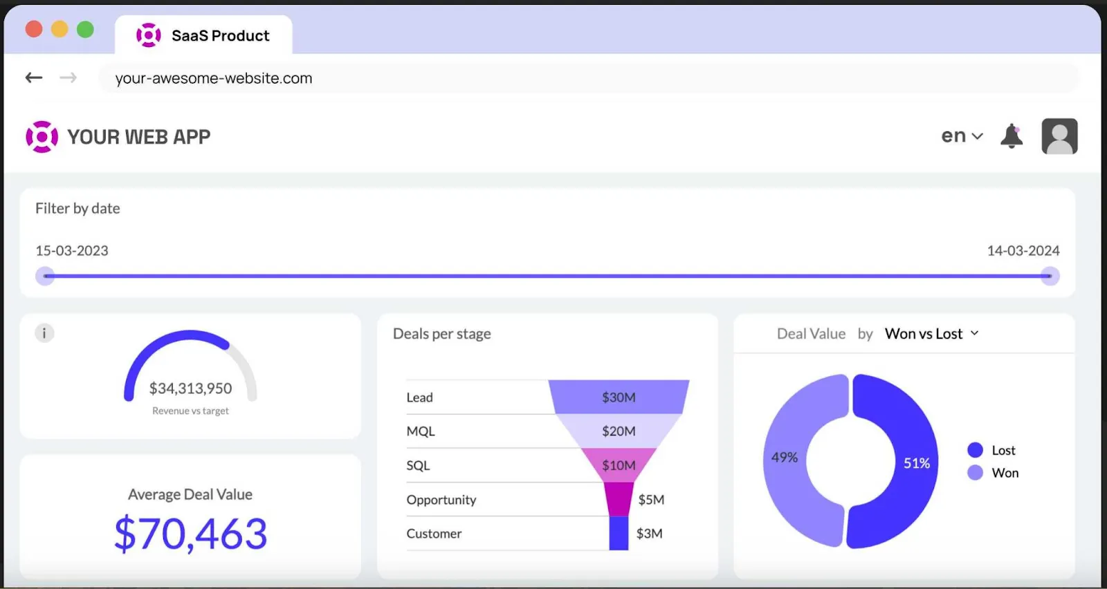
We have a large number of visualization options available to showcase the most important metrics and KPIs in your product. Engage your end users and drive higher retention and customer lifetime value by giving everyone access to key data from your product, embedded in the form of a dashboard.
Book a free demo with us to learn more!
Luzmo starts at €1,995 per month, billed annually, with a platform fee plus adoption-based usage and no internal builder seat licences.
FAQ
All your questions answered.
What is the main purpose of a funnel chart?
A funnel chart is used to visualize a linear process with multiple stages, such as a sales funnel or customer journey. It helps identify drop-off points and conversion rates between stages. In SaaS products, funnel charts are often embedded into dashboards using tools like Luzmo Studio, while Luzmo IQ and Luzmo AI help teams analyze performance and uncover insights automatically.
Are funnel charts suitable for SaaS product analytics?
Yes. Funnel charts are especially useful for tracking onboarding flows, trial-to-paid conversions and feature adoption. Embedded analytics platforms like Luzmo Studio allow companies to integrate funnel visualizations directly into their products, while Luzmo IQ and Luzmo AI help analyze user behavior and generate insights without manual reporting.
When should you avoid using a funnel chart?
Funnel charts should not be used for non-sequential data, comparing unrelated categories or visualizing detailed time-based trends. In those cases, other chart types such as bar charts or line charts are more appropriate.
How do you calculate conversion rate in a funnel?
Divide the value at the next stage by the value at the previous stage and multiply the result by 100. For example, if 800 of 1,000 leads move from qualification to demo, the stage-to-stage conversion rate is 80%.
What data do you need for a funnel chart?
At minimum, you need one field containing ordered funnel stages and one numeric field containing the value or count at each stage. The stages should represent the same process, cohort and measurement period so the resulting funnel reflects a real progression.
Written by

Ship the future of your data
Let us show you what Luzmo can do for your product.

Book your session with our analytics expert.