 ChatGPT
 Perplexity
.png)
.png)
.png)
Build your first embedded data product now. Talk to our product experts for a guided demo or get your hands dirty with a free 10-day trial.

.png)
It's 2025 and that meeting could have been an email, in the same way that a complex Excel sheet could have been a dashboard.
Using dashboards is a logical choice: you can visualize data and turn it from a soup of numbers into something that the average person can understand. But this is where problems start: business intelligence tools take years to master if you want even the most basic visualizations.
To prove to you that's no longer the case, we're showing you some of the very best dashboard platforms to help you visualize key metrics, be it for your own team or a group of customers. We'll walk you through pros, cons, and best use cases for each.
For the good part of the past few decades, business intelligence tools were reserved for companies with big budgets and tons of numbers to crunch. The barriers are lower nowadays, and businesses of all shapes and sizes are starting to see the benefits of being able to create reports and dashboards.
First, data is easier to understand. Instead of looking at raw data in sheets and columns, you can glance at Gantt charts, pie charts, or similar visualizations to understand the data and the meaning behind it. The person reading the dashboard can then make data-driven decisions with immediate impact on real business outcomes.
Closely related to this is the ability to democratize data access. You no longer need a degree in data analytics to be able to create and understand interactive dashboards. Insights are no longer reserved for the executive suite only.
The right business analytics tool also enables users to explore data, instead of looking at static dashboards. They can change metrics, use the drag and drop interface to switch date ranges, single out KPIs, remove data sources, and more. Data is no longer a set of numbers that can't be changed.
Last but definitely not least, dashboards are no longer something you only share internally with a group of key stakeholders. Embedded systems let you create reports and dashboards and share them within your website or SaaS app. Even the most non-technical users can do their own data analysis based on the datasets you provide them with.
Having said all of that, it may be difficult to choose your first dashboard tool. These are some of the best options in 2025 and what they're best for.
These are some of the best choices in the market, whether you need real-time data visualization, something that integrates with your favorite project management software, or just a simple tool to create drag-and-drop dashboards.
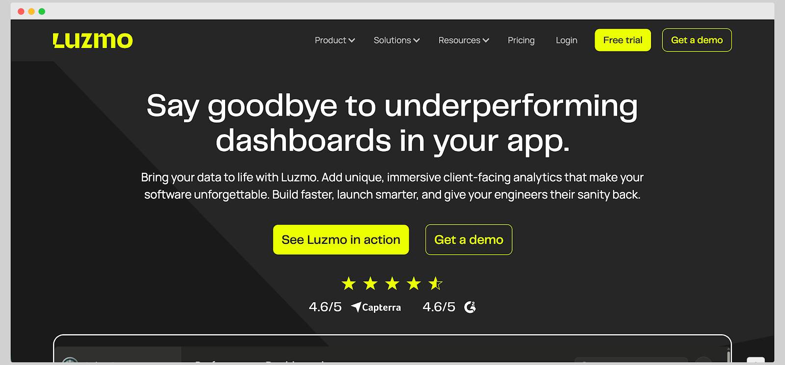
Luzmo is a modern business dashboard platform built for teams that want to create interactive, real-time dashboards without the complexity of traditional BI tools.
It’s especially loved by SaaS companies and product teams that need to embed dashboards directly into their apps or client portals. Unlike static reporting tools, Luzmo focuses on flexibility and performance, helping users turn raw data into dynamic visuals that actually drive action, whether it's on the web or on mobile devices.
It’s a great solution for businesses that care about both speed and design. Luzmo gives SaaS teams the power to deliver analytics that look and feel like part of their own product.
Key features
Luzmo can help you pull data from disparate data sources and present it in an intuitive interface that you can add to your SaaS products. Luzmo gets love from SaaS business owners, product managers and the end-users who make informed decisions every day based on Luzmo's dashboards.
Book a free demo to learn how you can empower users to explore data and find data patterns with Luzmo.
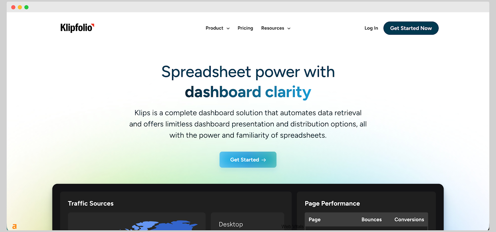
Klipfolio is a cloud-based dashboard and reporting platform built for businesses that want to keep track of key metrics across multiple data sources. It’s especially popular among marketing teams, agencies, and growing companies that need real-time visibility into performance without heavy technical setup.
The platform helps users pull data from spreadsheets, databases, and online services, turning it into clean, shareable dashboards. Klipfolio’s focus on accessibility and customization makes it a good fit for teams that want more control over how their analytics look and function.
Key features
Klipfolio’s customization power can be both a strength and a challenge. The interface may feel overwhelming at first, especially for users without any experience building dashboards.
Some integrations, while extensive, require manual configuration or third-party connectors. Performance can also slow down when handling very large datasets.
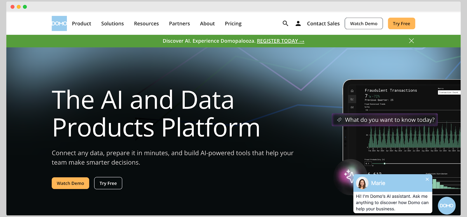
Domo is a cloud-based business intelligence platform built for companies that want to centralize data from multiple systems and make it instantly available to decision-makers.
It’s known for combining data integration and automation in a single platform, which makes it useful for executives, analysts, and operations teams alike.
Domo is often chosen by mid-sized to large enterprises that need a scalable analytics solution with strong collaboration and mobile capabilities. Its focus on accessibility makes it appealing to non-technical users who still need real-time visibility into performance metrics.
Key features
Domo’s extensive capabilities come with trade-offs. It can be expensive for smaller companies, and its pricing model isn’t always transparent, which can make budgeting challenging. Some users mention that the platform’s initial setup and data pipeline configuration may require someone from Domo to help with hands-on challenges.
Also, while Domo offers many connectors, customization within visualizations can feel more rigid compared to Tableau or Power BI, which is why many users look for Domo alternatives.

Metabase is an open-source business intelligence tool that helps teams explore and visualize data without relying heavily on developers or data scientists.
It’s known for its simplicity and accessibility, allowing anyone in a company to ask questions and get answers directly from their databases. Many startups and mid-sized businesses use Metabase because it can be deployed quickly, self-hosted for data privacy, and customized to fit internal workflows.
It’s a popular choice among engineering and product-led teams that want full control over their analytics setup.
Key features
While it’s great for quick reporting, Metabase doesn't have the deep data modeling, transformation, and predictive features found in enterprise BI tools like Power BI or Tableau.
The open-source version doesn’t include granular access controls or full audit logs, which maybe a downside for larger organizations.
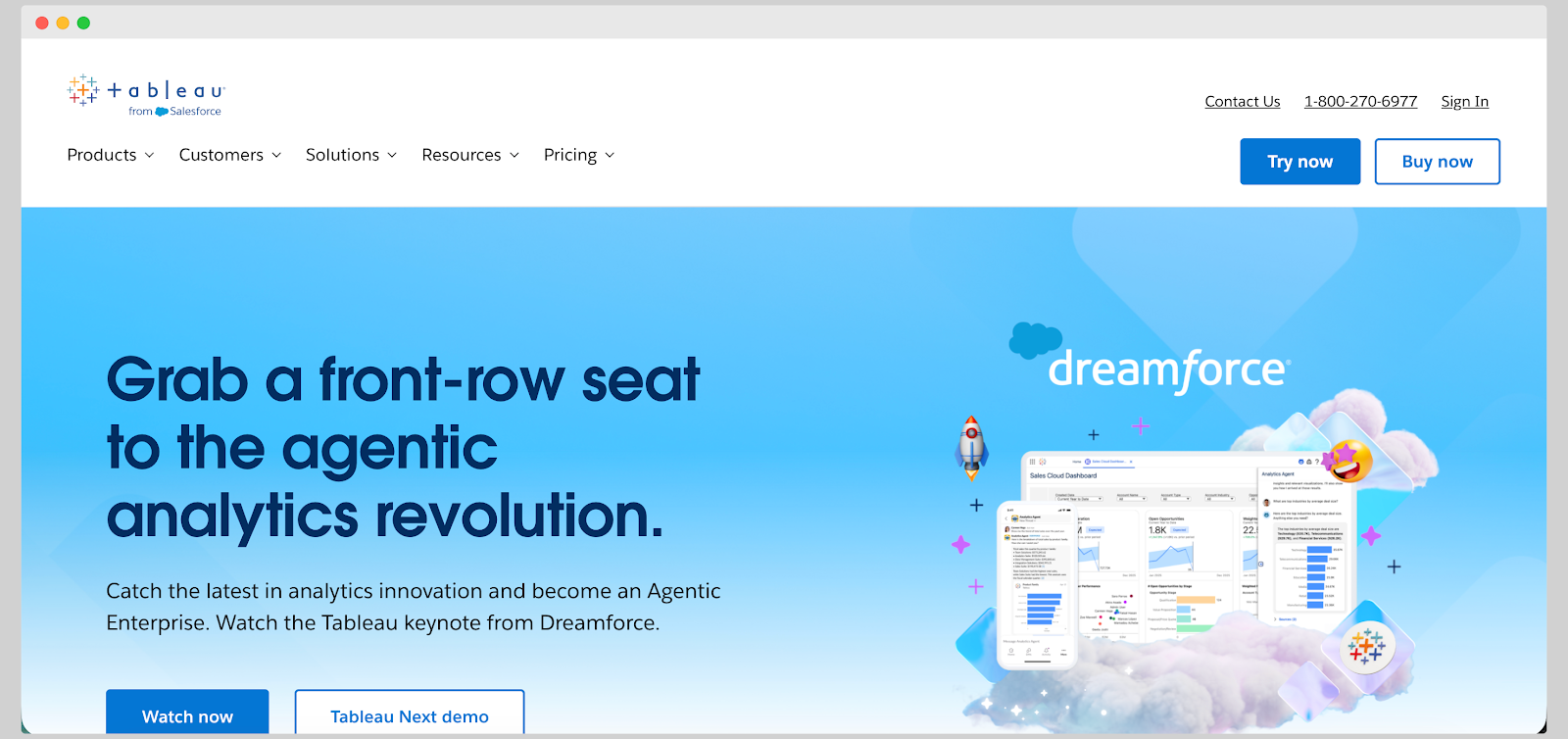
Tableau is one of the most established names in data visualization and business intelligence, trusted by organizations that need to analyze and present complex data in clear, engaging ways.
It’s used by analysts, managers, and executives across industries to create dashboards that communicate trends, performance metrics, and forecasts. Tableau has strong visual design tools and the ability to handle large, diverse datasets with speed and precision.
It’s especially popular with businesses that value visual storytelling and want analytics that appeal to both technical and non-technical audiences.
Key features
Tableau’s visual power comes with a few trade-offs.
The software license and hosting options can be expensive compared to tools like Power BI or Looker Studio, which can put it out of reach for smaller teams. Its learning curve is moderate, especially when working with calculated fields and data preparation.
Some users also note that keeping dashboards optimized for performance requires experience and ongoing tuning.
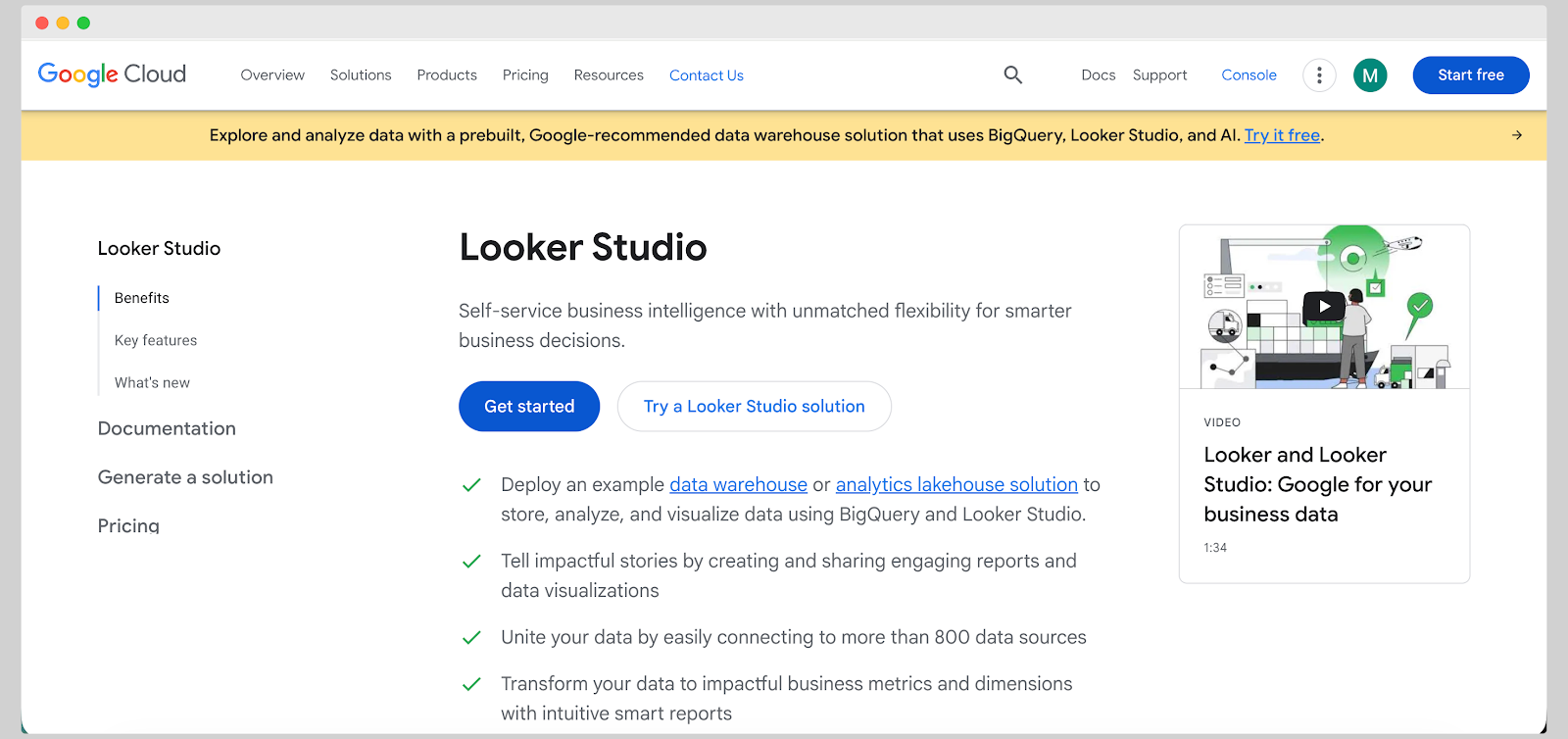
Looker Studio, formerly known as Google Data Studio, is Google’s free analytics and visualization platform built for marketers, analysts, and small to mid-sized businesses.
It allows users to build interactive dashboards and reports that pull live data from sources like Google Analytics, BigQuery, Google Sheets, and other marketing tools. Because it’s web-based, teams can collaborate easily and share reports through links without worrying about software installations.
If your dashboards rely heavily on data from free Google tools, this is a superb choice.
Key features
Looker Studio is simple, which is a big advantage, but it can also be a limitation.
It’s not built for complex data modeling or large-scale enterprise use, and performance can lag when handling massive datasets or third-party connectors. Visual customization is somewhat limited, and users often find managing permissions and data refresh settings less intuitive than expected.
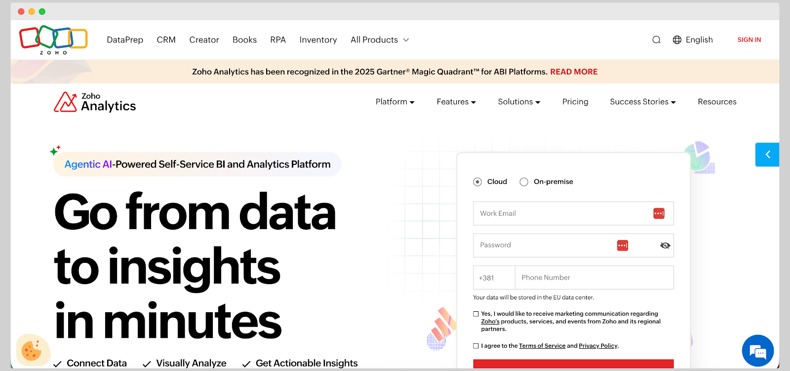
Zoho Analytics is a business intelligence and reporting platform that helps teams analyze data from multiple sources in one place.
It’s part of the broader Zoho ecosystem, making it an appealing choice for companies already using tools like Zoho CRM, Projects, or Books. The platform allows users to create interactive dashboards, track KPIs, and share insights across departments with minimal setup.
Zoho Analytics is a solid choice for small and medium-sized businesses that want affordable, cloud-based analytics, but without the complexity of enterprise-scale systems like Tableau or Power BI.
Key features
Although Zoho Analytics offers strong functionality for its price, it comes with a few downsides. Some users find the interface less intuitive than competitors, particularly when handling advanced formulas or visual customization.
Performance can be slow when managing very large datasets or multiple joins. Also, while integration within the Zoho ecosystem is excellent, connecting to external tools sometimes requires manual setup.

DashThis is a reporting and dashboard tool for marketing teams and agencies that need to present campaign results quickly and clearly.
It focuses on automating performance reporting across platforms like Google Analytics, Facebook Ads, LinkedIn, and HubSpot. Instead of spending hours exporting and formatting data, users can build professional-looking dashboards that update automatically.
DashThis is ideal for small businesses and agencies that want an easy way to visualize KPIs and share results with clients or stakeholders.
Key features
While DashThis is excellent for quick, visually clean marketing reports, it’s not meant for deep analytics or complex data modeling. If you're looking for advanced data transformations or predictive insights, DashThis will feel limited compared to more powerful platforms like Power BI or Tableau.
Some reviewers mention that customization options can feel restrictive, and larger datasets occasionally slow down report loading times.

Qlik Sense is a modern analytics platform built for companies that need deeper, more flexible data exploration. It’s used by business analysts and data teams who want to move beyond static dashboards and uncover hidden relationships within their data.
Qlik’s unique associative engine lets users explore data freely, discovering insights that might be missed with traditional query-based tools. It’s especially popular with businesses that value autonomy in data discovery and self-service analytics.
Key features
While Qlik Sense is known for its powerful data discovery capabilities, it can be complex to set up and manage for smaller teams without dedicated data engineers. The pricing structure is also less transparent compared to similar tools, which can make budgeting tricky.
Some users report a steep learning curve when customizing visualizations or working with Qlik’s proprietary scripting language. However, once implemented effectively, it delivers exceptional analytical depth and flexibility that few platforms can match.
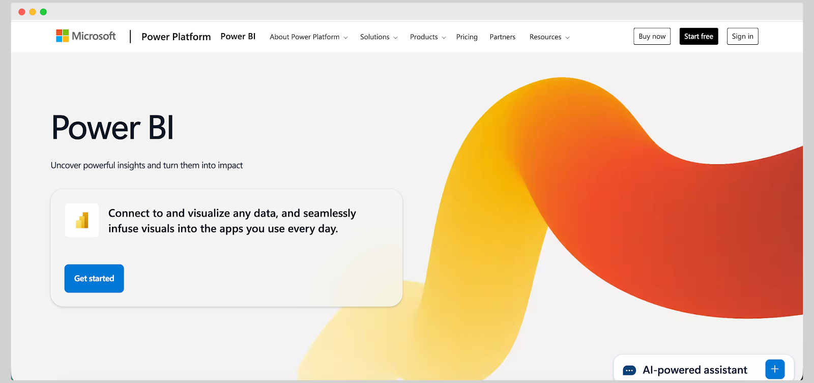
Power BI is Microsoft’s business intelligence platform built to help companies turn data into practical insights. It’s often used by analysts, managers, and executives who want to track performance metrics, identify trends, and make data-backed decisions without heavy coding.
Because it has seamless integration with Excel, Azure, and Microsoft Teams, it fits naturally into any company that's already using Microsoft products. It's a reliable choice for organizations that need customizable dashboards with a familiar interface and solid enterprise security, and don't mind some of the downsides we'll mention in a minute.
Key features
Having said all of that, Power BI has a few cons too.
The desktop version can feel sluggish when working with massive datasets, and understanding the difference between Pro, Premium, and Fabric licensing can be confusing for teams scaling up.
Some users find the visual customization options less flexible compared to Tableau or Looker, and there’s a noticeable learning curve for those unfamiliar with Microsoft’s data tools.
The right dashboard software is the one that doesn't end up sitting unused. Your internal team and your end-users require real data insights, and to get there, you need a tool that is easy to use and understand and supports data exploration, even for the less technically inclined.
With Luzmo by your side, you can create and embed dashboards your end-users can explore on their own, drill deep down into data and make better decisions. It's highly customizable, connects with the rest of your tech stack, and, unlike other dashboard software, has transparent pricing that is easy to understand.
Book a free demo today to learn more about Luzmo.
Dashboards provide a clearer and more interactive way to analyze data compared to spreadsheets. They automatically update as new data comes in, saving time on manual input and reducing errors. Plus, visual elements make it easier for teams to identify trends and share insights quickly.
Look for software that offers real-time data integration, customization options, interactive visuals, and easy sharing. If you work in SaaS or client reporting, embedded analytics and white-labeling can be valuable too. The best platforms also make collaboration simple through cloud sharing or built-in commenting.
Yes, many modern dashboard tools are built with user-friendly interfaces that allow drag-and-drop dashboard creation. Tools like Luzmo, Metabase, and Looker Studio cater to users who don’t have coding experience. Most platforms also include templates and pre-built connectors to make setup faster.
Embedded dashboards are reports or data visualizations that appear inside another product or website. For example, a SaaS company might embed a dashboard into its client portal so users can see their own analytics. Tools like Luzmo and Zoho Analytics make embedding simple while maintaining brand consistency.
Pricing varies widely depending on features and scale. Free tools like Looker Studio are ideal for basic reporting, while enterprise platforms like Tableau or Domo can cost hundreds per month. Many mid-tier tools like Luzmo or Klipfolio offer flexible pricing based on usage or the number of users.

All your questions answered.
Build your first embedded data product now. Talk to our product experts for a guided demo or get your hands dirty with a free 10-day trial.


