8 Best Tableau Alternatives for Data Analytics In 2025 & 2026
8 Best Tableau Alternatives for Data Analytics In 2026
Tableau is a popular business intelligence and data visualization tool used by thousands of companies around the world. Its user friendly interface, powerful data visualization functionality, great integrations, and strong community make it an obvious choice for data analytics. But what if you’re not happy and you want to try out Tableau alternatives?
Tableau does some things well, but if you’re looking for a more flexible BI tool with less of a learning curve, there are some great choices out there. Today, we take a look at some of the best Tableau alternatives. But first…
Why look for Tableau alternatives for data analytics?
While Tableau is incredibly powerful, this comes at a cost. The basic dashboards and reporting are pretty intuitive and easy to use. However, any advanced functionalities and calculations can take a long time for your data engineers and developers to pull off in this Salesforce product.
Tableau pricing is more catered toward large businesses. Tableau can be too much for your budget if you want to do data analysis and visualizations in your small business.
Customization options are not the greatest, either. If you want to create highly customized visualizations to make data exploration easier, your developers are going to struggle.
This analytics platform is also notorious for slow performance with large data sets. Tableau for embedded analytics is also not that great compared to some of the alternatives we’ll mention in a moment.
Modern embedded analytics platforms like Luzmo Studio are built specifically for seamless dashboard embedding, giving teams full design control without complex setup. On top of that, Luzmo IQ enables AI-powered analytics with natural-language queries, while Luzmo AI automates insight discovery and chart generation — helping both technical and non-technical users get value from their data faster.
All in all, Tableau has a lot to offer but at the same time, there are cheaper, more effective ways to create interactive dashboards.
Tableau alternatives for embedded analytics: a different use case
Most comparisons of Tableau alternatives focus on the internal BI use case: teams that need to build reports and dashboards for their own analysts and business users. That is the context Tableau was designed for, and it is the right frame for evaluating it as an internal analytics tool.
Embedded analytics — putting dashboards inside a software product for external end users — is a different problem. The requirements look different: multi-tenant data isolation (each customer sees only their own data), white-label styling (the dashboard looks like part of the product, not like Tableau), per-user economics (pricing that works at scale with potentially thousands of end users), and developer-first embedding (the implementation is done by software engineers, not analysts).
Tableau's embedding capability, Tableau Embedded Analytics, is available but it is architecturally secondary to the tool's core internal BI use case. Row-level security for multi-tenant deployments requires significant configuration. The iframe embedding approach limits styling flexibility. And Tableau's pricing model, designed around creator and viewer seats for internal users, becomes expensive when applied to an external end-user base at product scale.
This is not a criticism of Tableau as an internal BI tool — it is very good at what it was designed for. The point is that teams building customer-facing analytics features into a product should evaluate it against purpose-built embedded analytics platforms, not against other internal BI tools, because the requirements are fundamentally different.
Top Tableau alternative: 8 options to consider for business intelligence in 2026
If you need more ease of use, a more affordable pricing model, or better embedded analytics capabilities for business users, there are many great business intelligence tools to choose from.
Luzmo - the best alternative to Tableau
Looking for a business intelligence platform that lets you create and embed dashboards directly in your software product? Luzmo is the fastest, most flexible, and most affordable alternative to Tableau. It's purpose-built for teams that need embedded analytics that actually fit their product.
With a wide variety of data sources, connectors, and a powerful API, you can easily bring your data into Luzmo and start building interactive dashboards. The drag-and-drop interface and ready-to-use templates make dashboard creation simple for both technical and non-technical users.
What truly sets Luzmo apart are its four modular products that adapt to your analytics needs:
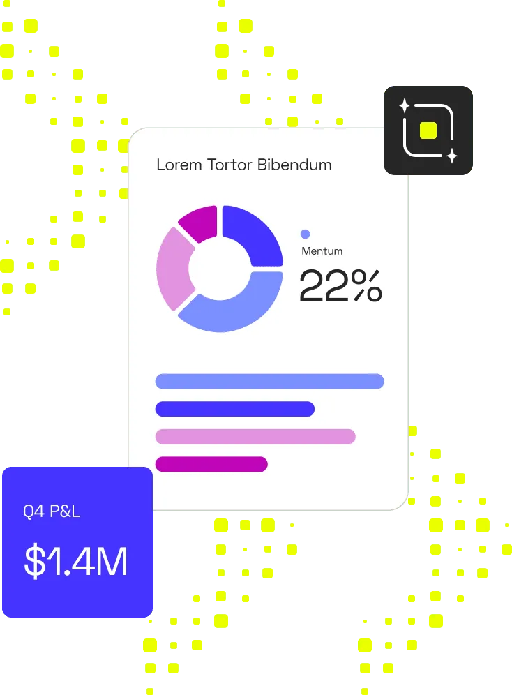
- Luzmo Studio: create and embed dashboards with an intuitive visual builder and full design control. Ideal for teams that want to ship pixel-perfect analytics without complex setup.
- Luzmo Flex: a developer-first SDK that lets your engineers build highly customized analytics experiences, connecting data from multiple sources and controlling every aspect of the dashboard’s layout, logic, and interactivity.
- Luzmo IQ: bring AI-powered analytics into your app with natural-language queries. Users can ask questions in plain English and instantly get relevant charts, insights, and summaries.
- Agent APIs: a new generation of AI-driven APIs that automate data discovery, chart generation, and performance optimization, so your dashboards can deliver insights proactively, not just reactively.
With Luzmo, embedding dashboards takes hours, not weeks. Developers can plug dashboards into your product with minimal effort, while end users get the freedom to create their own dashboards inside your app’s interface using the embedded editor.
Pricing: Luzmo's Starter plan begins at €495/month (billed annually), making it significantly more accessible than Tableau's enterprise pricing. The Premium plan at €1,995/month includes full whitelabeling and AI-assisted dashboarding. Enterprise plans with custom pricing are available for large-scale deployments. Pricing scales with Monthly Active Users (MAUs), not per-seat licenses. See Luzmo pricing →
Embed your first dashboard in less than 10 days and see how Studio, Flex, IQ, and Agent APIs can turn your app into a truly intelligent analytics experience.
TRY LUZMO FREE
Or simply book a demo with our team so we can tell you more about how Luzmo works.
Microsoft Power BI platform with powerful integration options
If you’re already in the Microsoft ecosystem and want to empower your internal team to make more data-driven decisions, Power BI is a pretty good choice. It integrates with Azure, SQL Server and Azure Active Directory, making light work for developers used to Microsoft frameworks.
It is much more than an upgraded version of Excel spreadsheets and it allows business users to make real-time, ad hoc reports. Like Tableau, it has massive capabilities but only the basic dashboards are light work. Any customization work will require a knowledgeable data analyst on your team with previous PBI experience.
It also does not handle large, complex data sets really well.
The biggest advantage of this tool is that finding developers who are handy with Power BI should not be a challenge. If you primarily use its desktop tool for data analytics, this is a good choice of a BI tool.
Qlik Sense / QlikView - semantic BI and data platform with powerful dashboard visualisation and integration features

Qlik makes a big promise with their Snapshots: self-service analytics for everyone. Take “snapshots” of data points over time and then turn them into graphs and charts that end-users can understand and use for guiding their decision-making process.
In practice, Qlik only makes sense if you have a large enough team with engineers who can handle the data preparation and data management, and do all the steps before the visualization. This tool has a very steep learning curve and mastering even the most basic workflow can take weeks to learn, let alone something like predictive analytics based on historical data.
If you have an enterprise business with a big data team and you don’t care much for an intuitive interface, Qlik is a solid option. Qlik for embedded analytics is not that great - there are many better alternatives.
Sisense - AI-powered BI and data tool with advanced data visualizations and flexible dashboard customization
Sisense is a business intelligence tool built embedded-first. This means that their primary target audience is SaaS businesses looking to create and embed dashboards in their product. To achieve this, there are three options: Fusion Embed, Compose SDK and Cloud.
Ironically, users report that embedding is not as easy as it is in most Sisense competitors. Instead, the biggest highlight is the choice of visualizations and how easy it is to build and customize dashboards.
By far, the biggest issue is Sisense pricing. In typical enterprise BI tool fashion, you can’t find it publicly, but our research shows you’ll need to spend around $20,000 per year for even the most basic setup.
Domo - all-in-one BI and data visualization platform with AI insights and seamless data integration
For teams that want all the necessary data analytics tools in one platform, Domo is an excellent option. Data warehouse, ETL, and visualization - you go from raw, unstructured data to actionable insights without leaving your browser tab.
This array of features comes at a cost, both figurative and literal. Users report that Domo is pretty difficult to master, even compared to traditionally complex tools such as Power BI. When it comes to the actual pricing, Domo keeps it a mystery but research shows that you can expect invoices in the rank of Looker. In other words, six figures annually.
Amazon Quick Sight - AI-driven dashboard and visualization tool for fast data visualisations and real-time analytics
Amazon Quick Sight is the AWS cloud platform for business intelligence. It offers some cutting-edge features, such as natural language processing and machine learning, allowing end users to easily explore data by asking questions in plain English. It is also praised for its fast performance, even when working with large datasets.
If scalability is your concern, Quicksight is a superb option. It’s fast, and works great across different devices and browsers, making it a surprisingly good choice for an embedded use case.
The downside is that compared to Tableau or Looker, the visualization options are fairly limited. Your dashboards may be AI-powered and load quickly, but there are not many chart types to choose from.
Looker - semantic BI and data platform for deep data integration and advanced dashboard visualization
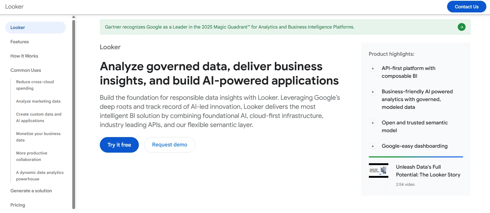
Not to be confused with Looker Studio (Google Data Studio), Looker is the tool of choice for many enterprise businesses. And for a good reason, too: its proprietary LookML makes it easy to do data modeling, analyze data, and prepare it for visualization.
Similarly to Tableau, it’s not geared for non-technical users and to get the most out of it, you’ll need a good data team. However, Looker makes up for it with a wide variety of visualization options.
The other downside is that Looker is very expensive. Prices can easily go from $5-10,000 per month, which may be worth it for your specific needs. However, it’s not exactly small-business-friendly.
Metabase - free trial BI and data visualization tool with simple dashboards and quick visualisation options
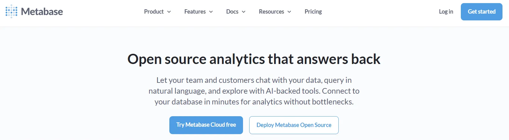
Metabase is an open-source BI solution that allows anyone to visualize and explore their company’s data without knowing SQL or Python. It’s an ideal free version of data visualization software for small teams that need a quick, user-friendly interface to build reports and dashboards.
This software for data analytics comes with a drag-and-drop builder, so you can create customizable dashboards without writing code. It’s designed for self-service BI, meaning both technical and non-technical users can generate insights from real-time data. You can also deploy Metabase on-premises or in the cloud, including Google Cloud, making deployment flexible and straightforward.
While Metabase helps teams seamlessly connect to data and visualize results, it does have limits. The semantic layer is fairly basic, and handling robust data models or advanced calculations can require manual work. Compared to premium BI tools comparable to Tableau, it lacks depth in automation and advanced customization. The free version is a great start, but scaling it across large datasets or enterprise needs may lead to high cost for the paid license.
Still, for smaller companies that want to visualize analytics and data quickly and affordably, Metabase is a solid entry point into modern business intelligence.
Free and open-source Tableau alternatives worth considering
For teams with strong engineering capacity and a preference for self-hosted infrastructure, open-source BI tools offer a path to capable analytics without the licensing costs of commercial platforms. The trade-offs are real, but so is the value for the right organization.
Apache Superset
Apache Superset is the most feature-complete open-source BI tool available. It supports a wide range of chart types, has a SQL editor for ad hoc queries, and can connect to most SQL databases and cloud warehouses. The interface is modern and reasonably intuitive for data analysts. The main limitations are embedding depth (Superset's embedding capabilities are functional but require significant configuration for multi-tenant use cases) and ongoing maintenance (as a self-hosted tool, your team is responsible for upgrades, security patches, and infrastructure).
Metabase
Metabase is designed for business users rather than data engineers, with a question-and-answer interface that abstracts SQL for non-technical teams. It is easier to set up than Superset and has a more polished user experience for general business analytics. Metabase also offers a paid cloud version and a basic embedding option. For internal analytics at a small to mid-size company with limited data engineering resources, it is one of the most accessible open-source options.
Redash
Redash is focused on SQL-based querying and report building rather than visual dashboard creation. It is well suited for data teams that primarily need to run queries and share results, rather than build polished interactive dashboards. Its embedding capabilities are more limited than Superset or Metabase. Redash works best as an internal analyst tool rather than a customer-facing analytics solution.
For any open-source option, the total cost of ownership includes the engineering time to set up, configure, and maintain the platform. For small teams or experimental use cases, this may be lower than commercial licensing. For production deployments at scale, the engineering overhead often exceeds what a comparable commercial license would cost.
Tableau alternatives by use case: internal BI vs. embedded analytics
The right Tableau alternative depends primarily on what you are trying to build. Internal BI and embedded analytics are distinct use cases with different requirements, and no single tool is the best fit for both.
For internal BI: replacing Tableau for your data team
If you need an internal analytics tool for analysts, Power BI is the most direct alternative — it is broadly capable, has a large user community, and integrates well with the Microsoft ecosystem. Looker is the stronger choice if your priority is centralized metric definitions and a governed semantic layer across a large organization. Sigma Computing is worth evaluating if your team is SQL-first and wants a spreadsheet-like interface with more analytical power than traditional BI tools.
For embedded analytics: building analytics into your product
If the goal is to put analytics inside a software product for end users — not internal reporting — the evaluation set changes. Purpose-built embedded analytics platforms handle multi-tenancy, white-label styling, and developer-first implementation better than tools designed primarily for internal BI. Luzmo AI adds natural language querying and AI-powered insight generation on top of the core embedding capability, giving end users the ability to explore their own data without needing to understand dashboards or filter panels.
For exploratory and ad hoc analytics
If the primary need is flexible, SQL-driven exploration for a data team, Metabase and Apache Superset are capable open-source options. Mode and Observable are commercial alternatives with stronger collaboration features and better support for combining SQL, code, and visualizations in a single environment.
Wrapping up the best Tableau alternatives
Tableau remains one of the top data visualization software options for large enterprises, thanks to its advanced modeling capabilities and deep integrations. But its high cost, complex deployment, and lack of flexibility make it less practical for many teams in 2026 and beyond.
If your company’s goal is to empower users with real-time data, intuitive dashboards, and predictable pricing, it’s time to look beyond Tableau.
At Luzmo, we offer a customizable, embedded analytics platform that’s easier to set up, scalable for any deployment format, and built for both developers and non-technical users. You can create reports and dashboards, embed them seamlessly, and get to insights faster than ever.
Start your journey toward better BI. Grab your free trial and see how Luzmo transforms your analytics and data experience.
FAQ
All your questions answered.
What makes a good Tableau alternative in 2025 and 2026?
A strong Tableau alternative should offer easier customization, better embedded analytics capabilities, transparent pricing, and faster implementation. Tools like Luzmo Studio allow teams to build and embed dashboards quickly using a visual builder, while Luzmo Flex enables developers to create fully customized analytics experiences with granular control over layout, logic, and interactivity.
Is Tableau suitable for embedded analytics in SaaS products?
Tableau can support embedded analytics, but embedding is not its primary focus. Many teams find it complex and resource-heavy to integrate into customer-facing products. Platforms like Luzmo Studio are purpose-built for embedded dashboards, while Luzmo Flex gives engineering teams the flexibility to tailor analytics directly within their application architecture.
What is the difference between visual dashboard builders and SDK-based analytics tools?
Visual dashboard builders allow teams to design dashboards using drag-and-drop interfaces with minimal coding, making them ideal for faster deployment. SDK-based analytics tools provide deeper customization and programmatic control for complex use cases. With Luzmo Studio, teams can create dashboards visually, and with Luzmo Flex, developers can extend and customize every aspect of the analytics experience within their product.
Written by

Ship the future of your data
Let us show you what Luzmo can do for your product.

Leave your e-mail and one of our analytics experts will reach out to you