What is an Interactive Dashboard?
In 2007, Apple launched the iPhone. Other phone manufacturers such as Nokia and Blackberry scoffed at the idea of a phone with a touchscreen and thought the phone would never be a success. However, Steve Jobs had all the information at the time, and with the success of the iPod, the launch was a no-brainer. The rest is history.
Having access to the most important data can lead to strategic decisions. And when that data is interactive and the end-user can explore it, the insights can be groundbreaking. This is what interactive dashboards are for.
Today, we explain what an interactive dashboard is, how it works and why you should consider using them in your business.
What is an interactive dashboard?
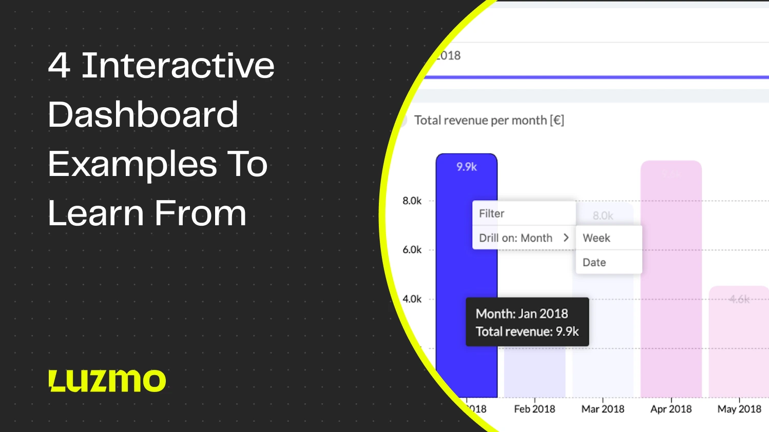
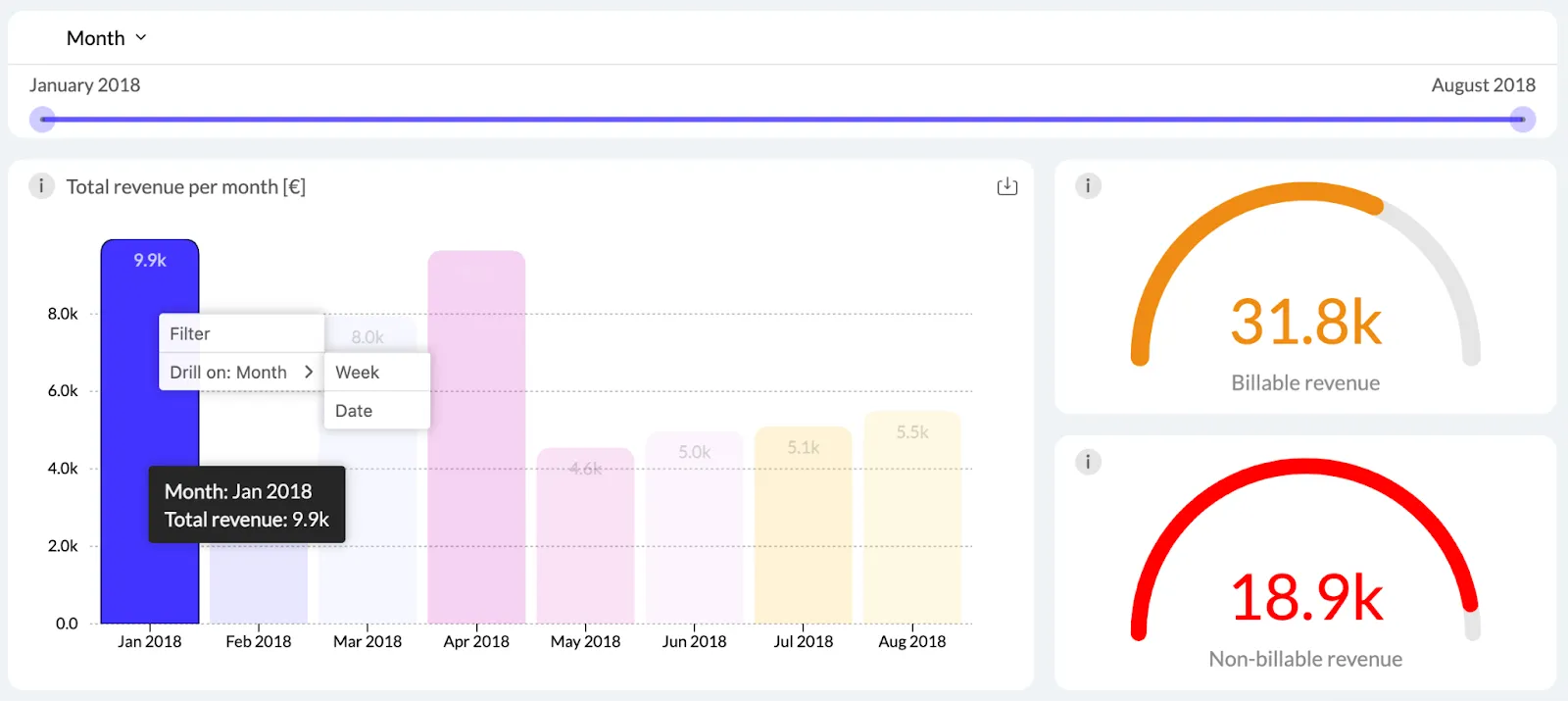
An interactive dashboard is a live document with data points, usually visualized through graphs, charts, and widgets. The “interactive” part comes from the fact that end users can interact with the dashboard and explore their data.
For example, they can change the timeframe, drill down into specific metrics they’re interested in and get detailed insights about specific data points.
For example, a sales manager can open a general sales dashboard and then go into a bar chart with individual sales reps. They can then find out who the most successful rep is, with the highest number of closed deals. Then they can drill down into data some more to find the individual sales and their average value.
The benefits of interactive dashboards
When you create dynamic, interactive dashboards, the end-users have the opportunity to view more than static data. Through data visualization, they can explore a certain dataset and unearth the KPIs that interest them. Here are the practical benefits of this dashboard type.
Improved decision-making: anyone in your team can do their own data analysis and find the key performance indicators that interest them. Analyzing and interpreting data is no longer reserved only for the tech-savvy members of your team.
With visual clarity, it’s much easier to understand changes in trends, forecast future performance and improve operational efficiency. Instead of looking at raw data, business users can look at various graphs and chart types that provide a wealth of information in one glance, compared to spreadsheets and tables.
With dashboard design elements such as tooltips and text boxes, your data engineering team can add instructions on how non-technical users can interact with and interpret interactive visualizations.
Access to real-time data: stakeholders across your team can just open a dashboard link and get access to key metrics refreshed in real-time. They no longer have to wait for data engineers to create weekly, monthly or quarterly dashboards to get insights.
Modern dashboard tools are also device-agnostic. This means you can access business intelligence data on desktop, mobile, tablet or any device with internet access.
Better communication and collaboration: different teams get access to the same datasets from the same data sources. For example, marketing and sales can get access to one dashboard and each department can do interactive data exploration to come up with different KPIs and results. This way, a single BI dashboard can facilitate better communication across teams.
Performance monitoring and management: with user-friendly dashboards, individual teams can keep track of their key performance indicators over time. They can make data-driven decisions in real time instead of waiting for data analysts to create and customize dashboards for them.
You can take things to the next level by setting up notifications for certain KPI values. For example, if your user churn drops below a certain threshold, the sales and customer success teams get notified.
More flexibility and adaptability: instead of static dashboards with fixed elements, your team and end-users can benefit from drag-and-drop dashboard builders and editors. Interactive charts and graphs are simpler to use than Microsoft Excel, without compromising on the quality of insights.
Self-service analytics allow the average user to do things such as data forecasting. With modern dashboard software, you can achieve true data democratization and allow anyone to benefit from interactive features in dashboards. Platforms like Luzmo Studio enable teams to build and embed interactive dashboards directly into their applications, while AI-powered tools such as Luzmo IQ and Luzmo AI help users explore their data, uncover trends, and generate insights using natural language—without relying on data analysts.
Key features of interactive dashboards
There are many types of dashboard tools to choose from: Power BI, Tableau, Qlik and others. If you’re considering your next dashboard tool with interactive features, make sure it has these key features.
Real-time data and collaboration
Make sure your chosen data analytics and dashboarding tool fetches data from your data sources in real time. For example, a financial dashboard should have the most up-to-date metrics at the time of viewing it, so a CFO can make critical decisions in the blink of an eye.
It’s also useful if multiple team members can collaborate on a dashboard together and leave comments and thoughts for everyone to see.
Customization features
The end user should be able to customize the dashboard to their liking. Moving dashboard elements and widgets to certain spots, changing dimensions, changing visualization types, and more.
Last but not least, if you have an embedded analytics dashboard, it should fit in well with the rest of your application. Your end-users want to have a seamless experience, so make sure the look and feel of their dashboard matches its surroundings.
The ability to drill down and explore data
A dashboard isn’t meant to be static. The end-user should be able to freely click around items and widgets to find the data they need. For example, they should be able to click through pie charts and find out what different slices mean and what the data looks like behind them.
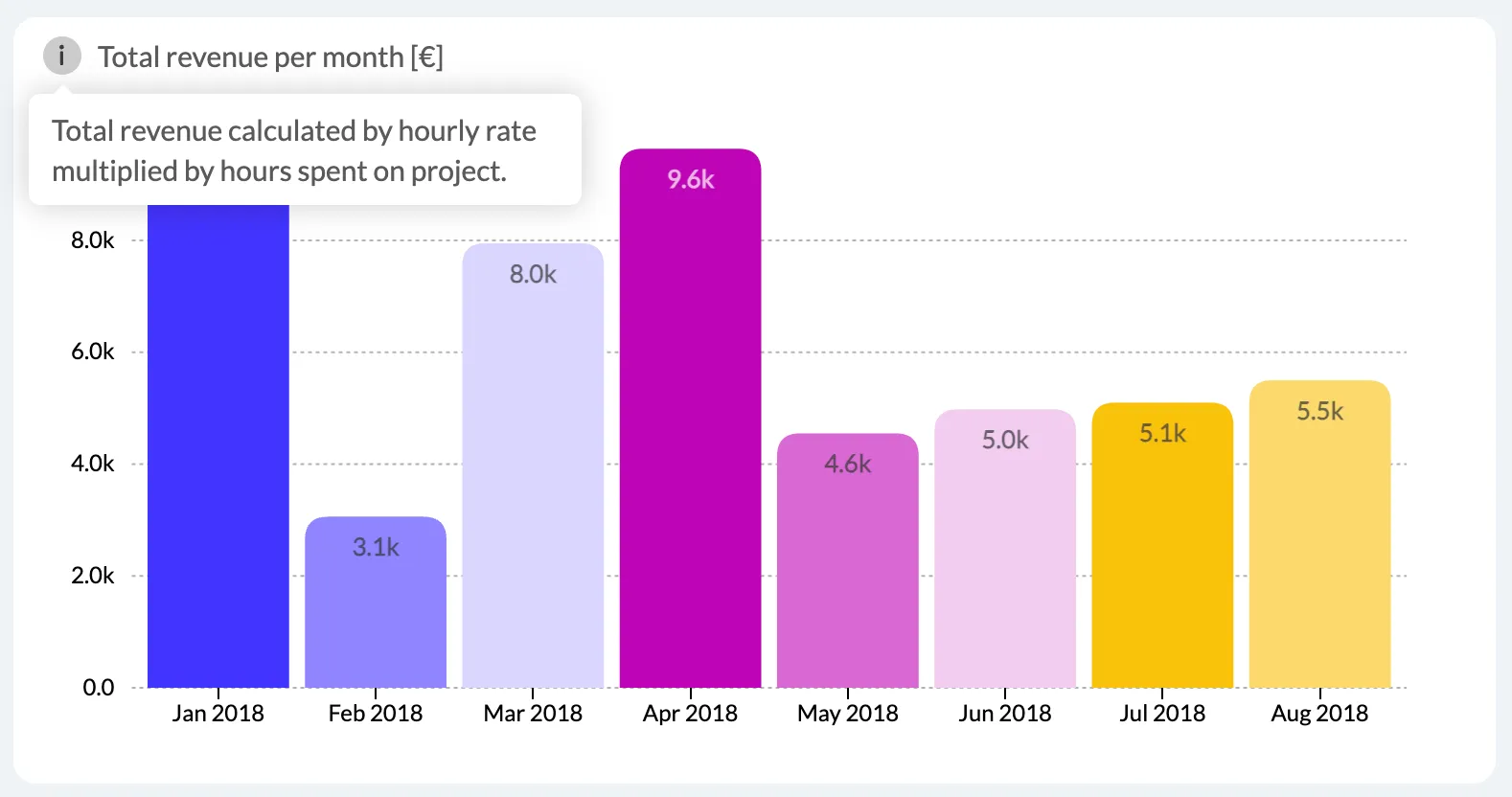
You can achieve this with features such as tooltips, which are instructions on what a piece of data is and how it can be explored. Drilldowns and drillthroughs are another great example. For example, in an email marketing dashboard, you could click through on the name of a specific subscriber and see a detailed dashboard with specific email stats for that person.
AI features
Artificial intelligence and language learning models have broken their way into the world of BI. Modern dashboarding tools like Luzmo come with AI out of the box. For example, you can use our AI chart generator to feed data to Luzmo and it will generate the best chart for your desired use case.
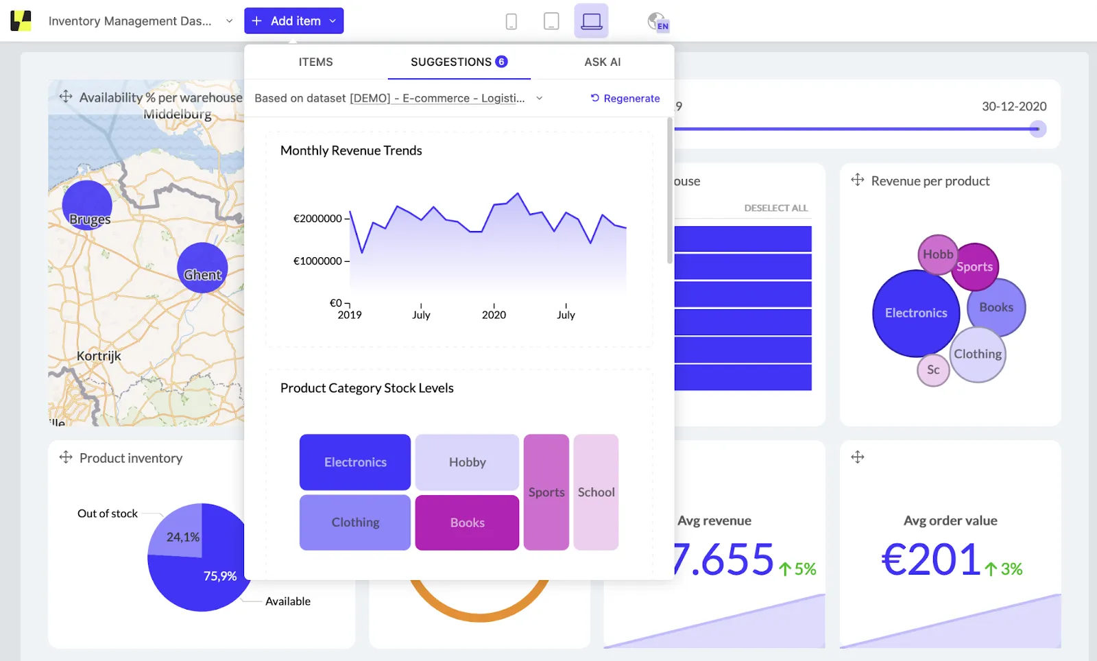
In some cases, you may want to ask for more specific recommendations. Besides Luzmo’s recommended charts, you can also use a prompt to ask for specific insights. This is the most common way you’ll see AI being offered in other modern BI tools, however, keep in mind that those use cases have a long way to go before they become fully usable in some tools.
Interactive dashboard features: what separates good from great
Most dashboard tools offer interactivity as a feature set. The difference between dashboards that users actually engage with and those they bypass — Luzmo research found 72% of users regularly export to Excel rather than use their dashboard — often comes down to which interactive features are present and how well they are implemented.
Cross-filtering
When a user clicks a data point in one chart — a bar in a bar chart, a segment in a donut — all other charts on the dashboard filter to show only data related to that selection. This allows users to investigate without navigating to a new page or setting filters manually. Cross-filtering is one of the highest-value interactive features because it enables exploratory analysis with zero additional user education.
Drill-down and drill-through
Drill-down allows users to move from a summary level to a more granular level within the same chart — clicking a monthly bar to see the weekly breakdown, for example. Drill-through navigates to a detail view that shows the individual records behind an aggregated value. Both features answer the natural follow-up question after a user notices something interesting in a summary view.
Date range controls and period comparison
A date picker that controls all panels simultaneously is a baseline requirement for any operational dashboard. More useful is period comparison — the ability to show the current period alongside the same period last year or the previous period, on the same chart — which gives every metric immediate context without requiring the user to switch views.
AI-powered natural language querying
The most significant recent addition to interactive dashboard capabilities is natural language querying: the ability for a user to type a question and receive a chart or table as an answer. This extends interactivity beyond the questions the designer anticipated and allows users to explore data paths that no filter panel could have predicted. Luzmo AI adds this capability to embedded dashboards, so end users can ask questions like "which customers increased their usage last month?" and receive a direct answer without leaving the product.
Examples of interactive dashboards
Want to get inspired with some of the best uses for interactive dashboards? Here are our top picks.
Sentiance’s driving dashboard
Sentiance is a mobility and motion insights company that needed dashboards with real time insights about their drivers. How many trips they make, where they are located, how safely they are driving and more.
The end users of the app can drill down into data and explore the driving habits of every single drive, to the level of individual trips.
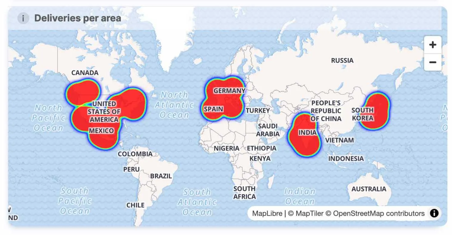
Kenjo’s HR dashboards
Kenjo is a human resources SaaS app used by thousands of businesses globally. Those businesses wanted a good way to show the multitude of HR metrics they track and measure every day. This was the result:
Kenjo users can now generate and explore their own dashboards instead of asking the IT team to create a dashboard every time they have a question.
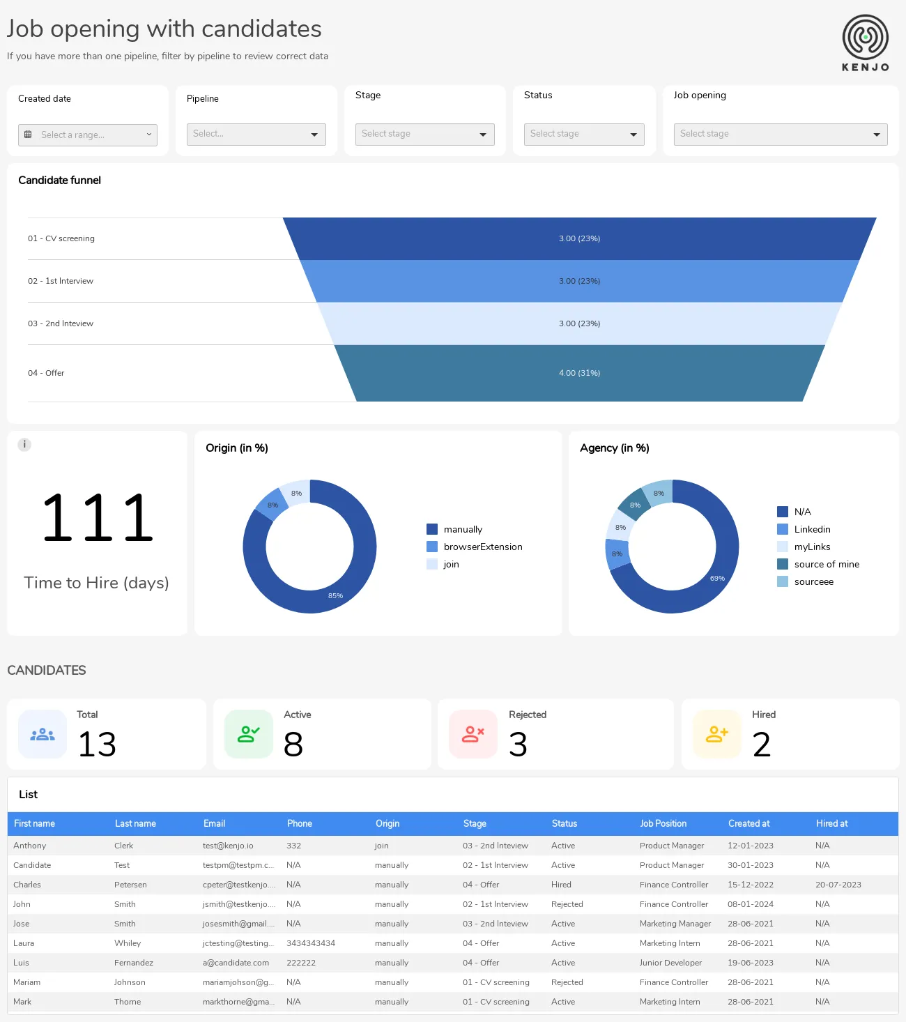
Spaceflow’s proptech dashboards
Spaceflow is a SaaS product for landlords who want to provide a superior tenant experience. They need a dashboard that shows key real estate information in one place: which apartments are occupied and when, which areas tend to be good for investment, which apartments are not booked to full capacity, etc.
Thanks to dashboards such as this one, dashboard requests from users dropped by 80% - since the end-users could now access their own, pre-built dashboards and explore them.
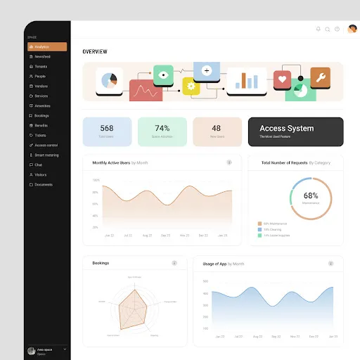
Euro2024 dashboard
Example of the chart picker
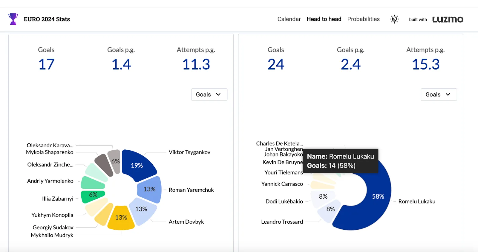
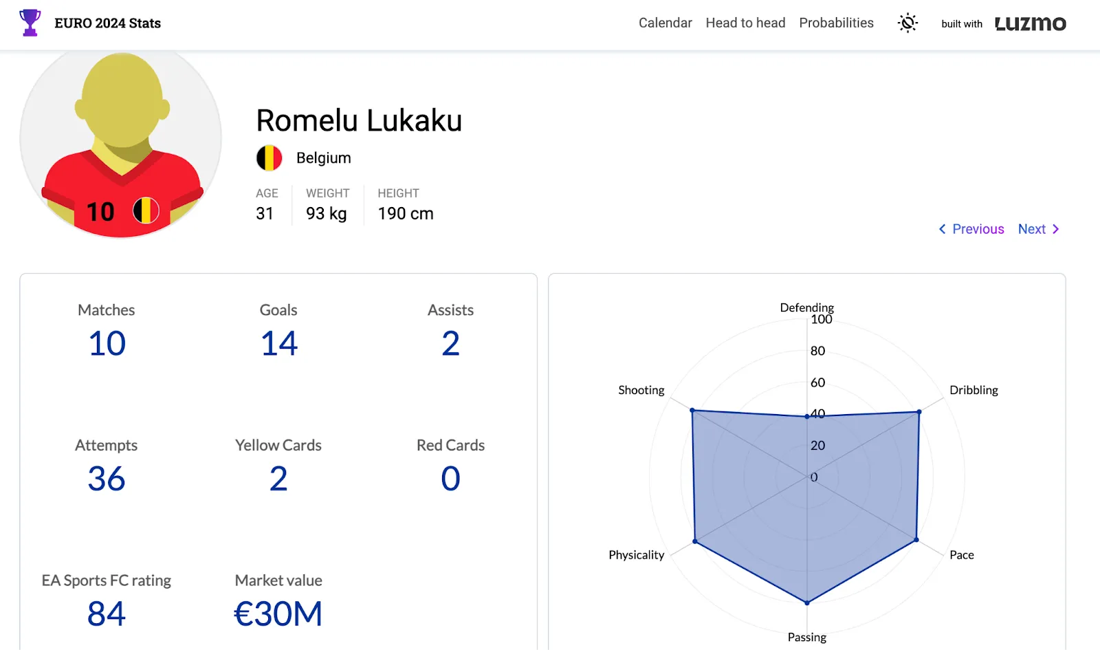
Example of the individual player stats (you can get here by clicking on a player in the donut chart on the previous screenshot)
Interactive dashboard examples by industry
Software product analytics
A software product embeds an interactive dashboard that shows each customer their own usage data — active users, feature adoption rates, session frequency, and engagement trends over time. The customer can filter by date range, drill down into a specific feature's usage pattern, and segment by user role. Instead of receiving a static monthly report from the vendor, the customer has live access to their own data and can answer questions as they arise. This reduces support requests and creates a data-engagement habit that contributes to retention.
Financial services
A financial platform shows portfolio performance through an interactive dashboard where the investor can switch between time horizons, filter by asset class, and drill into individual positions to see holding details and performance attribution. The interactivity allows each user to explore the data according to their own priorities — some users want the overview, others want the transaction-level detail — without requiring the platform to build a separate dashboard for each use case.
Healthcare and operations
A hospital operations team uses an interactive dashboard to monitor patient flow, bed occupancy, and staffing levels in real time. Clicking on a specific ward drills into ward-level data. Selecting a time range filters all panels simultaneously. Anomalies in waiting time data can be investigated by drilling from the summary chart to the individual records that make up the spike. This level of interactivity compresses the time between noticing a problem and having enough data to act on it.
E-commerce and retail
A retail analytics platform embeds an interactive dashboard for store managers that shows daily sales by product category, inventory levels by location, and returns by reason code. The manager can filter to their own store, compare this week against the same period last year, and drill into any category to see SKU-level performance. The same data that used to arrive in a weekly spreadsheet is now explorable in real time, with the store manager in control of what they look at.
Interactive dashboard best practices for software product teams
Building an interactive dashboard that end users engage with consistently requires more than technical implementation. The dashboards that see high adoption share a set of design and architectural decisions that distinguish them from those that end up bypassed.
Start with the user's question, not the data available. The most common mistake in dashboard design is building from the data outward — displaying everything that can be shown and letting users figure out what it means. The more effective approach is to identify the two or three questions the user needs to answer on a typical day and design the dashboard to answer those questions immediately, with interactivity available for exploration but not required for the core use case.
Limit the number of interactive elements visible at once. A dashboard with twenty filter dropdowns, fifteen drill-down links, and four date pickers is technically interactive but practically overwhelming. Users confronted with too many controls default to ignoring them. The most effective embedded dashboards surface one or two primary controls prominently and make additional controls available on demand.
Make the default view meaningful. The state the dashboard loads in — before any user interaction — should already answer a useful question for the majority of users. A dashboard that loads showing all time, all users, and all regions, requiring three filter interactions before the data is relevant to the user viewing it, will see low engagement. Pre-setting filters to the user's own data, the current period, and the most relevant segment removes friction from the first impression.
Test with real users before shipping. Interactive features that seem intuitive to the team that built them often confuse users who did not build them. A single usability session with three or four actual customers will surface navigation confusions and missing controls that are invisible in internal review.
Wrapping up
In 2026, there is no excuse for any dashboard not to be interactive. Today’s business users expect insights immediately and an interactive dashboard does just that. There is nothing to lose, and massive benefits to gain: faster decision-making, empowering every user in your team with data, improving collaboration across departments and more.
And if you want to empower your end-users with interactive dashboards in your software product, Luzmo ticks all the boxes. A wide variety of data sources, fast and efficient API, easy embedding, lots of visualization choices - we could go on for hours.
But why not have someone from our team show it all in action? Book a free demo with us to find out how your app users can benefit from interactive dashboards. Plans start at $495/month for Starter, $1,995/month for Premium, with custom Enterprise pricing available as you scale.
FAQ
All your questions answered.
What makes a dashboard “interactive” rather than a static report?
An interactive dashboard lets users engage with the data - filtering views, clicking into chart elements, drilling down by date or category, and changing parameters on the fly. This contrasts with static visuals where the viewer cannot manipulate the data to explore alternative slices or scenarios. Interactivity turns a dashboard from a presentation into a self-service analytics tool.
How do interactive dashboards improve decision-making?
They make it easier to uncover underlying causes and patterns by allowing users to pivot the view instead of requesting new reports. For example, a user can filter by region to see if performance issues are localized or compare periods to identify seasonal trends. This immediacy accelerates insight and reduces dependence on analysts.
What are best practices for designing interactive dashboards?
Limit the number of KPIs per view so users aren’t overwhelmed. Use consistent color codes to represent similar concepts. Provide context or benchmarks so users know what “good” looks like. Use responsive layouts so the dashboard works across screens. Good design makes exploration intuitive, not confusing.
Are there cases where interactive dashboards are less effective?
Yes. If the audience is only interested in a simple summary rather than exploration, a static snapshot can be more accessible. Also, overly complex interactive dashboards with too many controls can confuse users instead of helping them. Aim for clarity first - interactivity second.
Written by

Ship the future of your data
Let us show you what Luzmo can do for your product.

Leave your e-mail and one of our analytics experts will reach out to you