 ChatGPT
 Perplexity
.png)
.png)
.png)
Build your first embedded data product now. Talk to our product experts for a guided demo or get your hands dirty with a free 10-day trial.

Every product manager has felt it: you spend months building what you think are “insightful” dashboards—only to see your users bounce, export to Excel, or ask for manual reports anyway.
It’s not just frustrating. It’s wasteful, expensive, and a drag on both adoption and upsell. The dirty secret in SaaS? Even as analytics gets more “sophisticated,” most dashboards simply don’t help users make better decisions, and rarely drive the engagement you need.
The problem isn’t just the visuals. Most dashboards are too static. Users want to slice, filter, drill, and act—all within your product. They want interactivity, personalization, and a sense that the analytics are theirs, not just something “the platform” provides.
If your dashboards don’t keep up with the real flow of work, users will find their own way around—cutting you out of critical decisions and costing you serious retention and expansion opportunities.
Luzmo’s industry research surveyed over 200 SaaS product, data, and executive leaders about what’s broken, and what users really want.
Here’s what the data says:
If your dashboards are just “analytics tabs”—passive, generic, and disconnected—users are going to tune out. The dashboards that get engagement, retention, and upsell are the ones that feel alive, flexible, and tailored to every role.
Want the full deep-dive? Read Luzmo’s report here.
Gone are the days when analytics could be a PDF download or a weekly email. Interactive dashboards are the foundation for user-centric, product-led growth.
Here’s what modern SaaS and digital products are doing differently:
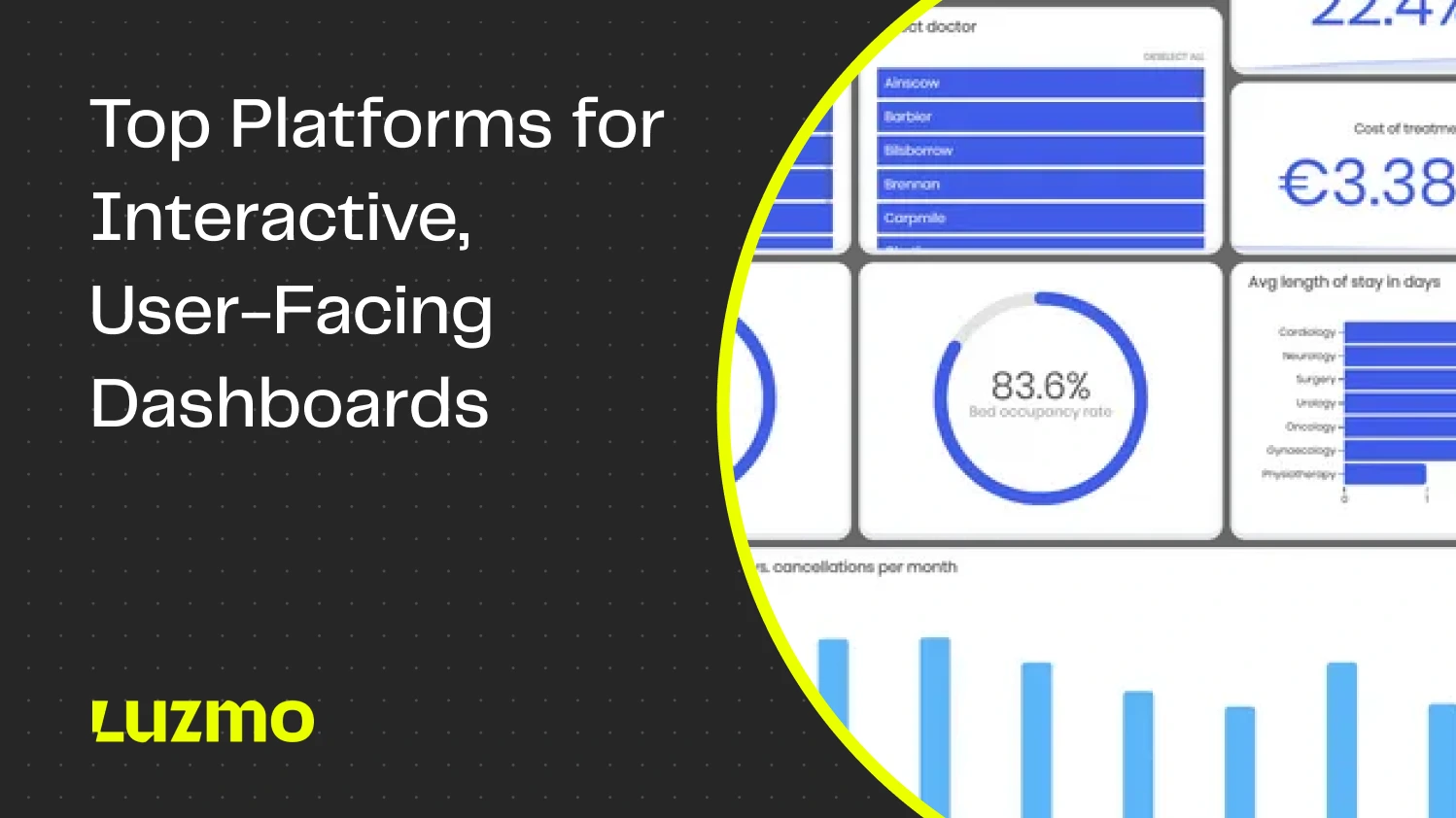
The following five platforms have made the shortlist for 2025. Each one takes a different approach, but only a few make it easy for product teams to deliver interactive dashboards users will actually love.

If there’s a single reason Luzmo leads the “interactive dashboard” pack, it’s that it was designed from day one for real user engagement. Filtering, drill-downs, chart-to-action workflows—Luzmo doesn’t just show your users data, it invites them to explore, click, and do something with it.
Luzmo Flex lets you embed fully interactive charts, widgets, and analytics modules wherever you want, so your product feels seamless, not stitched together.
With deep event hooks and integration options, users can trigger product actions (alerts, exports, onboarding flows, etc.) straight from a dashboard.
You get the “batteries included” backend too—robust APIs, multi-tenant controls, and a Connect stack that handles all your data sources.
Luzmo IQ raises the bar for user-centric analytics. Instead of hunting for the right filter, users can just ask a question (“Show me usage by segment this quarter”), and the platform builds the right chart or insight instantly. No training, no waiting on analysts—just interactive answers, always in context.
The embedded dashboard editor means you don’t just serve static views. Your end users can personalize, rearrange, or create new dashboards on their own. If your clients, partners, or non-technical teams have ever complained about “one-size-fits-all,” this is your get-out-of-jail-free card.
Luzmo is designed for SaaS and digital product teams who want analytics to feel fully on-brand and embedded.
If you’re looking for legacy, back-office-only BI or on-premise desktop reporting, Luzmo isn’t your fit. Its strengths are interactive, in-product, client-facing analytics for modern SaaS and digital platforms.

Qlik’s core innovation—the associative data engine—unlocks a unique type of interactive analytics: users aren’t locked into a single “drill-down” path. Instead, they can explore data from any angle, filtering and cross-filtering at will.
This model works exceptionally well in complex or regulated environments, where users need to chase connections and surface anomalies without rigid paths.
For SaaS or digital products, Qlik is more technical to embed. Full branding control requires serious effort, and business user customization (creating dashboards, not just using them) isn’t always straightforward. Some teams find the learning curve steep, especially outside classic enterprise environments.
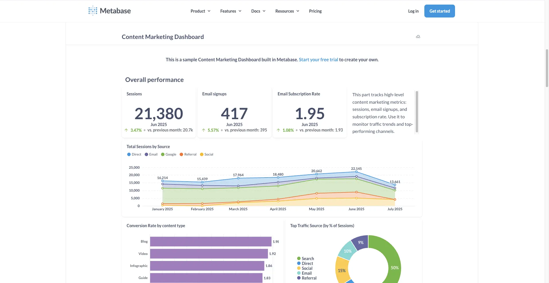
For startups, smaller teams, and fast-moving SaaS, Metabase is a go-to for getting up and running with interactive dashboards—without breaking the bank. It’s open source, embeddable, and easy to connect to most databases.
The interface is approachable, and even non-technical users can create questions, filter, and save views.
You get basic white-labeling (logo, colors), but advanced UX control and deep branding take work (and often aren’t practical for larger SaaS).
Enterprise features (row-level security, multi-tenant controls, audit trails) are weaker than Metabase alternatives like Luzmo, Qlik, or GoodData.
Performance on very large datasets or complex workflows can lag.

If your team lives in the Microsoft ecosystem, Power BI Embedded offers a familiar experience with solid interactive features. You get:
Embedding Power BI dashboards in your web app or portal is well-supported, and SSO makes end-user management easier for Microsoft shops.
Branding and UI customization are limited compared to newer competitors.
The embedding experience is straightforward, but building “totally native” analytics requires extra engineering.
For non-Microsoft shops, the value drops sharply.
It’s also more tailored to internal BI scenarios than customer-facing SaaS.

GoodData is built for scale and security. Its API-first, “headless BI” approach means you can decouple backend data logic from the presentation layer, enabling custom, interactive dashboards across many clients, partners, or user groups.
This flexibility comes at the price of simplicity. Out-of-the-box interactivity is decent, but customizing the experience takes serious technical resources.
Business users and designers may need support to get dashboards just right.
Open-source options exist for smaller teams, but GoodData's enterprise pricing can be high for full features.
So what should actually drive your decision? Here’s a product manager’s shortlist:
Looking for a no-fluff, feature-by-feature view?
Request our interactive dashboard comparison matrix and get an unbiased, downloadable resource for your next product decision.
The data is clear: most dashboards still fall short. Interactive, embedded analytics are no longer optional: they’re the difference between “an analytics tab” and a product users actually trust and adopt.
Luzmo sets the pace for client-facing, interactive dashboards, but every tool on this list can help you move beyond static reporting, if you know what your users and your product actually need.
Ready to level up your dashboards and drive real engagement?
Start with Luzmo’s embedded analytics, see why leaders are switching, or book a demo and see what a truly interactive dashboard experience can do for your product.

All your questions answered.
Build your first embedded data product now. Talk to our product experts for a guided demo or get your hands dirty with a free 10-day trial.


