 ChatGPT
 Perplexity
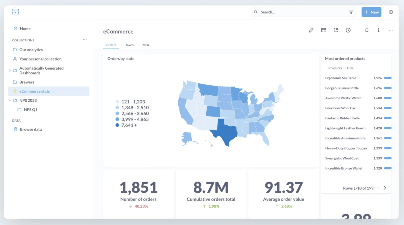
.png)
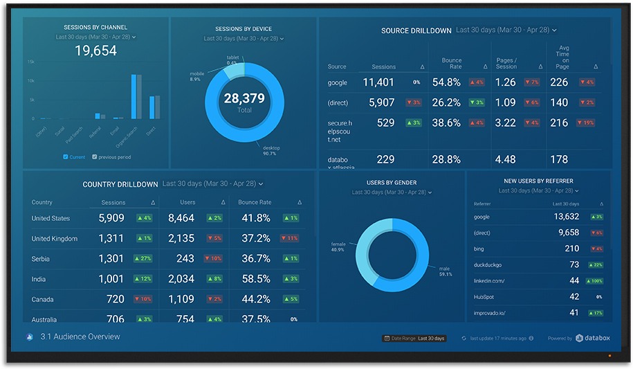
.png)
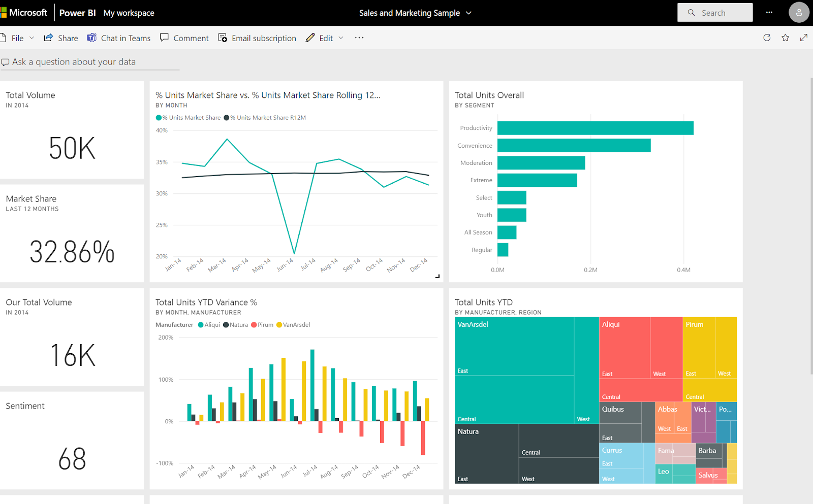
.png)
Build your first embedded data product now. Talk to our product experts for a guided demo or get your hands dirty with a free 10-day trial.

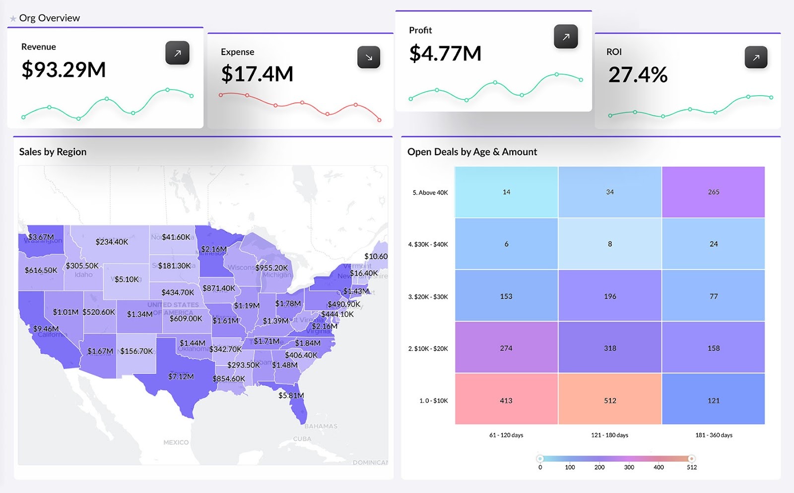
.png)
Data is powerful, but in the form of raw numbers, it doesn't convey as much as charts and different visualization types. If you want to give your end-users actionable insights, you'll employ data visualization. But what if the bare essentials are not enough?
If Excel charts are not cutting it anymore, you'll need to look at custom dashboard software: tools that let you choose different interactive visualization types, that connect to a variety of data sources, and let you visualize key performance indicators in a way that suits you and your target audience.
There are many types of dashboard software out there, which is why we're showing you a handful of the very best, for different use cases. But first...
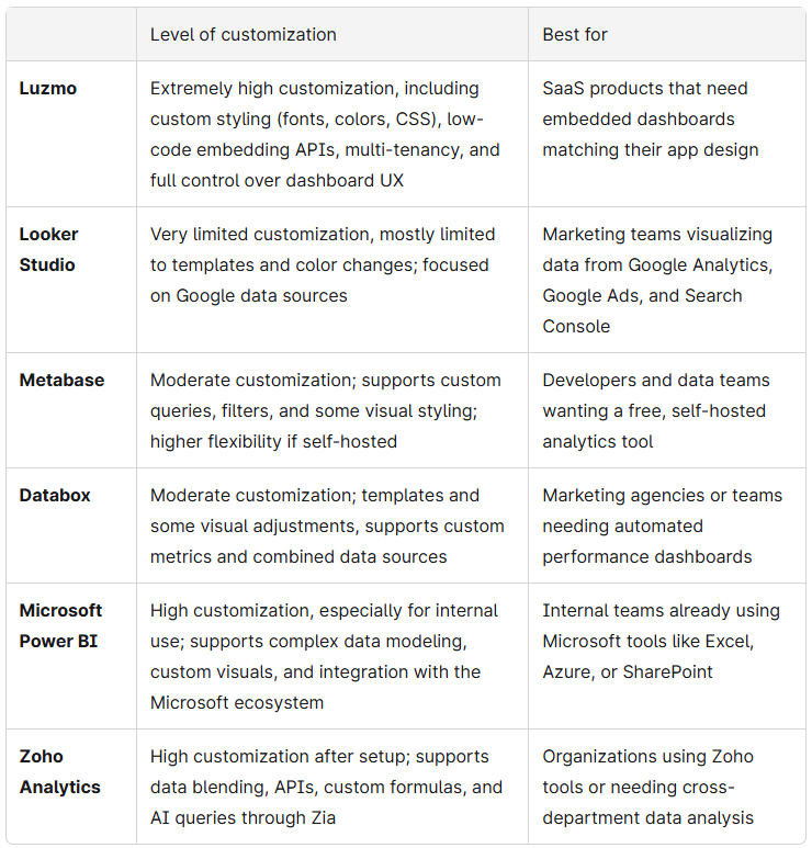
Depending on what your needs are (or those of your end users), customization could mean a few different things.
For example, marketing teams that want to see performance metrics across campaigns may just need the ability to change the color scheme of their charts.
CMOs creating predictive analytics dashboards may want to give drill-down options to a board of executives so they can zoom in on monthly or quarterly metrics, or single out a specific KPI.
SaaS vendors may want full control of the dashboard's UX so it fits into their app without compromises in loading speed.
We're listing several different custom dashboard software options, depending on what kind of customization you need. Here's a quick overview before we go into individual tools:
In embedded settings, customization is crucial because the dashboard software needs to feel like a native part of your app or website. In this regard, customization is more than being able to change colors on a chart. The dashboard needs to adapt to the design and UX of your product, and this is where Luzmo shines.
Unlike most dashboard software, Luzmo is built explicitly for embedded analytics. This means your developers can set up a custom dashboard in your app in the time it takes to finish today's lunch.
You can use our embedded dashboard editor, drag-and-drop interface, custom styling (fonts, colors, CSS), and low-code embedding APIs. There is also a dashboard web component for easier embedding in web apps with bi-directional communication, so your app and dashboard can interact.
In short, the custom dashboard loads like a part of your app, with the same design, UX, and loading speed.
And for full customization, Luzmo connects to your most important data sources, including common databases/data warehouses (PostgreSQL, MySQL, Snowflake, etc.) and APIs / plugin layers to connect custom sources. If there are sources that don't come with Luzmo natively, you can use our plugin API or custom integrations to make things work.
At the end of the day, it's not just dashboards that matter. In SaaS, you may want each user to get actionable insights connected to their own data, and this is where multi-tenancy comes in.
Luzmo provides multi-tenant support so each client or user sees their own data, with control over authentication and access rights. Each user gets secure access, reuse of your app’s authentication system, and you can define which datasets a user can see.
And while getting started is easy (even if you don't have a technical background), we provide a selection of dashboard templates to inspire you.
If you need interactive dashboards for your SaaS product, Luzmo is the fastest and most customizable way to create reports in the market today.
Book a free demo to find out how you can customize your dashboards in Luzmo.
Not to be confused with Looker (the BI tool), Looker Studio used to be Google Data Studio up until a while ago. It's the only completely free tool on this list, which has its pros and cons. It was initially designed for marketers using Google platforms as data sources.
For example, if you wanted to visualize marketing performance from Google Analytics, Google Search Console, and Google Ads, this is an excellent default choice. It's easy to get started with and there is a range of free templates you can use for inspiration.
On the other hand, you're limited to Google tools only. If you want to visualize data from social media platforms or various other marketing tools, you'll need to pay for different connectors through third-party apps.
If you need to visualize custom metrics or make your data visualization dashboards fit into a web page or an app, Looker Studio is not the best fit. Even if you have the technical skills to do this, the platform is simply not that customizable.
However, if you just need something to show Google Analytics data to your CMO, it's great in a pinch.
If you don't want to pay for dashboard software and you have developer talent on board, Metabase is an excellent self-hosted option. The level of control goes beyond dashboard design, and you can be in charge of the infrastructure and security too.
Despite being self-hosted, it doesn't take much to get up and running with Metabase. You can connect your data sources, query data, and design the dashboard in minutes after signing up. The no-code / visual query builder lets non-technical users filter, group, aggregate, and visualize data, all without writing SQL.
There are some downsides, however. Compared to more established BI tools such as Luzmo or Power BI, the customization options can feel rather limited. You won't get as many choices for chart formatting, custom visuals, or styling, which can be a dealbreaker if you want to embed your dashboards.
More worryingly, though, performance can drop significantly if you're dealing with large datasets. Also, for a truly custom, white label experience, you'll want to remove the Metabase watermark. This will cost you $575 per month for the Pro plan. The cost (among other things) is why users often end up looking for Metabase alternatives.
Databox is a common choice for marketing reporting for several reasons. It supports over 130 data sources, allowing agencies and in-house marketers to present marketing metrics that go beyond the free Google tools.
It connects to just about any tool a marketer may need. You can present data from:
And many, many others.
Databox is easy to set up and use, even if you've never used dashboard software before. There is a large number of templates you can use as a starting point for a fully custom, interactive dashboard. Examples include PPC dashboards, SEO dashboards, and many others. If you want to simplify client management for your agency, Databox can help establish reporting processes across clients quickly.
It also supports custom metrics (combining different data sources, formulas) to make a truly custom dashboard that matches your unique use case. Dashboards can be shared with a link or embedded into portals and web pages.
Cost is one of the major downsides. If you run a marketing agency and need a wide choice of connectors, each adds to your monthly Databox invoice. You also don't get as much freedom with customizing the visuals compared to tools like Luzmo.
In other words, you're limited in terms of visual formatting, layout control, and style options across different dashboard types. However, if your main goal is to share key metrics with clients in an automated report, this may not be a dealbreaker at all.
If you're already working with Microsoft tools on a daily basis and need something to track performance or visualize metrics internally, Power BI is a logical choice. These are some of the tools that play really well with this platform:
You can publish directly from Excel, import Power Query models, or connect to Azure databases without extra connectors.
Speaking of which, Power BI supports over 150 native data connectors, including cloud apps (Salesforce, Google Analytics, HubSpot), on-premises databases, APIs, and custom connectors. You can blend multiple data sources in a single dashboard, which helps create unified analytics across departments.
It also has one of the best choices of data visualization types in the industry, spanning bar charts, decomposition trees, waterfall charts, and others.
But of course, this comes at a cost when you start building dashboards. To get the most out of customizing Power BI, you'll need a working knowledge of DAX (data analysis expressions), data modeling, and Power Query. The upside is that there are plenty of data scientists with a specialization in Power BI who are proficient in this. The downside is that you need one on your team.
The pricing is deceptively low once you get started. If you want to share your dashboards internally and externally, you'll have to upgrade to Power BI Pro or Premium. Licenses can get pretty expensive as your user base grows.
Zoho is a household name in the world of business platforms, with its CRM, help desk, email tools, and more. The analytics platform integrates well with all of the mentioned tools, but even beyond that, the integrations offer plenty of customization options.
Zoho Analytics connects to databases, cloud services, business applications, APIs and more. With a bit of tinkering and initial setup, you can display a variety of business metrics in one dashboard. It also supports data blending(joining data from different sources) for end-to-end insights.
With enough setup, you can benefit from the "Ask Zia" feature, which is a conversational AI assistant that answers questions about your data.
But the rich feature set comes at a cost. Compared to other dashboard software, it takes more time to learn Zoho Analytics, especially the more advanced features, data blending, writing custom formulas, and similar.
Compared to more specialized BI tools, the choice of chart types can feel limited. It also doesn't perform well under heavy load and when working with big data sets.
Even the most complex data is easy to understand when presented through visualization. However, most business users are not happy with their dashboard software's default state. To find out which custom dashboard software is right for you, start with two questions: who is the target audience viewing the dashboard, and what does customization bring for them?
Digital marketers who need simple white label dashboards may be happy with a free tool like Looker Studio. However, SaaS teams that need exceptional end-user experience will require a tool that can be customized down to the last pixel, and this is where Luzmo comes in.

All your questions answered.
Build your first embedded data product now. Talk to our product experts for a guided demo or get your hands dirty with a free 10-day trial.


