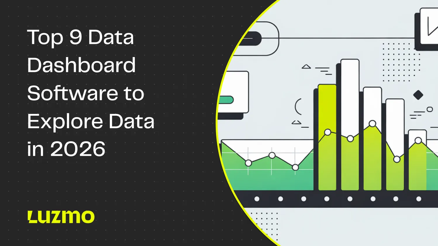
Top 9 Data Dashboard Software to Explore Data in 2026
With AI tools making their way into every aspect of work, it was about time data was democratized. Getting actionable insights from data is no longer reserved for data analysts only. Nowadays, everyone can get data access, thanks to a large number of data visualization tools.
Unlike business intelligence tools of yesterday, these tools come with a drag and drop interface, they support easy data analysis and allow users to visualize data in a variety of formats.
Today, we're showing you the best data dashboard software to help you create interactive dashboards and get data insights, without a degree in data science.
What to look for in data dashboard software
Whether you want to do enterprise business intelligence or simply generate marketing reports from disparate data sources, good dashboard software has a set of common features. This is what you should look out for if you want to choose the right dashboard software in 2026.
1. Strong data sources and connectors: they pull information from different sources and bring it together in one clear view so teams can see the full picture without balancing multiple platforms.
2. Real-time accuracy: the data and visualizations update automatically, giving users confidence that what they see reflects what’s happening right now. Ideally, you can choose the interval, from real-time to daily data refresh.
3. Custom visuals and layout: users can choose chart types (bar charts, Gantt charts, pie charts, etc.), rearrange sections, and adjust visuals so dashboards highlight what matters most to their audience.
4. Interactivity: good dashboards let you click, filter, and drill into data. In today's data driven world, the end user should be able to use one data set to tell their own story.
5. Easy sharing: team members can share dashboards, set viewing permissions, and comment directly within the tool, which is crucial for both internal and user-based reporting.
6. Reliable performance: as data grows, dashboards stay fast and stable, be it standalone or within a SaaS app.
7. Alerts for key changes: you can set up automatic notifications when something important happens so nothing slips through unnoticed.
8. Dashboard templates. If you don't know how to get started and create reports and dashboards that lead to valuable insights, pre-built templates can help you get inspired.
The best data dashboard software to create interactive reports and dashboards in 2026
If you or your end users want to make more data-driven decisions, choosing the right dashboard software is the most important step. From the cost, the data integrations, and all the way to dashboard performance, the differences between these tools can be massive.
These are the most important tools to consider in 2026, along with their best use cases.
1. Luzmo: best for in-app SaaS dashboards
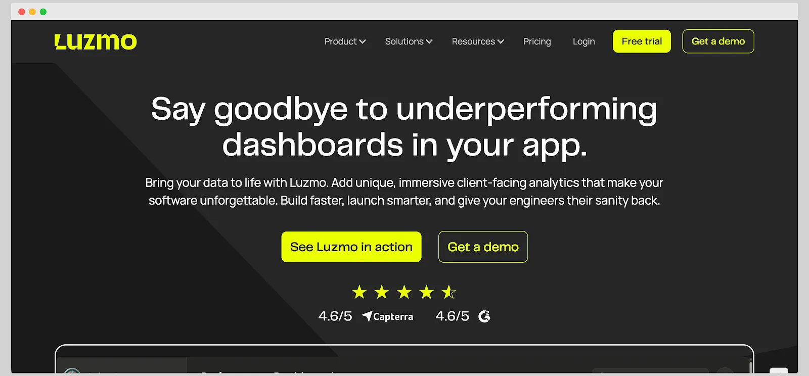
If you want to visualize data in your own product, Luzmo has the ideal combination of ease of use, choice of integrations, end-user analytics capabilities, detailed customization, and much more. While traditional reporting tools are built for sharing dashboards internally with team members, Luzmo performs best when it's embedded in your product.
In other words, it's embedded-first by nature. A developer-friendly SDK gives you easy integration and full control over the user experience, unlike iframe-based BI tools that feel disconnected or slow.
Customization options are limitless. You can change just about anything, from fonts, color schemes, chart types, and any other design element. The dashboard feels like a native part of your product rather than a bolted-on extension.
And none of that affects performance, either. Luzmo dashboards load very quickly, regardless of the data volume or the number of connected sources. For users viewing dashboards, this is critical as they can see their data without heavy loading times.
Speaking of which, everyone can see their own, specific data, thanks to multi-tenant architecture. You can easily manage tenant-level access, apply data filters, and reuse the same dashboards across customers without duplicating work.
And it's not just end-users. Your team can use Luzmo easily too, regardless of their background. Developers can embed dashboards and manage authentication, while everyone else can edit dashboards through a drag-and-drop interface. This keeps both technical and non-technical users in sync without creating bottlenecks.
Behind the scenes, several components power Luzmo’s analytics experience. Luzmo Studio provides a visual drag-and-drop builder where teams can design and manage dashboards without heavy coding. Luzmo IQ helps users discover patterns, anomalies, and trends automatically across datasets, while Luzmo AI enables natural-language analytics so users can ask questions about their data and instantly generate charts or insights.
Perhaps most important of all, Luzmo has flat, transparent pricing and you know exactly what you'll pay every month.
Luzmo offers transparent, tiered pricing starting at €495/month (Starter) and €1,995/month (Premium), both billed annually, with Enterprise plans available at custom pricing. All plans scale based on Monthly Active Users. See Luzmo pricing →
Get your free trial of Luzmo today.
2. Microsoft Power BI: best for detailed, in-house reports
Microsoft Power BI is a powerhouse for businesses that want to build detailed, data-rich reports within their own environment. It’s tightly integrated with Excel, SQL Server, and other Microsoft tools, which makes it especially appealing for organizations already invested in the Microsoft ecosystem. Once data is connected, Power BI provides extensive modeling and transformation options, giving analysts full control over how information is structured and displayed.
The platform supports a wide range of visualizations, advanced calculations through DAX formulas, and layered filtering that lets users dig deep into specific metrics. Reports can be shared securely within an organization through Power BI Service or embedded into internal portals for broader access. It’s ideal for companies that need governance, version control, and data accuracy across large teams.
The downside is accessibility for non-technical users. The interface can feel complex at first, and creating or maintaining advanced dashboards often requires someone comfortable with data modeling or formulas. Sharing outside the Microsoft environment can also add extra steps.
3. Looker Studio: best for free marketing reports based on Google Analytics and Search Console
Previously known as Google Data Studio, Looker Studio is a free tool that enables users to visualize data from Google tools. It primarily works with Google Analytics, Google Ads, and Google Search Console, and it's a great choice for in-house marketers who want a free way to foster a data-driven culture in a team.
Looker Studio comes packed with a number of reports for different use cases such as SEO, PPC, website analytics and others. It's not the most scalable platform out there and it doesn't allow for a lot of customization, but it provides tons of business value.
It's possible to add external integrations (e.g. with CRMs, platforms such as LinkedIn or Facebook), but these are not natively supported by Looker Studio. You're going to have to pay for third-party apps and integrations, and at that point, you might as well invest in a third-party app such as Whatagraph.
4. Whatagraph: best for marketing agencies that use a variety of data sources
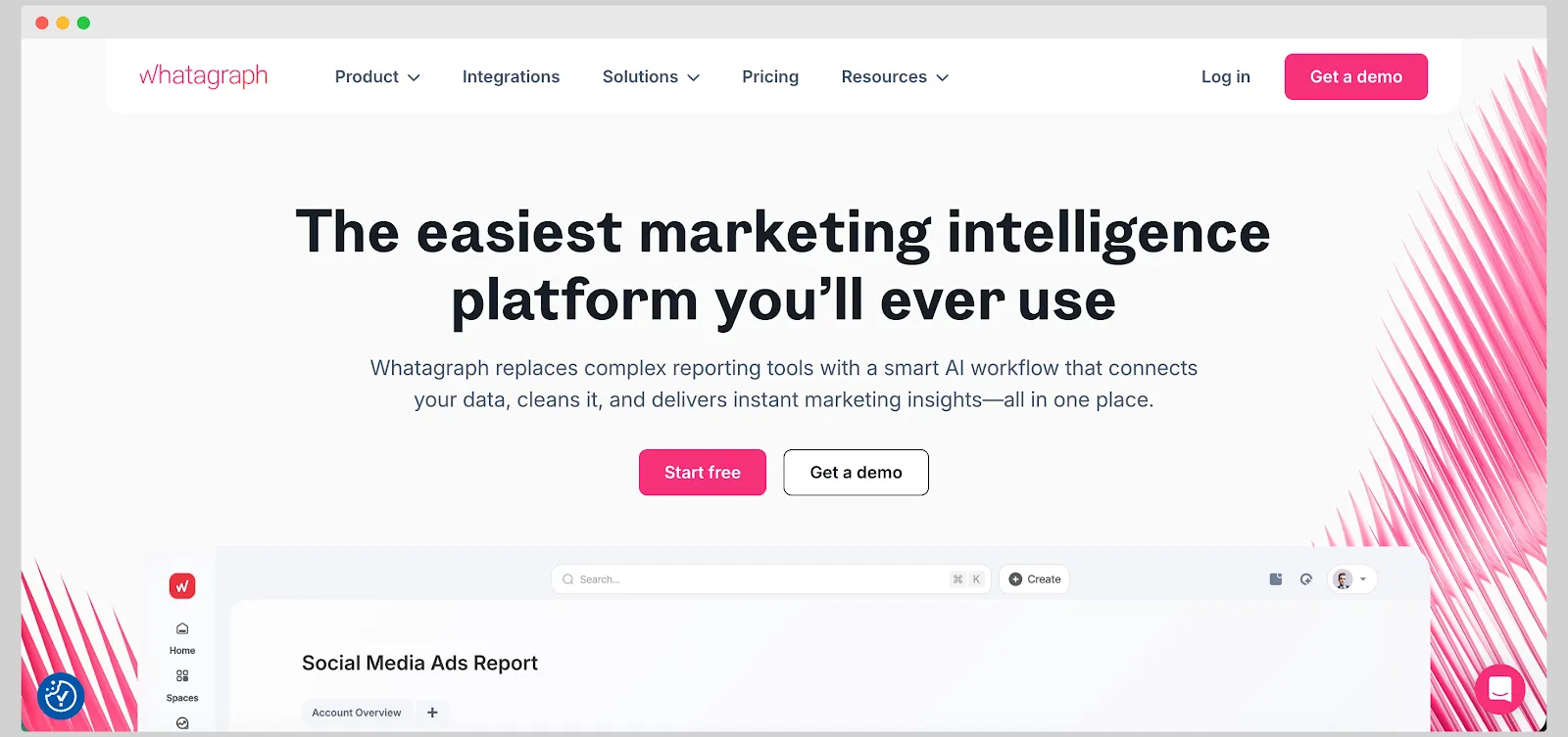
Whatagraph is a marketing intelligence platform that helps marketers connect and visualize data from a variety of sources. While anyone can create and share reports with Whatagraph, it's primary target audience is agencies that use a variety of data sources and share dashboards with a large number of clients.
Out of the box, it supports almost 50 different data sources, from Facebook Ads, Adobe Analytics, Shopify, WooCommerce, and many others. Combine that with a rich template library and you have all the tools you need to create a great marketing dashboard.
On the flip side, it can get very expensive for smaller teams because the pricing is built for agencies. While there is a solid number of connectors, not all of them are of equal quality, and the integrations may break with some.
Customization is possible, but more advanced activities (formula creation, advanced filters) come with a steeper learning curve.
If price is a concern, then Metabase may be a great choice.
5. Metabase: best for free, self-hosted data analysis
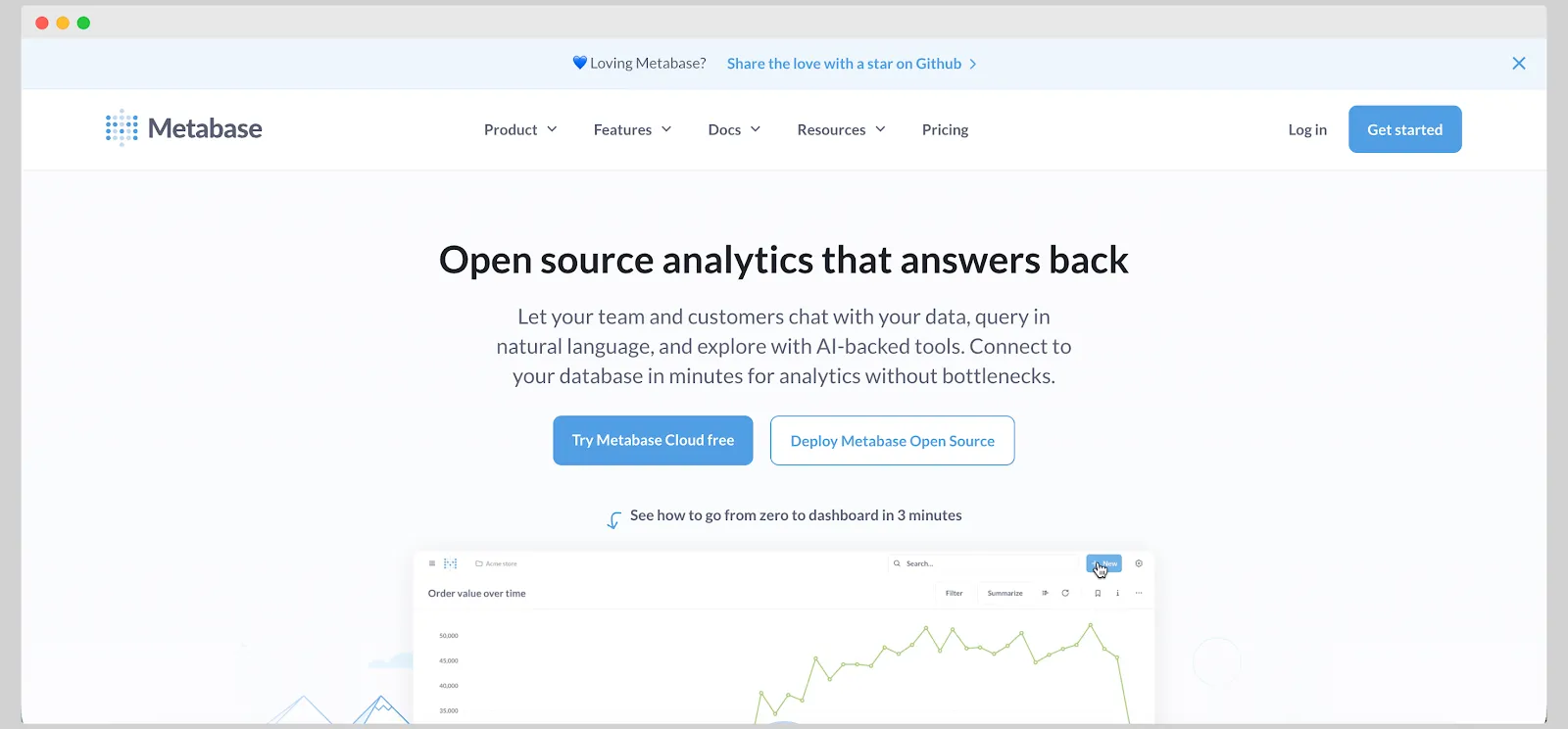
Metabase is a free, open-source and self hosted data dashboard tool that allows even non-tech savvy business users to create real time dashboards. It connects directly to major relational databases (e.g., PostgreSQL, MySQL, SQL Server) and allows both visual query building and SQL-mode for analysts.
It supports self-hosting (open-source edition) so you have control over deployment, cost and environment if you prefer that route. This is an excellent way to get started wit making more informed decisions based on data without spending a lot, but it's only viable for light use.
On the downside, more complex processes and larger data volumes can cause Metabase performance to come to a halt. Customization and visualization options are limited compared to most other data dashboarding tools.
Most importantly, the free version has a lot of limitations that will require upgrading, and Metabase is not cheap by any means.
Explore some great Metabase alternatives on our blog too.
6. ThoughtSpot: best for AI-powered business intelligence
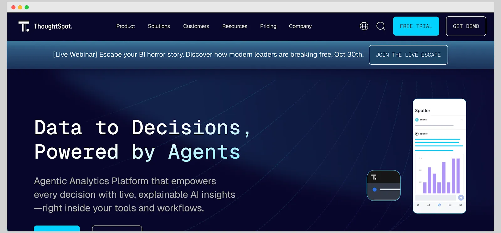
ThoughtSpot is a business intelligence platform that makes data exploration feel more like a conversation than a technical task. Instead of digging through endless menus, users can type a question and get instant visual answers powered by AI. It’s built for companies that deal with large amounts of data and want faster ways to uncover trends, patterns, and opportunities.
The platform connects with major cloud data warehouses such as Snowflake, BigQuery, Redshift, and Databricks. Once connected, you can build dashboards, search for metrics in plain English, and even get automated insights based on recent data changes. It’s a refreshing alternative to traditional BI tools that require constant help from data teams.
That said, ThoughtSpot comes with a few trade-offs. Pricing is geared toward larger organizations, and setup can be more technical than plug-and-play tools. While it’s great for quick insights, customization is limited if you want highly tailored visual layouts or complex dashboard designs.
For smaller teams that prefer full creative control or need to embed dashboards directly into their product, a tool like Luzmo can be a better fit, especially because ThoughtSpot pricing is quite complex.
7. Tableau: best for businesses that need to present data with a huge variety of visualization types
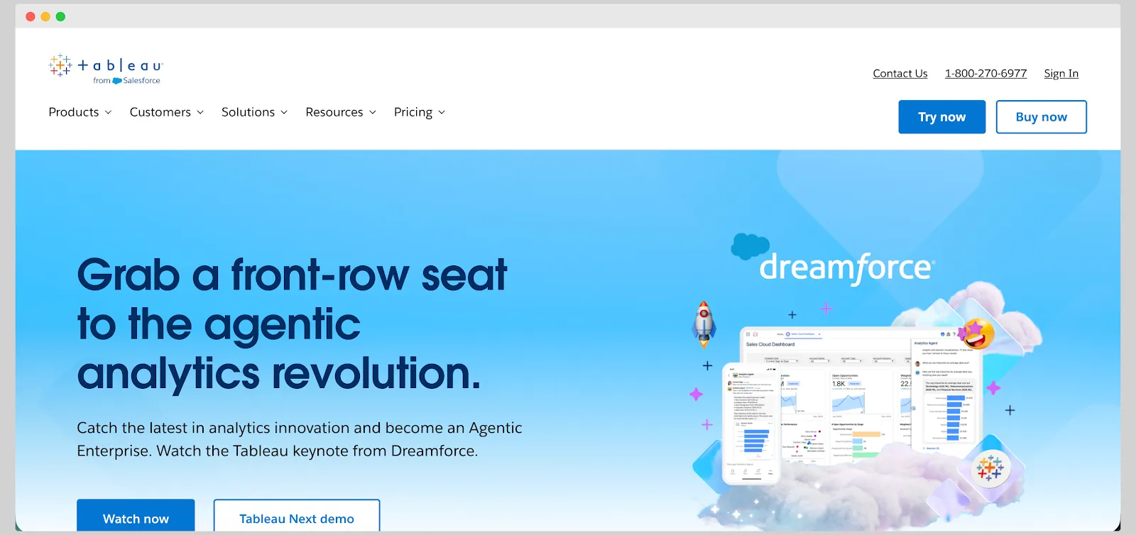
Tableau is one of the most established names in data visualization. It’s widely used by businesses that need to turn large, complex datasets into polished visuals that can be shared across teams and departments.
The platform gives users an enormous range of chart types, from simple line and bar graphs to complex geospatial and trend analyses, making it a favorite for companies that want complete control over presentation and storytelling.
The drag-and-drop interface makes building dashboards feel intuitive, and once the data is connected, users can experiment freely with visuals and filters. Tableau integrates with a wide range of data sources, including spreadsheets, databases, and cloud warehouses like Snowflake or BigQuery. The public gallery and strong community support also make it easier to learn from real examples and stay inspired.
The downside is that Tableau can get heavy when handling very large datasets, and it takes time to master its more advanced features. Pricing also tends to climb quickly once you add multiple users or enterprise-level governance. It’s powerful but not lightweight.
8. Zoho Analytics: best for companies already in the Zoho ecosystem
Zoho Analytics is part of the larger Zoho suite, making it a natural fit for businesses that already use tools like Zoho CRM, Books, or Projects. It brings reporting and data visualization into the same environment, allowing teams to pull data directly from their existing Zoho apps without the need for complex integrations.
The platform offers a familiar, spreadsheet-like interface that makes it easy to organize and visualize data. Users can combine multiple sources, apply filters, and create dashboards with interactive charts, pivot tables, and trend lines. There’s also an AI assistant called Zia that can answer questions about your data in natural language, helping teams explore metrics without writing queries.
The main limitation is flexibility. While Zoho Analytics works well inside the Zoho ecosystem, connecting it to external or custom data sources can feel clunky. Visual customization options are also more basic compared to tools like Tableau or Luzmo.
For companies already committed to Zoho, it’s a convenient and cost-effective choice.
9. Databox: best for data storytelling across marketing, sales and other internal functions
Databox is a reporting platform built to help teams track performance across different business areas without spending hours building spreadsheets or manual reports. It brings together data from tools like HubSpot, Google Analytics, Salesforce, Facebook Ads, and many others, giving teams a single place to monitor KPIs and tell a clear story about progress.
The setup process is simple, and the pre-built dashboard templates make it easy to start visualizing data within minutes. Databox shines when it comes to sharing performance updates, since dashboards can be shared through links, displayed on TVs, or sent as daily or weekly snapshots.
Teams can also set goals and track progress visually, which makes reporting more actionable and transparent.
The trade-offs are mostly around flexibility. Customization is somewhat limited, and the platform can feel restrictive if you want to build highly tailored dashboards or work with non-marketing datasets. Pricing can also increase as you add more data sources or users.
Databox is great for fast-moving teams and small businesses that value clear visuals and quick insights, but for companies that want deeper customization or embedded analytics for clients or products, Luzmo offers a more adaptable option.
Wrapping up
The best data dashboard software isn't the tool that costs the least. It's the tool that helps you create and share dashboards without extensive technical support or knowledge of things like semantic models or data cleaning. Dashboards should help you get deeper insights without necessarily knowing how to connect various sources or write complex formulas, not force you to learn how to use SQL.
If you have a SaaS platform and you want to help end users and decision makers understand their data without getting a degree in data engineering, Luzmo can do the heavy lifting for you. Connect, integrate, visualize, and share within the same day.
Book a free demo with our team to learn more.
FAQ
All your questions answered.
What is dashboard software used for?
Dashboard software helps businesses collect data from multiple sources and present it in a visual format such as charts, graphs, and tables. This makes it easier for teams to track key performance indicators (KPIs), monitor trends, and make data-driven decisions.
What features should good dashboard software include?
Strong dashboard tools usually include data integrations, real-time updates, customizable visuals, interactive filters, and sharing options. These features allow users to explore data, collaborate with team members, and quickly understand performance metrics.
Who typically uses data dashboard tools?
Dashboard tools are used by a wide range of professionals, including marketing teams, product managers, executives, analysts, and SaaS developers. They help both technical and non-technical users understand data insights without needing advanced data science skills.
Written by

Ship the future of your data
Let us show you what Luzmo can do for your product.

Leave your e-mail and one of our analytics experts will reach out to you