How 5 Companies Moved Beyond Static Reports
Giving users access to data is not the same as giving them an answer.
A spreadsheet export may contain every required field. A separate BI platform may offer advanced analysis. A quarterly report may be accurate. Yet each option creates distance between the user's question and the insight they need.
Interactive analytics closes some of that distance. Users can filter, compare and investigate data inside the product or service where the decision happens.
Timewax, Spaceflow, Field & Concept, Workero and Statbel started from very different reporting setups. Their stories show how companies can move beyond static outputs without forcing every user to become an analyst.
Five reporting experiences that needed to change
| Company | Previous experience | New experience |
|---|---|---|
| Timewax | Customers exported project data and analyzed it in Excel | Reporting became part of the SaaS product |
| Spaceflow | Landlords switched between Spaceflow and a separate BI tool | Analytics moved into the landlord portal |
| Field & Concept | Manual analysis and periodic business reviews | Interactive dashboards inside the customer zone |
| Workero | Partners had raw booking, payment and occupancy data | Personalized dashboards for workspace partners |
| Statbel | Municipal data existed across open datasets | Citizens and policymakers gained an interactive municipality tool |
Timewax brought spreadsheet analysis back into the product
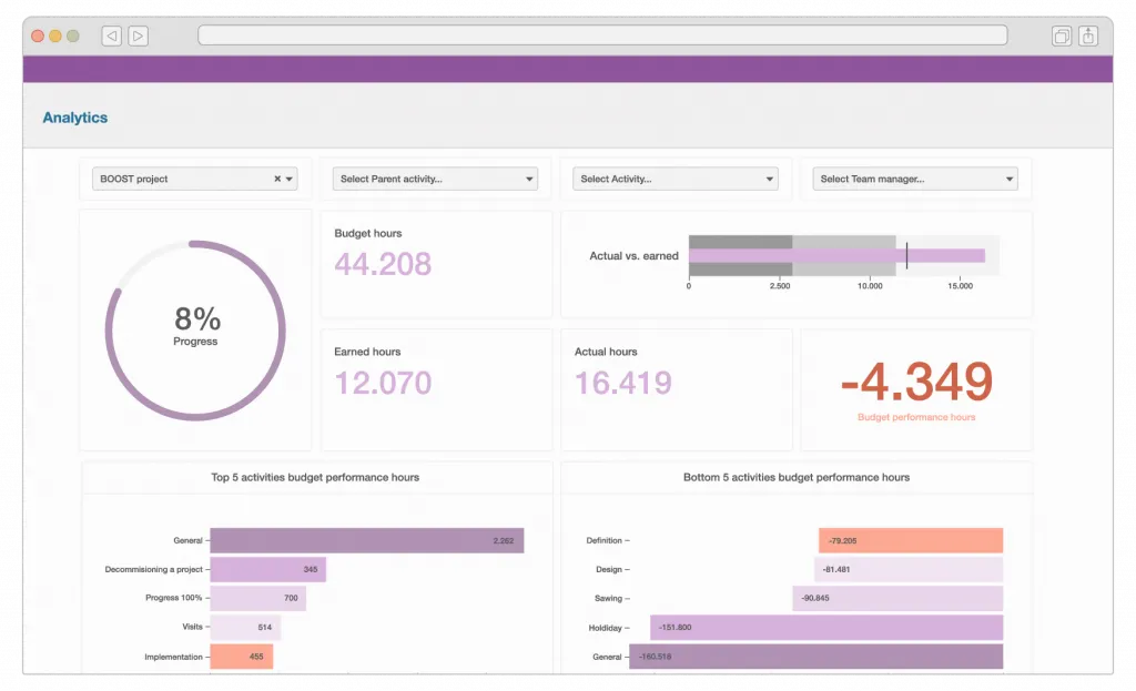
Timewax helps project-based companies plan resources, manage budgets and track project performance.
The platform generated valuable operational data, but customers often downloaded that data and analyzed it in Excel. The answers existed, but users had to leave Timewax and do the analytical work themselves.
Common questions included:
- Which projects were profitable?
- Which clients generated the strongest margins?
- Which resources were overused or underused?
- How much budget remained?
Timewax added a reporting module inside its SaaS application so customers could answer those questions without rebuilding the analysis in a spreadsheet.
The team implemented Luzmo in two months. Standard dashboards served common needs, while premium customers could receive more customization.
The important change was not simply replacing Excel with charts. Timewax moved insight closer to planning decisions and kept more of the customer workflow inside its own product.

Spaceflow replaced a separate BI experience with native reporting
Spaceflow provides tenant experience software for residential and commercial properties.
Its customers already had access to analytics, but advanced reporting lived in a separate BI tool. Landlords moved between the Spaceflow portal and another application with a different interface.
The data was useful. The experience around it was not.
Spaceflow redesigned its reporting and embedded the new dashboards directly in the landlord portal. Users could review building engagement, app activity, occupancy and service performance in the same place used for daily building operations.
The company reported up to 80% fewer generic data requests after the broader reporting overhaul. That result came from several changes together: improved dashboard structure, new metrics, better design and embedding the experience in Spaceflow.
This is a useful reminder that analytics adoption depends on context. Even a capable BI tool can create friction when users must leave the product to access it.
Read the Spaceflow case study →
Field & Concept shortened the gap between campaign activity and action
Field & Concept runs field marketing and brand activation campaigns.
Customers had access to datasets, but useful analysis required manual work. Monthly or quarterly business reviews added context, though the reporting cycle slowed down how quickly both sides could act.
Field & Concept embedded interactive dashboards inside its customer zone. Its clients could follow campaign performance, sales results, team activity, working hours, travel costs and budget pacing.
The first dashboards were operational in one month. An initial setup used Excel and CSV exports before Field & Concept connected its internal tools to feed dashboards automatically.
This changed the cadence of reporting. Clients no longer had to wait for the next formal review to see the latest state of a campaign. They could filter the data and investigate the metrics relevant to their own goals.
Business reviews still had value, but less time was spent assembling the basic analysis.

Read the Field & Concept case study →
Workero turned booking data into partner insight
Workero helps companies share and monetize unused workspace. Its platform handles desk, meeting room and event-space bookings.
That activity generates data about reservations, payments and occupancy. Raw records can show what happened, but partners need a clearer view of how their spaces perform.
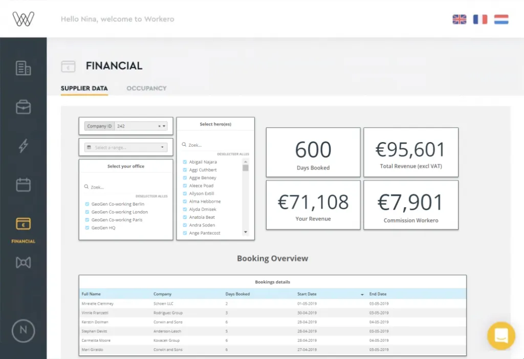
Workero added personalized dashboards for its partners. The implementation connected booking data to an interactive reporting layer and applied partner-specific access.
According to the case study, Workero moved from raw booking data to an interactive dashboard for each partner in three main steps.
This type of reporting changes the product relationship. Partners are not only using Workero to process bookings. They can also use the platform to understand demand and workspace utilization.
Statbel made municipal data usable outside specialist teams
Statbel is Belgium's national statistics office. It publishes large volumes of demographic and economic information.
Open data can be valuable while remaining difficult for the public to navigate. Downloadable datasets may work for researchers, but citizens and local decision-makers often need a clearer route into the information.
Statbel created an interactive municipality tool covering topics such as population, buildings, income, entrepreneurship and transport.
Users can select a municipality and explore its most important statistics and trends through dashboards. The experience makes public data accessible to researchers and policymakers while remaining understandable to residents without specialist analytical tools.
This example sits outside the typical SaaS use case, but the design problem is similar: the source data already exists. The work lies in turning it into an experience people can use.
Static reporting creates work on both sides
Static reports do not only inconvenience the person reading them.
Someone must export the data, format it and explain it. When a new question appears, the process starts again. The customer waits, and an internal team becomes the reporting interface.
The five examples removed different parts of that cycle:
- Timewax reduced the need for spreadsheet analysis.
- Spaceflow removed the switch to a separate analytics application.
- Field & Concept shortened the delay between campaign activity and review.
- Workero gave partners a direct view of booking performance.
- Statbel made open data more approachable to non-specialists.
Interactive analytics is most useful when it removes a specific obstacle between data and action. A chart that happens to move when clicked is not enough. The shift is from a cycle of export, reformat, send and explain toward one where users open, filter, compare, investigate and act.
When should a static report become an interactive experience?
When users ask follow-up questions
A fixed PDF may answer the first question but not the next one. Filters and drilldowns give users a controlled way to investigate.
When the data changes frequently
A report becomes stale quickly when booking, campaign, occupancy or operational data changes every day.
When reporting lives outside the main workflow
Even strong analytics can be ignored when users must remember another login or switch to a visually disconnected tool.
When internal teams repeat the same analysis
If customer success or operations rebuilds similar reports for different accounts, reusable interactive dashboards may remove recurring work.
Static formats still have a place. PDFs can support formal records, scheduled summaries and offline distribution. The mistake is treating them as the only interface for data that users need to explore.
How interactive reporting connects to the bigger picture
Moving beyond static reports is rarely a standalone project. It usually accompanies a broader effort to make product value visible and to give users more control over their own reporting.
If you are planning a similar move, it helps to review embedded analytics examples and to see how other teams scaled customer-facing analytics as their reporting needs grew. For many products, the practical path is embedded analytics that lives inside the workflow rather than a separate tool users must remember to open.
Timewax, Spaceflow, Field & Concept, Workero and Statbel each removed a specific obstacle between their users and the answers already sitting in their data.
FAQ
All your questions answered.
What is the difference between a static report and interactive analytics?
A static report presents a fixed snapshot. Interactive analytics lets users filter, compare, drill into and update the view as new questions appear. Both can use the same data, but the user experience and reporting workflow are different.
Should SaaS companies remove spreadsheet exports?
Not necessarily. Exports remain useful for offline work and specialist analysis. The product should avoid making spreadsheets the only practical way for customers to answer common questions.
Can interactive dashboards replace business reviews?
They can reduce the preparation needed and give customers access between meetings. Business reviews may still provide strategic context, interpretation and shared decision-making that a dashboard cannot replace.
When is real-time reporting necessary?
Real-time or near-real-time reporting matters when the underlying activity changes quickly and users can act on fresh information. Slower update schedules may be sufficient for stable or periodic metrics.
Written by

Ship the future of your data
Let us show you what Luzmo can do for your product.

Book your session with our analytics expert.