How 5 SaaS Companies Make Product Value Visible With Analytics
A customer can use a product every week and still struggle to explain what it delivers.
The work happens inside the platform, but the outcome may remain scattered across usage logs, support conversations and internal reports. When renewal time arrives, the vendor and customer are left reconstructing the value from memory.
Customer-facing analytics changes that relationship. It gives users a visible record of time saved, engagement created, activity completed or operational performance improved.
24sessions, Speakap, Field & Concept, Hult Ashridge and Spaceflow use analytics for different purposes. Their stories show five ways SaaS companies can make product value easier for customers to recognize.
Five ways analytics can make product value visible
| Company | Value customers need to see | How analytics helps |
|---|---|---|
| 24sessions | Time saved through video meetings | Shows measurable ROI, including up to 20 minutes saved per meeting for one large client |
| Speakap | The impact of internal communications | Reveals activation, retention, engagement and content performance |
| Field & Concept | Campaign progress and budget use | Gives clients real-time visibility into field marketing activity |
| Hult Ashridge | Learning participation and program outcomes | Shows learning hours, course engagement, scores and NPS |
| Spaceflow | Building and tenant operations | Gives landlords a single view of engagement, occupancy and service performance |
24sessions turned time saved into a visible ROI metric
24sessions, now part of MessageBird, offered video engagement software for customer conversations. Its clients understood that video could replace some in-person meetings, but the financial and operational value was not always obvious.
That created a customer retention problem. The product could be useful without customers having a clear metric they could repeat internally.
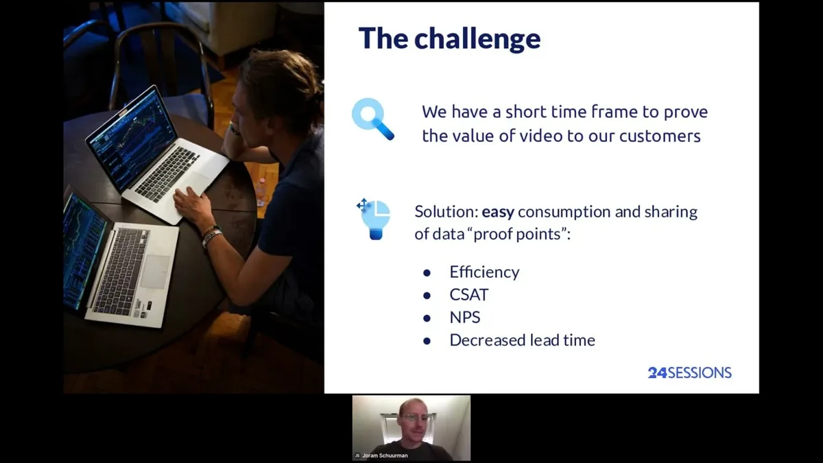
24sessions added white-label analytics inside its platform to show how customers used video and what those interactions changed. For one large financial-services client, the data showed savings of up to 20 minutes per meeting compared with an in-person appointment.
The result was more useful than a generic usage chart. It translated product activity into a business outcome the customer could understand and defend.
This is the clearest form of value reporting: connect a product action to time, money or another metric already used in the customer's organization.
Read the 24sessions customer story →
Speakap showed communication teams what employees actually engaged with
Speakap is an employee communication platform for dispersed and frontline workforces. Its customers use the product to share company information, workplace updates and operational messages.
Internal communications teams often work with incomplete feedback. A survey may show sentiment occasionally, but it does not explain how employees interact with communication every day.
Speakap created Compass, an analytics add-on that helps customers see employee activation, daily product use, reactions to company updates and the content that performs best.
"Internal communication isn't an exact science. Companies usually go with their gut feeling, or an employee survey at most. With Compass, we can finally share facts with our customers. We can expose how their employees are really interacting with company updates."
Sarah Darweesh, Director of Marketing at Speakap
The dashboards give communication managers something more useful than a total login count. They can compare content performance, understand which posts resonate and use those signals to adjust future communication.
According to the case study, more than 600 Speakap customers use Compass. The analytics layer helps those teams demonstrate the impact of work that previously depended heavily on intuition.

Field & Concept made campaign activity and budget use transparent
Field & Concept runs field marketing and brand activation programs. Its customers need to understand what is happening across campaigns, sales teams, locations and budgets.
The data existed, but turning it into a useful view took manual work. Customers could access raw datasets and discuss performance during monthly or quarterly business reviews, yet those reviews slowed down the response to new information.
Field & Concept embedded interactive dashboards inside its customer zone. The reports can show sales results, target attainment, field team performance, travel costs, working hours and budget pacing.
Clients can see where money is going and drill into the KPIs relevant to their campaign. Data collected by employees in the field can flow into the dashboards automatically, making the view more current than a manually prepared review.
For Field & Concept, the value is not limited to reporting efficiency. The dashboards reinforce its promise of transparency and give clients a clearer basis for optimizing campaign investment together.

Read the Field & Concept case study →
Hult Ashridge connected learning activity with program outcomes
Hult Ashridge provides corporate education, leadership and coaching programs. Its digital applications help participants engage with online learning, while corporate clients need visibility into how those programs are performing.
The organization had used in-house analytics for years, but new digital products introduced different datasets and reporting requirements. The team needed a more flexible way to present results without rebuilding each reporting experience.
Hult Ashridge embedded dashboards in its own applications and retained control over which users could access each dataset. One year after onboarding, it had six core dashboards live in the platform.
The reports cover measures such as learning hours, course engagement and completion, program scores and Net Promoter Score. Those metrics help clients move beyond participation counts and examine the outcomes the organization is trying to improve.

Read the Hult Ashridge case study →
Spaceflow brought operational insight back into the product
Spaceflow provides tenant experience software for residential and commercial buildings. Landlords use the platform to manage communication, bookings, services and building operations.
The company previously offered analytics through a separate BI tool. Customers could access useful information, but they had to move between the Spaceflow portal and another application with a different interface.
Spaceflow redesigned the reporting experience and embedded it directly in its landlord portal. Customers could then see building engagement, tenant activity, lease information and service performance in the same product used for daily operations.
The reporting overhaul also reduced generic data requests by up to 80%, according to the case study. That number reflects more than a visual redesign. Customers could find common answers themselves without asking the Spaceflow team to prepare another report.
Value becomes easier to see when analytics appears inside the workflow connected to it. A landlord reviewing building operations does not need to leave the platform, open another BI environment and reconstruct the context.
Read the Spaceflow case study →
Product value needs a metric customers recognize
The examples use different measures because the products create different kinds of value.
24sessions can show time saved. Speakap can show communication engagement. Field & Concept can show campaign progress and budget use. Hult Ashridge can show learning activity and program results. Spaceflow can show building operations and tenant behavior.
The strongest customer-facing analytics does not begin with the chart type. It begins with a customer question:
What would prove that this product is working for us?
A useful dashboard might answer that question with one direct business metric. In other cases, it may need several connected measures showing adoption, activity and outcomes.
The goal is not to overwhelm customers with every data point the product collects. It is to surface the evidence that helps them take action and explain the product's contribution to someone else.
Seen together, the five stories trace the same path: product activity becomes a meaningful customer metric, gains context and comparison, prompts an action and finally becomes evidence a customer can use at renewal or expansion. Analytics does not guarantee that outcome, but it makes the value legible enough to defend.
How to choose the right customer value metrics
Start with the reason a customer bought the product.
A video platform may focus on time saved or meetings completed. A communication platform may focus on employee activation and engagement. A learning platform may need completion, participation and outcome measures.
Then test each metric against three questions.
Can the customer understand it without an analyst?
A metric should not require a long explanation before it becomes useful. Customers need enough context to understand what changed and why it matters.
Can the customer act on it?
A dashboard should help users decide what to do next. Speakap customers can adjust communication. Field & Concept clients can respond to budget pacing. Spaceflow landlords can investigate building trends.
Can the customer repeat it internally?
The strongest metrics can travel beyond the dashboard. They help a user brief leadership, support a business review or explain why the product deserves continued investment.
Customer-facing analytics becomes commercially useful when it gives customers language and evidence for the value they already experience.
What product teams can learn from these examples
If you are weighing your own approach, it helps to see more embedded analytics examples and to understand how other teams scaled customer-facing analytics without turning every request into an engineering project.
The same evidence that proves value also shapes what comes next: giving users more control over their own reporting and replacing static reports with interactive analytics. Each step depends on customers first being able to see what the product delivers.
24sessions, Speakap, Field & Concept, Hult Ashridge and Spaceflow each kept their teams focused on the product value only they could build, using embedded analytics to make that value visible inside the product.
FAQ
All your questions answered.
How can SaaS companies use analytics to prove product value?
They can connect product usage with outcomes customers already care about, such as time saved, engagement, completion, revenue activity or operational performance. The dashboard should explain what changed and help the customer act on the result.
Can customer-facing analytics improve retention?
It can support retention when it helps customers recognize and communicate product value. Analytics does not guarantee renewal, but it can provide clearer evidence for business reviews, adoption conversations and renewal decisions.
What is the difference between a usage dashboard and an ROI dashboard?
A usage dashboard shows what customers did in the product. An ROI dashboard connects that activity to an outcome, such as reduced meeting time, stronger engagement or better operational performance. Many effective reporting experiences combine both.
Which metrics should a customer-facing dashboard include?
The dashboard should prioritize metrics linked to the customer's original goal. Start with a small set of understandable measures, then add filters or drilldowns for users who need more detail.
Written by

Ship the future of your data
Let us show you what Luzmo can do for your product.

Book your session with our analytics expert.