How 5 SaaS Companies Made Analytics Feel Native to Their Product

Customers can usually tell when analytics was bolted on. The colors are slightly off. The reporting section has its own login. A separate tool opens in a new tab and asks users to learn a second product just to answer a question about the first.
Native embedded analytics avoids that gap. It feels like part of the product because it shares the product's design, identity, permissions and context.
Spaceflow, Selligent, Workero, Field & Concept and Lansweeper each made analytics feel native in a different way. Together they show that "native" is not one design trick. It is a set of layers, from visual styling to the ability to act on what a chart reveals.
Five native embedded analytics experiences
| Company | What made it feel native | Layer it emphasizes |
|---|---|---|
| Spaceflow | Reporting moved into an integrated portal experience | Product context and navigation |
| Selligent | White-label dashboards inside the marketing product | Visual design and branding |
| Workero | One master dashboard filtered by product login | Authentication and permissions |
| Field & Concept | A customer zone with centralized data and dashboards | A single place to work |
| Lansweeper | Insights placed inside asset and troubleshooting flows | Analytics in the moment of the task |
The layers that make analytics feel native
Before the examples, it helps to name what "native" actually involves. A reporting experience feels native when it inherits several layers from the host product:
- Visual design: the same colors, typography and components as the product.
- Navigation: analytics lives where users already are, not behind a separate tool.
- Authentication: users reach reporting through the product's own login.
- Permissions: what each user sees follows the product's existing access rules.
- Product context: insights appear next to the data and workflows they describe.
- Action: users can do something with what they see, not just read it.
The companies below each strengthen one or more of these layers.
Spaceflow moved reporting from a separate tool into the product
Spaceflow provides a tenant-experience platform for landlords and property managers. Its customers needed a clear view of building and community performance.
Earlier reporting relied on stand-alone Tableau dashboards that lived outside the main experience. Customers had to leave the product to see their data, and the reporting felt separate from the platform they used every day.
Spaceflow moved to an integrated portal experience where reporting sits inside the product. Alongside a broader reporting overhaul, the case study reports up to 80% fewer generic reporting requests, which suggests customers found what they needed without leaving to ask for it.
This is the product-context layer at work. When analytics stops being a separate destination, it starts feeling like a feature of the product rather than a bolt-on.
Read the Spaceflow case study →
Selligent kept dashboards inside its own branded experience
Selligent Marketing Cloud serves marketers who work across many campaigns and channels. Its reporting needed to feel like part of Selligent, not a visit to a third-party analytics tool.
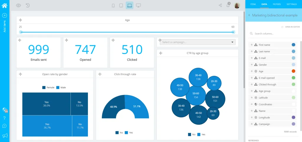
Selligent offered general campaign dashboards to all customers and a white-label dashboard editor to premium tiers. Both live inside the Selligent product and carry its branding, so marketers stay in one familiar environment.
The white-label layer is what makes it feel native. Customers build and read dashboards that look like Selligent, not like a generic reporting product wearing someone else's logo.

Read the Selligent case study →
Workero personalizes one dashboard through the product login
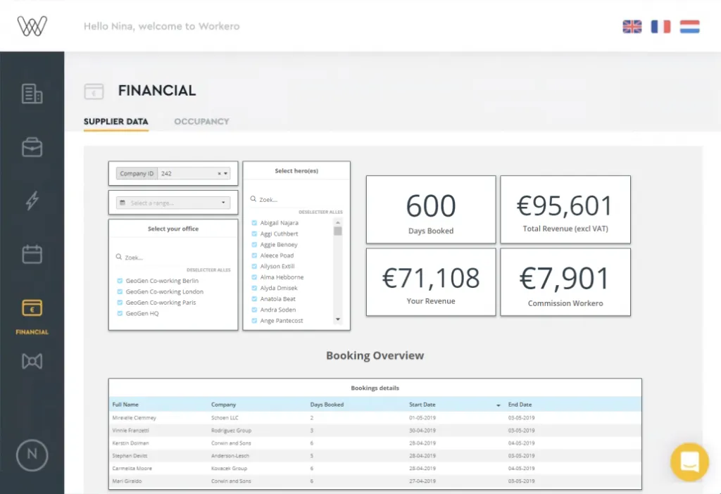
Workero provides workspace and flex-office management software used by multiple partners. Each partner should see only its own booking, payment and occupancy data.
Rather than build and maintain a separate dashboard for every partner, Workero uses one master dashboard. The product login and a token-based security flow pass the current partner's context to the analytics layer, which filters the view accordingly.
To a partner, the result feels like a dashboard built just for them. In reality, everyone shares the same underlying dashboard, personalized through authentication and permissions rather than duplication.
This is the authentication-and-permissions layer done well. The native feel comes from the fact that users never log in twice and never see anyone else's data.
Field & Concept gave clients one place to work with their data
Field & Concept runs field marketing and retail activation campaigns. Clients needed access to campaign performance and budget data without chasing the team for updates.
Field & Concept centralized raw data and dashboards in a customer zone. Instead of scattered exports and prepared decks, clients have one place inside the relationship where current data and reporting live together.
A single, consistent place to work is itself part of feeling native. Clients do not switch tools or mental models; they open the customer zone and the data is there, in context.

Read the Field & Concept case study →
Lansweeper put insights inside the workflows users already follow
Lansweeper manages large volumes of technology asset data. Its users investigate specific devices, risks and troubleshooting questions as part of their daily work.
Lansweeper began placing contextual visualizations directly inside asset and troubleshooting workflows, so the relevant insight appears next to the task rather than in a separate reporting area. The case study notes this contextual experience as being in beta, with conversational exploration through Luzmo IQ described as a next phase.
This is the action-and-context layer. When a chart shows up at the exact point a user is trying to solve a problem, analytics stops being a report to consult and becomes part of getting the work done.

Read the Lansweeper case study →
Native is a stack of decisions, not a single setting
These five companies emphasize different layers.
Spaceflow fixes product context. Selligent owns visual design. Workero nails authentication and permissions. Field & Concept provides a single place to work. Lansweeper delivers analytics in the moment of the task.
No single layer makes analytics feel native on its own, and native design by itself does not create commercial results. What these stories share is that each company removed a seam customers would otherwise notice, so reporting felt like a natural part of the product instead of a visitor to it.
How to make your embedded analytics feel native
Match the product's design system
Use the same colors, typography and components. Reporting should look like a screen in your product, not a framed third-party tool.
Use one login and one set of permissions
Users should never authenticate twice, and analytics should inherit the access rules the product already enforces.
Personalize through context, not duplication
Pass the current user or tenant into a shared dashboard so each person sees their own data, instead of maintaining a separate copy per customer.
Place insights where the work happens
Put charts next to the records and workflows they describe, so users find answers without leaving what they were doing.
Let users act on what they see
A native experience closes the loop: filtering, drilling in or taking the next step should happen in the same place as the insight.
Where a native experience fits with your other analytics decisions
Making analytics feel native works best alongside your other reporting choices. It builds on moving beyond static exports and separate tools and complements how you personalize analytics across customers without duplicating dashboards.
If you are shaping the experience, it also helps to review embedded analytics examples and to see how a native feel supports turning analytics into a premium product feature. You can explore embedded analytics as a product capability rather than a one-off feature.
Spaceflow, Selligent, Workero, Field & Concept and Lansweeper each removed a different seam between their product and their reporting, so analytics felt like something they built, not something they attached.
FAQ
All your questions answered.
What does native embedded analytics mean?
Native embedded analytics feels like part of the host product rather than a separate reporting tool. It shares the product's visual design, navigation, authentication and permissions, and it appears in the context where users already work instead of in a disconnected dashboard.
Is native analytics only about visual styling?
No. Matching colors and fonts is one layer. A native experience also inherits the product's login and permissions, respects tenant boundaries, appears in relevant workflows and lets users act on what they see. Styling alone does not make analytics feel native.
Does a native experience require building analytics in-house?
No. Several of these companies used an embedded analytics platform and still achieved a native feel through white-labeling, shared authentication and contextual placement. The work is in the integration and design decisions, not necessarily in building a reporting engine from scratch.
Does native design on its own drive commercial results?
No. A native experience improves adoption and usability, but the companies here combined it with packaging, broader product changes and support. Native design should be read as a contributor to outcomes rather than the single cause.
Written by

Ship the future of your data
Let us show you what Luzmo can do for your product.

Book your session with our analytics expert.